Affiliate links on Android Authority may earn us a commission. Learn more.
8 smartphone gimmicks that might not be so bad after all
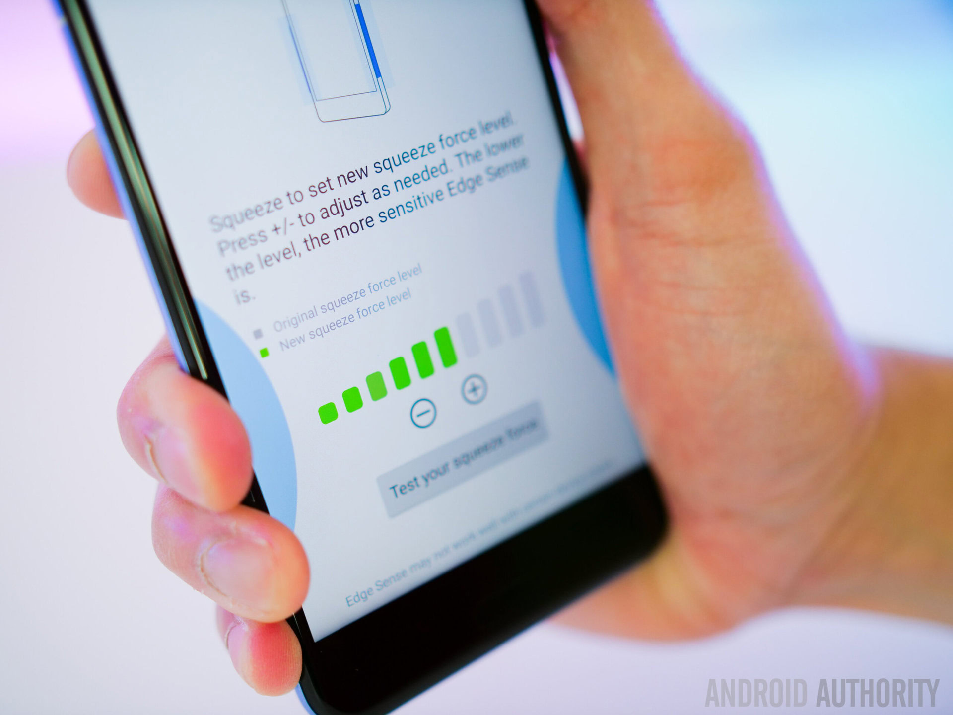
In hopes of differentiating their products from the competition, a lot of manufacturers equip their phones with features that are, or at least look to be, a bit gimmicky at first glance. The most recent one is the HTC U11‘s Edge Sense, which basically allows you to open any app of your choice by just squeezing the device. Although it sounds a bit weird, it actually works a lot better than expected.
In addition to Edge Sense, we have seen quite a few weird features on various smartphones over the years. As inherently risky innovations, a lot of them have been criticized by the media and users, although not all are as bad as they initially appear. In this post, we’ll take a look at the more interesting ones.
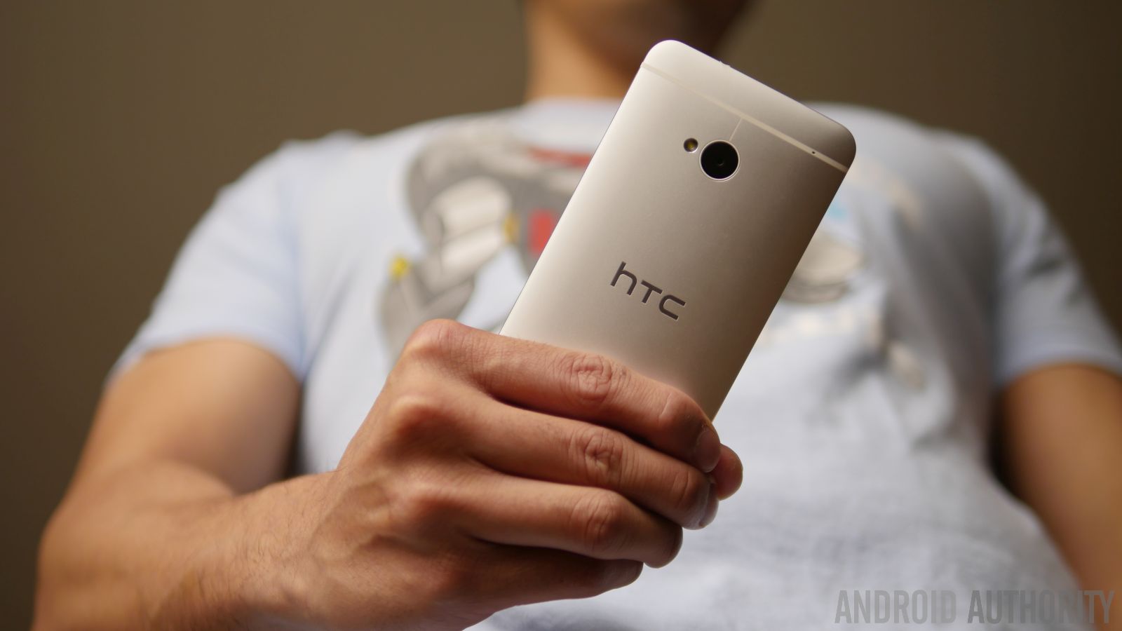
Oppo’s O-Touch panel
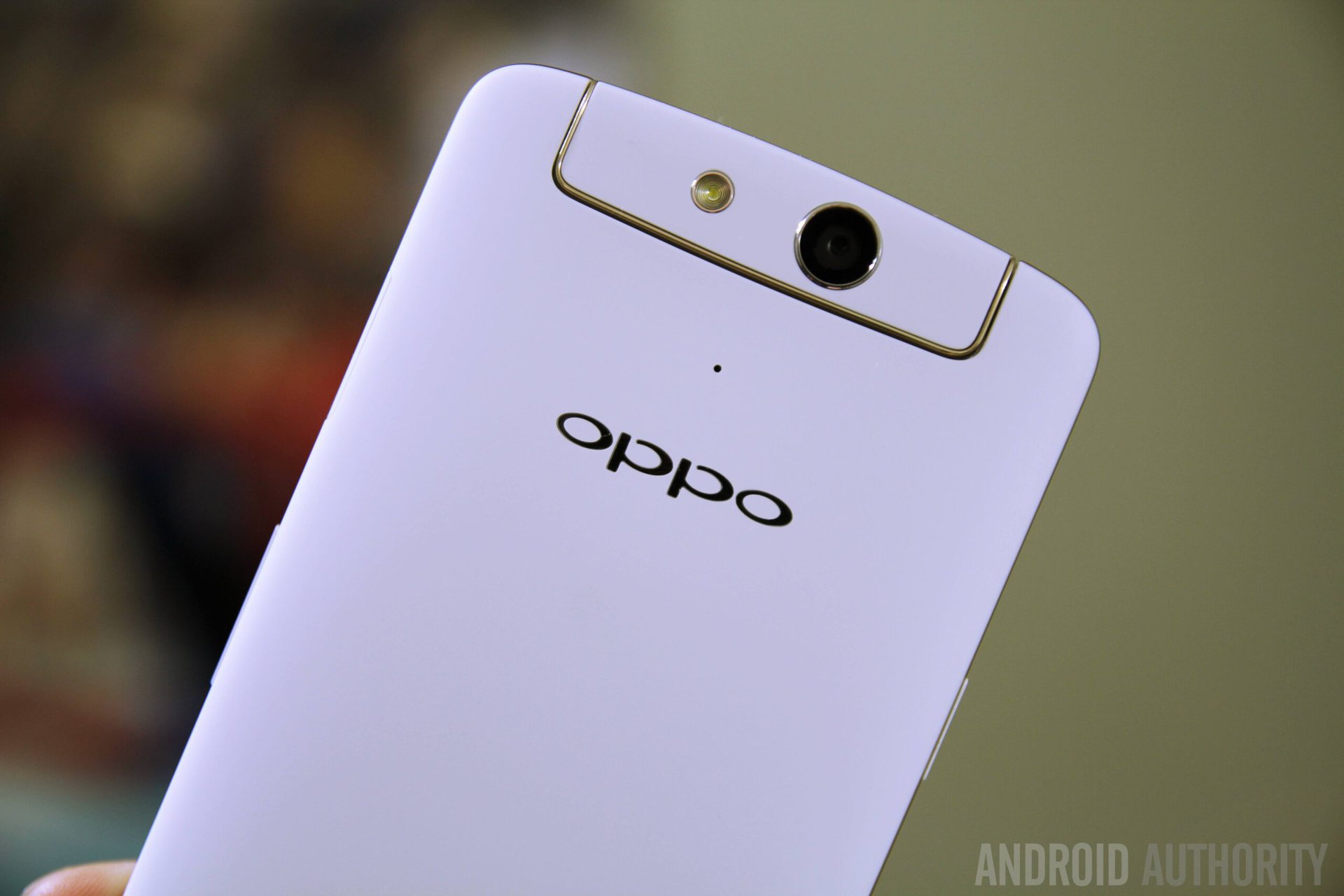
Back in 2013, OPPO announced the N1 smartphone. One of its biggest features was the so-called O-Touch panel found on the back of the device.
In case you forgot all about this already, it’s basically a touch-sensitive panel that allows you to control some functions of the device without having to put your fingers on the screen. You can, for example, scroll through web pages or move from one home screen to another by swiping your fingers up, down, left, or right. You can also use the O-Touch panel to launch the camera, take a picture, skip to the next song, and more.
The feature was, for the most part, received with skepticism when it was announced, and we haven’t seen it used on any of the newer devices available on the market. Well, at least not in the exact same form. You can get your hands on smartphones with fingerprint scanners that support various gestures including swipe down to see the notification tray, swipe left to go back, and swipe right to see the most recent apps.
However, fingerprint gestures are limited in functionality and don’t offer as many features as OPPO’s O-Touch panel. Additionally, they are somewhat tiny, while the panel on the N1 smartphone was quite a decent size.
So, would we like to see a touch panel on an upcoming smartphone? Sure, why not. It adds another way of interacting with the device, which is never a bad thing. It’s also quite natural to use, as the panel is located right where the index finger normally rests when you pick up a device.
It would, however, have to be an optional feature, so you could turn it off in case you didn’t want to use it. Otherwise it might become annoying, as you could accidentally open an app, take a photo, or perform a certain task by mistake just by placing your fingers on the back of the device.
Changhong H2’s molecular scanner
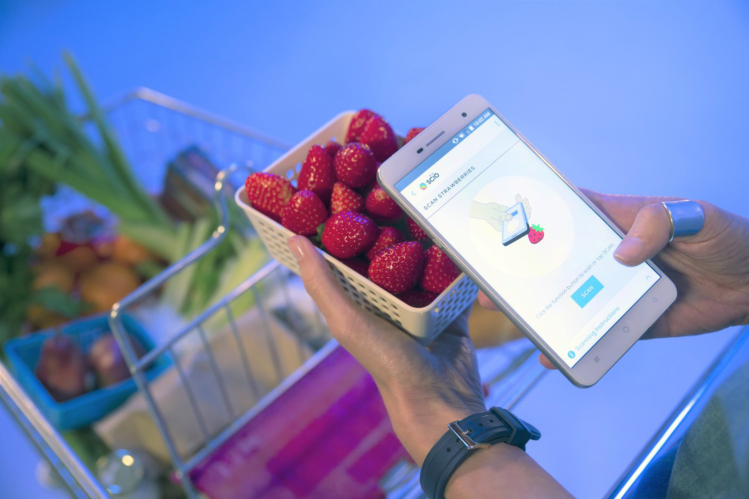
At CES 2017, the Changhong H2 smartphone was revealed. What makes it stand out from the crowd is its built-in spectroscopic sensor called SCiO. With its help, you can scan various objects such as fruit, liquids, medication, and more to see their chemical composition. It works by absorbing light reflected back from an object, breaking it down into a spectrum, and then analyzing it to determine its chemical makeup.
To give you an example, you can scan a drink to see its alcoholic content, or a beauty product to check out the allergens it contains. If you’re a fitness junkie, you can use the molecular scanner to check out your body fat percentage. All you have to do is place the sensor close to your biceps, scan it, and the data will show up on your screen. Sure, it might look weird, but it gets the job done.
The technology sounds a bit gimmicky at first and we can’t say how good or bad it works in real life, as we haven’t tested it properly yet. If it does perform as advertised though, molecular scanners just might have a bright future ahead, and we wouldn’t mind seeing it on other smartphones either. Checking the nutritional value of a certain product, what allergens it contains, and more on the fly could be useful to quite a lot of people and the smartphone seems like the perfect form factor.
That said, it would have to be easy to use, work quickly and accurately, as well as be affordable. The company has said that it is working on a software development kit that will allow developers to create their own applications, which should quickly expand the range of applications too.
Alcatel’s reversible UI
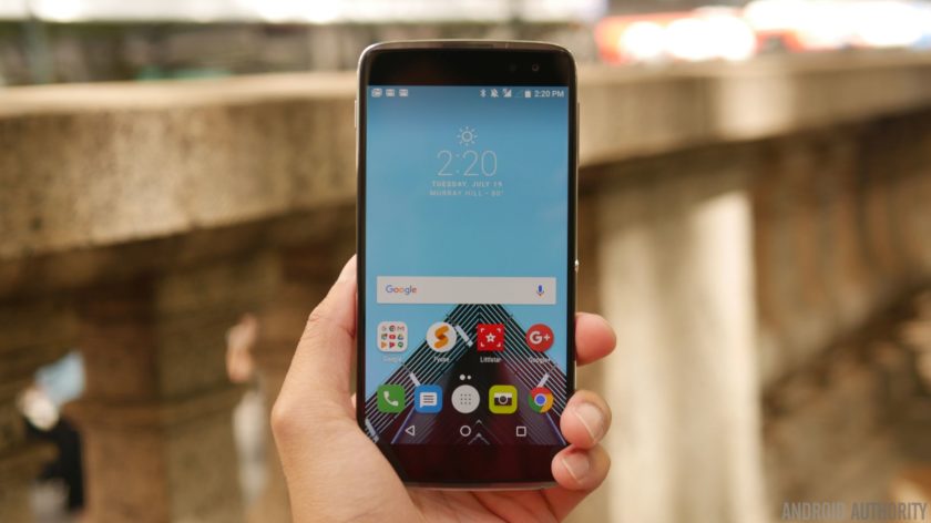
Alcatel has a few “reversible” smartphones in its lineup, including the Idol 4s, among others. What this actually means is that the user interface will rotate completely if the device is turned upside down, making it perfectly usable upside down. The smartphone also comes equipped with two front-facing speakers and when you receive a call, the one that’s on top – whichever it may be – will work during your conversation. So, however you pick up the device, you can use it without a problem. Because of this, the Idol 4s features a symmetrical design, which means the bottom half of the device looks exactly the same as the upper half, at least on the front.
The reversible feature works great in some case and not so much in others. If the smartphone is upside down, you can still use it to chat with friends online, browse the web, and so on. However, the problem comes up when you launch the front-facing or the rear camera to take a picture. You’ll have to make sure the device is in the correct position in this case, otherwise, your selfies might look a bit weird, as the camera will be at the bottom of the smartphone.
Despite its problems, we wouldn’t mind seeing this as an optional feature on other smartphones. It definitely wouldn’t hurt, as you would be able to turn it off in case you don’t like it, and seems like a natural fit as we move towards slimmer bezel-less phones. Maybe it’s just me, but I grab my smartphone upside down all the time, so a rotating UI would be great when quickly answering a call or checking a notification.
However, there are also other problems associated with this feature that are worth pointing out. If a smartphone doesn’t have a symmetrical design like the Idol 4s, it might look weird if you’re holding it upside down in public, despite the fact you can still use it without an issue. Also, it would be a bit difficult to unlock an upside down device with your fingerprint if the scanner is located on the front. While there are definitely benefits to a reversible UI, there’s also a few reasons it hasn’t really caught on.
Trackball
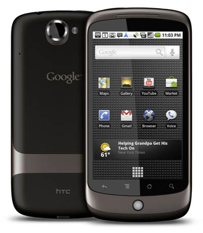
A lot of early Android smartphones, including the Nexus One, featured a trackball. It allowed you to click on links, could light up to alert you to notifications, and more. Of course, this sounds like very old technology these days, the kind of technological relic that no one would want to see on their high-end smartphone of today. And in a way, that’s true.
However, like fans of QWERTY keyboards, some people probably wouldn’t mind seeing trackballs make a comeback, especially on smaller devices, as they do have their share of advantages. For example, it’s a lot easier to move to a certain part of a text using the trackball than it is by navigating there with a finger. With our current method, you frequently have to tap on the screen quite a few times to position the cursor in the exact spot where you want it to be. While this probably isn’t a big deal to most users, it is definitely annoying and less-than-ideal.
However, the likelihood of seeing trackballs reappear on future devices is somewhere between slim to none. Unless someone with more money than sense decides to release a retro-looking smartphone that combines the latest technology along with a few old features. Such a device would certainly bring back some good memories for a lot of people, but its unlikely it’d fly off shelves, Nokia 3310 reboot notwithstanding. I wouldn’t hold my breath, but everything is possible these days.
Samsung Galaxy Beam’s projector
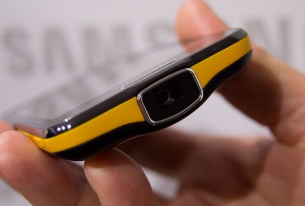
You all remember this one, right? Back in 2012 at MWC in Barcelona, Samsung showed off the Galaxy Beam smartphone. It didn’t impress in the specs department but did stand out from the crowd thanks to its nHD pico projector with a resolution of 640 x 360 and brightness of 15 lumens. The device can display movies and images up to 50 inches in size and comes equipped with a dedicated button for the projector.
On paper, it actually sounds like a great thing to have. However, it didn’t really work quite as well as many had hoped. Even at the highest brightness, the projection was darker than we would like. It worked somewhat well in a dark room, but that’s obviously expected. Also, the device gets quite hot after using the projector for a long period of time.
Because of its faults, many have described the projector as a gimmick. In a way, they are right, as the technology wasn’t that well received among consumers. Nevertheless, a few years down the road, we wouldn’t mind seeing projector phones make a comeback if the implementation was handled better. A brighter 1080p projector might be handy for publicly sharing videos or pictures with friends, rather than squeezing around a tiny 5-inch display or passing your phone around a group of people.
However, one of the problems with equipping a smartphone with a projector is that it makes it quite thick. Lenovo, for example, has found a way around the problem by releasing a Moto Mod called the Insta-Share Projector, which basically attaches to the back of Moto Z devices. This is a great solution, but most manufacturers can’t implement something similar, as the majority of smartphones don’t have a modular design. This means that we likely won’t see a thin and sleek smartphone with a built-in projector that offers great quality anytime soon.
Oppo’s rotating camera
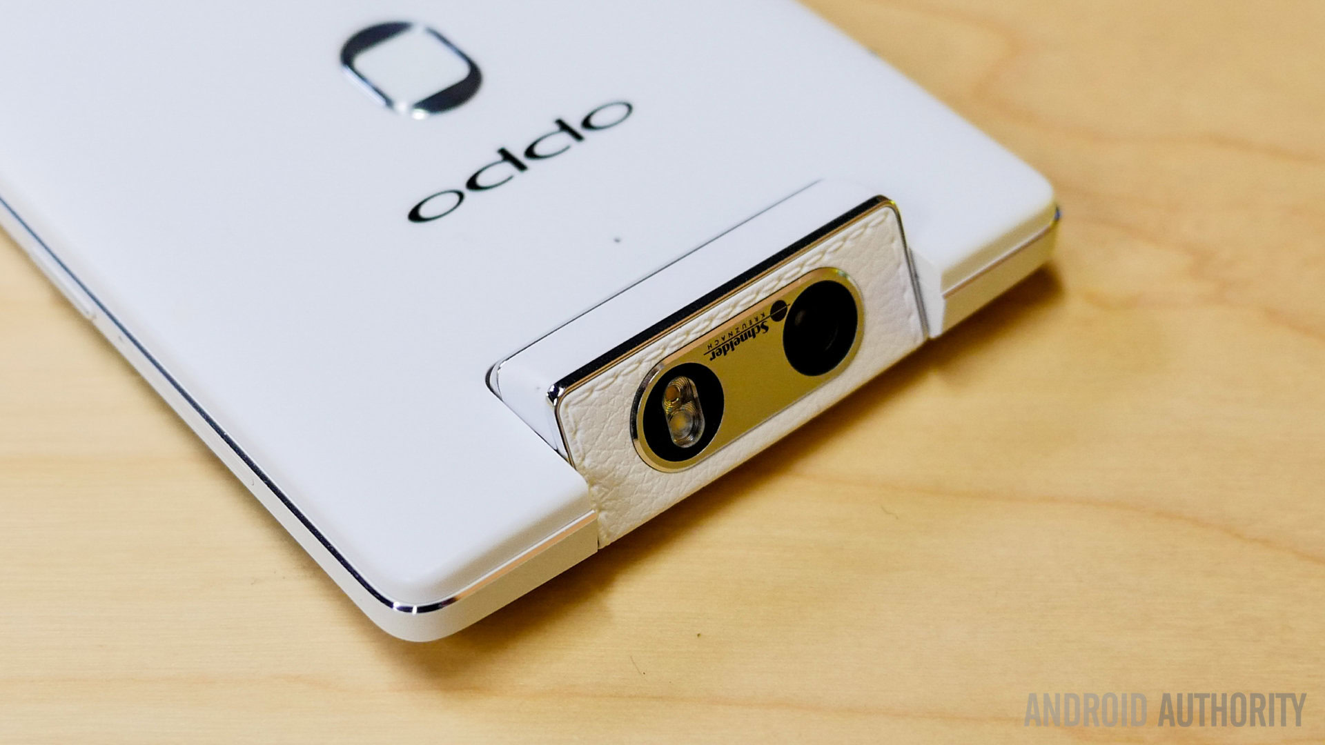
A couple of OPPO smartphones, like the N1 already mentioned in this post and the N3, are equipped with a rotating camera. What this means is that instead of two cameras — front and rear — the devices only have one on board, one that can be rotated and used in both directions. You can turn it around manually, or in the case of the N3 it will also rotate on its own thanks to an automated motor.
At first, it was considered a gimmick that didn’t add any real value, but simply existed to make the handset a bit different from the competition, even if it did mean you could use the main camera for selfies too. Sadly, the idea wasn’t that popular at the time and no other manufacturers have attempted a similar design since. Nevertheless, the idea isn’t really that bad, especially if you can make the camera rotate automatically with a single tap.
The main camera on a typical smartphone is typically better than the one found on the front (although some OEMs have now started matching megapixel count on the front and rear). So being able to take high quality selfies simply by rotating the camera module should be pretty appealing – even if no one ever really got excited by the idea. The only real problem is that cameras like these do look a bit funny, and how this would work in a bezel-less future we have no idea. As clever as the solution was, two fixed cameras look like they’re here to stay.
YotaPhone’s dual-display
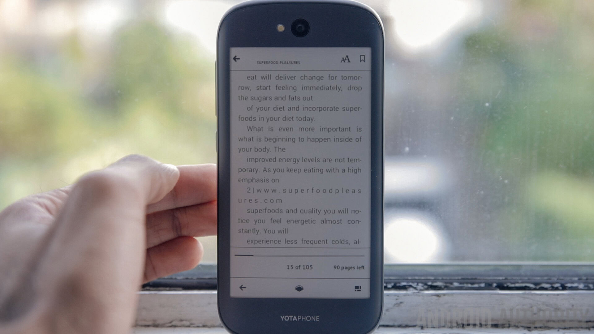
YotaPhone devices are unique on the market because they feature two displays. In addition to the standard screen up front used for traditional UI interactions, they also feature an E-ink display on the back. Described as a gimmick by some, there are plenty of great use cases for a Kindle display on a phone and we would love to see this on more devices.
The reality is that reading an e-book on a smartphone for a longer period of time isn’t the best experience. An E-ink display is much more suitable for book lovers, as it doesn’t cause as much eye strain. It also doesn’t consume as much power and can be used without a problem outside under direct sunlight. And if you’ve got your boarding pass displayed and your battery dies you’re still good to go.
An extra display of any kind would, however, increase the price of a device, although the difference shouldn’t be that big. E-ink displays aren’t really that expensive and are way more affordable than other high-end panels found on smartphones today. Considering how intriguing the concept was, it’s amazing no one else “borrowed” the concept for their own device. Yota is preparing the Yotaphone 3 for release later this year, so the idea is still alive.
LG G Flex’s self-healing back
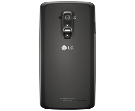
The LG G Flex, which was announced way back in 2013, was a rather unique handset and not just because of its bendy display. The smartphone came with a self-healing back that got rid of scratches on its own. Although it was also received with some skepticism, the self-healing process actually did work, but only to a point.
It was able to get rid of minor scratches caused by keys and other objects but didn’t do so well when it came to more severe ones — which is understandable. Those who owned the phone did seem to like the feature, and it was also present on the LG G Flex 2. However, we haven’t seen it on any of the newer smartphones from LG, which is a shame.
Devices can get scratched quite easily these days, which is something all of us are trying to prevent. But accidents do happen, which is why having a phone with a self-healing back is actually pretty nice. Of course, you’d have to give up the glass and metal bodies that many flagship phones ship with these days. You can check out LG’s promo below to see how it works.
These are just some of the smartphone gimmicks we have seen in recent years that actually might not be quite as bad as originally thought. Did we miss any? Let us know in the comments.