Affiliate links on Android Authority may earn us a commission. Learn more.
A closer look at the redesigned Settings menu [Diving into Android O]
Published onMarch 21, 2017

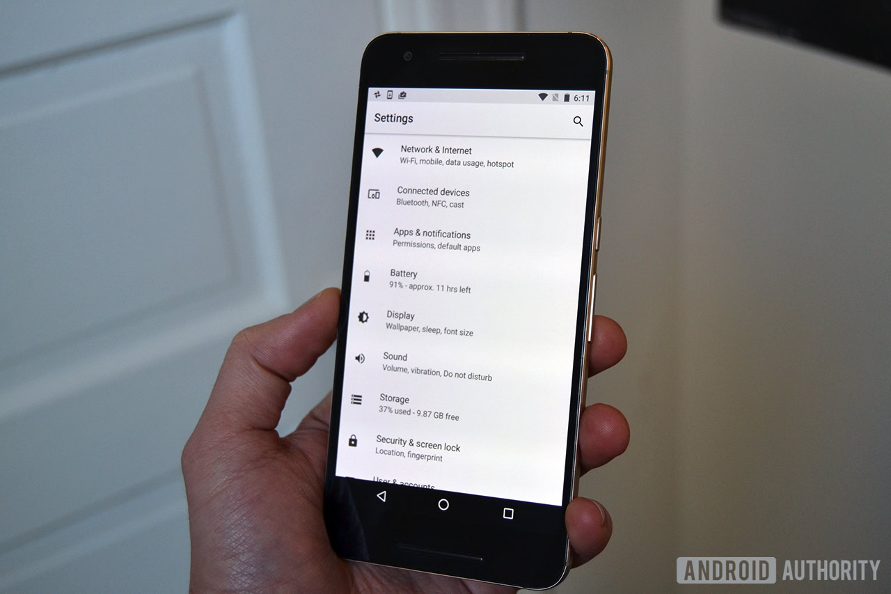
If you can remember way back to the first Android N Developer Preview, Google introduced an all-new, redesigned Settings menu. Now with Android O, Google is changing up the Settings menu yet again.
You might be thinking that this is just change for change’s sake. But I’m here to tell you that I’m really liking this new Settings menu so far… much better than the Nougat implementation. It’s more compact, and much easier to find things.
For starters, you’ll notice everything looks much lighter than it was before. The backgrounds for all the tabs are a light gray, and there’s no more dark blue/gray header. Google has also done away with the teal icon accents, and instead made everything the same shade of dark gray. All of these screenshots have come from the Nexus 5X (running O) and 6P (running Nougat), but it’s worth noting that the Pixel’s settings menu, of course, features that bright Pixel blue accent color instead of the teal.
In the screenshots attached above, you can see the difference between the Settings menu on Android O compared to the menu on Nougat. Google is now simply organizing each section by category, instead of listing each category with the full list of settings below it. This results in a much cleaner, easier to navigate layout. The changes are especially clear in leftmost screenshots in the gallery.
One other thing worth mentioning – there’s not more slide-out navigation menu. I’m not sure if anyone was a huge fan of of that feature, but now that the Settings menu is much shorter than it was before, it makes sense why Google would remove it.
Check out the other screenshots below for a closer look at the Connected devices and Bluetooth Audio sections.
Now that you’ve had a closer look at the new Settings menu, are you a fan, or will you miss the old one?