Affiliate links on Android Authority may earn us a commission. Learn more.
System UI Tuner gets a new navigation bar customizer [Diving into Android O]
Published onMarch 22, 2017

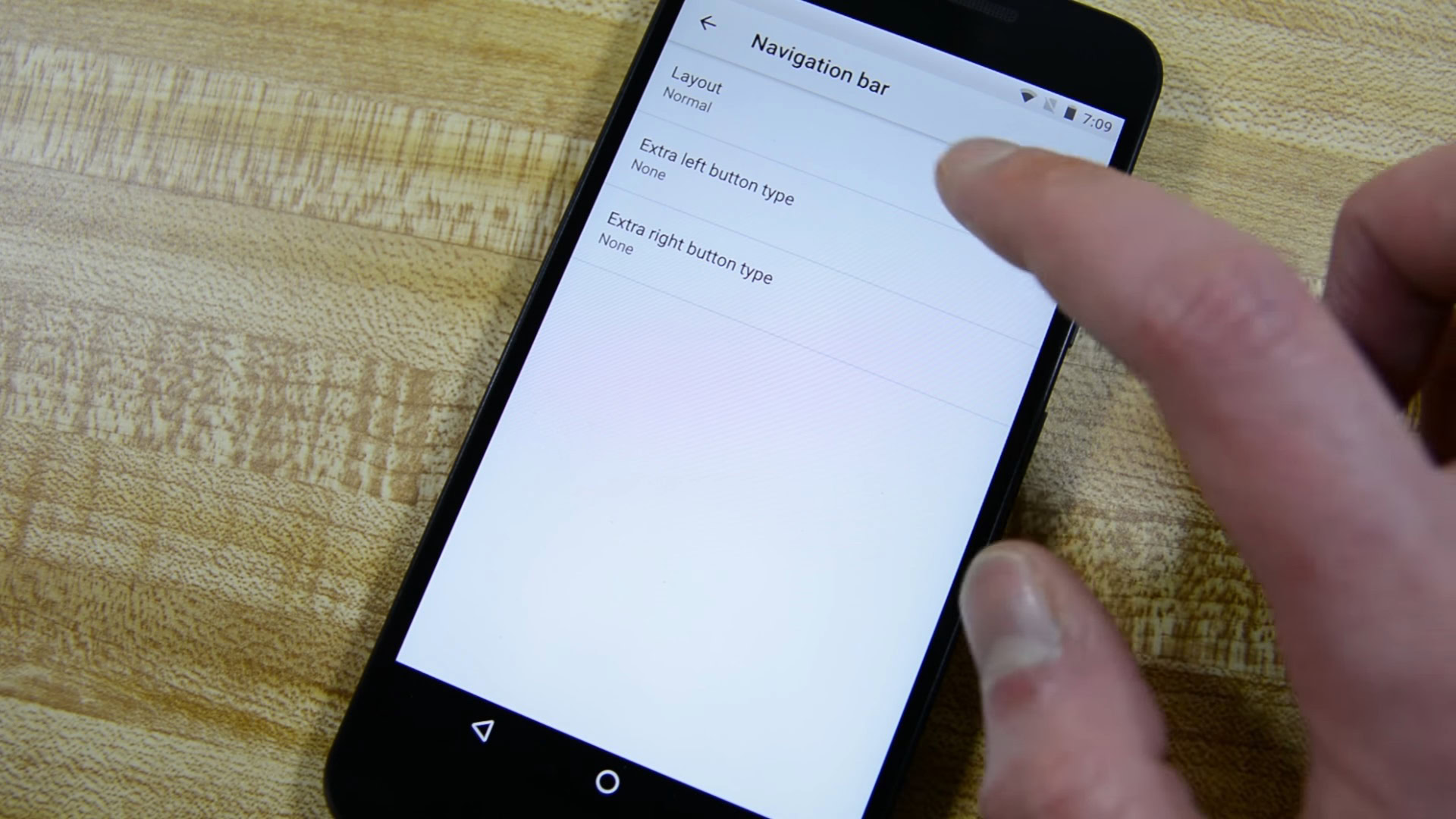
The System UI Tuner in the Android O Developer Preview has introduced new ways to customize the navigation bar of your device. The navigation bar is the panel at the bottom of a number of Android handsets (not all: some use physical/capacitive buttons instead) that houses the Home, Return and Recent Apps buttons.
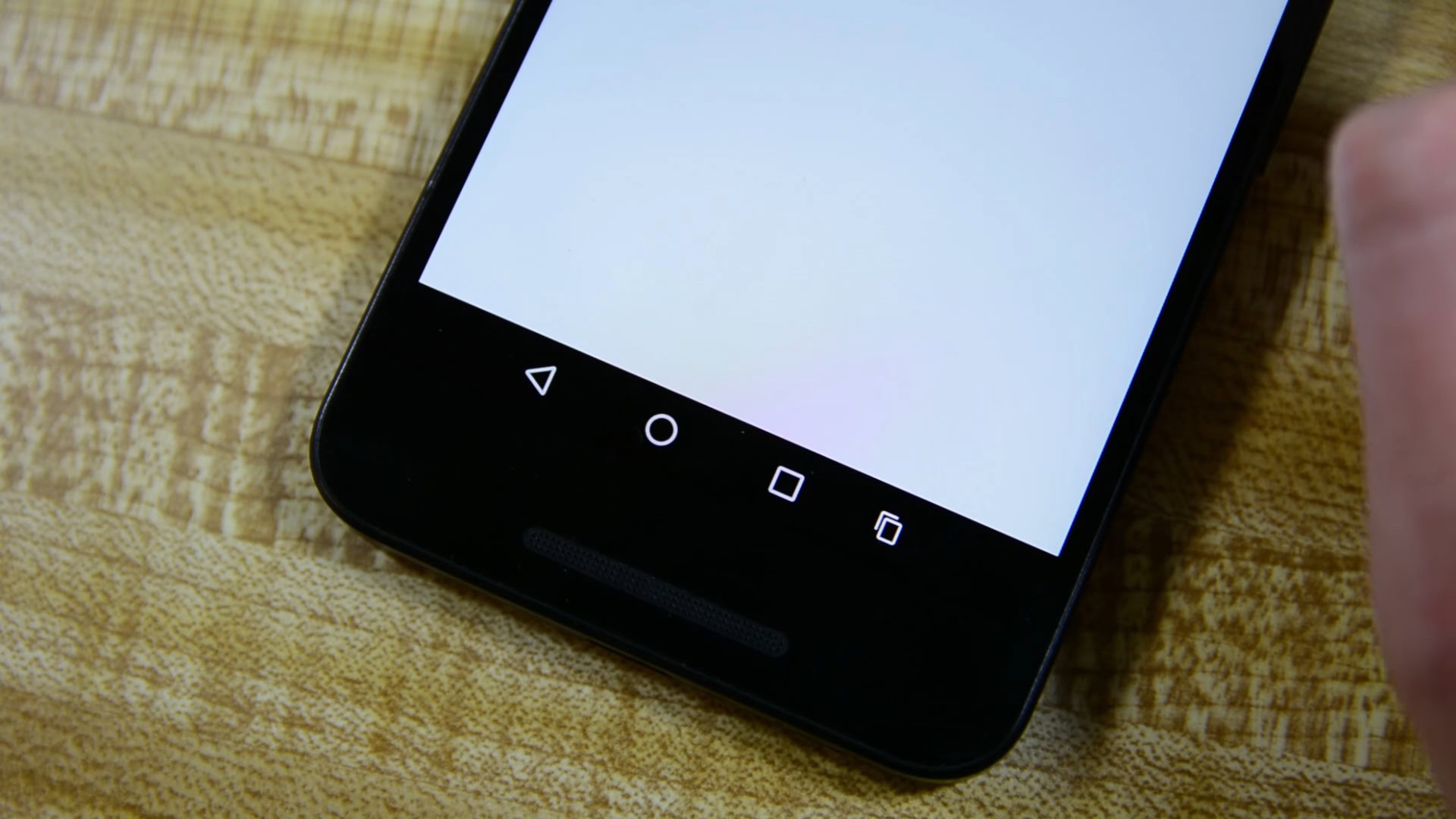
In stock Android, these are currently represented by a triangle, a circle and a square but the Android O Developer Preview lets you add further buttons, up to a total of five, for a new range of functions. These extra symbols can be added to the left or right side of the pre-existing ones but you can’t remove any from the standard three-button setup.
Among the buttons you can add are +, -, <, >, and ☰ symbols. What do each of them do? Well, that’s up to you to decide. By entering one of the Keycode numbers (the full list of which can be found here) the button will behave as you want it to. For example, if you would like to use a dedicated button specifically to end a call (hey, someone might), you can give it the Keycode “6”. You can also add a clipboard icon which is used for pasting content.

Finally, you can squash the icons closer together and move them to the left or right side of the device. More than just an aesthetic preference, this could help users of larger devices operate their handsets one-handed. Note that you can’t change the order of the original buttons, however.
These features are a work in progress and Google is unlikely going to have users enter Keycodes from its developer reference guide in the final version of Android Oh Henry! coming later this year (or Android Oreo, possibly). Still, it’s an indication of where the software might be headed.
We’ll have more on Android O for you very soon. Until then, take a look at an overview of what’s new in the video below.