Affiliate links on Android Authority may earn us a commission. Learn more.
Developing Android apps with bottom sheets
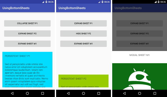
Bottom Sheets are a lesser known part of the Design support library. The Design support library is an Android library intended to help android developers implement the Google material design guidelines. We have covered some other design support library components and widgets in the past, including the coordinator layout.
Bottom sheets, according to Google’s own definition, are views that slide up from the bottom of the screen to reveal more content. This content can be anything, depending on the individual application. Bottom sheets have been used for menus, the display of more data and information, in the place of dialogs, and can also be used to show deep linked content from other apps.
Consistent readers of these tutorials will know that I’m a big fan of the design support library’s implementations of the material specs, and Bottom Sheets are another reason why.
Types of bottom sheets
There are two types of bottom sheets:
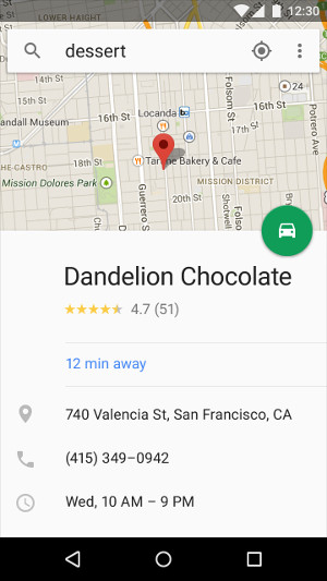
1. Persistent bottom sheets, which present bottom sheets as just another view on the displayed activity/fragment. These are usually used to show menus and other supporting content for an app. An app that uses persistent bottom sheets extensively is Google maps.
2. Modal bottom sheets, which present a bottom sheet like a dialog, where pressing the back button dismisses the bottom sheet. This is excellent for presenting deep-linked content from other apps.
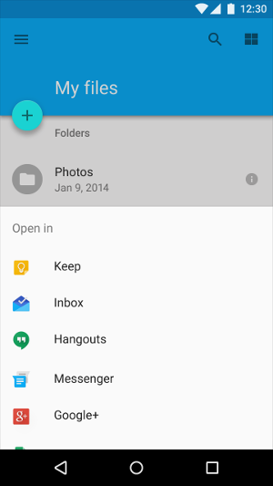
Persistent bottom sheets are displayed at the same elevation as an app, whereas modal bottom sheets are at a higher elevation than the app’s content. When used the main app dims to indicate the shift of focus to the bottom sheet.
Preparation
As mentioned above, bottom sheets have been integrated into the Design support library from version 23.2. Make sure you have included the library in your project, by adding the following line to your app build.gradle file, note that 24.1.1 is the current version at the time of writing:
dependencies {
    ...
    compile 'com.android.support:design:24.1.1'
}
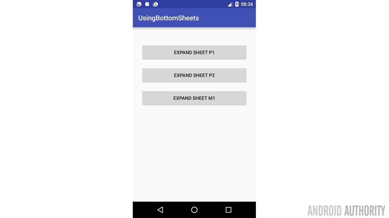
For our sample app, we are going to create three different bottom sheets in a single activity. Each bottom sheet will be activated by one of three buttons. The sheets are helpfully name P1 and P2 (for persistent sheets), and M1 for the modal sheet.
Main Activity design
The initial design for our activity_main.xml, before adding bottom sheet declarations, is shown below
<?xml version="1.0" encoding="utf-8"?>
<android.support.design.widget.CoordinatorLayout
    xmlns:android="http://schemas.android.com/apk/res/android"
    xmlns:tools="http://schemas.android.com/tools"
    xmlns:app="http://schemas.android.com/apk/res-auto"
    android:id="@+id/bgLayout"
    android:layout_width="match_parent"
    android:layout_height="match_parent"
    android:paddingBottom="@dimen/activity_vertical_margin"
    android:paddingLeft="@dimen/activity_horizontal_margin"
    android:paddingRight="@dimen/activity_horizontal_margin"
    android:paddingTop="@dimen/activity_vertical_margin"
    tools:context="com.sample.foo.usingbottomsheets.MainActivity">

    <ScrollView
        android:layout_width="match_parent"
        android:layout_height="match_parent"
        app:layout_behavior="@string/appbar_scrolling_view_behavior">

        <LinearLayout
            android:layout_width="match_parent"
            android:layout_height="match_parent"
            android:orientation="vertical"
            android:paddingTop="24dp">

            <Button
                android:id="@+id/button_1"
                android:layout_width="match_parent"
                android:layout_height="wrap_content"
                android:text="@string/button1"
                android:padding="16dp"
                android:layout_margin="8dp"/>

            <Button
                android:id="@+id/button_2"
                android:layout_width="match_parent"
                android:layout_height="wrap_content"
                android:padding="16dp"
                android:layout_margin="8dp"
                android:text="@string/button2"/>

            <Button
                android:id="@+id/button_3"
                android:layout_width="match_parent"
                android:layout_height="wrap_content"
                android:padding="16dp"
                android:layout_margin="8dp"
                android:text="@string/button3"/>
        </LinearLayout>
    </ScrollView>
</android.support.design.widget.CoordinatorLayout>
To use a persistent bottom sheet, you must use a CoordinatorLayout as it’s parent container. Let’s add the first persistent bottom sheet to the layout.
Designing the bottom sheet
A persistent bottom sheet is a part of the Activity view heirarchy. So, we add the component that we intend to represent our bottom sheet. For our sample, we want the bottom sheet to be scrollable, so we use a NestedScrollView. In the activity_main.xml layout file created above, add the following NestedScrollView to the file, between </ScrollView> and </android.support.design.widget.CoordinatorLayout>
<android.support.v4.widget.NestedScrollView
        android:id="@+id/bottom_sheet1"
        android:layout_width="match_parent"
        android:layout_height="250dp"
        android:clipToPadding="true"
        android:background="@android:color/holo_blue_bright"
        app:layout_behavior="android.support.design.widget.BottomSheetBehavior">

        <LinearLayout
            android:layout_width="match_parent"
            android:layout_height="wrap_content"
            android:orientation="vertical">

            <TextView
                android:layout_width="match_parent"
                android:layout_height="match_parent"
                android:text="@string/sheet_p1"
                android:textSize="16sp"
                android:textAllCaps="true"
                android:padding="16dp"/>

            <TextView
                android:layout_width="match_parent"
                android:layout_height="match_parent"
                android:text="@string/long_latin"
                android:padding="16dp"
                android:textSize="16sp"/>
        </LinearLayout>
    </android.support.v4.widget.NestedScrollView>
This NestedScrollView represents our bottom sheet. We want the sheet to be scrollable if the content is longer than the height we specified (android:layout_height=”250dp”). The most important line in the xml above is the app:layout_behavior line. It specifies the behavior attribute for the NestedScrollView, with a value of android.support.design.widget.BottomSheetBehavior which indicates to the Design support library that the component is intended to be used as a bottom sheet.
Showing the bottom sheet
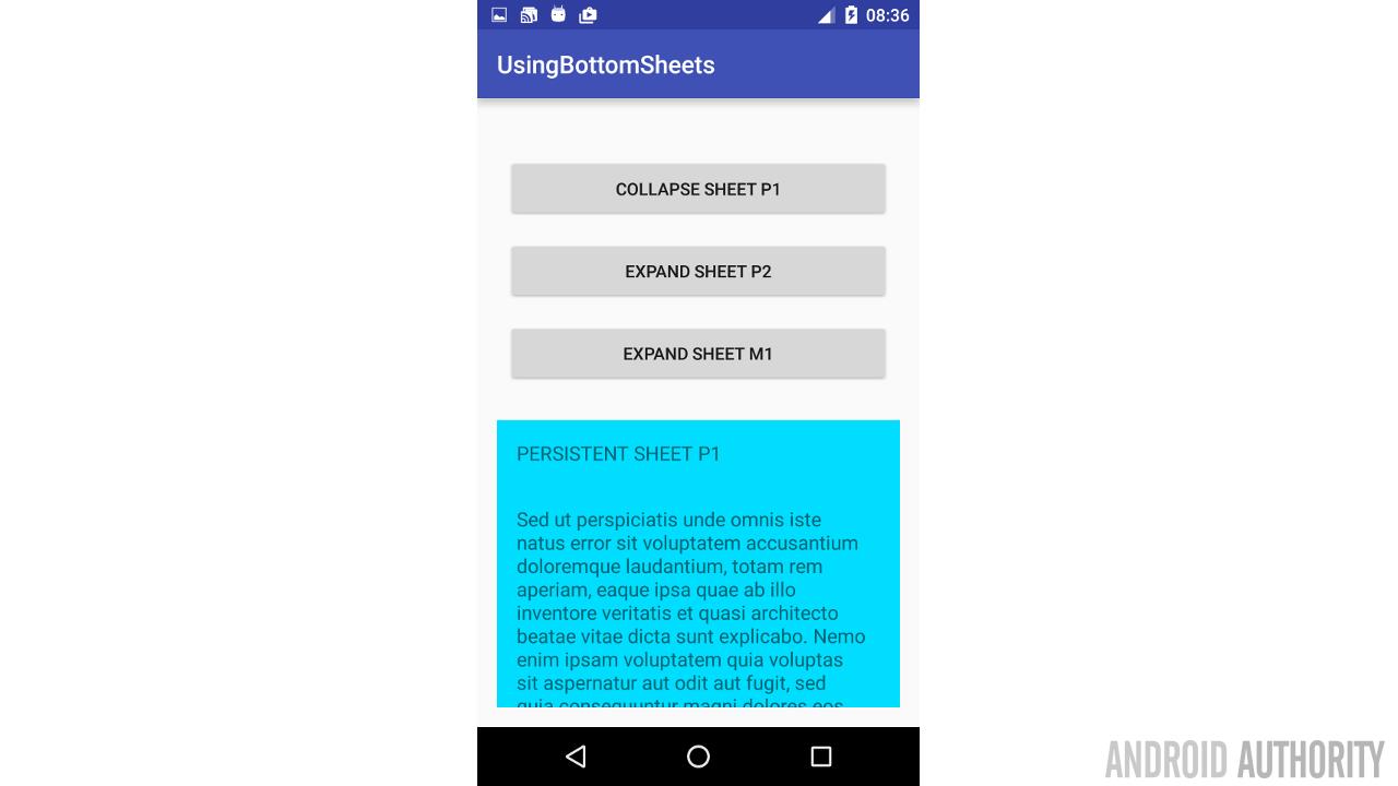
We want the sheet P1 to slide into view when the user clicks on the first button. Add the following code to your Activity.
private BottomSheetBehavior mBottomSheetBehavior1;

    @Override
    protected void onCreate(Bundle savedInstanceState) {
        super.onCreate(savedInstanceState);
        setContentView(R.layout.activity_main);

        View bottomSheet = findViewById(R.id.bottom_sheet1);
        mBottomSheetBehavior1 = BottomSheetBehavior.from(bottomSheet);

        mButton1 = (Button) findViewById(R.id.button_1);
        mButton1.setOnClickListener(new View.OnClickListener() {
            @Override
            public void onClick(View view) {
                if(mBottomSheetBehavior1.getState() != BottomSheetBehavior.STATE_EXPANDED) {
                    mBottomSheetBehavior1.setState(BottomSheetBehavior.STATE_EXPANDED);
                    mButton1.setText(R.string.collapse_button1);
                }
                else {
                    mBottomSheetBehavior1.setState(BottomSheetBehavior.STATE_COLLAPSED);
                    mButton1.setText(R.string.button1);
                }
            }
        });
    }
Recall that in the activity_main.xml, we set the NestedScrollView’s app:layout_behavior to a BottomSheetBehavior. In the code above, we declare mBottomSheetBehavior1, and then assign mBottomSheetBehavior1 to the BottomSheetBehavior for the NestedScrollView using BottomSheetBehavior.from().
Bottom sheets can be in one of five different states, but the two we are concerned about at the moment are STATE_COLLAPSED and STATE_EXPANDED. As the name’s imply, the sheet is in STATE_EXPANDED when it is expanded, and in STATE_COLLAPSED when collapsed.
On every button click, we check the state of the bottom sheet. If it is expanded, we collapse it, and if it is collapsed, we expand it. Note also that the bottom sheet can be collapsed by dragging it down.

Persistent bottom sheet P2
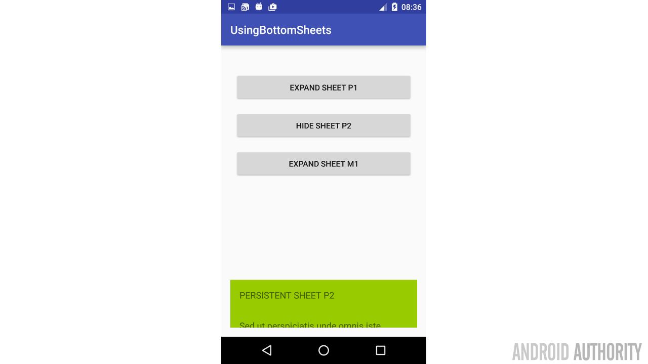
The second bottom sheet in our demo (P2) is completely identical to sheet P1 in xml. Add the markup below to the activity_main.xml, just before the </android.support.design.widget.CoordinatorLayout> tag
<android.support.v4.widget.NestedScrollView
        android:id="@+id/bottom_sheet2"
        android:layout_width="match_parent"
        android:layout_height="250dp"
        android:clipToPadding="true"
        android:background="@android:color/holo_green_light"
        app:layout_behavior="android.support.design.widget.BottomSheetBehavior">

        <LinearLayout
            android:layout_width="match_parent"
            android:layout_height="wrap_content"
            android:orientation="vertical">

            <TextView
                android:layout_width="match_parent"
                android:layout_height="match_parent"
                android:text="@string/sheet_p2"
                android:textSize="16sp"
                android:textAllCaps="true"
                android:padding="16dp"/>

            <TextView
                android:layout_width="match_parent"
                android:layout_height="match_parent"
                android:text="@string/long_latin"
                android:padding="16dp"
                android:textSize="16sp"/>
        </LinearLayout>
    </android.support.v4.widget.NestedScrollView>
As you can see, it is exactly the same as the P1 layout above, except with a different background color. What we intend to achieve with this however, is a bottom sheet that is initially shown fully to the user, then slides down halfway out of the screen, and finally can be dismissed completely from the screen by either sliding it out or clicking the button.
The code to achieve all this is more involved than for P1, so we are going to discuss it in chunks.
Making bottom sheets peek
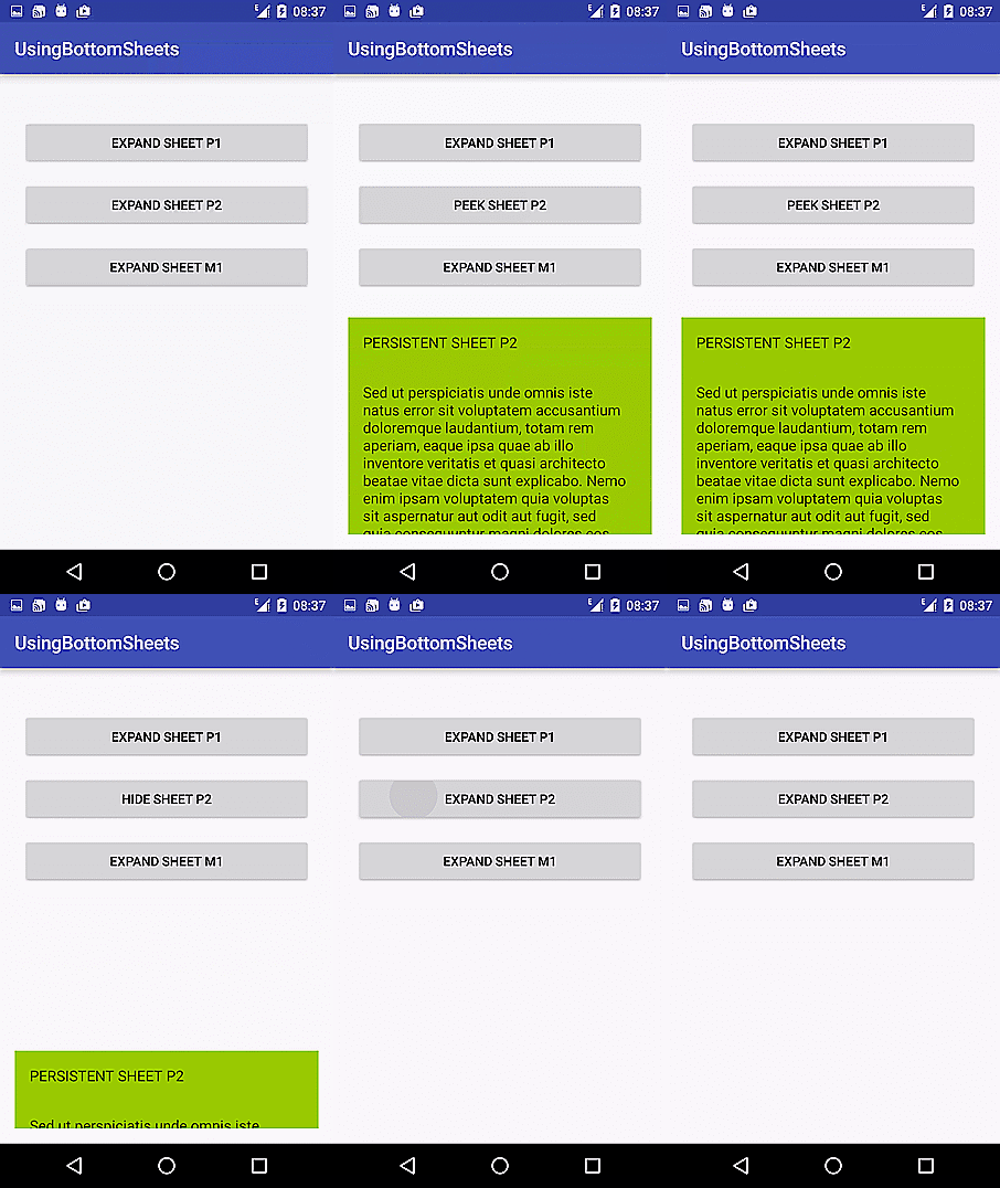
Similar to the P1 sheet above, we create an mBottomSheetBehavior2 and assign it the same way. To achieve the effect where the sheet slides partially out of the screen, we set the BottomSheetBehavior’s peekHeight. In the sample app, we set the peek height using mBottomSheetBehavior2.setPeekHeight(300);
When the peekHeight is set, the bottom sheet collapses to the defined peekHeight in pixels. Take note of that. The sheet would expand to it’s target height, but on collapse, it collapses to the target height and remains on screen. To collapse the bottom sheet completely out of the screen, we would either need to set the peekHeight to 0 and then reset the state or, we could set the BottomSheetBehavior state to STATE_HIDDEN. For our demo app, we have elected to set the state to STATE_HIDDEN. Before setting the bottom sheet to that state, we must first set the behavior to be hideable using the setHideable(true) method.
final View bottomSheet2 = findViewById(R.id.bottom_sheet2);
        mBottomSheetBehavior2 = BottomSheetBehavior.from(bottomSheet2);
        mBottomSheetBehavior2.setHideable(true);
        mBottomSheetBehavior2.setPeekHeight(300);
        mBottomSheetBehavior2.setState(BottomSheetBehavior.STATE_HIDDEN);

        mButton2 = (Button) findViewById(R.id.button_2);
        mButton2.setOnClickListener(new View.OnClickListener() {
            @Override
            public void onClick(View view) {
                if(mBottomSheetBehavior2.getState() == BottomSheetBehavior.STATE_EXPANDED) {
                    mBottomSheetBehavior2.setState(BottomSheetBehavior.STATE_COLLAPSED);
                    mButton2.setText(R.string.button2_hide);
                }
                else if(mBottomSheetBehavior2.getState() == BottomSheetBehavior.STATE_COLLAPSED) {
                    mBottomSheetBehavior2.setState(BottomSheetBehavior.STATE_HIDDEN);
                    mButton2.setText(R.string.button2);
                }
                else if(mBottomSheetBehavior2.getState() == BottomSheetBehavior.STATE_HIDDEN) {
                    mBottomSheetBehavior2.setState(BottomSheetBehavior.STATE_EXPANDED);
                    mButton2.setText(R.string.button2_peek);
                }
            }
        });
Handling swipe events
At this point, we have built two bottom sheets that are expanded and collapsed on demand. However, if you have run the app at this point, you will notice that the button text do not change if you change the bottom sheet state by swiping. For example if you click to expand sheet P2, the button text changes to “PEEK SHEET P2”. But if you then swipe the sheet down to it’s collapsed state, the button text still shows “PEEK SHEET P2”. To get notified whenever the bottom sheet state changes, we must set a callback on the BottomSheetBehavior. The code snippet to set a callback for mBottomSheetBehavior2 is shown below:
mBottomSheetBehavior2.setBottomSheetCallback(new BottomSheetBehavior.BottomSheetCallback() {
            @Override
            public void onStateChanged(View bottomSheet, int newState) {
                if (newState == BottomSheetBehavior.STATE_EXPANDED) {
                    mButton2.setText(R.string.button2_peek);
                }
                else if (newState == BottomSheetBehavior.STATE_COLLAPSED) {
                    mButton2.setText(R.string.button2_hide);
                }
                else if (newState == BottomSheetBehavior.STATE_HIDDEN) {
                    mButton2.setText(R.string.button2);
                }
            }

            @Override
            public void onSlide(View bottomSheet, float slideOffset) {
            }
        });
For the demo, we simply change the button’s text. Of course, you can perform more advanced tasks in the callback, if your app requires that.
Modal bottom sheets
Unlike both persistent bottom sheets discussed above, the modal bottom sheet is not a View that’s hidden and shown within the activity_main.xml layout. Think of the modal bottom sheet like a dialog, that slides into view from, and is anchored to, the bottom of the screen. Because that is exactly what it is. To display a modal bottom sheet, we must define a class that inherits from BottomSheetDialogFragment, which also inherits from AppCompatDialogFragment.
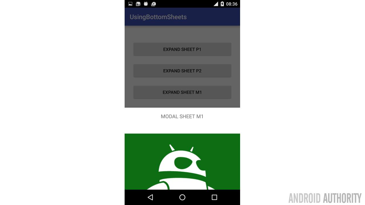
Before creating our BottomSheetDialogFragment however, let’s create the layout for the dialog. We call this layout file fragment_bottomsheet3.xml.
<?xml version="1.0" encoding="utf-8"?>
<LinearLayout
    xmlns:android="http://schemas.android.com/apk/res/android"
    android:orientation="vertical"
    android:layout_width="match_parent"
    android:layout_height="wrap_content">

    <TextView
        android:layout_width="match_parent"
        android:layout_height="match_parent"
        android:text="@string/sheet_m1"
        android:textSize="16sp"
        android:textAllCaps="true"
        android:padding="16dp"/>

    <ImageView
        android:id="@+id/imageView"
        android:layout_width="wrap_content"
        android:layout_height="wrap_content"
        android:layout_weight="1"
        android:src="@drawable/android_authority"/>

    <TextView
        android:id="@+id/textView"
        android:layout_width="wrap_content"
        android:layout_height="wrap_content"
        android:layout_weight="1"
        android:layout_gravity="center"
        android:textAlignment="center"
        android:text="This is a test string for the sample"
        android:textSize="20sp"/>
</LinearLayout>
Our demo layout is a simple layout with two TextViews and an ImageView.
Showing a modal bottom sheet
To show a modal bottom sheet, we need to create a class that inherits from BottomSheetDialogFragment, and call the show() method on that class.
For our sample app, which has no special actions, we simply extend BottomSheetDialogFragment, as shown below, and override the setupDialog method to set the dialog’s content view.
public class BottomSheet3DialogFragment extends BottomSheetDialogFragment {

    @Override
    public void setupDialog(final Dialog dialog, int style) {
        super.setupDialog(dialog, style);
        View contentView = View.inflate(getContext(), R.layout.fragment_bottomsheet3, null);
        dialog.setContentView(contentView);
    }
}
In the MainActivity, we handle the final button click by requesting our BottomSheetDialogFragment show() itself.
mButton3 = (Button) findViewById(R.id.button_3);
        mButton3.setOnClickListener(new View.OnClickListener() {
            @Override
            public void onClick(View view) {
                BottomSheetDialogFragment bottomSheetDialogFragment = new BottomSheet3DialogFragment();
                bottomSheetDialogFragment.show(getSupportFragmentManager(), bottomSheetDialogFragment.getTag());
            }
        });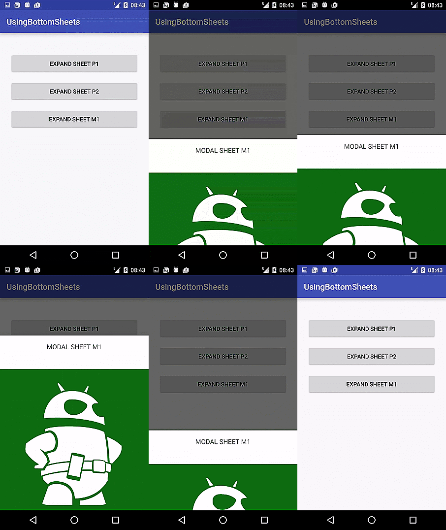
Note that we did not set the behavior for the modal sheet to be hideable, nor did we set the peek height. The modal bottom sheet automatically computes appropriate values for both peek height and expanded height.
Conclusion
Bottom sheets have their uses, and in some situations, they provide the most elegant solution to presenting users with additional information or actions. However, in other cases, they can be a particularly poor design choice. For example, on larger screens which have more screen estate, dialogs and menus could be more useful and intuitive, compared to smaller screen devices, where apps have to make the most use of each precious pixel.
There are other methods that affect your bottom sheets behavior, which we have not covered here. Explore the BottomSheetBehavior APIs to find out more. As always, the complete source for the sample app is available on github. Live long and code hard.