Affiliate links on Android Authority may earn us a commission. Learn more.
Let's build a simple Android app part 1
Published onFebruary 17, 2016
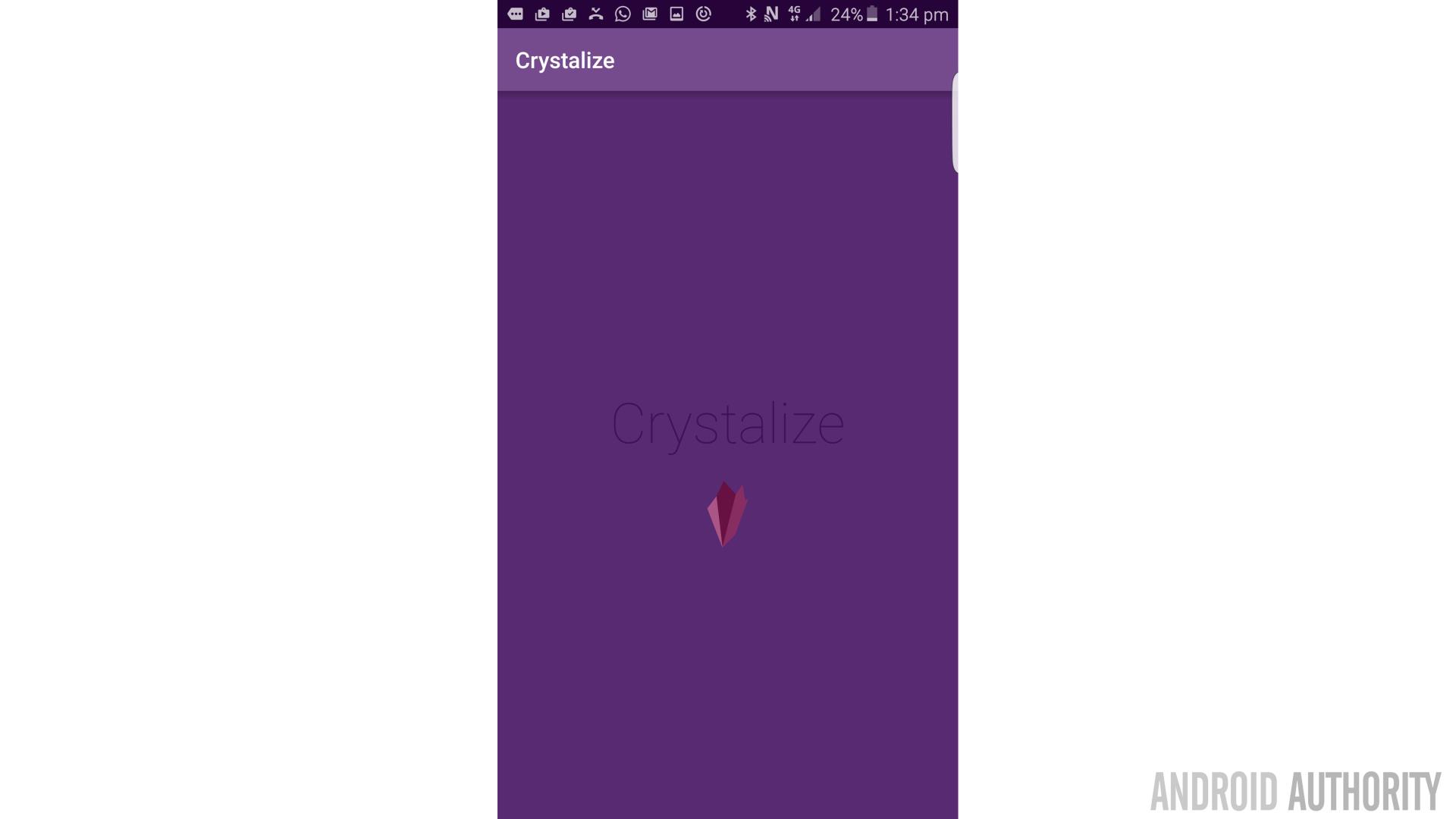
In this post, we’re going to build a basic, functioning app. This app, if all goes to plan, will not only serve as a learning opportunity but also as something you can reverse engineer and reappropriate for your own ends. If you’re so inclined, you can change a few details, compile it and distribute it/sell it. All the code, images and resources are available on GitHub here, or you can follow the process step-by-step and build your own version.
This is a two-part series, so in part one we’ll only be making something very bare bones. In the next installment, things will get a little more refined and useful.
We’ve already gone over how to set up Android Studio and previous posts on this site have provided steps to create a ‘Hello World’ app. So if you aren’t familiar with the basic setting up process, it’s worth reading those posts first. In this guide, I’ll be assuming that you already have Android Studio installed, so we’re going to dive straight in. The next question: what to make?
I wanted to create something that would be simple and that would be easy to turn into other things. I was going to go with a quiz but that feels too much like a game (and a game might make an interesting future post…). So instead, I chose a test. Yep, that’s certainly less fun!
I’ve always wanted to know Morse code, the phonetic alphabet and chemical symbols. I just think it would be awesome if one day those skills came in handy in a real world situation and everyone would be super impressed (“Wait a minute, that’s Morse code for the chemical symbol for potassium!”). So this app is going to be a learning tool test that you can use every day to learn that kind of stuff.
If you’d like to learn something else though, you will just be able to change the questions and answers. You can make it into a quiz, into a revision tool… you name it!
Making a splash page
So to get started, open up Android Studio and start with a new empty activity (note an empty activity, not a blank one). This is the third option from the left (pictured) when building a new app and it will keep things a simpler for now:
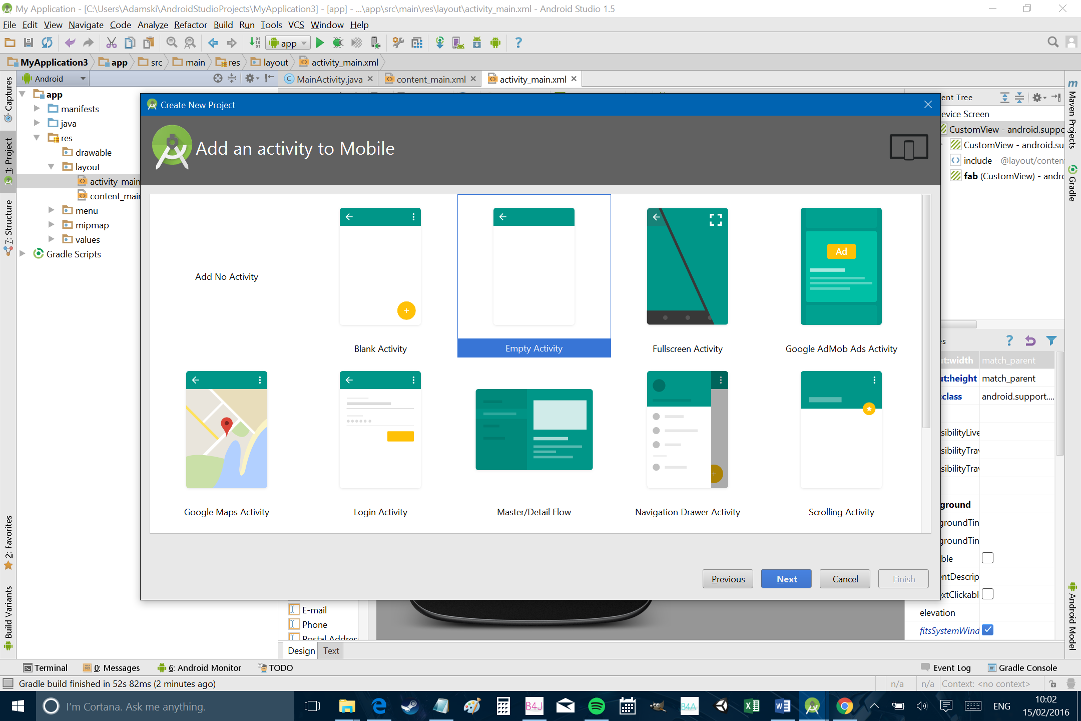
You may want to call the new app ‘Crystalize’, or if you already have different plans, you can call it anything else. You can also choose your own company domain of course. For simplicity, I recommend leaving the name of the activity and layout as the defaults as that way we’ll be on the same page.
Now head over to the ‘activity_main.xml’ file and take a look around. ‘activity_main.xml’ is the .xml file that will define the layout of MainActivity.java. For the most part, each ‘activity’ (screen) in an app will have two corresponding files: the .xml which sets out the layout and the java which defines the behavior of the app and what happens when you click on different elements. If you’ve ever built a website, the XML is used in a similar way to how HTML is used to build a web pages, in fact XML and HTML are related.
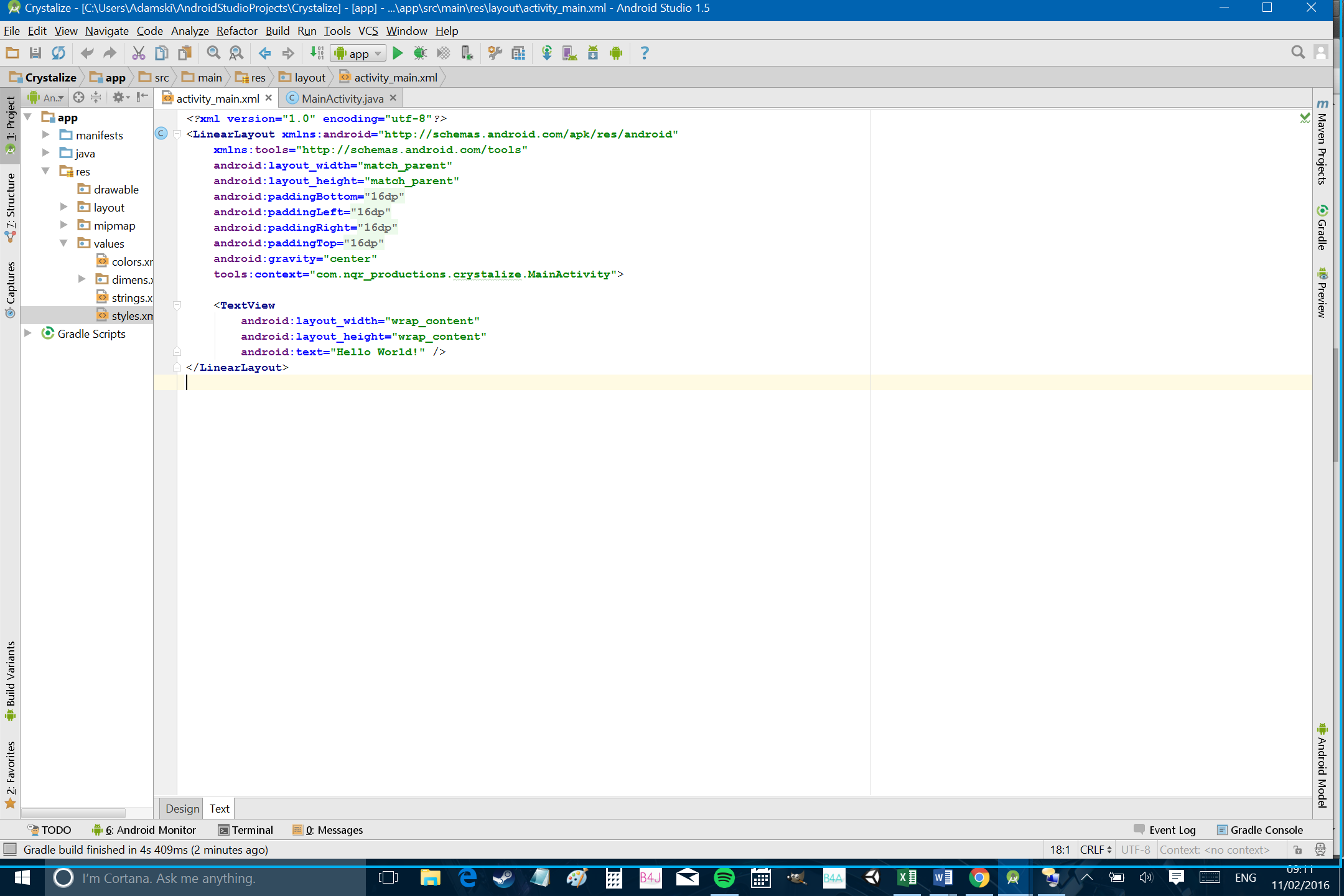
Right now, the activity_main.xml is pretty barren and uses a relative layout with a single ‘TextView’ saying “Hello World!”. Read through this page and you should find it’s fairly self-explanatory what everything does. ‘android:layout_height’ for instance sets the height, while ‘android:text’ tells us what text to show. There are many more instructions we can add to further customize the way things look but all that’s strictly necessary in most cases is height and width.
Let’s start mixing things up. Open activity_main.xml. We’re going to change the layout from ‘relative’ to ‘linear’, meaning that the elements we add will simply line up on top of one another. We’re also adding a line setting the gravity to center so that the edit text will appear in the middle of the screen. We do this by simply adding ‘android:gravity = “center”’ somewhere within the triangular brackets for the linear layout.
<?xml version="1.0" encoding="utf-8"?>
<LinearLayout xmlns:android="http://schemas.android.com/apk/res/android"
    xmlns:tools="http://schemas.android.com/tools"
    android:layout_width="fill_parent"
    android:layout_height="fill_parent"
    android:paddingBottom="@dimen/activity_vertical_margin"
    android:paddingLeft="@dimen/activity_horizontal_margin"
    android:paddingRight="@dimen/activity_horizontal_margin"
    android:paddingTop="@dimen/activity_vertical_margin"
    android:gravity="center"
    tools:context="com.nqr_productions.crystalize.MainActivity">

    <TextView
        android:layout_width="wrap_content"
        android:layout_height="wrap_content"
        android:fontFamily="sans-serif-thin"
        android:text="Hello World!" />
</LinearLayout>
If you take a look at the designer, we’ve now moved the text to the center of the screen. We’re going to be making this our splash page, so having some text in the middle there will work well for our app name.
(Note that you can switch between the designer and the code for the xml you’re viewing using the tabs along the bottom.)
And with that in mind, it will probably make sense to change the name of activity_main.xml to something else. Right click on the tab and rename it as ‘splash_page.xml’. Instead of ‘OK’, the option to go ahead with the change is ‘Refactor’. This means that the name of the app is going to change in every reference and instance so far – so it will now say ‘setContentView(R.layout.splash_page);’ in the main activity, without you having to change anything yourself.
But a little bit of tiny text isn’t really enough to look like a nice splash page. Instead, we need to increase the size of that text and the font. And we need it to be our app name!
So change “Hello World” to “Crystalize”. This is what I have decided to call the app – it’s a reference to ‘Crystalized intelligence’ in psychology, which is basically a fancy term for knowledge (as opposed to ‘fluid intelligence’ which is more relating to IQ, memory, focus etc.). Yep, I’m a nerd.
We’re also going to make the text a little bigger, so add this line to the TextView:
android:textSize="50dp"
DP means ‘density independent pixels’ and that means that it should look a similar size on whatever type of device you’re using.
You can now either run the app or just view it in the designer to see how it’s going to look.
Adding some style
We’re still only on our splash page, but we want it to look as good as possible and we want to have a consistent color scheme and design language between our activities. Now is as good a time as ever to define the look of our app.
So next, we’re going to pick a color for the text and for the background. To do that, why not head over to Paletton, which is a great tool for picking colors that will work well together. I’m going to go for three adjacent colors, which will help us to get that smart, minimal Material Design look.
Pick the colors you like, then click ‘Tables/Export’ to find the color codes. You can save this for future reference.
I think an app called ‘Crystalize’ needs a color palette that uses cool hues. So I’m going with #582A72 as my main color, which is a nice purple hue. Add the following code to the LinearLayout in the recently renamed splash_page.xml:
android:background="#582A72"
Now add this line of text to your TextView:
android:textColor="#BD1255"
We shouldn’t blow our own trumpets, but this looks boss already…
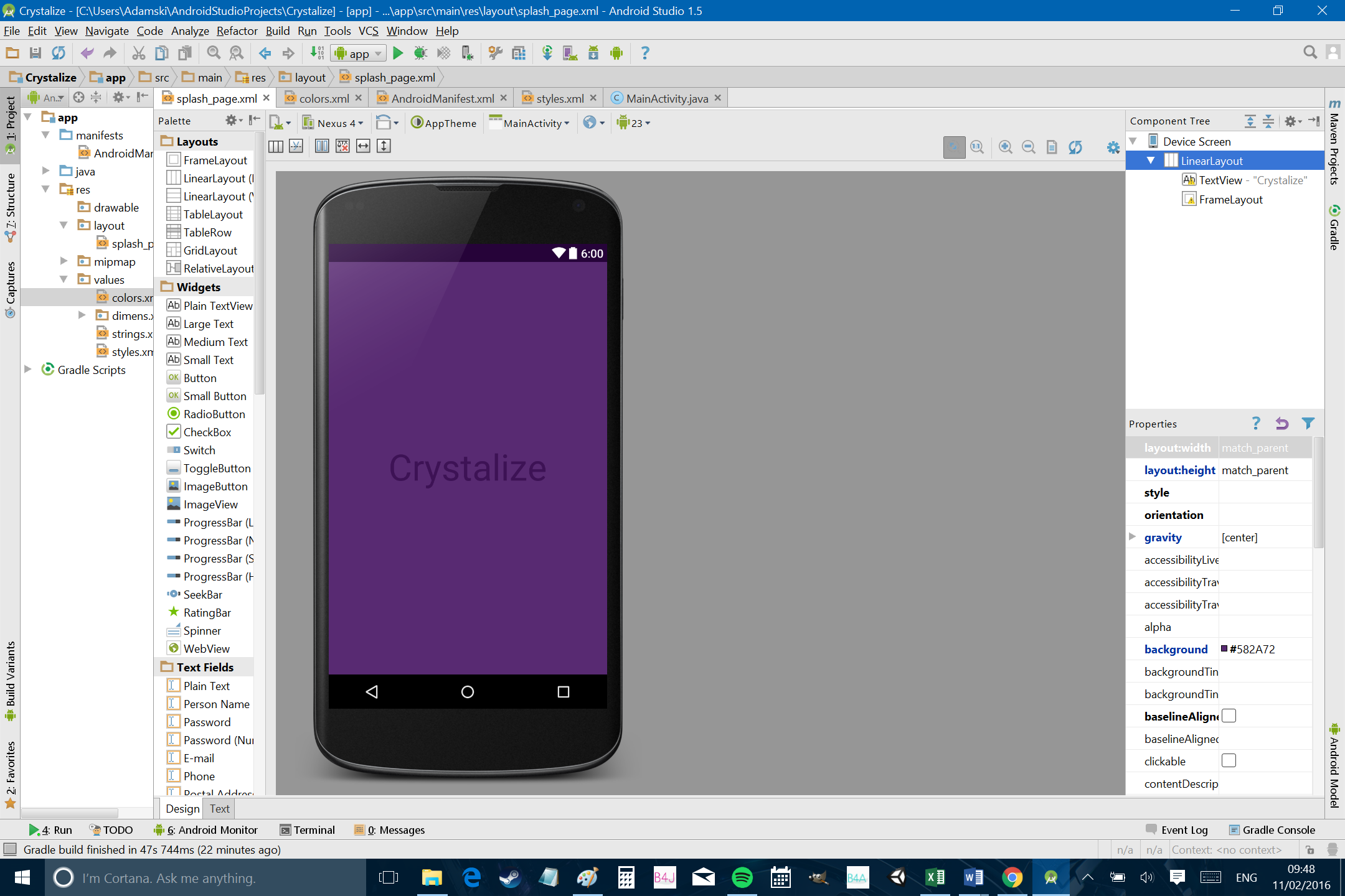
Only problem is, we still have the notification tray in a default blue color, which just does not go. So now you’re going to open up another file by using the explorer on the left. Under “app > res > values” you’ll find a file called ‘colors.xml’ which is a handy resource you can use to change the color palette of your app easily. If we had all the time in the world, we’d be using this to file define all the colors in the app and then referring back to it. This would make it much easier to change the color palette in future – or to let the users choose their own color scheme.
Buuuut we don’t have all the time in the world and for the sake of simplicity, we’re just going to enter color codes as and when we need them. Your users will just have to make do with the one theme!
For this particular bit though, you’re going to change the ‘colorPrimary’ and ‘colorPimraryDark’ elements to: ‘#764B8E’ and ‘#260339’ respectively. For ‘colorAccent’, I’m using ‘#882D61’. You’ll notice that you can actually see a preview of the color pop up on the left – convenient!
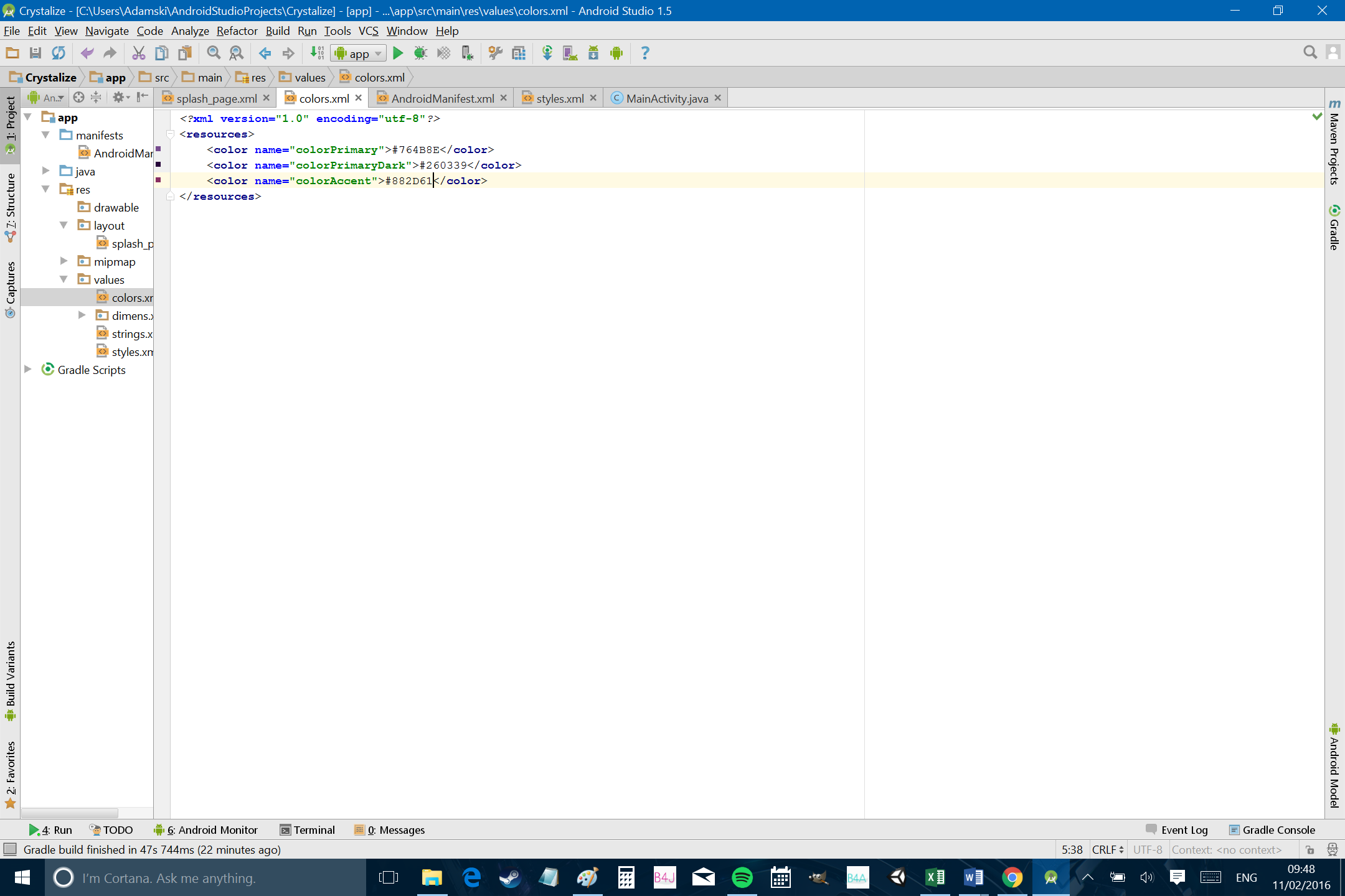
Now our app is made up entirely of attractive, complementary colors. Beautiful!
One last thing to do, is change that font to something that’s a little nicer. Unfortunately, it’s not even half as easy as it should be to set custom fonts. So we won’t worry about that.
Instead, just add this to the TextView:
android:fontFamily="sans-serif-thin"
It’s a little more original and a little more minimal and it just looks cooler.
It still lacks a certain je-ne-sais-quoi however… what it needs is a logo of some sort. I made this logo for us to use in Adobe Illustrator using some of the other color codes we found in Paletton. It totally looks like a crystal. Shush.
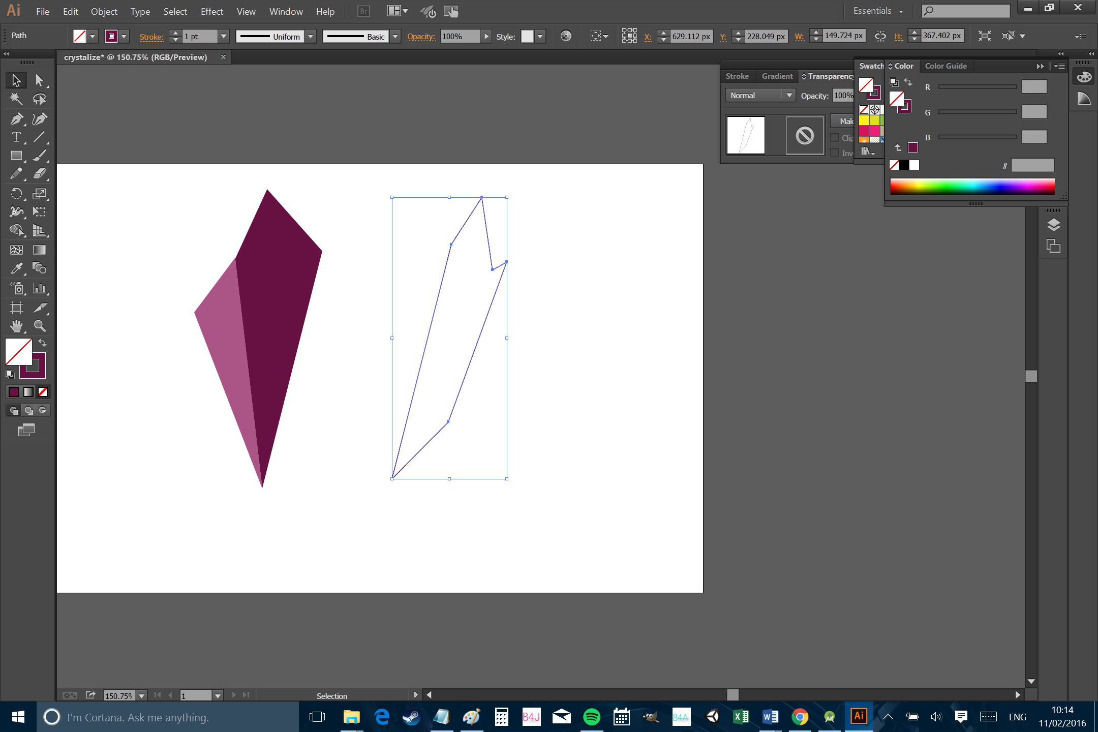
So we’re going to add this image to the drawable folder for our app project. This can be found at ‘app > src > main > res > drawable’. The way I like to do it is to right click on the folder or file and then select ‘Show in Explorer’. This way, you can conveniently drag and drop your files just as you would with any other folder.
So plop ‘crystalize.png’ in there and then add an image view to your splash_page.xml, right beneath the ImageView. This will look like so:
<ImageView
    android:layout_height="60dp"
    android:layout_width="wrap_content"
    android:src="@drawable/crystalize" />
This looks sort of cool, but really we want it to align vertically. So now add these lines to the LinearLayout :
android:gravity="center"

android:orientation="vertical"
While you are there you can also change ‘layout_height’ for the image to 60dp. Now you should have a nice, somewhat pro looking front page for your app.

All that’s left to do is build an actual app that does something!
Building an actual app that does something
As beautiful as our splash page is, eventually your users will get bored of staring at it.
That’s why we’re going to let them tap anywhere on the screen to start enjoying the app.
So add this line to the LinearLayout in activity_splash.xml:
android:onClick="onSplashPageClick"
And these lines to MainActivity.java:
public void onSplashPageClick(View view) {

finish();

}
You’ll also need to add this import statement up top:
Import android.view.View;
Until you do this, you’ll see an error crop up and the word View will be red. Android Studio should prompt you to do this automatically though and if you place your cursor on the highlighted text, wait for the little dialog and then hit Alt+Return, you can generate the necessary lines without any typing. Importing statements like this give us access to classes, thereby letting us use extra code in our apps.
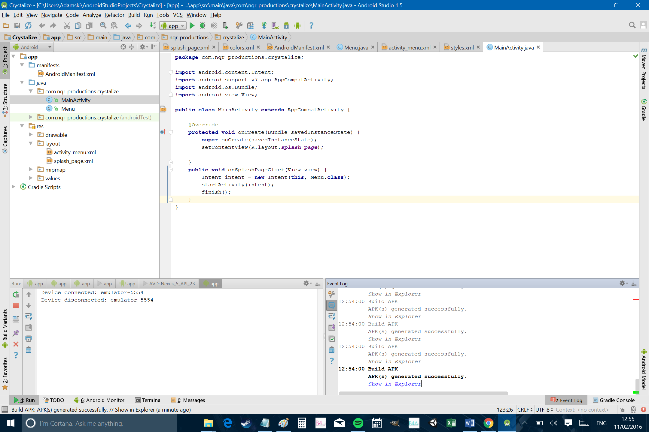
If this is your first time coding java, then welcome! This is where we’ll be defining the behaviour of the app, whereas the XML lets us arrange our views and what they’re going to look like. You may already know this but when using java, every line ends with a semi colon (unless it’s the start of a pair of curly brackets). If there’s an error and you’re not sure what’s causing it, it may well be that you forgot one of these semi colons somewhere.
Try loading up the app now on an emulator or on your phone. You should now find that touching anywhere on the screen causes the app to close. This is the ‘finish()’ line in action, which is triggered by the ‘onSplashPageClick’ event that is called when you click on the LinearLayout.
This tells us that our little bit of code is working but we have more ambitious plans in store for Crystalize!
Adding an activity
Rather than just closing this app, it would be good if we could open up the next page. To do this, we’re going to create a new Java file and a new xml file to go along with it.
Right click on your package name in the file explorer (on the left) and then select ‘New > Activity > Empty Activity’ from the drop-down menu. This will create another new activity just like our first one. Remember to choose ’empty activity’ again to keep things simple.
We’re now going to call this new page ‘questions’, so follow the steps to create the java file as well as ‘activity_questions.xml’. This is where we’re going to be displaying the questions (in case you hadn’t guessed…).
Once again, questions.java will control the behavior and activity_questions.xml will control the look. This is actually indicated by this line in questions.java where the xml is referenced:
setContentView(R.layout.activity_questions);If you changed that line to ‘activity_main’, then this page would have the same appearance as the first page!
For extra credit, check your AndroidManifest.xml file. You’ll see that a section describing your new activity has been mentioned there. The Manifest file contains important information about your app which is necessary for the Android OS as well as other apps (like launchers) that are going to interact with us. You don’t generally need to worry about it at this level but knowing it’s there is handy as it will be important in future.
Now head back to MainActivity.java and swap ‘finish()’ for this new line of code:
Intent intent = new Intent(this, questions.class);

startActivity(intent);
This is telling the app to start the next activity when the screen is clicked (instead of closing the app). Again, we need to add an import statement and again you can do this by clicking on ‘Intent’ and then pressing alt + return when instructed to. This should remove the error messages.
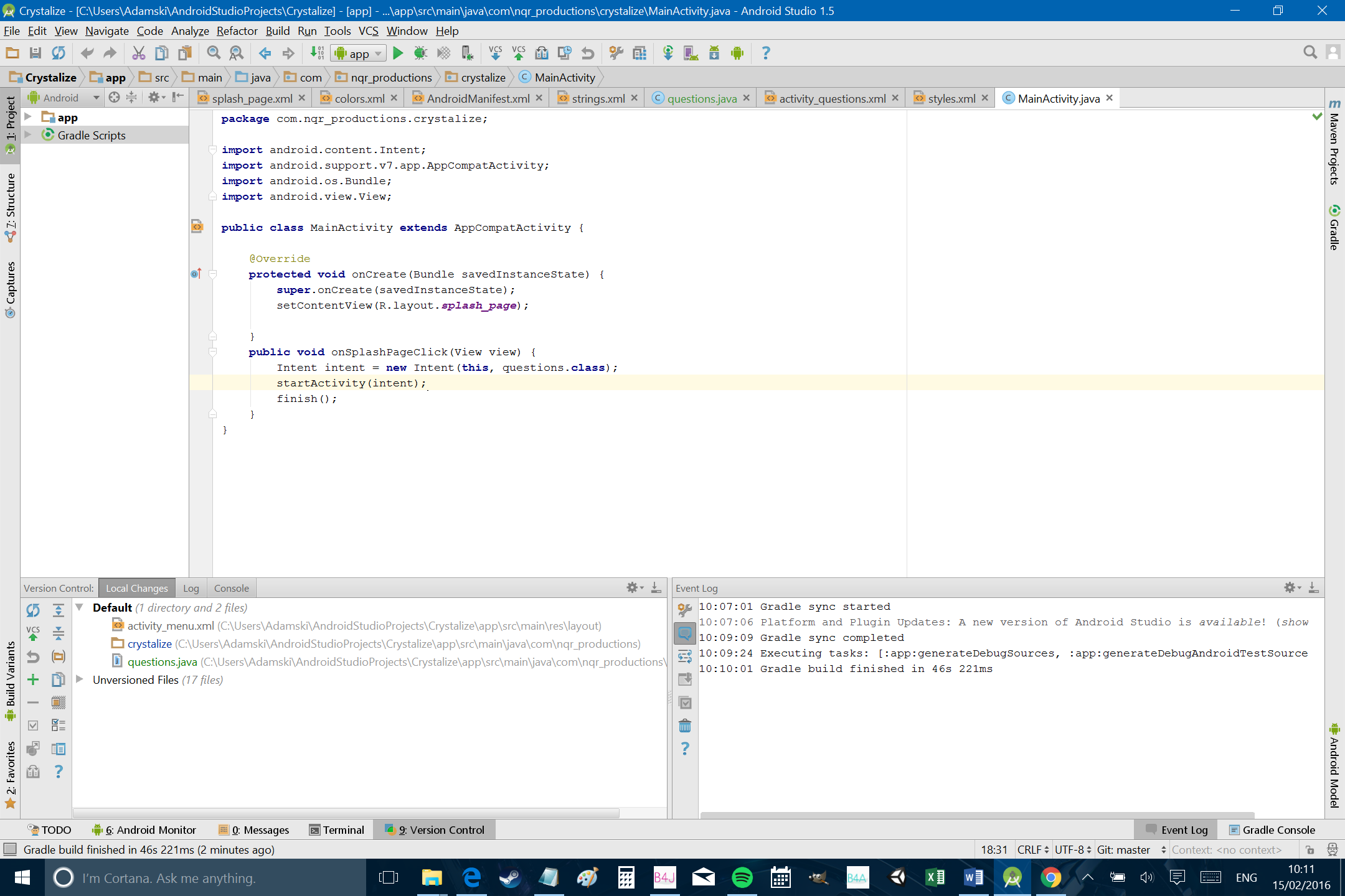
I’ve also set my ‘activity_questions.xml’ to have a colored background like the splash page, just so that things look as nice as possible early on. I’m using a lighter color from our color palette though because we need to be able to read text on top of it. So in the activity_questions.xml, add the background for the layout again and change it to a linear layout again. We’ll also set the orientation to vertical – just like before:
android:background="#764B8E"
android:orientation="vertical"
Give the app a go though and you might find that there is still some less-than-ideal behaviour though. When we click the screen and launch the next activity, this all works perfectly nicely. The only problem is that hitting ‘back’ takes us back to the previous page and shows us the splash screen again. This is not the behavior most users expect from their apps!
So to eradicate this behavior, we’re going to put back the ‘finish();’ line in our onClick, just below ‘startActivity(intent);’. This will now simultaneously start the new activity while also closing the old one, so that when you hit ‘back’ from the second activity, it just closes the application. Sorted!
Using views
Next, we want to populate the new activity with the relevant fields – buttons, text boxes etc. In Android, these are called ‘views’ and the easiest way to add them is by editing the xml file. (You can also use the designer or add them programmatically via the java, but I think this is the best method for illustrative purposes.)
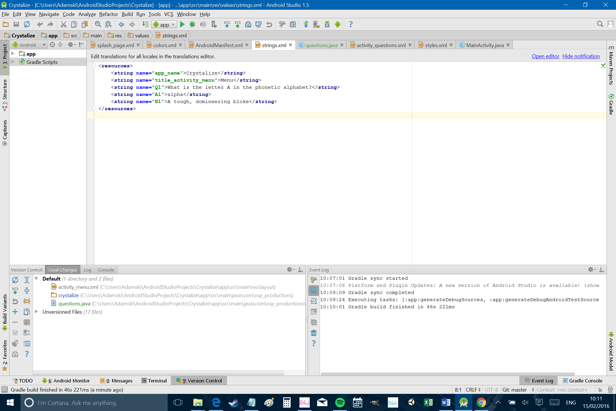
Before we do this, we’re going to first add some info to the strings.xml file. This will come in handy in a moment. You’ll find this in the explorer at: ‘app > res > values’. Again, you may wish to diverge from my app here if you’re trying to make a different kind of quiz or test but these are the strings I’m using:
<string name="Q1">What is the letter A in the phonetic alphabet?</string>

<string name="A1">alpha</string>

<string name="H1">A tough, domineering male</string>
A string is a type of variable (a unit of data that you give a name) that in this case carries letters and words. We can define our strings in this file and then refer to them throughout the rest of our code (just like the colors.xml). Here I’ve added a question, the correct answer and a hint.
Now we’re going to edit the activity_questions.xml, which will set up the layout for this second activity.
Okay, you’ll want to hang on to your hat for this next part as we’re adding a lot of code! If you remember how we managed the TextView and ImageView in splash_page.xml, we’re basically repeating that same process here with more views. Now we have a text view, an edit text and two buttons. We’re also adding a bit more information to help keep things laid out nicely. Copy out this code and you’ll notice a pretty simple pattern emerging for adding views:
<TextView
        android:layout_width="wrap_content"
        android:layout_height="wrap_content"
        android:fontFamily="sans-serif-thin"
        android:textColor="#440027"
        android:textSize="30dp"
        android:layout_marginTop="100dp"
        android:text="@string/Q1"/>

    <EditText
        android:layout_width="match_parent"
        android:layout_height="wrap_content"
        android:background="#9775AA"
        android:inputType="text"
        android:textSize="20dip"
        android:layout_margin="10dp"
        android:hint="Answer"/>

<LinearLayout
    android:layout_width="wrap_content"
    android:layout_height="wrap_content"
    android:orientation="horizontal"
    android:layout_gravity="center">

    <Button
        android:layout_width="wrap_content"
        android:layout_height="wrap_content"
        android:text="Okay"
        android:layout_margin="2dp"
        android:padding="2dp"/>

    <Button
        android:layout_width="wrap_content"
        android:layout_height="wrap_content"
        android:padding="2dp"
        android:layout_margin="2dp"
        android:text="Hint"/>

</LinearLayout>
This is going in-between the first linear layout (remember we changed it from relative to linear in the last section), so the top of the page should look like this:
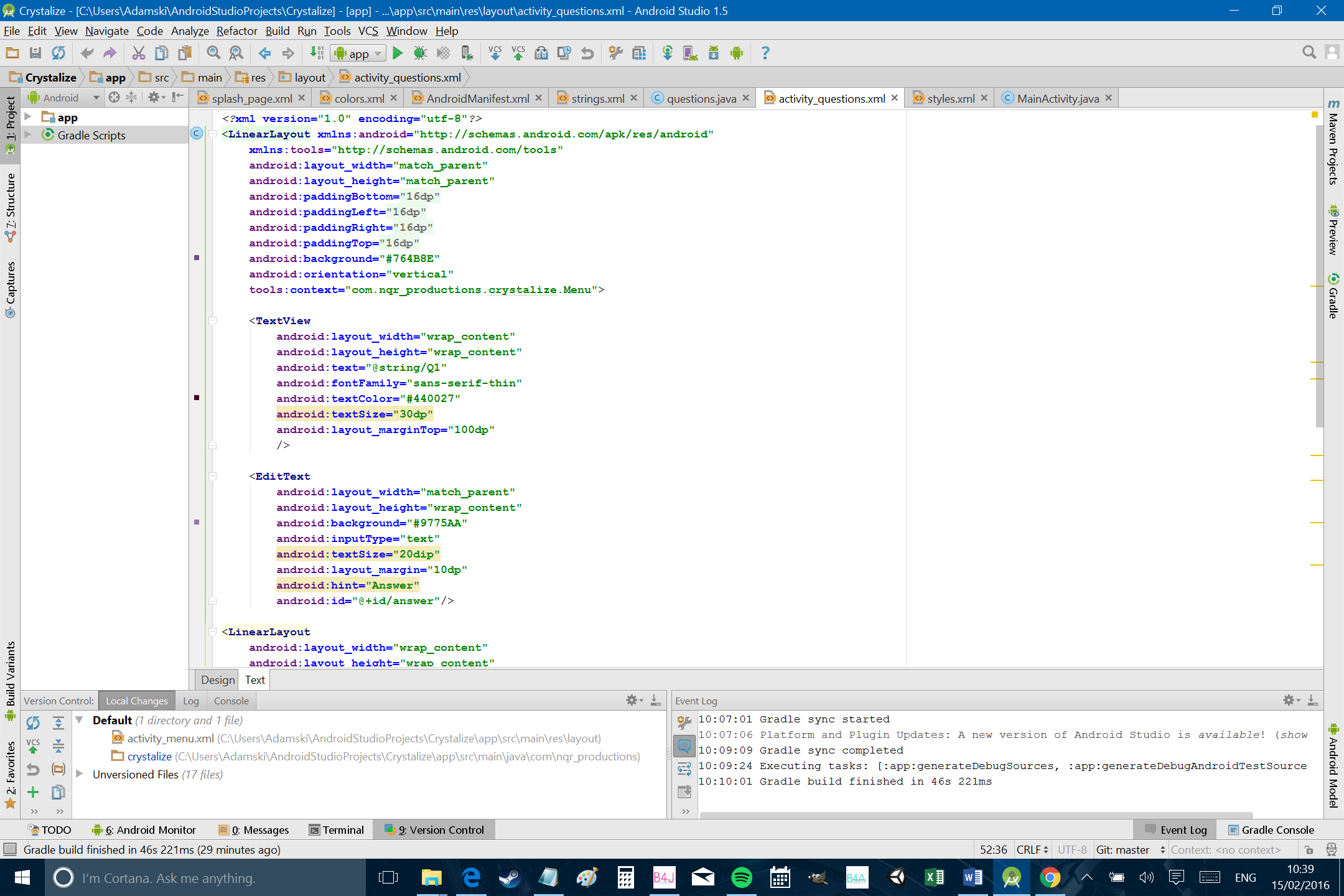
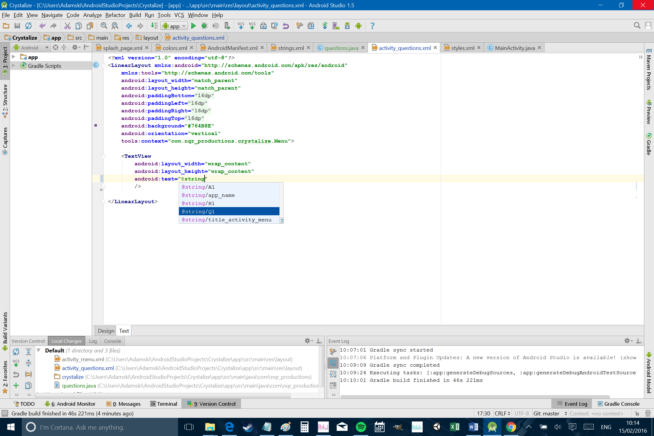
The text for the TextView notice is ‘@string/Q1’, which is referencing the ‘Q1’ string we added just a moment ago. If you’ve done this right, AndroidStudio should recommend the strings you have available as you start typing.
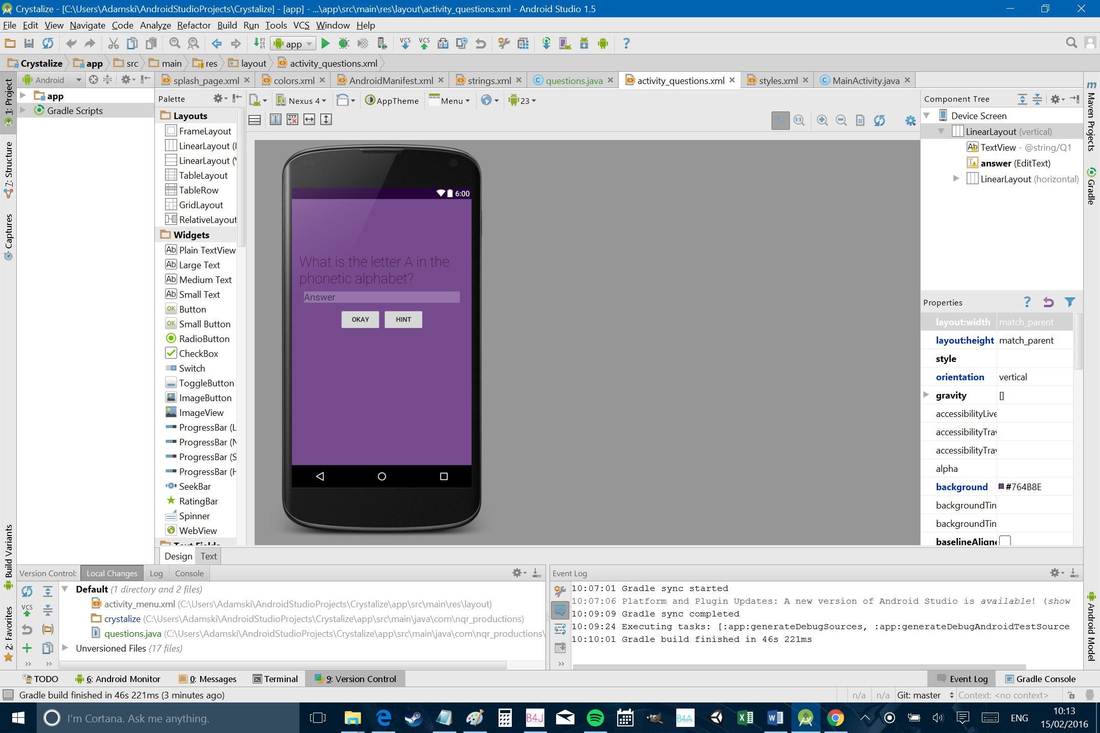
Notice how we have two separate linear layouts at this point. These are now ‘nested’ and it means we can have a row of buttons going horizontally and stack them underneath our other vertical elements (notice the orientation is defined as horizontal this time). We’ve also added lots of padding and margins to space everything out. Padding is how much space you want within the view, whereas the margin is how much space you want to leave around it. ‘android:hint’ meanwhile is the faint text that shows before the user starts entering anything. It all should give you something that looks like this in the designer:
Checking the Answer
It should be pretty self-explanatory what this app is going to do at this point. We want the user to answer the question in the EditText and then tell them if they got it right.
To do this, we’re adding an ‘onClick’ to our button and an ‘ID’ to our edit text in the activity_questions.xml. The button gets:
android:onClick="onAnswerClick"
And the EditText:
android:id="@+id/answer"
We also want to add an ‘onClick’ for the ‘hint’ button:
android:onClick="onHintClick"
Now comes the tricky part: adding the actual code to define the behavior in the app. At this point you should know what that means, opening up the java! So head over to questions.java. There are a few new concepts we’ll need to introduce at this point, so let’s start with the easy bit: the ‘Hint’ button.
For this, we want to use our ‘onHintClick’ because as you’ll recall, this code runs whenever the specified view is clicked. Underneath that, we’ll also be adding another line of code, so input the following:
public void onHintClick(View view) {

    Toast toasty = Toast.makeText(getApplicationContext(), getString(R.string.H1), Toast.LENGTH_SHORT);
    toasty.show();

}
As you go, remember to import the classes as you are prompted to do so.
First of all, we are creating a toast message and calling it ‘toasty’. A toast message is a small dialog that pops up on the bottom half of the screen and then disappears after a short while. We are filling this toast message with makeText and this requires us to add some extra information about how that text is going to look and behave. The first item (getApplicationContext()) is the context and not something you need to worry about at this stage. The second item (getString) is where the message you want to show goes. You could just put “Hello!” in here for a greeting but in our case, we’re getting the string from strings.xml. Remember we called one of those strings ‘H1’? So ‘getString(R.string.H1) refers to that. Finally, Toast.LENGTH_SHORT just means the message doesn’t hang around too long.
Try running your app again and you should find that now, when you click on the ‘Hint’ button, a little message comes up and says “A tough, domineering male”, reminding us that the answer is indeed ‘Alpha’.
Now you grasp that bit, we can add our onAnswerClick as well.
public void onAnswerClick(View view) {

    String answer = ((EditText)findViewById(R.id.answer)).getText().toString();
    String correctanswer = getString(R.string.A1);

    if (answer.equals(correctanswer)) {
        Toast toasty = Toast.makeText(getApplicationContext(), "Right!", Toast.LENGTH_SHORT);
        toasty.show();

    } else {
        Toast toasty = Toast.makeText(getApplicationContext(), "Nope!", Toast.LENGTH_SHORT);
        toasty.show();
    }
}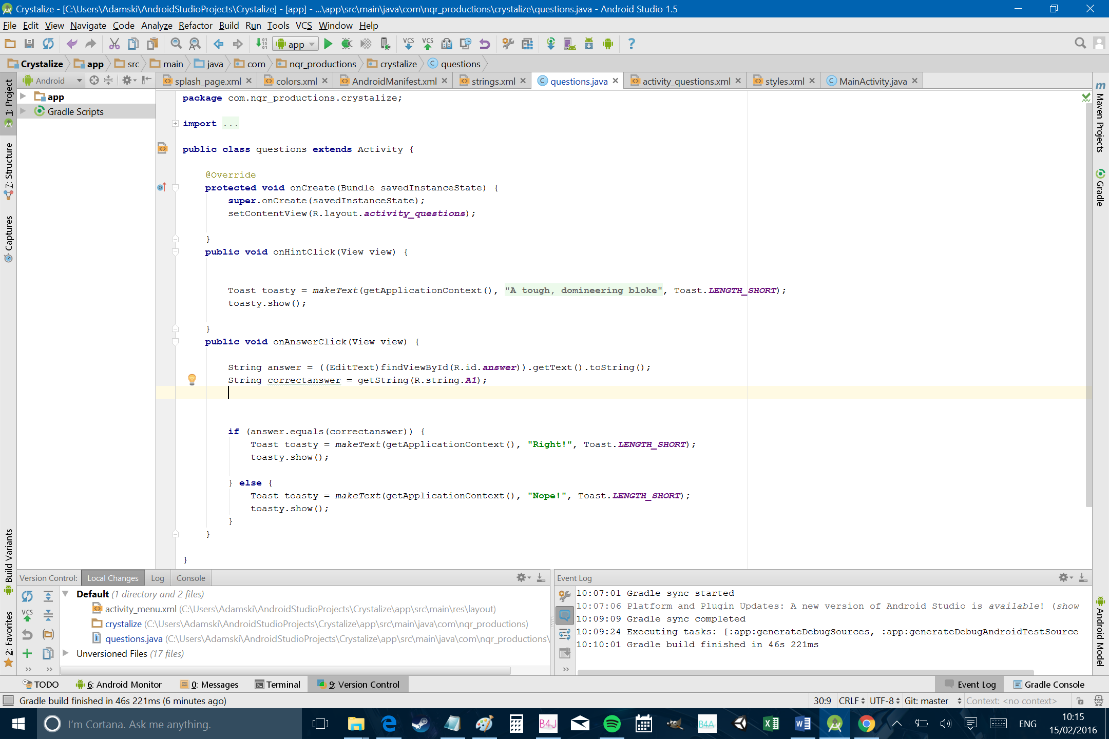
Answer is the string that the user entered and we’re getting this from the EditText using ‘findViewByID’. Correctanswer meanwhile is ‘A1’ from our strings.xml.
Then we’re using an ‘IF’ statement to compare the two strings and ensure that they are the same. When you use ‘if () { }’, the rest of the code contained in the following curly brackets only runs if the statement in the regular brackets is true.
In this case, we’re showing our “Right!” toast message only if the answer the use gave is the same as the correct answer. If we were using numerical variables, then we could say ‘if (x == y) {‘, but with strings you have to do things slightly differently so we say ‘if (answer.equals(correctanswer)) {‘.
Right after the brackets close we have an ‘else’ statement. This is what runs if the ‘if ()’ statement is untrue. This might all sound quite familiar if you’ve used Excel equations. Run this bit of code and you’ll find that the toast message tells you if you have the answer right or not.
There’s just one problem, which is that you can confuse the app by using upper case. As such, we’re also going to add one more line of code right after we create our ‘answer’ string. That is:
answer = answer.toLowerCase();
What you’re doing here is simply converting the string to lower case. That way, it doesn’t matter if the user decided to capitalize their first letter or not.
Next time…
Okay, I think that’s probably more than enough for one day. Hopefully, your brain isn’t swelling up too much at this point and you’ve found some of this helpful, useful or interesting. You actually have enough of a basic understanding at this point to release an app of your own if you want to. You could make a quiz for instance by starting a new activity every time someone gets the answer right and then packaging it as a ‘Christmas Quiz’. Or you could make some kind of image quiz.
That’s obviously not the most effective way of making a quiz though and it’s not the most exciting of apps…
So stay tuned for part two and we’ll continue refining this thing and adding some cool features. We’ll start by tidying a few things up and talking about the Android app life-cycle and from there, we can begin adding more functionality; letting users create their own questions for instance and selecting which ones show up randomly from a string array.
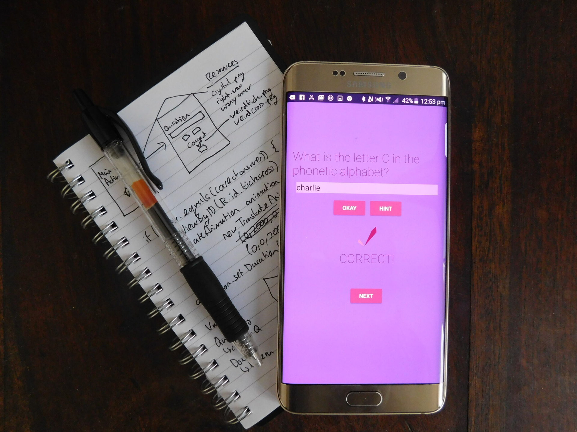
Or maybe there’s something in particular you’d like added? Let me know in the comments if there’s something you want to see and depending on what it is, we might be able to include it in the finished app.
Meanwhile, have a play with this app yourself. You can find all the files and resources at the GitHub repository here.