Affiliate links on Android Authority may earn us a commission. Learn more.
Diving into Android M: (re)revamped app drawer and customizing what shows in status bar
Published onJuly 9, 2015

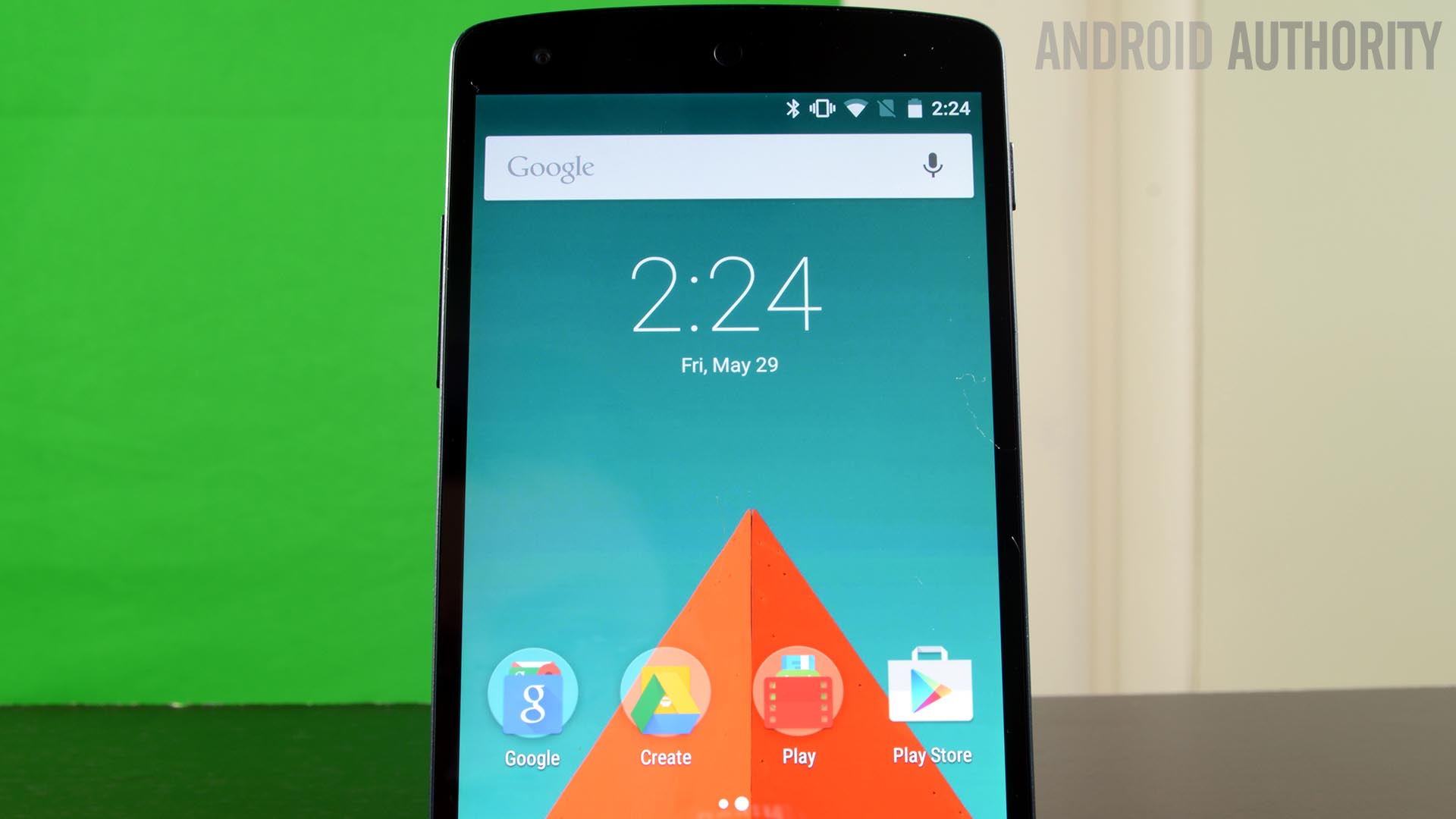
Earlier today Android M Developer Preview 2 arrived adding a number of bug fixes, performance tweaks, and the promise of more complete APIs for developer testing. We are still diving in and trying out some new things but we thought we’d take the time to highlight two interesting changes.
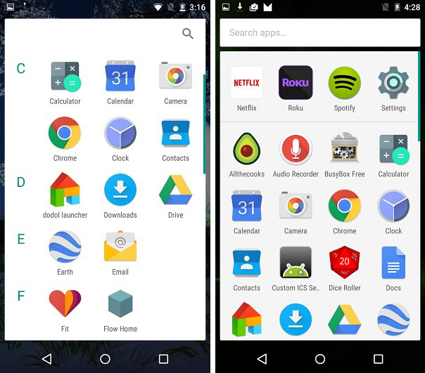
First, the app drawer has once again been modified. As you might recall, the first M preview brought a new vertical scrolling app drawer that was alphabetically sorted and featured four shortcuts on the top row. While this is still the case, the difference now is that the A/B/C/etc lettering on the side has now been removed.

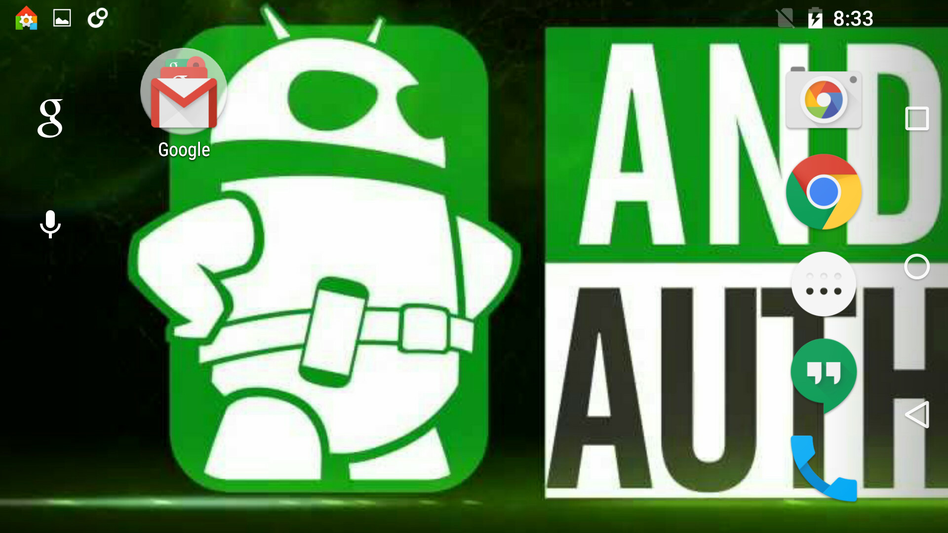
While on the subject of the launcher, it’s now also possible to allow rotation on the homescreen by enabling “rotation” from within the launcher settings.

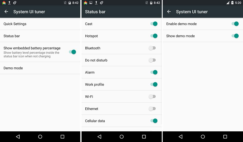
Simply put, you can now toggle off Wi-Fi, cellular, and just about everything that surfaces on the right side of the status bar except for battery. You can also enable/disable battery percentage from the System UI tuner and toggle on demo mode.

For those wondering what demo mode is, basically it sets your battery status to 100% and shows only the cellular icon giving you a clean, unified status bar for taking screenshots of your apps (obviously geared towards developers).
So there’s a quick look at just a few of the changes we’ve stumbled upon with Android M, though we should have many more “Diving into M” articles coming over the next few days. What do you think of these changes so far? Let us know in the comments.