Affiliate links on Android Authority may earn us a commission. Learn more.
Confessions from a stock Android fan: TouchWiz isn't the monster I thought it was
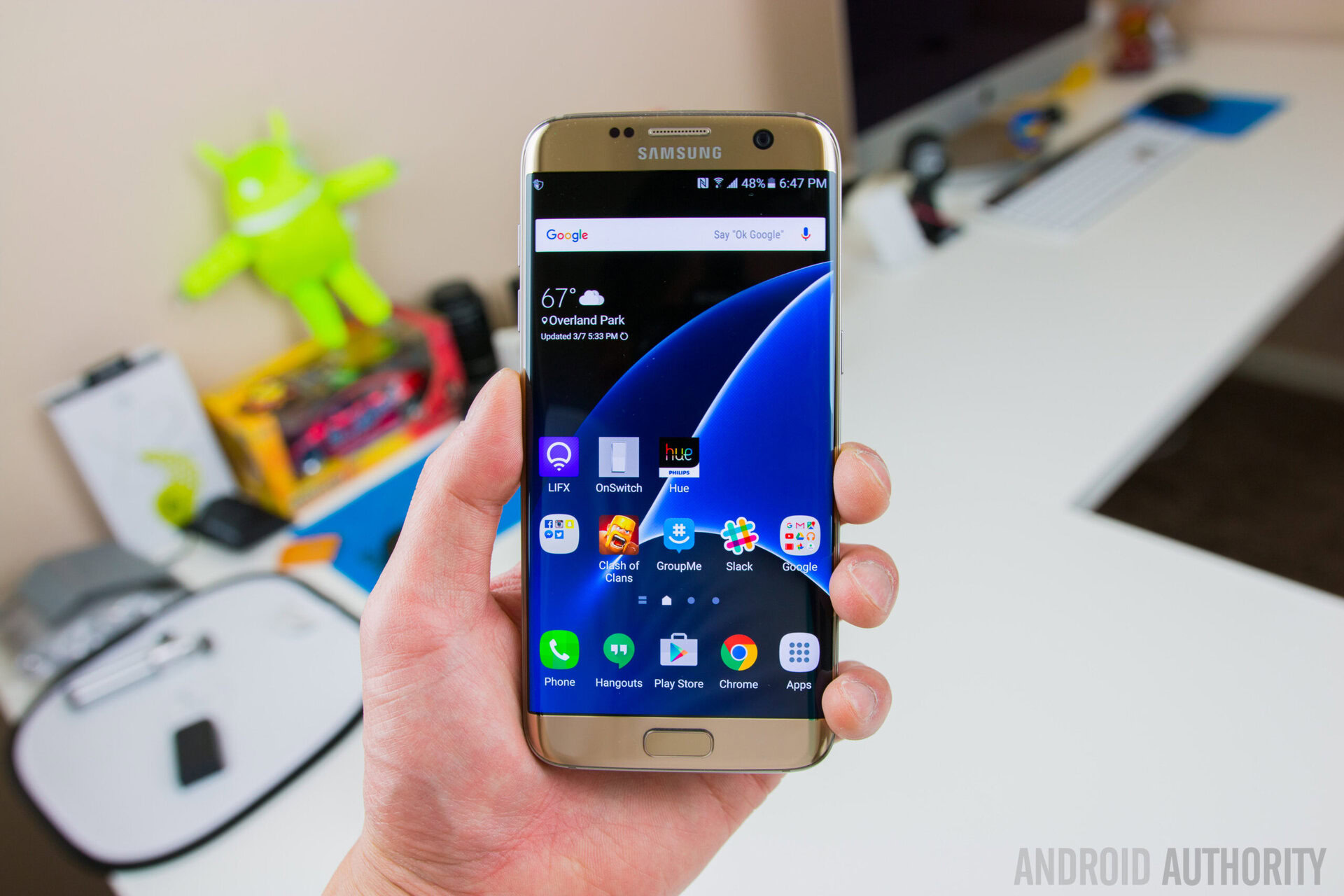
Oh boy ladies and gents, time to grab that popcorn. TouchWiz is one of those subjects that really seems to fire people up, with some saying it’s the greatest thing to ever happen to mobile, others outcrying that it is a bloated, soul-sucking devil.
As someone who has primarily, though not exclusively, used Nexus devices as daily drivers going back to the Nexus 4, I have certainly gotten in a ‘LagWiz’ joke or two at Samsung’s expense, and have enjoyed teasing some of my Galaxy-wielding colleagues (ahem… Nirave… cough, cough) for their smartphone choices. Being honest though, I haven’t used a Galaxy as a true daily driver since the Galaxy S2, with only brief periods (hours, days, etc) spent messing with more recent devices like the Galaxy S6 and the Note 5.
[related_videos align=”center” type=”custom” videos=”678284,675814,675817,676937″]
That all changed a little bit over a week ago, when I took the Galaxy S7 Edge out of its box.
Alongside Lanh, who will do the video review, I’ll be bringing you a full (written) review of the Galaxy S7 Edge in the very near future, as we wanted to slow things down and make sure we provided the best review possible, instead of rushing out of the gate. That said, I do want share a surprising revelation that occurred to me over the last week or so: TouchWiz in’t necessarily the monster in the closet I once believed it to be.
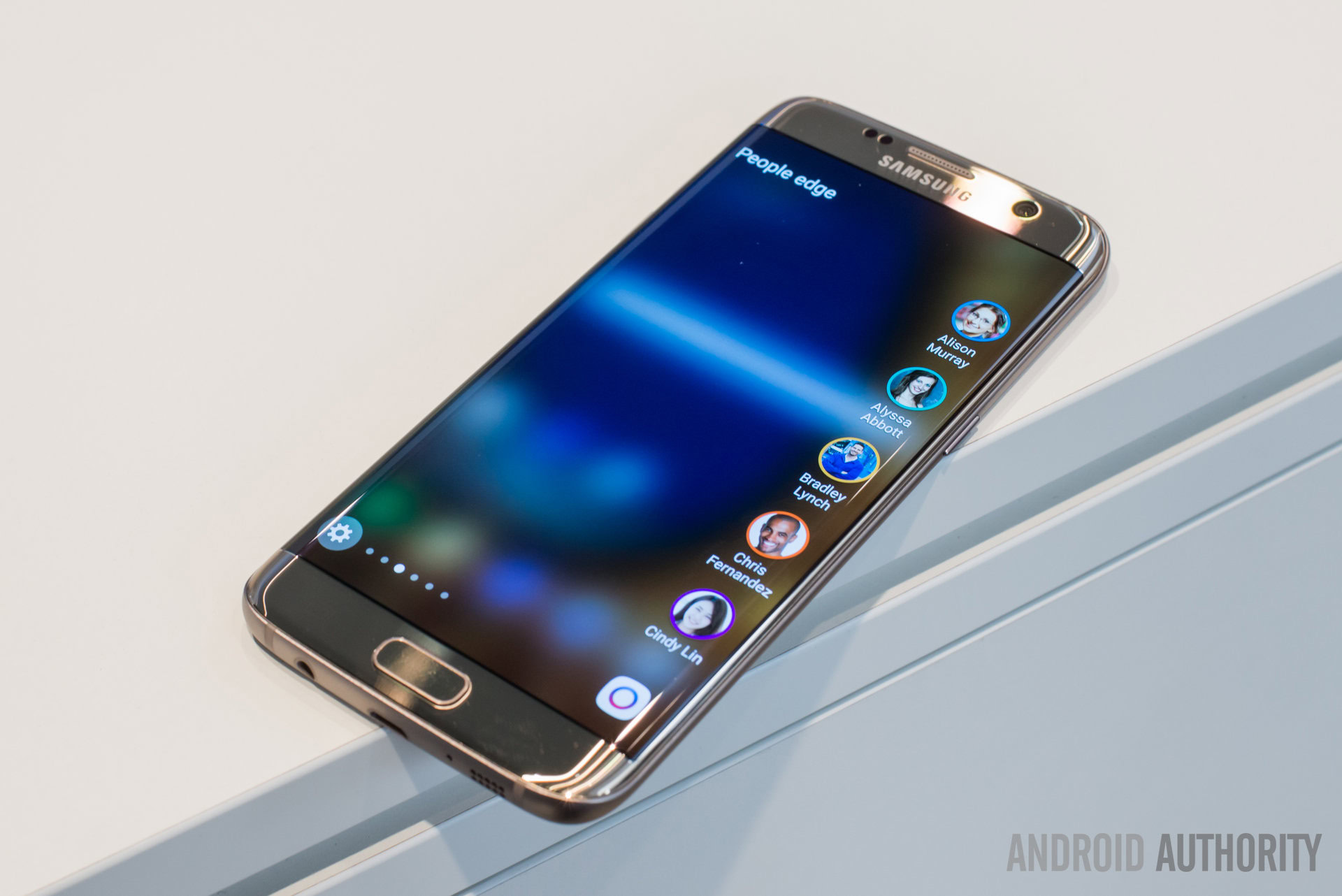
“Better than stock?” No, I wouldn’t go that far. I still enjoy the clean, fluid, and fast experience that is stock Android. I also really miss software keys when using a Samsung phone, though Gala know that’s sort of a minor thing.
What I can say is that when I first got the S7 Edge, I assumed that the minute that the review was over, I’d instantly pop out my SIM card and go running to my Nexus 6P crying. With tears running down my cheek, I’d hold it tightly and tell it about all the horrible things that TouchWiz had done to me. And my Nexus would make it all better.
In truth, I will likely return to my Nexus 6P in time, but I’m in no massive hurry to do so – much to my own surprise. At the end of the day, the Nexus series will remain my go-to option long-term for a number of reasons, including keeping up with Android updates. This is doubly true right now, with the release of Android N’s first preview. That said — without giving away too much about my final opinions of the phone (which I’m still formulating) — I must say there’s a lot to love about the Galaxy S7 Edge and I’m quite impressed by it.
As we speak, my fellow Nexus fanboys are likely ripping up my membership card. Yes, we have a secret club where we sacrifice heretical devices to the Google-y gods so that they may blesseth us with a bloat-free existence.Nevermind, I’ve said too much.
The upcoming review will give my full impressions of all aspects of the Galaxy S7 Edge, and in that review I’ll be fully throwing aside any bias I might regarding stock Android, because that’s how fair reviews should be. As for this feature, I want to talk about a few things I really think Samsung has gotten right on the software side, and even some things that they are doing better than Google is with Stock Android.
Keep in mind these aren’t the only things about TouchWiz I may have found pleasant to use, but certainly the elements that stick out the most to me.
TouchWiz features I really like
Multi-window
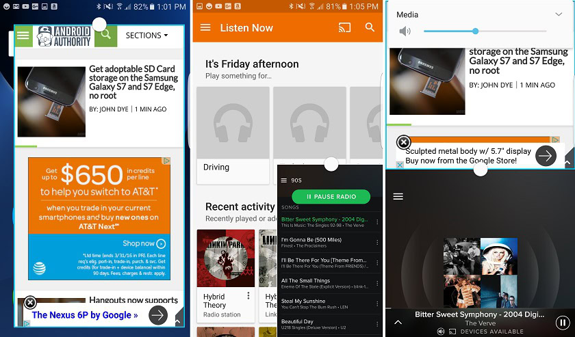
This point was a lot more valid just a few days ago when I started brainstorming the idea for this feature. With Android N, things are going to get a whole lot more even. But they aren’t there yet. In its current form, Android N’s split-screen mode is a bit clunky and works with very few apps. In contrast, Samsung’s floating window and multi-window features are easy to use, easy to learn, and there’s a great number of apps compatible with it. Sure, not everything allows these features (like Samsung’s Calculator… which I don’t get…), but many do.
Even if stock Android seems to have finally picked up on the usefulness of multi-window, at least for now, Samsung’s implementation is clearly better. Of course, Android N is going to keep evolving between now and its final form (Android 7.0), so this feature set could be much more on par in the near future.
That dialer

I have never liked 3rd party dialers. I hate HUAWEI’s, I have no major love for LG’s either. I’ve also downloaded numerous apps and many of them aren’t my cup of tea. Stock dialer for the win… until I started to get used to Samsung’s dialer. Not only is it clean and easy to use, it also has some really cool features. It’s optional ability to determine if a number is a spammer is very useful for example, though stock Android in its current iteration does have some similar features and is expanding its ‘blocking/filtering’ features in Android N as well. That said, it seems like Samsung’s features are a bit deeper here.
Beyond this, what I really like is the flexibility of the dialer with the ability to reject calls and send a preset message, or simply message them a custom one. The dialer’s looks aren’t at all bad either, with a layout at is actually somewhat similar to what you get with stock but with some Samsung tweaks and changes mixed in. Bottom-line, the dialer is clean, easy to use, and rivals the stock Android dialer – at least in my humble opinion.
Theming
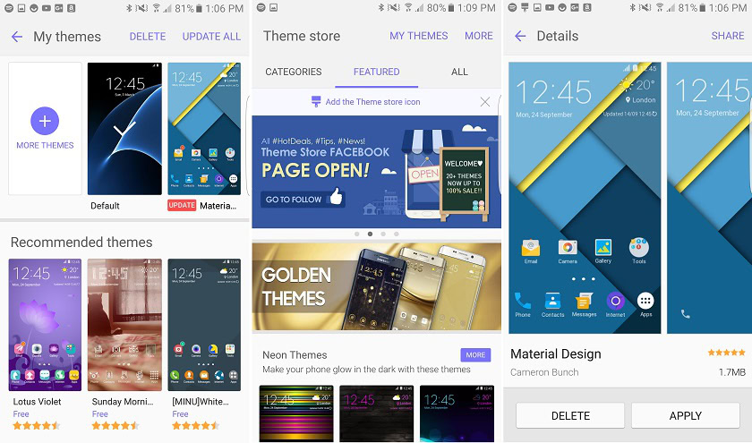
I’m not much for using a “theme engine” on phones, but mainly because most theming engines aren’t that great. I do really like how deep Samsung lets you take things though. In fact, it’s perfectly possible to make the notification shade and settings look “almost” like stock Android. Sure it’s different, but as close as you’re going to get with a custom skin like this. Many theming options simply don’t go that deep.
The Samsung Theme engine store could use some better organization, and it would be nice if they better promoted some of the cooler themes, but it’s still a really well implemented feature despite some minor quirks.
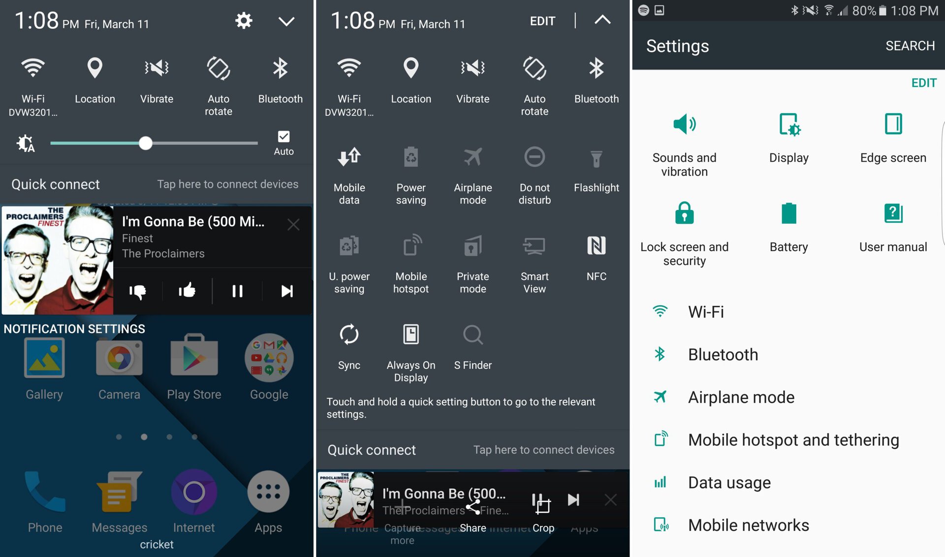
With Android M, it was possible to edit some things and “turn on” theming. It was a primitive mess, but as a concept, I really liked the idea of giving consumers more customization power. I haven’t yet experimented to see if this feature remains in Android N (though I plan to soon), but it would be certainly nice if stock Android eventually offered some kind of theming experience and here’s to hoping they take some inspiration from Samsung in its implementation if and when they do.
Flexibility in options
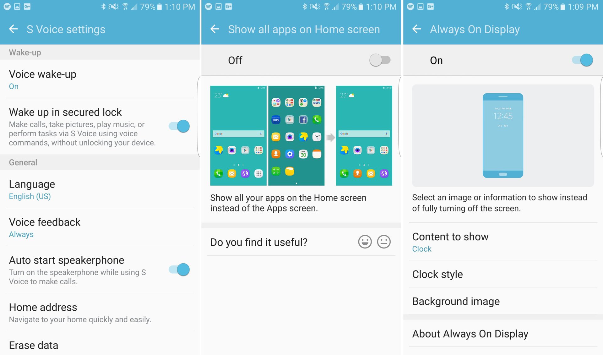
Rooting, ROMing, Xposed modules, Tasker – yes, stock Android is very flexible and customizable. That said, these are things that require tinkering. Out of the box, stock Android is a squeaky clean slate that you must crack open and dig in deep to turn it into something custom tailored to your needs. For many, that is the appeal and I tend to agree. But I have to say that despite having a ton of extras, Samsung doesn’t force them down your throat anymore.
despite having a ton of extras, Samsung doesn't force them down your throat anymore.
Don’t like that Always on Display? That’s cool, toggle it off (in fact, many carrier models have this toggled off by default). Want to make things look more like stock? Sure, there’s a theme or two for that in the store. Don’t want an app drawer? No you don’t need to put on an iOS-style launcher, just toggle drawer off in Galaxy Labs. Total newb? There’s an easy mode that makes things … easier. The same goes for stuff like Smart Manager, Samsung Pay, S-voice, and so much more. All these ‘extras’ are there if you want them, but ignoring them is just as easy and nearly all them are not enabled by default. In fact, I’m sure most “casual users” will never even realize 50% of these extra options even exist. That’s a fair cry different from Samsung’s old strategy of “prompting you” into using various gimmicks and tweaks through its tutorial system.
Yes, I realize it is a touch ironic to praise Samsung for having hundreds of options, as these extras have often been called out as ‘bloat’, and goes against the very nature of stock Android. Of course it all comes down to what your definition of bloat is.
For me, I have a problem with tons of pre-installed apps I’m never going to use but that constantly haunt me in app drawer, homescreen, and so forth. Samsung has some of these (Microsoft and Samsung apps) but not nearly as much as they once had. Tons of non-obtrusive settings and toggle-able options that I won’t see every day unless I’m looking for it? I have no problem with this, and there’s almost reassuring about knowing I have options, in case I ever want to explore them. And honestly, some of these options can actually be pretty useful once you adjust to them.
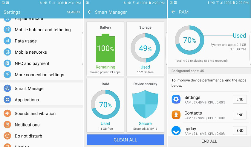
The only reason I would complain about these extras are if they slowed down the Galaxy S7 Edge’s day-today. But honestly, they don’t, at least not thus far.
Yes, TouchWiz does use a lot of RAM – with only about 1 to 1.2GB free most of the time, out of 4GB – but sluggishness isn’t a major issue for Samsung in 2016. Yes, there’s a slight delay in parts of the launcher on occasion, but not to the point that it gets in the way. If you consider even ‘slight dropped frames’ to be an issue, it’s important to keep in mind that a 3rd party launcher removes this issue altogether.
My Overall impressions of TouchWiz
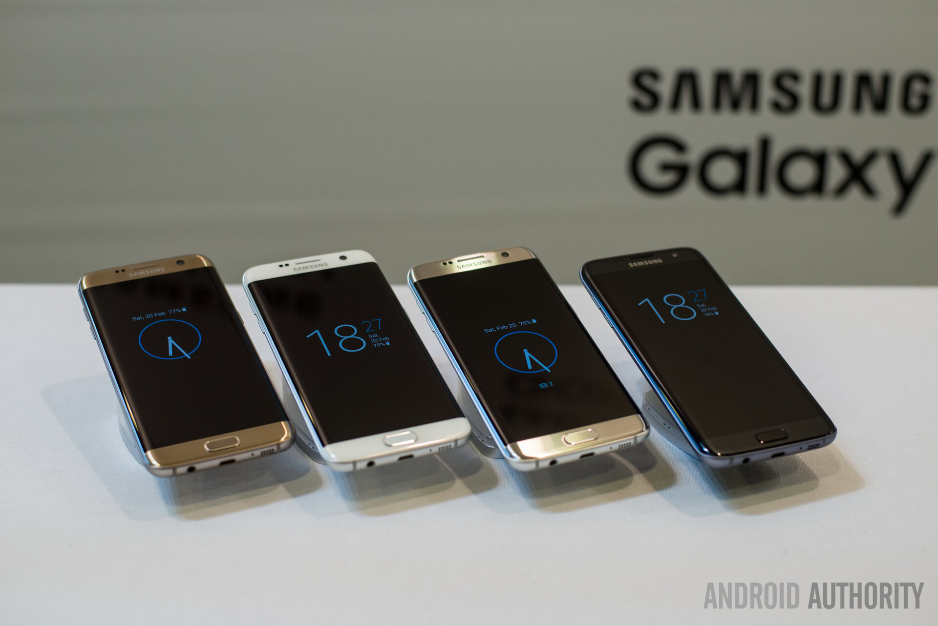
I really enjoyed my Galaxy S2, but never was that keen on the software. One of my best friends had an Galaxy S5 and I borrowed it for 24 hours, and remember thinking it was total junk. This reaffirmed in my mind that moving on from Samsung after the S2 was the right move. With the Galaxy S7 Edge (and the S7), however, I will admit that Samsung finally seems to get it. Talking with co-workers, and based on my limited time with the Galaxy S6 and Note 5, this change for the better began with last year’s TouchWiz iterations. In 2016, many of TouchWiz’s features remain the same as in 2015, but it’s clear that Samsung is working hard to polish the overall feel and things are likely to only get better from here on out.
Despite my personal preference for stock Android, I can see how some users might prefer TouchWiz
Despite my personal preference for stock Android, I can see why someone would prefer TouchWiz if they are looking for something with a bit more “beyond the surface”, without having to bake in these features themselves through things like 3rd party apps, ROMs, root apps, and xposed modules. Is it perfect? No. Is it a nightmare to use like some claim it is? Not at all. There’s some (very) minor lag and hiccups here and there, but nothing that ‘breaks’ the experience. And even stock Android has had its fair share of issues over the years — particularly Lollipop’s early days, so expecting absolute perfection may arguably be asking for too much.
The beauty of Android is that there are tons of options, and likely to be a version that is right for you. But if you’ve been judging TouchWiz largely based on notions that date back from past years of use, I encourage you to look on TouchWiz with refreshed respective. Perhaps you too will admit that, even if you aren’t sure if it is ‘right for you’, TouchWiz is not necessarily a monster hiding in the closet waiting to snatch us up, bog us down, and lag up our lives.
I look forward to seeing how TouchWiz performs over time (as that may prove to be the real test), but for now, I have few complaints about software performance or even functionality. What are your thoughts on TouchWiz? Does ‘modern’ TouchWiz deserve its reputation? Let us know your thoughts in the comments below.