Affiliate links on Android Authority may earn us a commission. Learn more.
Google Drive update simplifies organization
January 14, 2016

While we can all agree that Google Drive is a magical future box made of angel feathers and maple syrup bacon that has changed all of our lives for the better (Christ, do you remember emailing documents to yourself?), it’s never exactly had the most intuitive organization interface. Most people’s main Drive folder looks like a whole creative suite stepped on a landmine and got splattered across the walls, ceiling, and carpet. Now Google is looking to change that by streamlining a number of organization features in their newest update to the web interface.

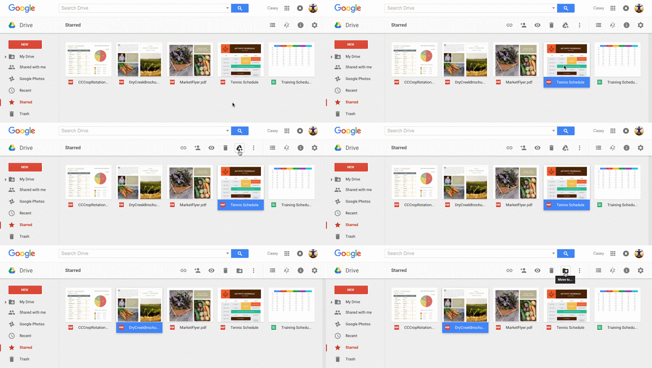
So what all is Google tweaking here? First of all, clicking a file in the main window will display a “Move” button, allowing you to quickly relocate misplaced documents. If the file isn’t in your Drive, this button will be an “Add to My Drive” icon instead. This same “Add to My Drive” will appear when you’re previewing files.

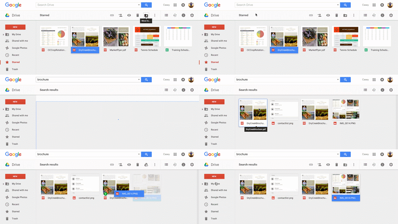
One of the more frustrating organizational issues with this interface in the past was the inability to drag items from search results to a specific folder. Now it’s a snap. Search for the files you want, then shovel them into the folders where they need to live.

Hopefully these alterations to Google Drive will encourage you to tidy up the mess you’ve let accrue. Seriously, it looks like a bachelor pad belonging to a post-divorce alcoholic in here. If your mother walked in and saw this, she would flip her lid. Those Google Docs files are just scattered throughout the main folder! Were you born in a barn?
Thank you for being part of our community. Read our Comment Policy before posting.