Affiliate links on Android Authority may earn us a commission. Learn more.
Google Maps is adding new icons and colors to help you find stuff faster
Published onNovember 15, 2017

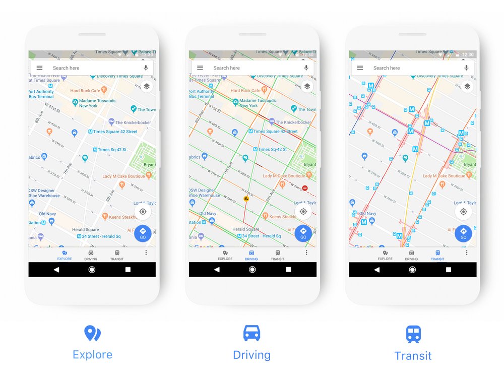
Google Maps is rolling out some new user interface and icon updates over the next few weeks that should, in theory, make it easier and faster for you to find things. Google says that the driving, navigation, transit and explore maps will now show off icons and information that are more specific to each map mode. One example is that the transit map will now more clearly show where the local train stations are located.

In addition, you should see some new icons, along with colors for those icons, that should help you spot specific points of interest on Google Maps. The eight colors for those icons are orange (food and drink locations), dark blue (shopping), red (health), green (entertainment and leisure), purple (services), gray (civil services and worship) dark green (outdoor) and blue (transport).
Some of the new logos that will find its way to Maps will be specific to certain countries. For example, a bank in the US will have a dollar icon on Google Maps, while it will show the British pound icon for banks located in the UK. Google says these icon changes and colors, along with the map mode updates, will be included over the next few weeks in the app itself, along with services and apps that use Maps such as Google Assistant, Search, Google Earth, and Android Auto. In the near future, third-party apps that use Google Maps APIs will see the new icons and colors as well.