Affiliate links on Android Authority may earn us a commission. Learn more.
Google Play Movies & TV changes to a dark theme in latest update

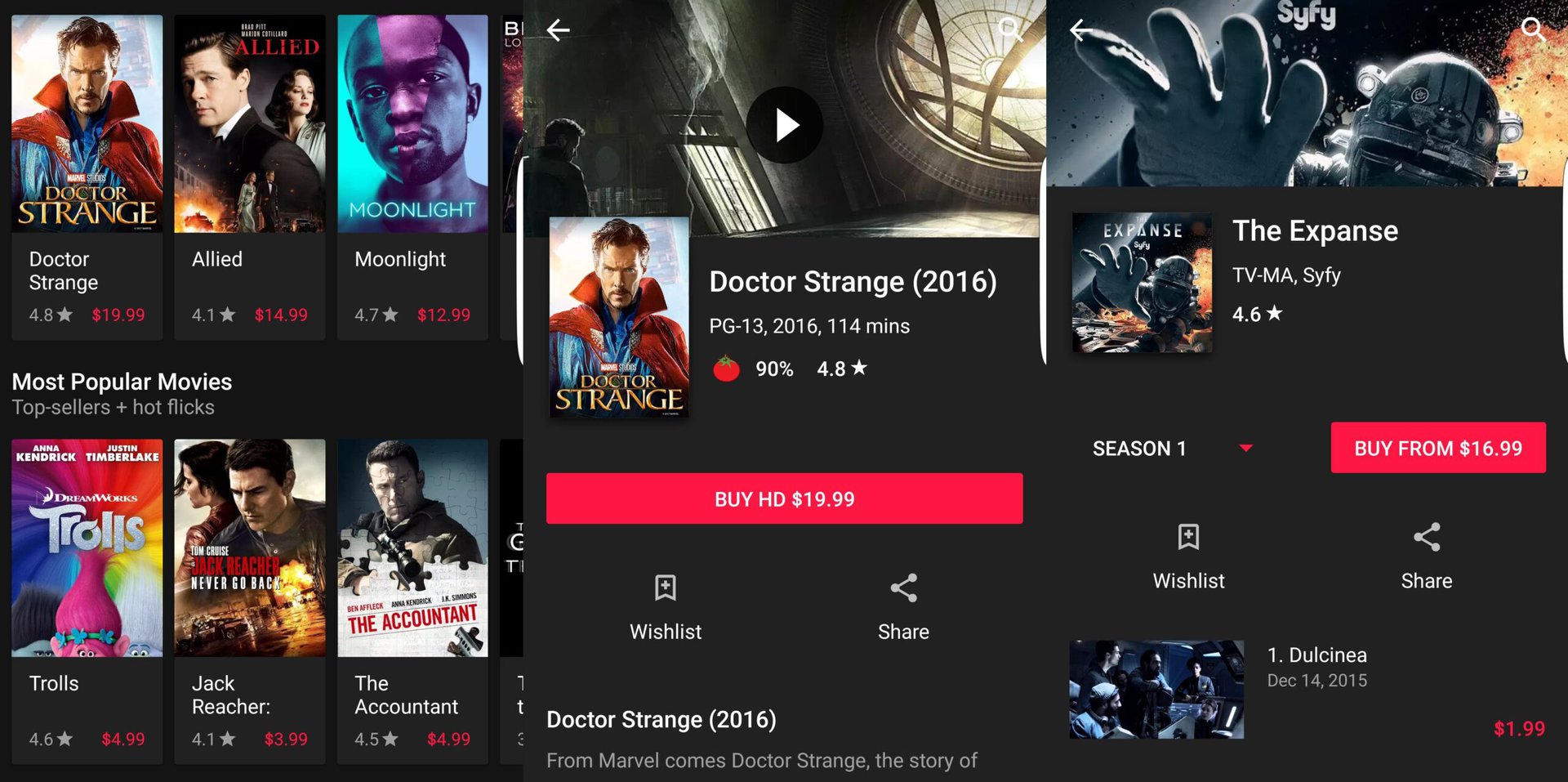
The Google Play Movies & TV app for Android just got a rather large, if a bit superficial, change. The latest 3.22.14 version, available to download from the Google Play Store, turns the app into a dark theme by default. Instead of a white background with some red category bars, the app is now almost completely dark, with white categories.


The change to the app is pretty jarring for people who may have been used to the older version. Ultimately we think this is a good thing, as it will help make each movie or TV show listing stand out. This change appears to be permanent; the app has no option to turn it back to its white/red theme.
Android Police also notes a few other smaller UI changes to Movies & TV that may still be important to some users, including cards that are now smaller so they can fit on the screen better. In some cases, three cards can now fit on a screen horizontally instead of just two.
The same site went into one of its code teardowns and claims to have found evidence that may show the app will add a way to connect to streaming services and cable or satellite TV providers sometime in the future. It’s possible Google is trying to include access to subscription services like Netflix, Hulu or HBO in the Movies & TV app so users will only have to go through one app for all of their paid video sources. Keep in mind that these code teardowns don’t mean these features will be included in future updates, if at all. It may just be that Google is testing this code out to see it it will actually work.
What do you think of Google Play Movies & TV switching to a dark theme? Let us know your thoughts in the comments!