Affiliate links on Android Authority may earn us a commission. Learn more.
Google Play Music search bar just got a new look

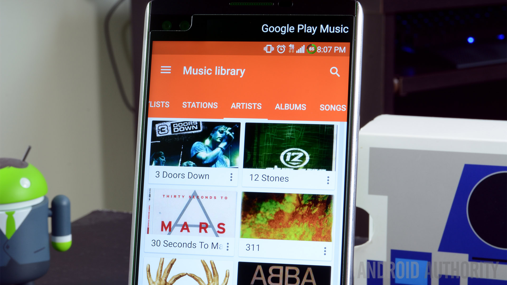
A server-side change has tweaked the Google Play Music search bar. Gone (or soon to be gone) is the magnifying glass of old, as this new search bar heralds in an era of a Google Now-esque bar with “Google Play Music” stamped neatly in the area where you type (or speak) your search. Some users are already seeing this change roll out, but others are still waiting. However, you can expect the change to hit your device over the course of the next few days.

This isn’t a massive change by any means, but it is part of an ongoing trend of Google apps getting design tweaks that move them away from strict Material Design philosophy in favor of a cleaner, quicker user experience. All in all, what we appear to be moving toward is a more unified Google app experience that keeps key features, like search bars and menu items, in the same places. That way a user never has to ‘learn’ a new app; they already know where everything is.
If you’ve never given Google Play Music a spin, you should check it out. The free model lets you have unlimited radio streaming from any device, but if you fork over for the subscription, you can upload your entire music collection and add songs on the fly. Listen to whatever you want, whenever you want, on whatever you want. Click the button below to get started, and let us know what your favorite music streaming service is in the comments!