Affiliate links on Android Authority may earn us a commission. Learn more.
Google Play Music's web interface updated with huge Material Design refresh
May 14, 2015

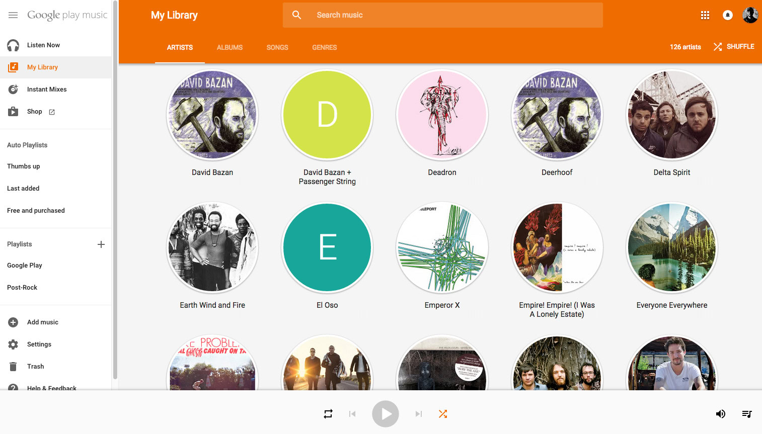
Google is now rolling out a huge update to the Google Play Music web interface, which brings a ton of great Material Design user interface changes. The web interface now looks much more refined, and more closely resembles the Google Play Music applications you’d find on an Android smartphone or tablet.
Upon opening the web interface, one of the first things you’ll notice is the addition of a slide-out navigation tray, tucked away on the left side of the screen. Once you open it up, you’ll find the familiar Listen Now, My Library, Instant Mixes categories and more. Clicking on an artist, song, or album brings up large card views which take up the majority of the screen – a UI element that’s been present in the Android app for some time now. When clicking on the artist view, each selection is now presented as a circular icon, as well.
Overall, functionality is very much the same. The interface may take a few minutes to get used to, but it should be a welcome change for most users. The updated interface is rolling out to the masses now, but it may be awhile before it makes its way to everyone. Hit up the source link below to check it out for yourself!
Thank you for being part of our community. Read our Comment Policy before posting.