Affiliate links on Android Authority may earn us a commission. Learn more.
Google+ receives a huge redesign centered around Communities and Collections (Updated)

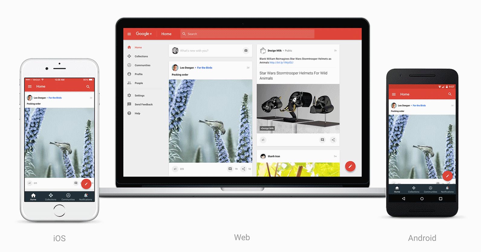
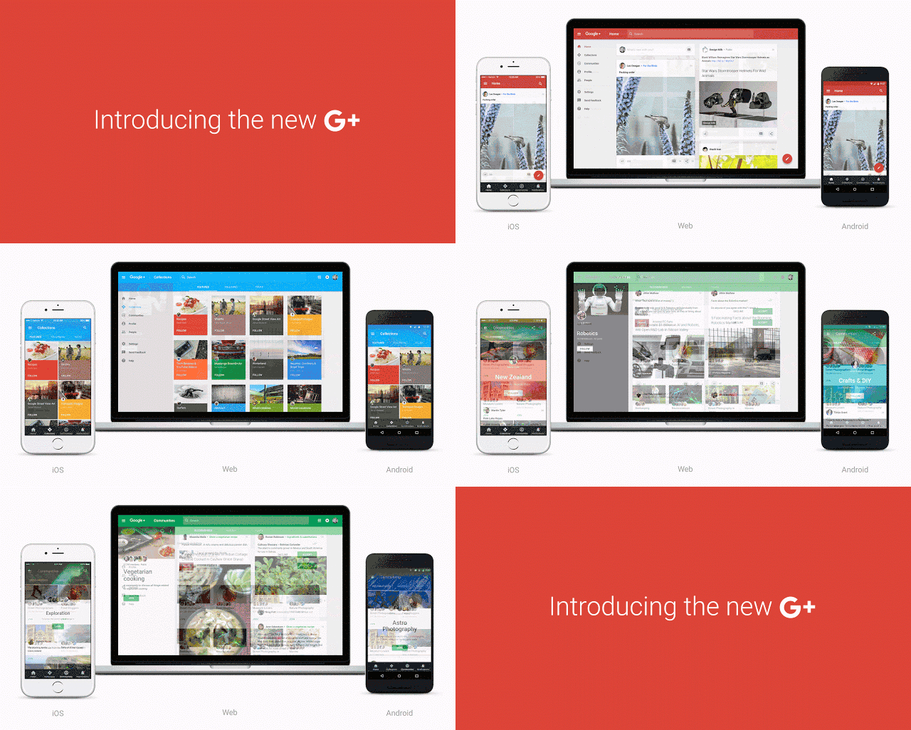
Google today introduced a complete redesign for Google+ on Android, iOS and on the web. The new version of the social network will put an emphasis on Collections and Communities, and will make it much easier for users to post, search, connect and more.
For starters, Google+ is getting a new navigation system that’s centered around Collections and Communities. Collections let you view content relating to a specific topic, and Communities allow groups of people with the same interests to join together and discuss, post and discover new content relating to their common interests. These two features have been available in Google+ for some time, but now Google+ will put both facets at the forefront of the service. The new Google+ will also make it much easier to post, search and connect with other people, too. The home stream of Google+ is also getting a big redesign that will not only load much faster, but make it easier to consume relevant content at the right times.


You can preview the new Google+ on the web today by signing in and clicking the “Let’s go” button when you see the prompt. Google notes that since not all of the new features have made it into the updated version yet, so you can switch back to the older version at any time. Updates to the Android and iOS versions will be rolling out in the next couple days.
- Navigate to Settings from the drop down menu on the left-hand side of the web version
- Scroll down to the section called "Manage other apps & activity"
- Select "Manage Google+ activity"
- Click the search field at the top of the page, wait for the bar to turn gray, the click the Google+ logo to go home
This won't switch you over to the new layout permanently, but it will allow you to navigate around the website as long as you stay on the same tab. Thanks for the tip, Peter!
So what are your thoughts? Excited to try the new redesign?