Affiliate links on Android Authority may earn us a commission. Learn more.
The Google search bar widget may be getting a rounder look soon

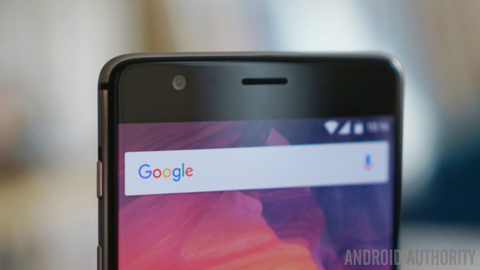
The familiar Google search bar widget on Android phones could be getting a small, but very noticeable, makeover. Reports are coming in that the regular rectangular bar has been changed to one with rounded edges, along with a microphone icon on the right side and the “G” logo on the left.


Android Police notes that the new rounded Google search bar widget has been spotted by some users as a change from the standalone version. So far, it has not been spotted as part of the Google Now Launcher’s integrated search bar, only the 4×1 widget that you can place anywhere. It’s a bit similar to the Google “pill” look that was put in with the company’s new Pixel phones. It’s likely that the company is just testing the look of this design with a small section of the Android audience before deciding whether or not to roll it out worldwide.
What do you think of this new look for the Google search bar widget? Do you prefer it over the current one with the sharp edges or do you like the smoother look of the curved sides? Let us know in the comments. We will, of course, post an update if and when Google decides to make this change for every Android user.