Affiliate links on Android Authority may earn us a commission. Learn more.
Literata is the elegant new typeface of Google Play Books, get it here
Published onMay 19, 2015

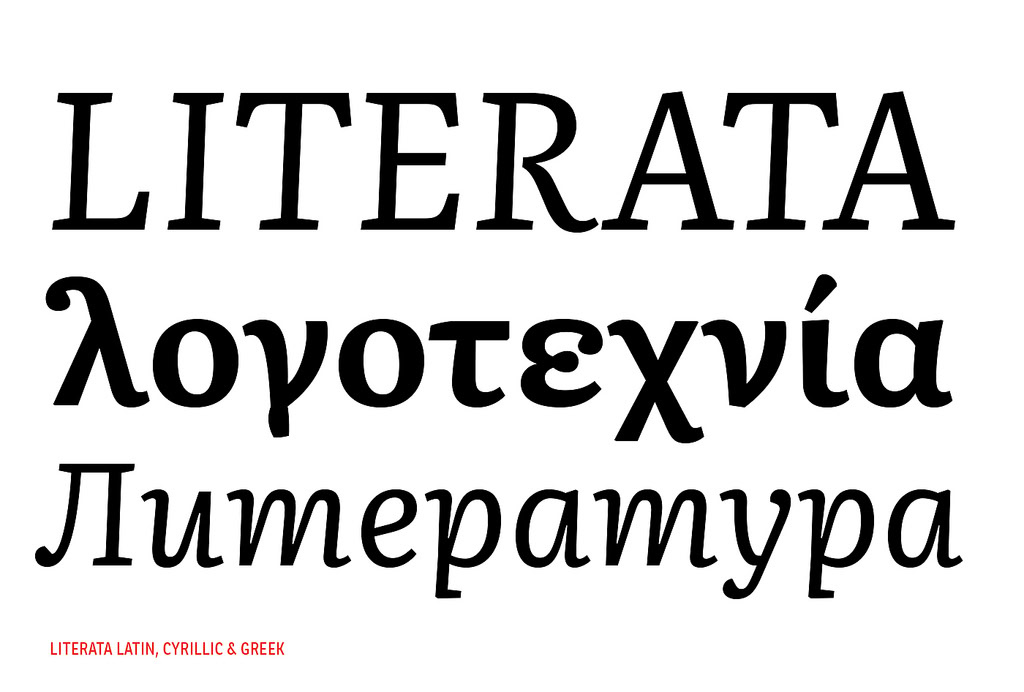
Google Play Books 3.4.5 brings a change that typography aficionados will appreciate: a new default typeface called Literata.
Literata, which was officially introduced yesterday on Twitter, is an elegant serif typeface that Google commissioned from type foundry Type-Together in April 2014, designed to replace Droid Serif as the default typeface of Play Books. (For a discussion about the difference between font and typeface, read this Fast Co Design article.)
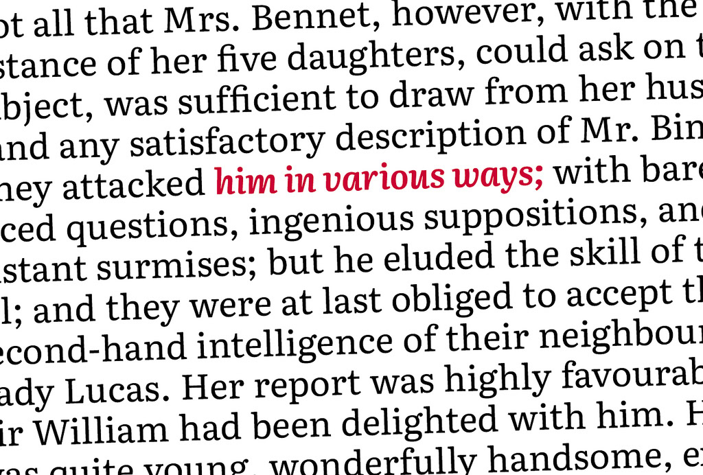
Literate delivers, according to Type-Together, “outstanding reading experience on a whole range of devices and high resolution screens.” It’s also meant to “establish a recognizable visual identity for Google’s native eBook App and stylistically distinguish itself from other eReader competitors.” In other words, Literata is a branding exercise, not just a stylistic choice.

That explains some of the quirks of Literata, including a non-slanted italic variant that’s supposed to make it “unique, recognizable and easy to remember,” as well as a number of other smaller but delightful flourishes.
The name of the typeface suggests Literata will remain exclusive to Play Books, with the Droid family staying on as the default typeface for Android and Google apps.
If you’d like to try out Literata on your PC, you can download it from here. It’s currently my default font in Word, and it’s a pleasure to use.