Affiliate links on Android Authority may earn us a commission. Learn more.
Mailbox for Android version 2.0.1 update brings a Material Design refresh
Published onApril 3, 2015

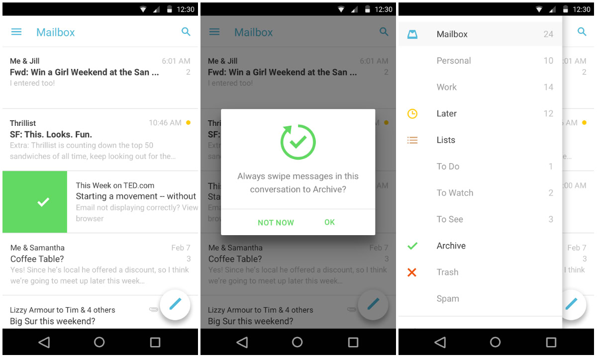
If you’re a fan of the “inbox zero” mentality when it comes to managing email, odds are you’ve tried Mailbox for Android. The app, which was an iOS exclusive for some time, makes it easier than ever to delete, snooze and archive emails with just a few swipes. When the application launched on Android, there were few differences between the iOS and Android versions, at least aesthetically speaking. But today that changes, as Mailbox is receiving quite the update to version 2.0.1 which brings a Material Design refresh to the app.
Once you update to the newest version, you’ll notice a few key additions in the user interface. Most notably, the Mailbox team has added in a floating compose button which makes it easier to create an email when you’re in your inbox. The slide-out navigation drawer now reaches to the top of the screen, though it’s still not a full-height drawer like we see in many other Google apps. The new update polishes up the entire app, making it look like a true Android application.
The update is rolling out as we speak, so be sure to head to the Play Store link below to grab the newest version. Mailbox users – how are you liking the new update?
