Affiliate links on Android Authority may earn us a commission. Learn more.
Material Design Awards 2017 winners announced by Google

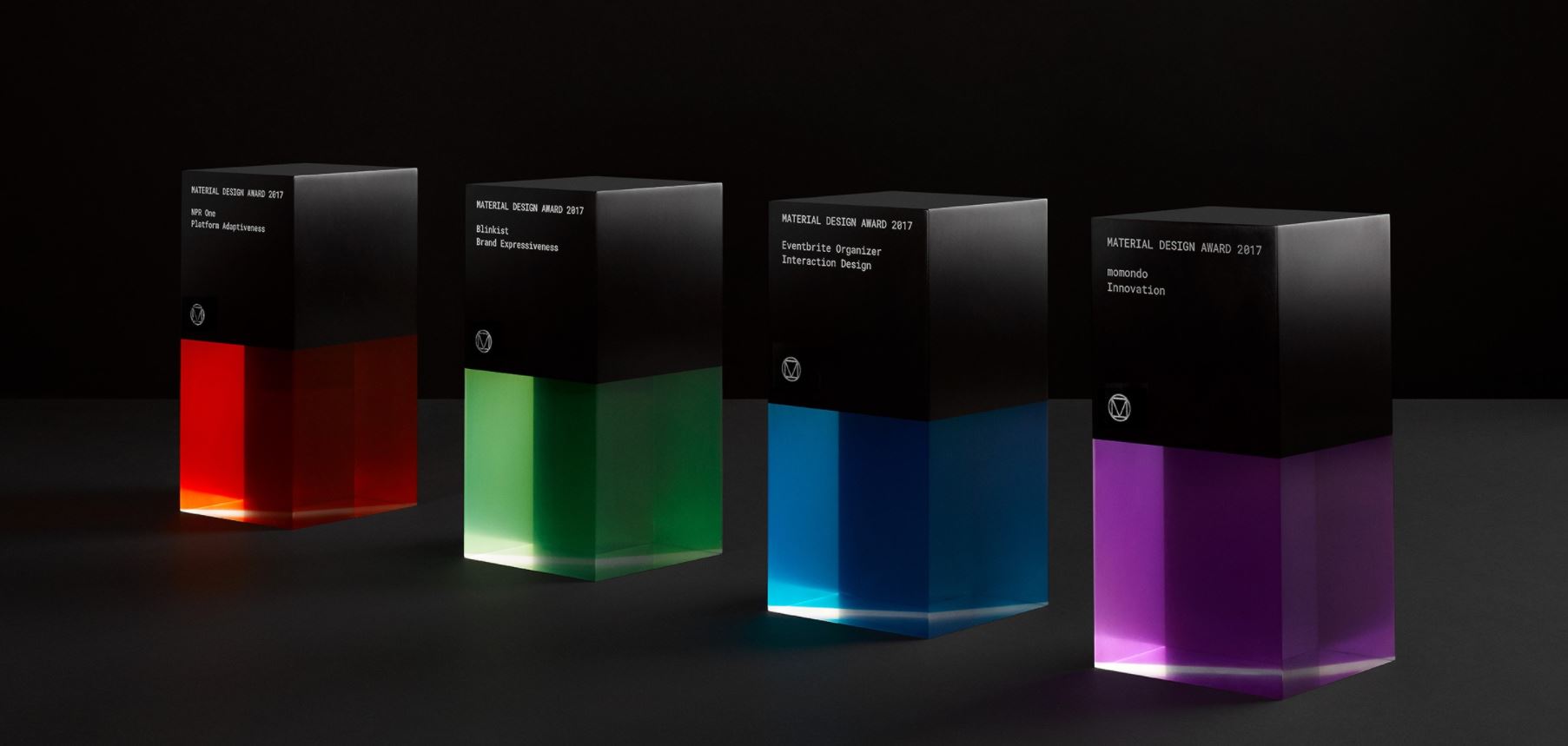
The Material Design Awards winners for 2017 have been announced by Google. The awards recognize the best of the best in terms of using Google’s Material Design guidelines to create meaningful experiences. Even more exciting, for the first time in the brief history of the awards, Google allowed the public to get in on the nominations.
Hundreds of entries were submitted and Google came up with four winners in four categories. Blinklist took home the prize for Brand Expressiveness, Eventbrite Organizer won for Interaction Design, NPR One for Platform Adaptiveness, and momondo for Innovation. All of the winners will join representatives from Google to celebrate at the SPAN Pittsburg Conference on September 14 and 15.
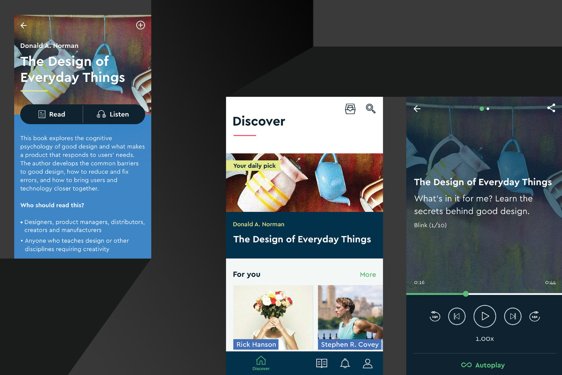
Blinklist is an app that condenses over 2,000 best-selling nonfiction books into 15-minute reads or listens. It was awarded the Brand Expressiveness award due to its engaging and harmonious use of iconography, motion, and typography. When awarding Blinklist, Google stated that “The type layout establishes clear hierarchy while maintaining a reader-friendly presentation through the comfortable use of whitespace.”

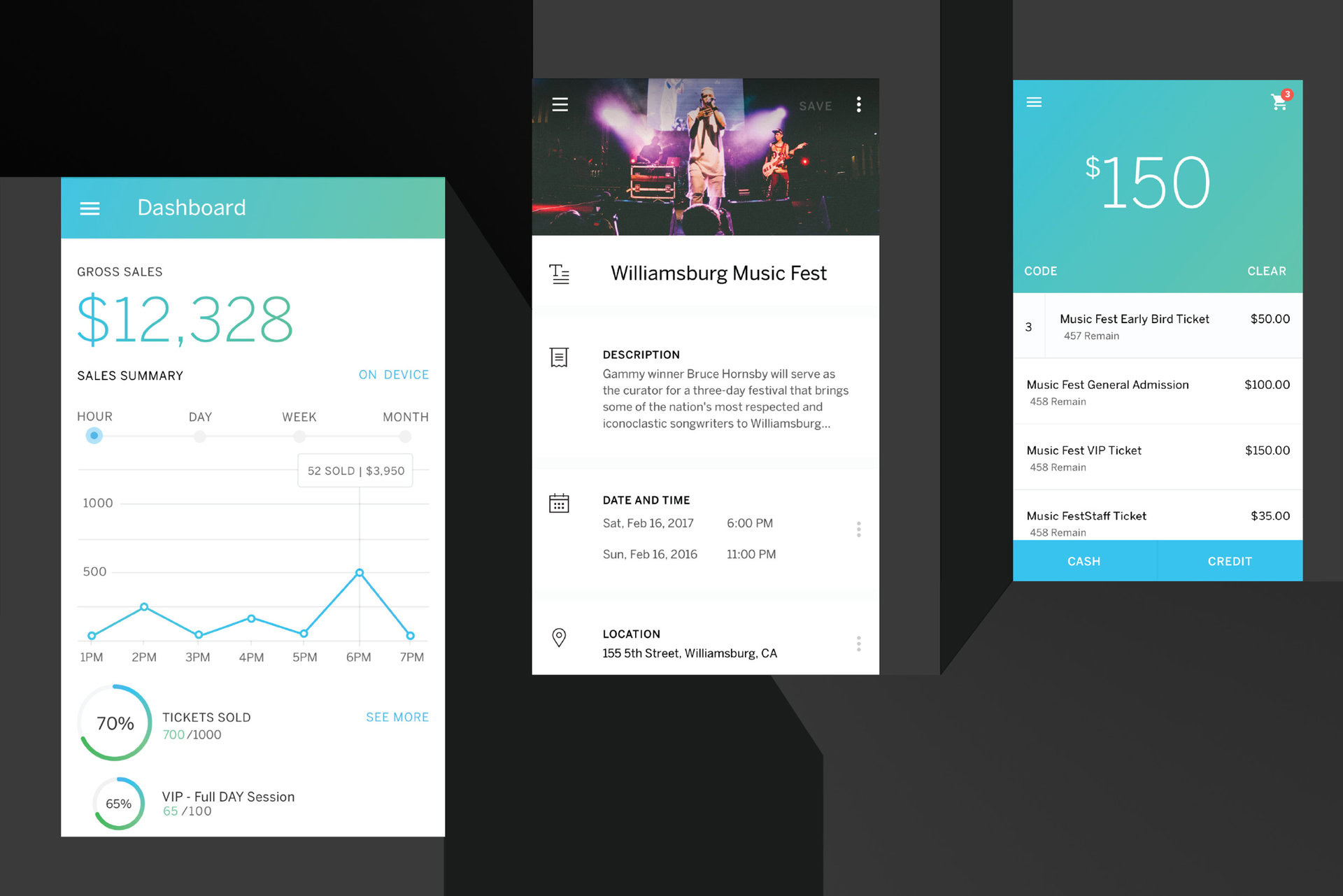
Eventbrite Organizer, the winner for Interaction Design, is an app that lets you oversee the event management process from start to finish. The app lets you create tasks directly in the app, track and control ticket sales, and quickly accept payment for tickets and merchandise. Within the app, all of your information is quickly accessible and looks beautiful.

NPR One was awarded the Platform Adaptiveness award due to how flexible the app is. Whether its on your wrist, in your pocket, or in the car, the app allows users to consistently perform tasks in a way that feels natural to each device. NPR One got high marks for the organization of its stories, as well as enabling targeted searching and casual discovery of stories.

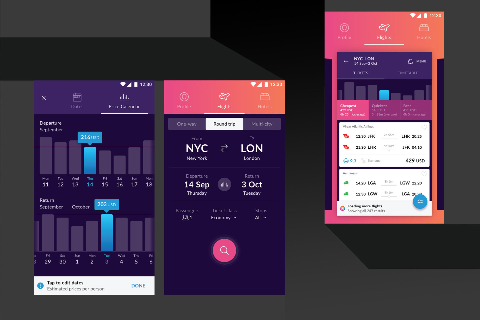
Momondo takes a simple task and makes it beautiful. The app isn’t unique in its functionality, it finds, compares, and books hotels and flights, but it is unique in how it displays information. Gorgeous backgrounds, graphs, and loading screens give Momondo a leg up on the rest of the competition.

This is the third year that Google has given out Material Design awards. Check out our coverage from last year to see the previous winners.