Affiliate links on Android Authority may earn us a commission. Learn more.
Microsoft Office for Android review
Published onMarch 31, 2014

Functionality
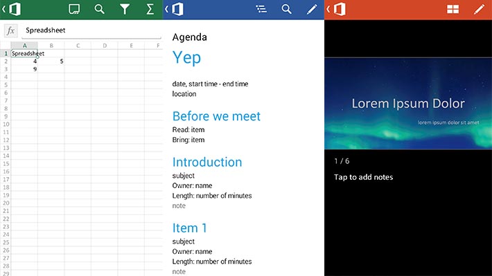
Okay so there’s very little about Microsoft Office that you don’t already know. You know about Microsoft Word, Spreadsheet, and PowerPoint, what they do, and how they work. So thankfully this part of the review won’t take very long. As you can imagine, the mobile version of Office contains these three things and you can use them to create and edit documents, presentations, and spreadsheets.
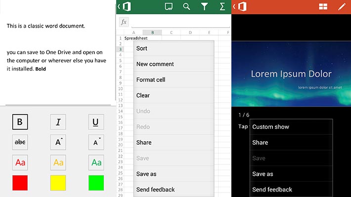
When creating and editing, you have the basic tools like editing and control. You can use some basic formatting should you need it. It’s not nearly as powerful as the desktop apps or the Office 365 web apps. That’s a shame and we hope they increase functionality eventually but aside from some tweaks here and there it’s going be difficult to prepare full featured documents and presentations on the mobile version.
It’s fairly simple and that’s about all the app does in terms of pure functionality. However, there is more going on under the hood. Using Microsoft Office requires a Microsoft account. Once you have that you’ll automatically get some storage for Microsoft’s OneDrive service which you may know by its prior name which SkyDrive.
Currently you get 7GB for free and there’s a promotion for now that gives you an extra 3GB if you download the OneDrive app and use it to upload your photos from your Android device.
Everything you do in the Microsoft Office app is saved and drawn from your OneDrive account much like how every document you make in Google Drive is also stored in Google Drive. There is very little difference between the two fundamentally and for that, Microsoft does deserve a little praise.

Design
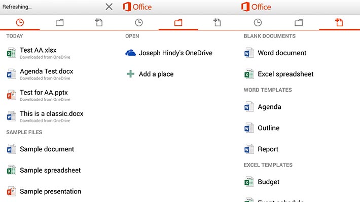
In terms of design, Office actually looks pretty good. Moving around the app is simple so no one should be getting lost. It uses some of the Android design guidelines such as the swiping tabs and using the logo at the top to go back to previous pages. Inside the files, it’s easy to navigate around your documents.
It saves every file to OneDrive so you can’t really go surfing around your device storage so don’t plan on being able to do that. The interface is overall very simplistic and the controls in apps are pretty simplistic too. Really, nothing is too difficult.
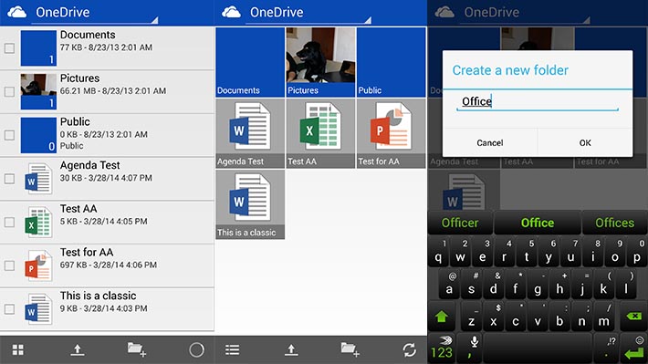
That doesn’t mean it isn’t tedious. In order to get the full experience, you’ll have to download the OneDrive app as well. That’s really the only good way to navigate your OneDrive account. When you open documents in OneDrive, it’ll open in Microsoft Office but the Office app doesn’t surf the OneDrive account very well. That, we thought, was a poor design choice.

The good
So here’s what we liked about Office
- It’s Microsoft actually giving it the old college try. Their first attempt at an Office app was not the most popular option and it didn’t work all that well. Now that it’s free and it’s been overhauled and integrated with OneDrive, it is suddenly much better than it used to be.
- One of the biggest complaints about non-Microsoft Office apps is how it wrecks the formatting of Microsoft Office documents. That should no longer be a problem.
- You are forced to use OneDrive for your storage for this app and that sucks, but they give you 7GB free so it’s not all that bad. You can get 3GB more for a limited time by downloading the OneDrive app and giving it permission to upload your camera stuff. So you can start with 10GB and even though Google Drive gives you more, at least Microsoft doesn’t leave you in the dirt in terms of cloud storage.
- Full integration with OneDrive means that if you download the OneDrive app on your PC and have an internet connection, you have full control over the documents on both platforms without any difficulty. Office on mobile can open any document in OneDrive as can the PC Office app as well as the Office 365 web app. Multi-platform integration is never bad. Ever.
- Lastly, the design isn’t terrible. Microsoft has developed some questionable mobile apps for Android in the past and this does not fall into that category. It doesn’t follow all of the Android design suggestions, but it follows a few of them and the app design positively reflects that.
The bad
And here’s what we didn’t like so much.
- We would’ve liked to see more formatting tools. You can do the basic stuff like bold, underline, italics, color, and size, but things like adding images, advanced formatting, and others aren’t present and that’s disappointing.
- Integration with OneDrive is fantastic and I love that, but knowing when to use which app for which purposes is a little hard to get used to. Like if you need to open a document, you’ll find it easier in OneDrive rather than the Office app and that’s disorienting. Also, your only storage option is OneDrive although you can download files from OneDrive if you have to.
- Despite the good design, the controls are a little tedious. When you open a document, you have to click the pencil icon at the top in order to edit it. That extra step kind of screws with the brain because you’re kinda used to just opening the document and go. That, along with the way the app lets you see formatting options can be tedious and even a little frustrating.
- There are very few (if any) tablets supported. It’s 2014, that’s just inexcusable at this point.

Final thoughts
Here’s the bottom line with Microsoft Office mobile. It’s a lot better than I was expecting it to be. Given prior experiences with Microsoft applications, there wasn’t that expectation that this would be directly comparable to the best Android has to offer. As it turns out, it is directly comparable and Microsoft has a pretty good app here.
That said, you won’t be concocting epic documents with this app. You can edit them and create some basic stuff but the hard work will still have to be done on either the web app or the desktop app. In any case, if you’re an Office user and you have Android, I highly recommend you check this app out.
