Affiliate links on Android Authority may earn us a commission. Learn more.
Microsoft OneDrive gains Material Design refresh in first beta release

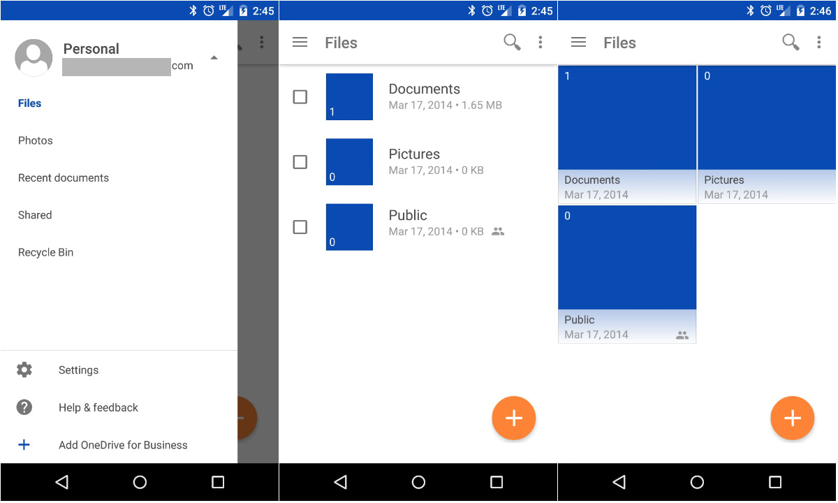
Microsoft has just released their first beta version of the OneDrive Android app, which brings a nice Material Design refresh. The app doesn’t feature any changes in functionality or bring any new enhancements on board, but it does provide a nice visual change.
As you can see from the images above, the entire app is flat blue and white. The status bar is now blue as well, which is a subtle but nice change. Also, Microsoft has done away with the ugly gray action bar on the bottom, and has brought a floating action button on board, which features a bright orange color. The action button features the only orange in the entire app, so it’s an odd decision on Microsoft’s part to make it that color. Other than that, we have a slide-our hamburger menu on the left side of the interface that has gained a simpler, more minimalistic layout. The Settings menu and different file views have been reworked, and the entire app has become a lot less complicated in design.
If you’d like to get your hands on the first beta version of OneDrive, feel free to join the OneDrive Preview Google+ Community, or head to the link below to side load the apk before the official update rolls out.