Affiliate links on Android Authority may earn us a commission. Learn more.
New look Google Play Store begins hitting devices
Published onOctober 22, 2015

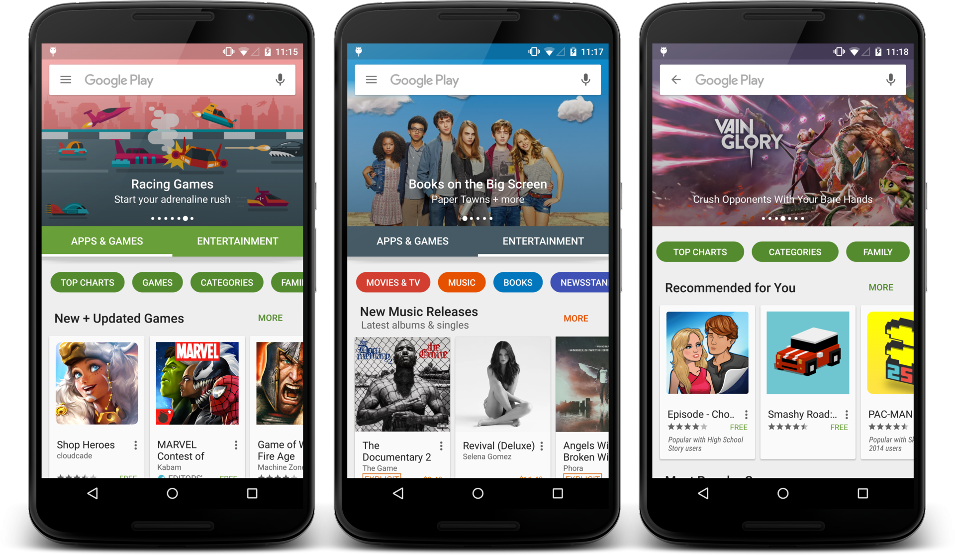
Just last week, a new version of the Google Play Store was teased, promising a redesigned user interface and a number of tweaks to the way that categories are organized, among other changes. The update has now begun rolling out to Android devices, so keep your eye out for the new look.
Perhaps the most notable change is the new UI. The home page button placements have been moved around and are now curved rather than rectangular. There’s now also a large space for images and featured products at the top of the home page, while app recommendations remain in their little white boxes nearer the bottom of the page.
As previously teased, the new Play Store does away with the numerous categories from before and is cut down to just two main ones: Apps & Games, and Entertainment. Games and various other app sub categories now appear under the Apps & Games tab. The Entertainment tab houses the Books, Movies & TV, and Music sections. There’s also right-to-left flow of information for all RTL languages supported by the platform.
The new look Google Play has already begun landing on some handsets, but it could be a while before it makes its way to your phone or tablet, as these rollouts tend to be rather slow and depend heavily on which region you are located in. If are lucky enough to have already seen the update, let us know what you think in the comments below.