Affiliate links on Android Authority may earn us a commission. Learn more.
Samsung Galaxy Beta Program shows off a new look, does without App Drawer
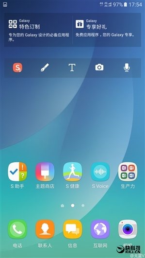
Samsung’s flagship phones are synonymous with several key things: (1) They use the company’s most advanced Super AMOLED displays, (2) they have seen a major build quality upgrade recently, and (3) they are tricked out with TouchWiz, the Korean OEM’s customized Android skin. Along with the radical redesign that took place in 2015 with the Galaxy S6, a decision was made to tone down the extent of TouchWiz’s overtones, removing what some might have felt to be superfluous bloat. While the newest build seen on the Galaxy S7 certainly isn’t stock Android by any means, it seems a major UX overhaul may be coming soon:
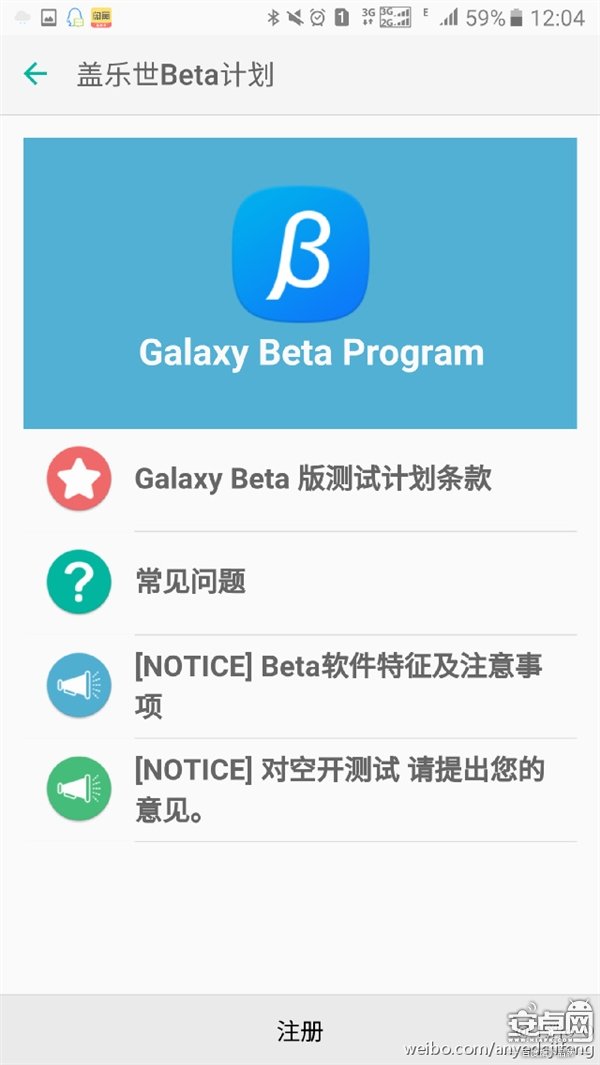
According to a new report by PLAYfuldroid.com, users in South Korea and China who own a Galaxy Note 5 are eligible to partake in a “New Note UX” beta program. The post explains that while the test device itself may be the note, this August the layout will supposedly make its way to the Galaxy S6, the Galaxy S6 Edge, the Galaxy S6 Edge+, the Galaxy S7, and the Galaxy S7 Edge. It is not clear if this means the beta will be made available, or if Samsung will indeed issue a major UX update with these changes at that time.


This approach has been seen before in Chinese OEM products like those from Lenovo and even last year’s Axon Phone. More recently it surfaced on LG’s G5, which promptly made headlines for the lack thereof. LG in turn, then had to release a “new” skin option that restored its old App Drawer.
Also worth mentioning is the redesigned icons, namely the Dialer and the Messaging apps. The phone now features a circle inside the square and the latter has chat bubbles instead of an e-mail icon as exists on the Galaxy S7.
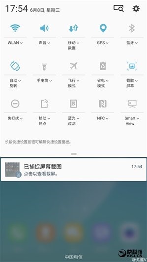
The Notification Shade has also been altered, with the various toggles now sans the white circular background that appears in the current build of TouchWiz. The result is much more similar to the stock Android approach.
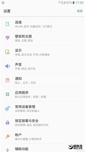
Even the Settings menu has been changed to look more like stock Android. Gone are the seemingly infinite number of categories that Samsung currently uses, instead much more concise headers that contain multiple setting selections inside. This is, again, closer to a stock Android approach
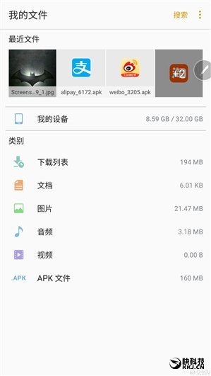
Even the Storage setting screen looks drastically different. The top ribbon indicates the latest files that have been downloaded, for example.
Analysis
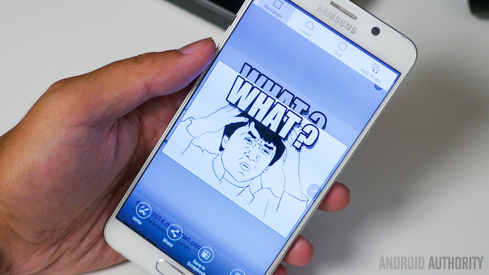
While this story is still in its infancy, it’s highly likely that what’s being shown here is a preview of the new UX that will launch with the Galaxy Note 7 come August. It’s unknown however, as to if this will be a default TouchWiz layout change, if the ability to add an App Drawer will be optional, if this will ultimately be just a skin that is available in the Theme Store, or if nothing will ever come to pass.
Suffice to say that, based on the reaction to LG’s removal of the App Drawer, there might be quite a bit of backlash among some Samsung users. The move comes at a time when it is believed that Google itself may be seeking to remove the App Drawer from the next version of its mobile OS platform, known currently as “Android N”. Some feel the decision is to make the presentation more like iOS, while others say it removes confusion for those people who can’t find their apps.
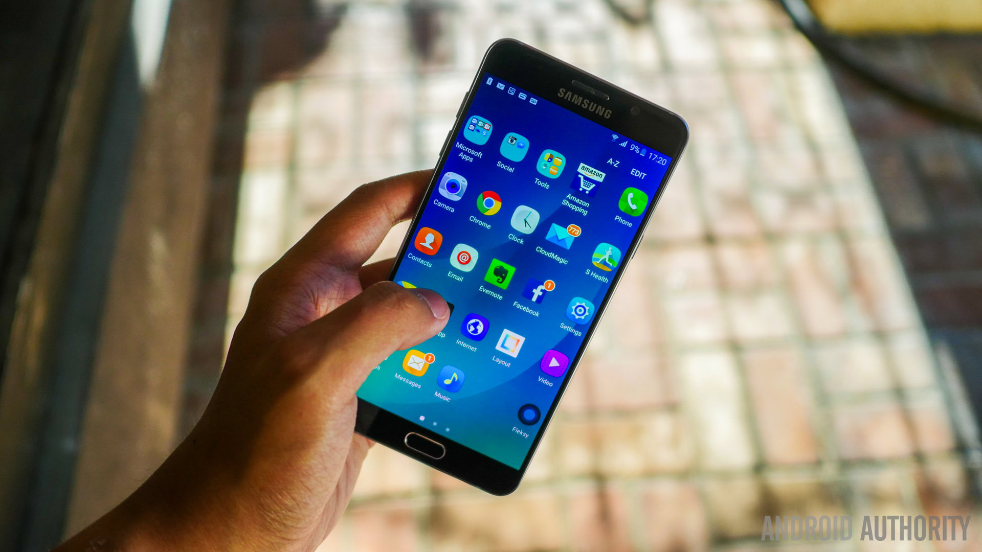
Assuming this will go through, it raises the question: Is Samsung doing this of its own volition, or is this a product of Google’s “suggesting” such. Several years ago recode published a story that indicated Samsung was specifically cited as having arguably “angered” Google to the point where Mountain View had a sit-down with the partner OEM to discuss ways to make TouchWiz more similar to the Android vision Google itself has put forth. Recently HTChas worked with Google to remove excess bloat and duplicate Apps from the recently released HTC10, though the device still has an App Drawer.
Wrap Up
While the new look might cause some concern for some, it’s useful to remember that Android lets users install any number of custom launchers without having to root the device. Google’s own Google Now Launcher is an option, as is Nova Launcher and countless others.
What do you think, though? Are you excited to test out this incarnation of TouchWiz, or would it actually anger you? Leave some comments down below!