Affiliate links on Android Authority may earn us a commission. Learn more.
Samsung Galaxy Note 7 review (updated)
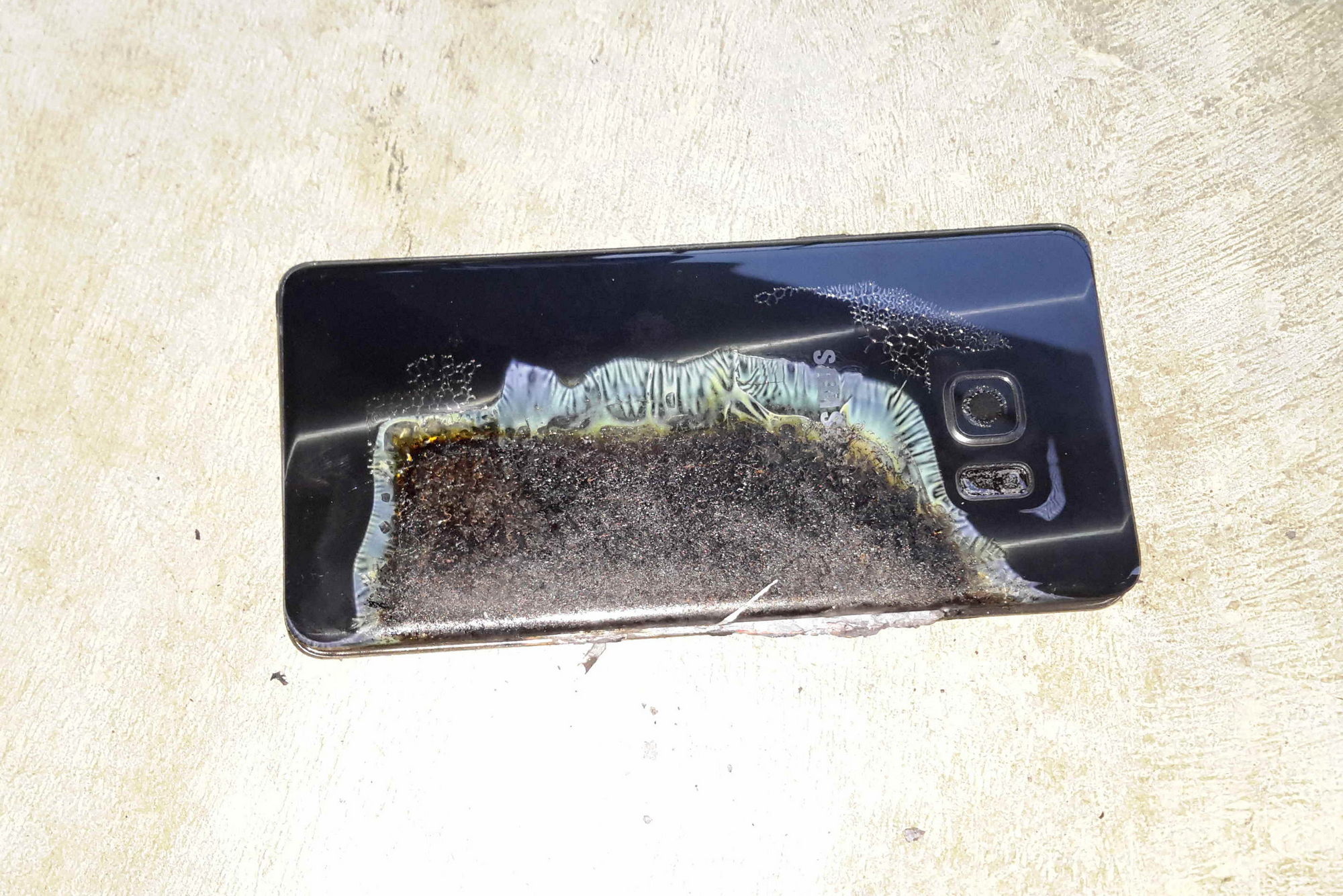
Update (10/12): In an unfortunate turn of events, Samsung has fully recalled and halted sales of the Samsung Galaxy Note 7. Considering Samsung’s current official recommendation is to turn off and return the Note 7, we can obviously no longer officially recommend the phone. It’s a shame too, as this device was easily the best phone ever created by Samsung, and perhaps the best by any OEM in smartphone history, with a strong 9.3 rating in our original reviewing.
For more details on the Samsung Galaxy Note 7 recall and production halt, check out our Galaxy Note 7 recall information hub.
Here we are – Samsung went ahead and skipped a whole number to bring out their newest Note device. Though the main reason makes a lot of sense – Samsung wanted unification of their Galaxy line – the very notion of skipping a whole version is an interesting one. Does the phone actually innovate or jump forward to justify going from 5 to 7?
Or, as we have started to see in the Galaxy over the last couple years, are we just subject to the decisions of big Samsung and are getting a small step forward in an otherwise established line of smartphones? If history is privy to repetition, is it entirely possible that the next in the Note line simply repeats the same while coating it in what they hope looks different? All of these questions are pondered in this, our full review of the Samsung Galaxy Note 7.
Design
It feels like a long time since we were introduced to Samsung’s unibody dual glass design on the Galaxy S6, a move that plenty of us thought was a welcome far cry from the plastic phones of the past. Since then, Samsung has tried to incorporate new design elements into what their Galaxy phones were clearly going to look like moving forward. This included the Edge, originally brought to the forefront in the Galaxy Note Edge – perhaps a phone that hasn’t been given the credit it deserves, with the Edge now being a Galaxy mainstay. And there’s no better place to see that than in the Galaxy Note 7.
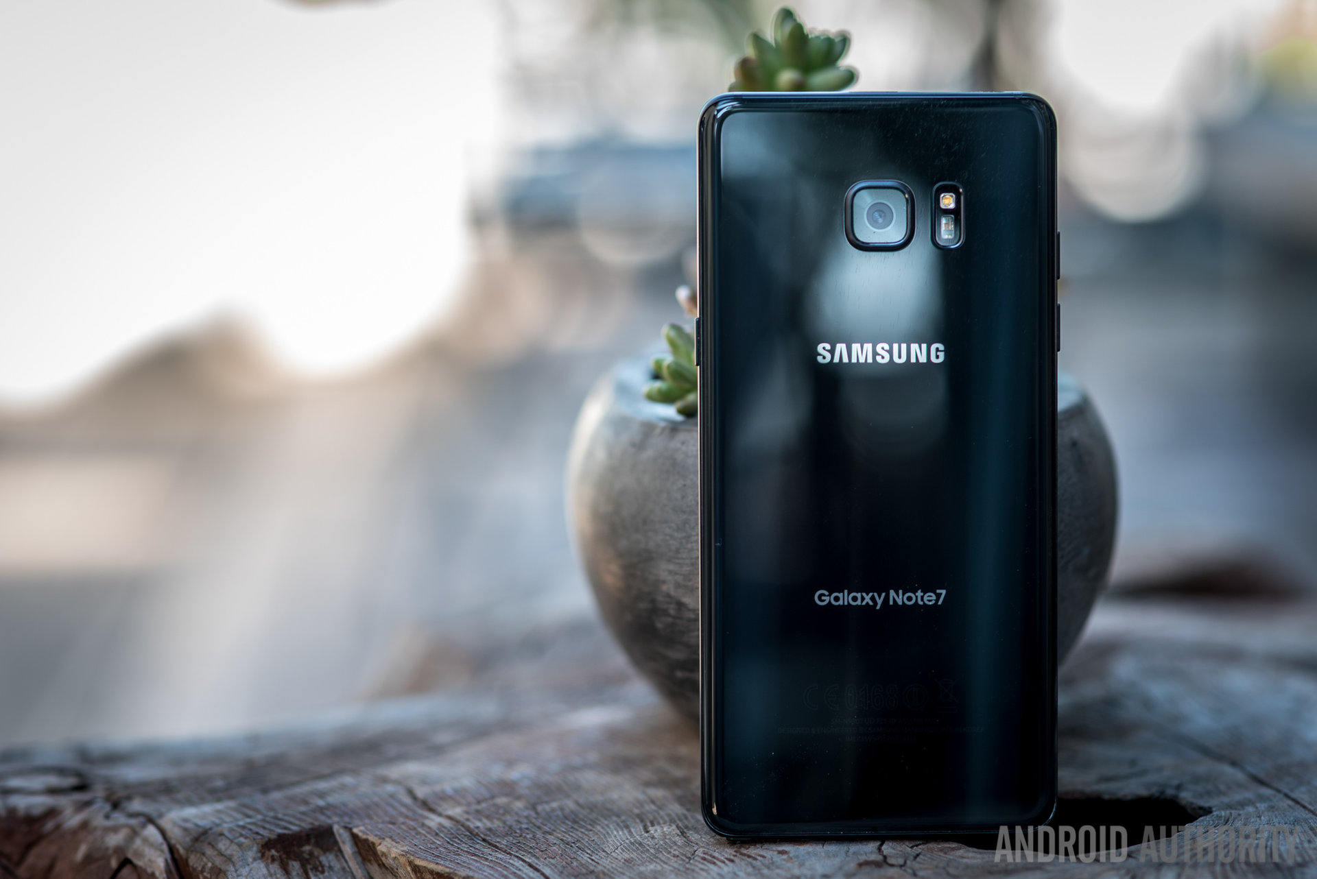
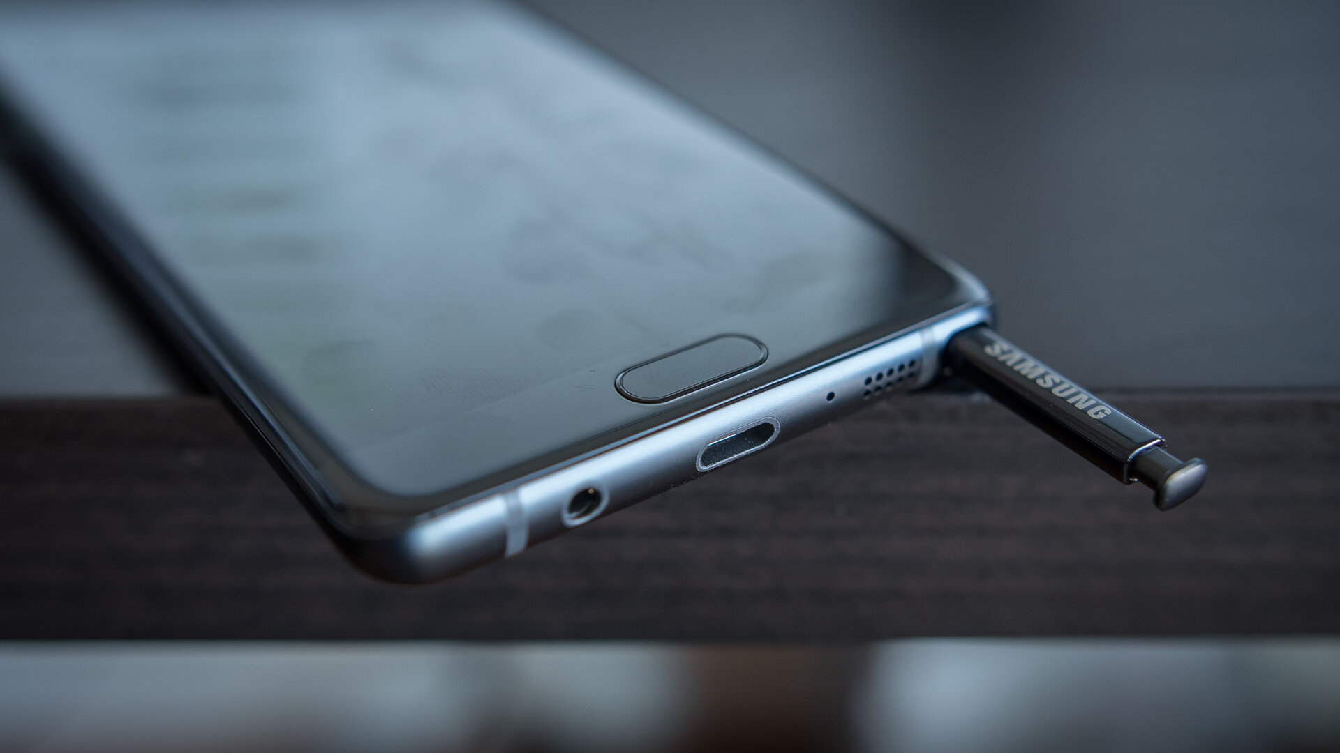
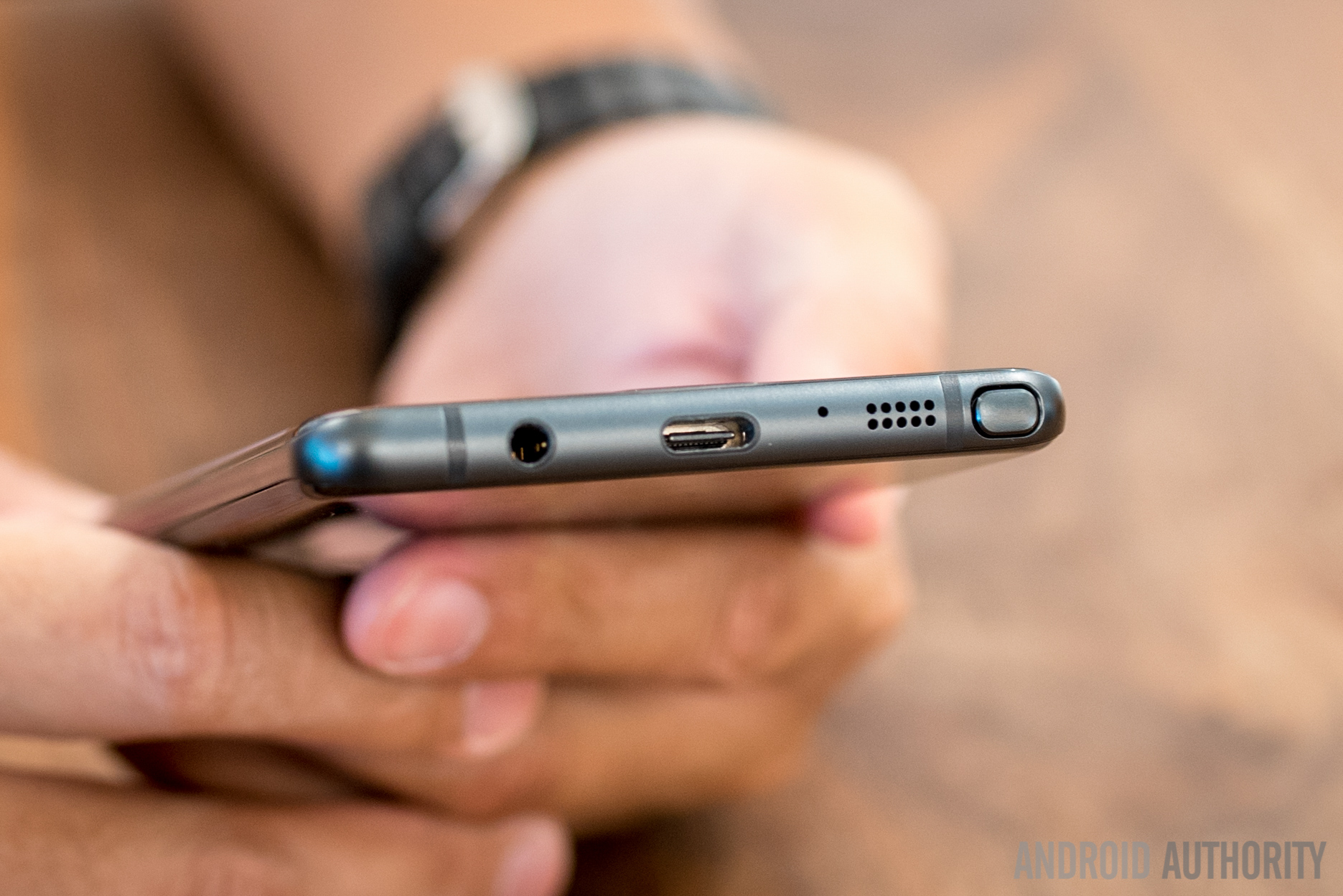
So, at its core, there are basically no surprises with the way the Note 7 looks – a dual glass design with tactile home button and single camera optics on the rear next to a heart rate sensor. Then there is the Iris Scanner, a dedicated secondary camera module and LED light that accompany the existing front facing camera and notification light. A USB-C charging port is one of the more obvious changes, centered between the speaker, the headphone jack – that the Galaxy is thankfully still holding on to – and the Note-defining S-Pen.
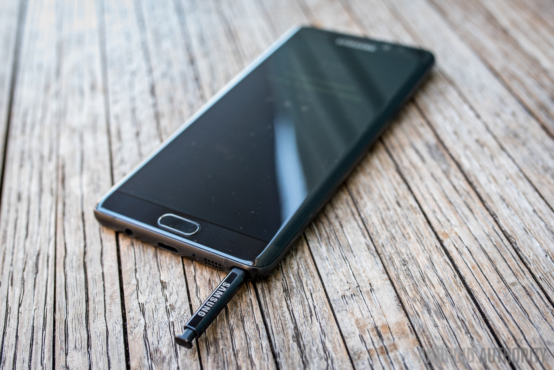
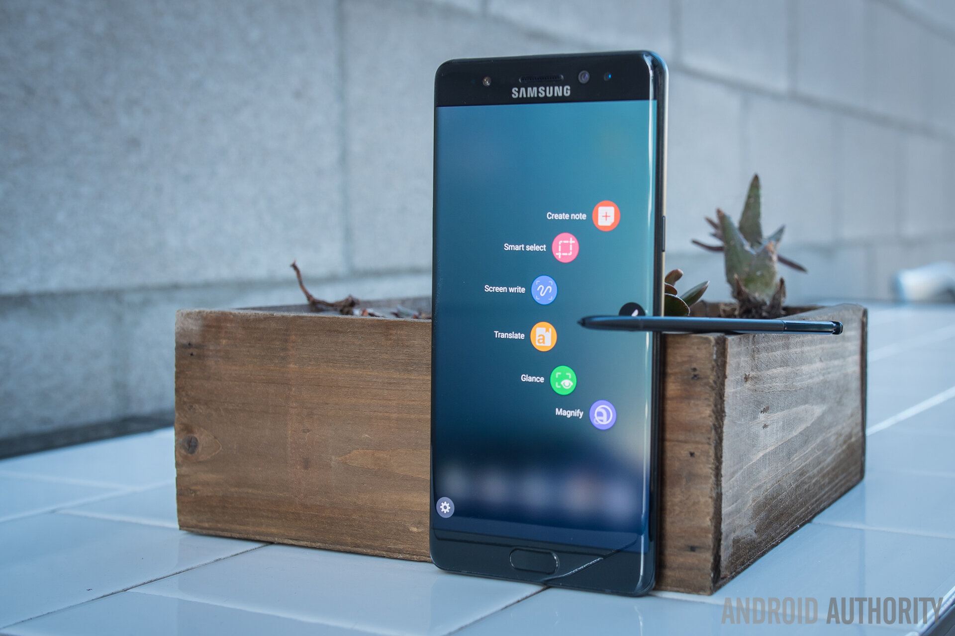
The S-Pen doesn’t go backwards into the slot anymore, thankfully – so no Pengate this year – and it manages to do that with a clicky-top that is just wider than the rest of the pen and the slot that it slides into. All that aside, the S Pen and its singular button feel exactly the same as last year despite some subtle changes – a thinner tip means better precision on the highly pressure sensitive screen and the pen itself is as long as a standard ballpen. None of this means an even slightly different experience physically using the Note 7’s little friend.
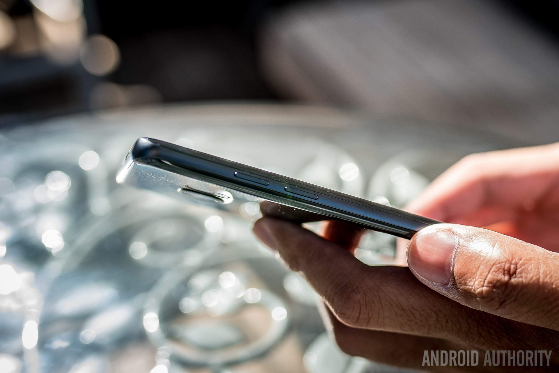
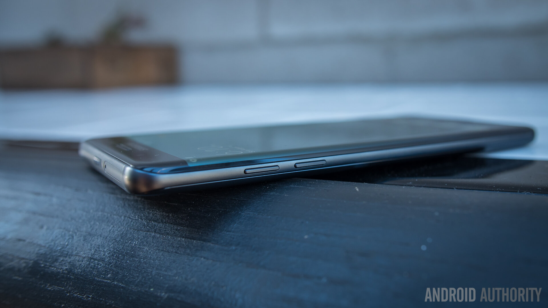
Subtle is the word to use for the refinements to the phone’s overall design, but they actually work to change the handling experience of Samsung’s famously large smartphone. The 5.7 inch screen is now curved – and that is the deal, as there will be no flat version of the Note nor any other types to accommodate the Edge – but a curve is actually found on the backing, too, much like the previous Note 5. The marriage of these two curves was summarized in one main word that Samsung was keen to make very clear in the phone’s introduction:
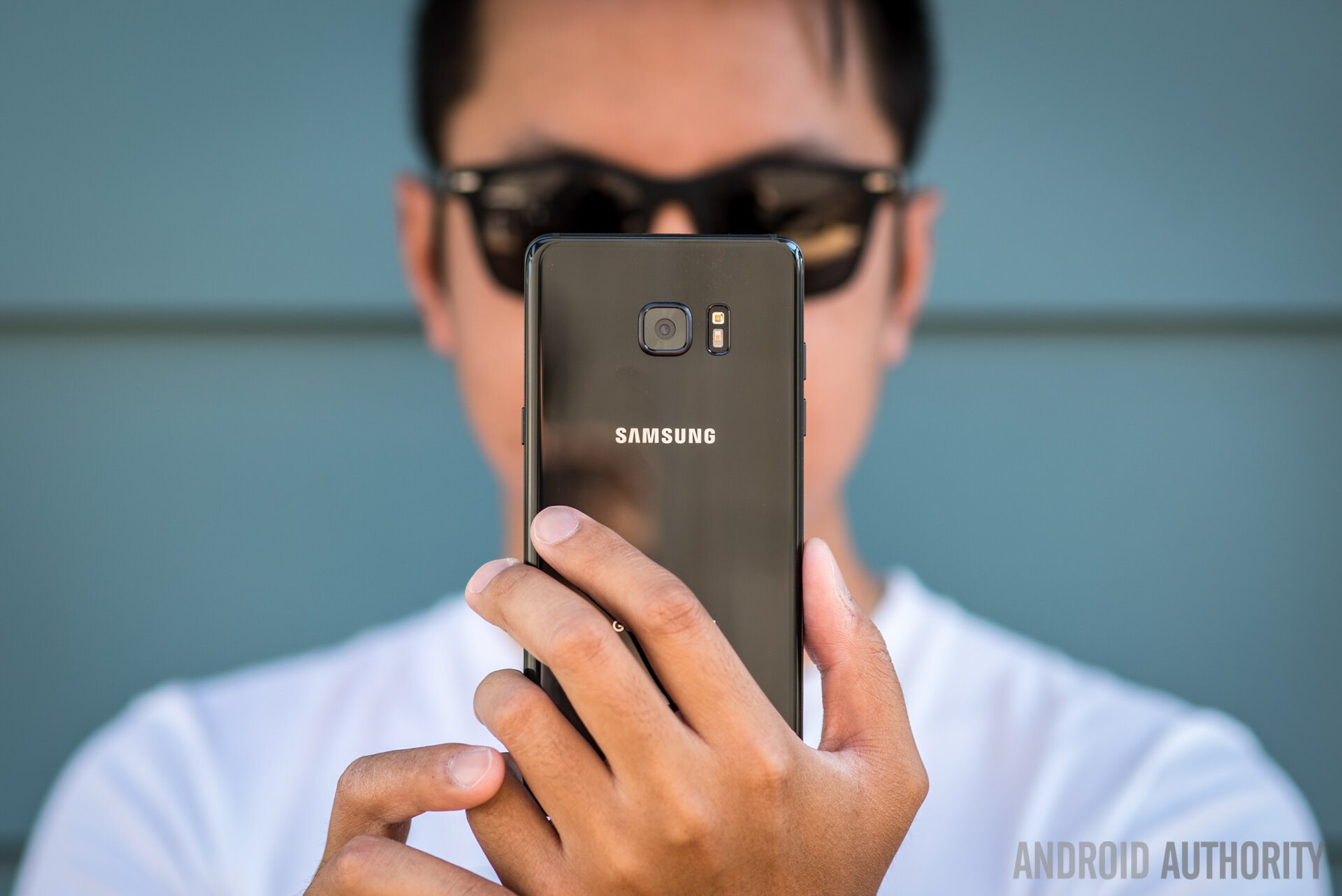
Symmetry. It is a design term that is not always used in the world of smartphones and, indeed, is often relegated to art and architecture. But designers of the Note 7 made it a big focus this year, to wonderful effect. The symmetry is not lost on the eyes, but it does have to somewhat be searched for, because the Note 7 retains the overall design DNA of the Galaxy S7 Edge. But it’s when one grabs and handles the phone that the symmetry becomes one of the most welcome additions to what used to be a functional, powerful, but ultimately somewhat tone-deaf Samsung design history.
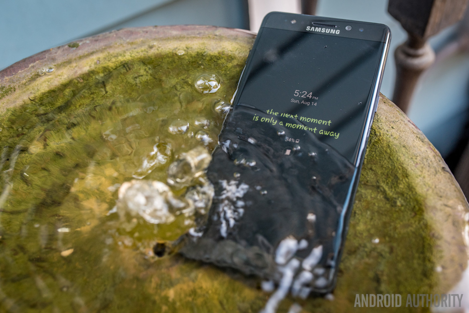
Of course, the final change to the design here is IP certification. Now, the Galaxy Note 7 can be submerged in water for some time and still tick; or write, rather, because it is possible to use the S Pen underwater. Maybe users won’t be writing or drawing in the pool or ocean, but for the vast majority of people, at least this phone won’t break due to a splash.
What Samsung has managed to do with the Note 7 is something users like myself probably didn’t know they wanted – a larger phone experience that feels accessible. Even though the Note 7 might not win any medals for one handed usage, it is definitely one of the most comfortable big screen experiences that we have ever had the pleasure of using.
Display
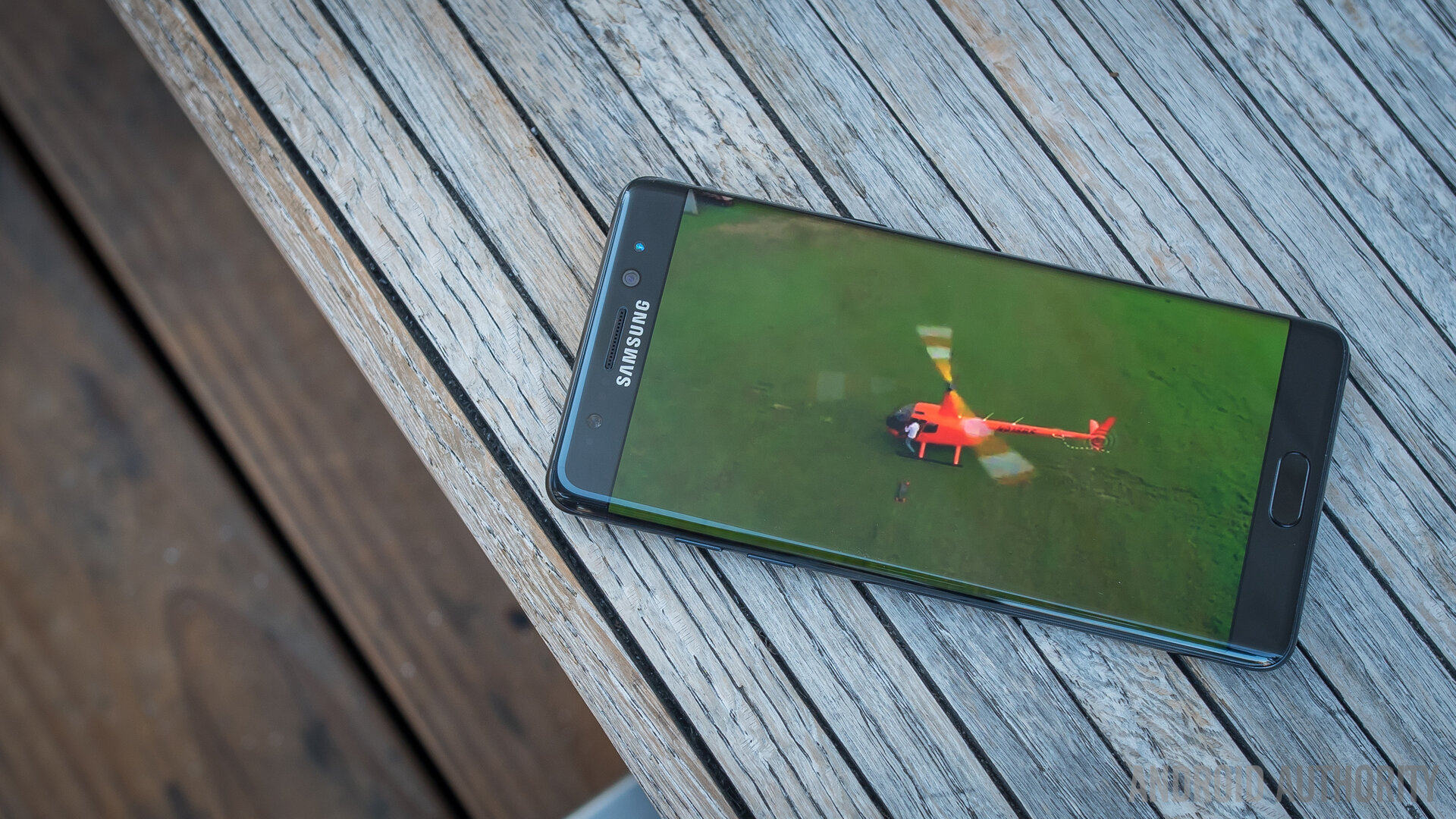
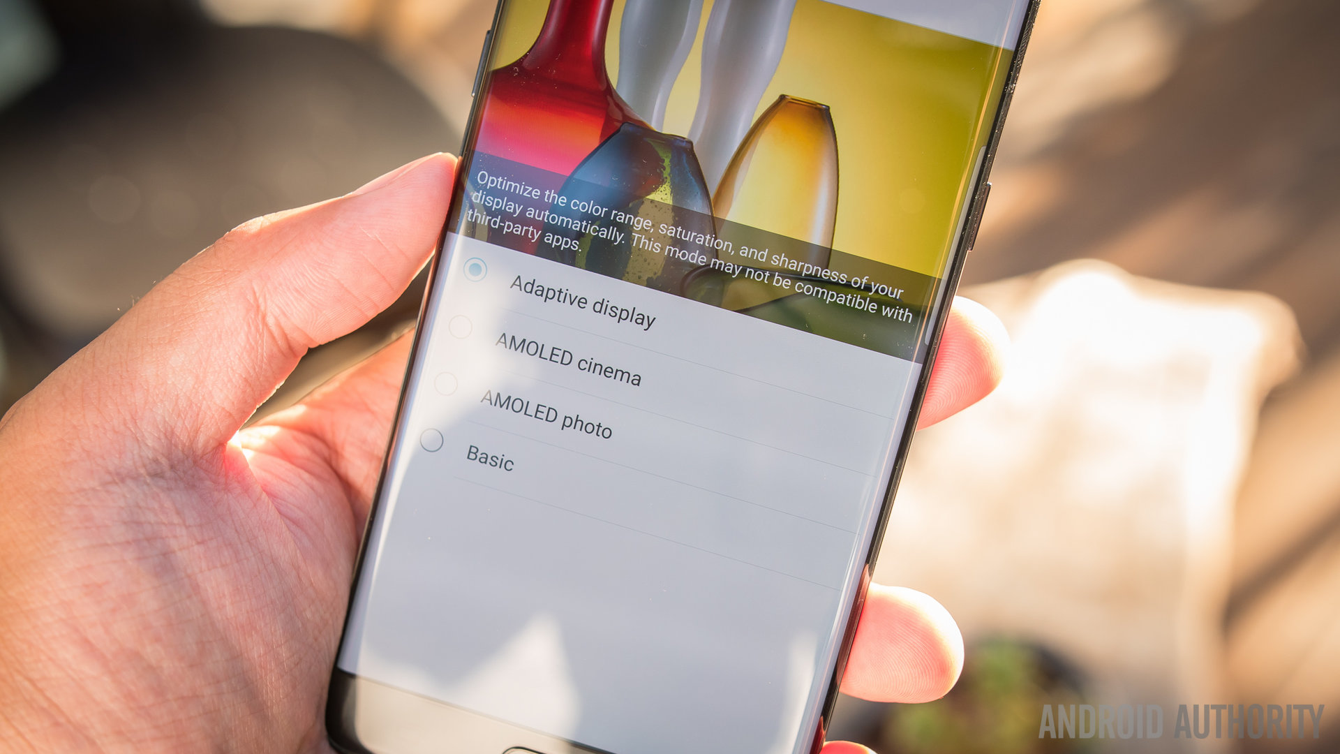
Samsung hasn’t really leapt forward in much of the Note 7, and that starts with the display – a Quad-HD resolution Super AMOLED display that pumps out some of the most saturated colors in smartphones. Granted, this can be changed in the settings among a couple AMOLED modes, a bland (in comparison) Basic mode, and the default Adaptive mode that tries to change it up according to what is being displayed.
Speaking of color, a Blue Light Filter is easily accessible in the notification shade and can be set on a schedule so that it only triggers when it matters – after the sun goes down. Users might not be all that in tune with the benefits of a Blue Light Filter, so allow me to explain it plainly – the harsh blue light of electronic displays, especially late at night, make it harder to get more sleep both in quantity and quality. As one of our resident AA health-nuts, I make plenty use of this feature.
It is important to note that the resolution can also be changed in the name of battery savings. In the Device Maintenance area of the settings, the resolution of this 5.7 inch display can actually be made as low as 720p. It’s easy to see the difference between Quad HD and regular HD, which means we don’t think users will change resolutions often unless power saving is highly in demand.
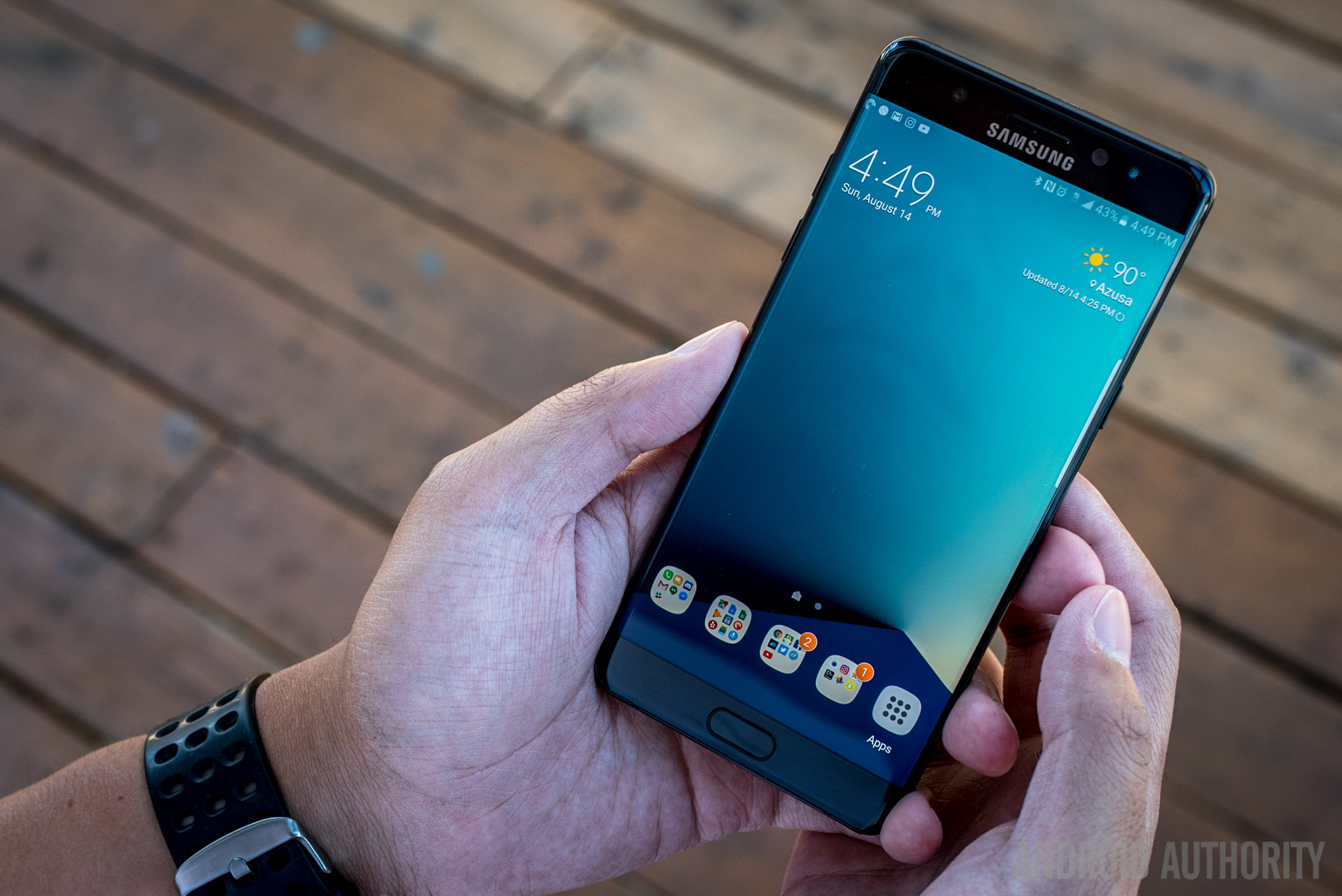
A big deal from the Galaxy S7 line now makes it over to the Note, and that is the Always On Display. Though we found it nice to have the time or a calendar always at the ready on the Galaxy S phones, Samsung has brought it a step further by making it a little more customizable.
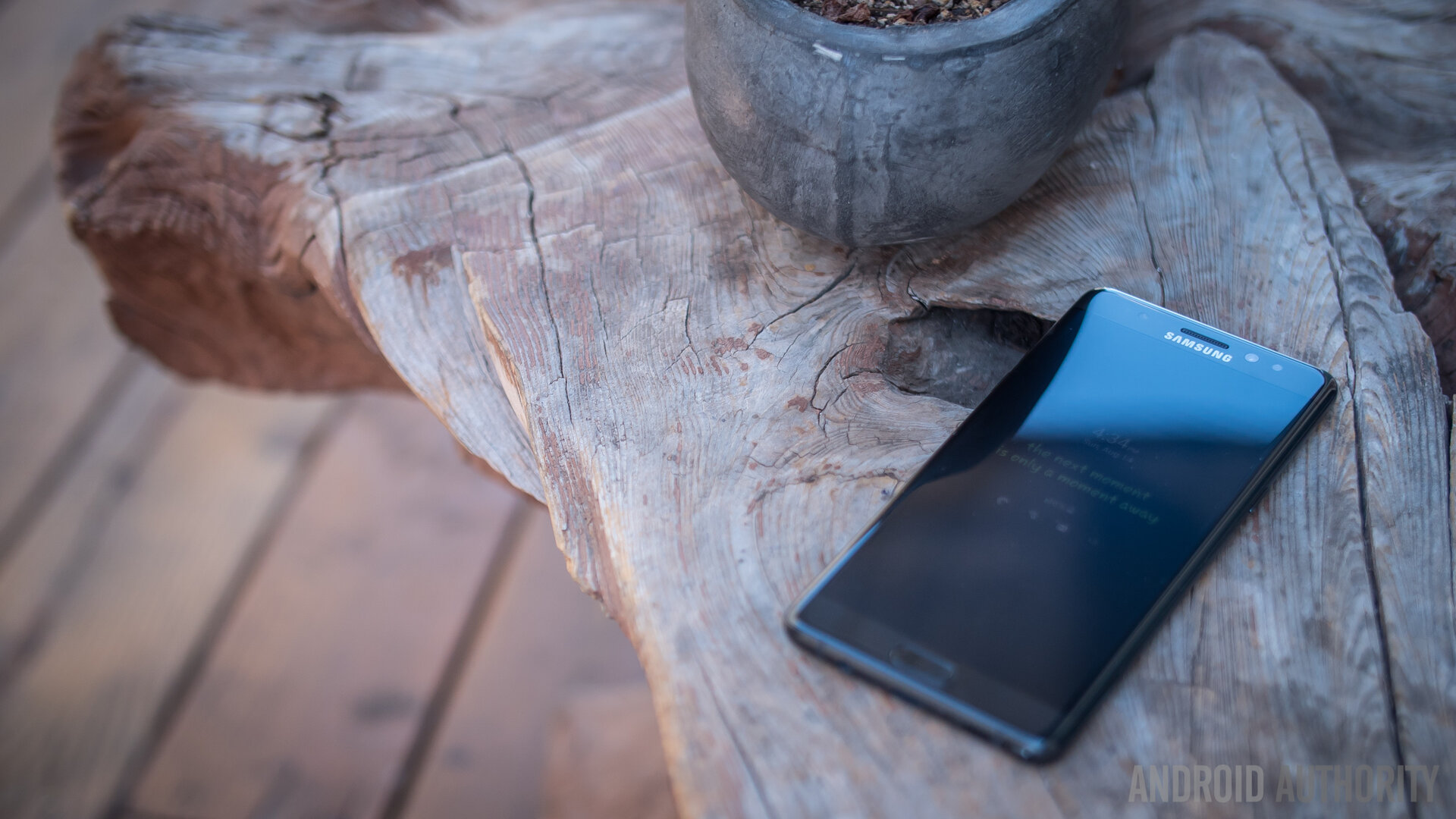
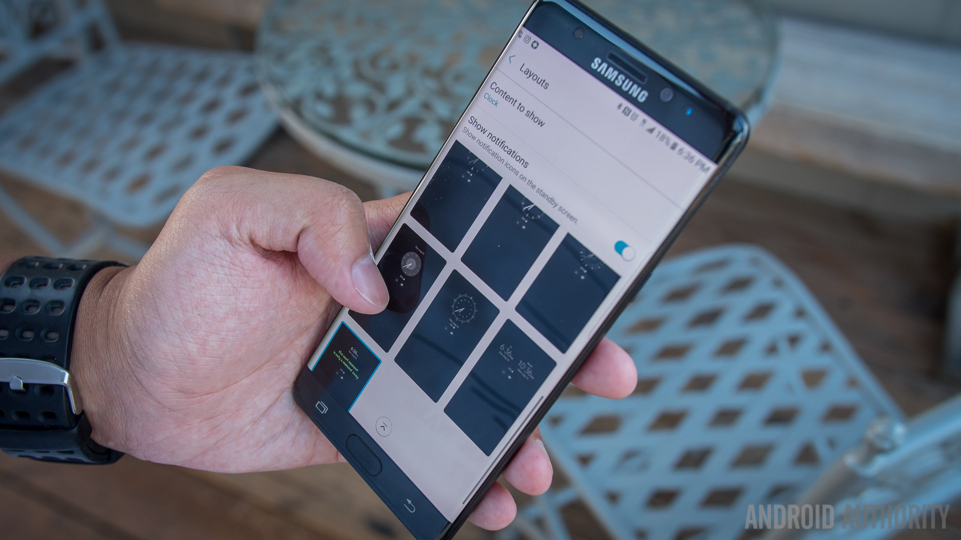
In the settings, the AOD can be changed to have a number of different clocks, a few different calendars, and a small number of canned images. A favorite of these options is the ability to put in a personalized block of text. The AOD lists the different notification icons that are sitting in the notification shade, so you can get a quick glance at what is waiting for you under the lock screen.
Considering the Note now employs the curved display, the Edge screen elements also move over from the S7 Edge – but there isn’t really anything new in the Edge UX. What is worthy of note is that the angle and curve of the display isn’t very egregious, so accidental presses from user palms shouldn’t be that much of nuisance. As a matter of fact, we found touches to the very edges of the curve harder to trigger – thankfully, this is pretty much never an issue and doesn’t impede in any typical tasks users may do. It is far more common to slide from the edge to the middle of the display, like with the Edge UX.
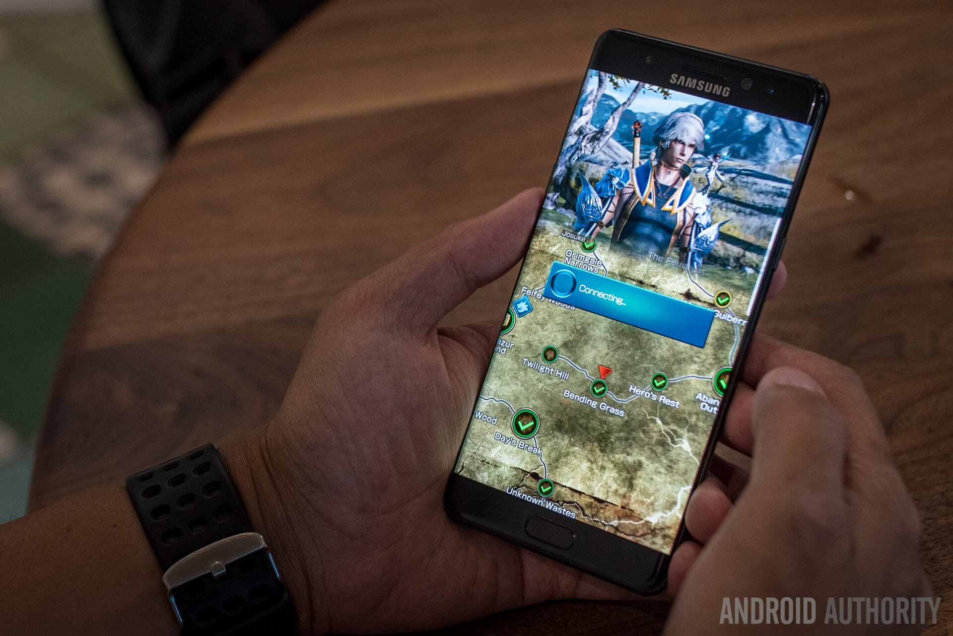
Though subtle, another aspect of the curved screens comes to the Note – Material Design elements that slide from either side of the interface seem to curve into view, which is a rather lovely effect when noticed. A related but somewhat negative side effect of this is a bit of difficulty reading text that bleeds all the way to the actual curves of the display.
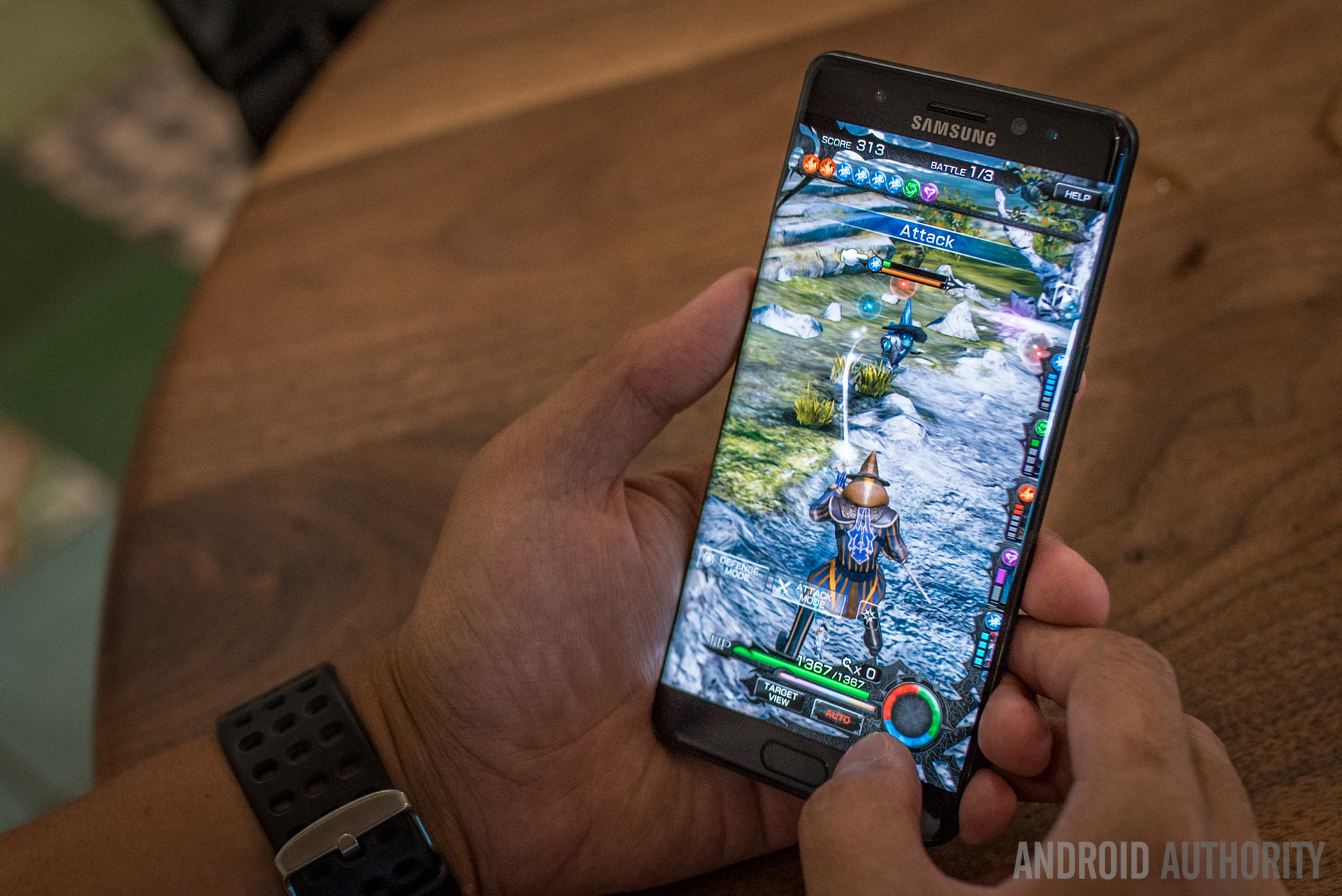
Of course, the above aspects are somewhat nitpicky to what is otherwise an expectedly wonderful viewing experience. Text is sharp across the board, video playback is always nice on a larger display, and playing games like MOBIUS Final Fantasy proved to be really fun with such a vivid screen. Though there are a few additions made to the overall experience, they do well to bolster what was already considered a great experience in the Note line. “If it ain’t broke, don’t fix it” might be the axiom to employ here, but it might be more practical to just say there are little to no complaints here.
Performance
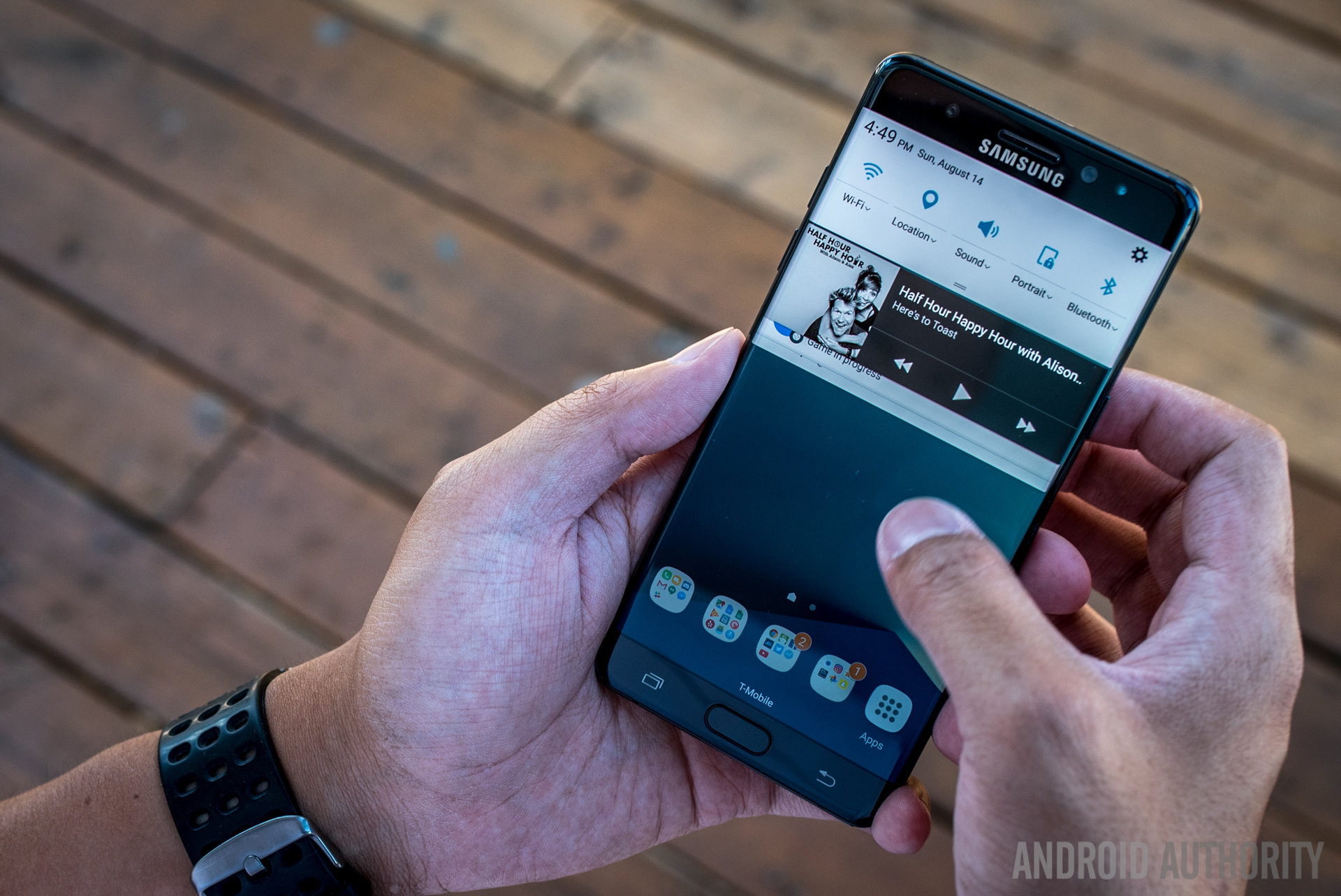
The same sentiment can just barely be used with the processing power and overall performance experience, too. Users familiar with the Galaxy S7 and S7 Edge know what to expect here – the Snapdragon 820 with the Adreno 530 and 4GB of RAM. It is worthy of note that the Exynos 8890 edition of the phone will also be produced but it won’t be the version made readily available to users in the West.
It’s not hard to merit the Snapdragon 820, one of the most abundantly available SoC packages found today, because it has proven itself as a reliable and good performing processor. The same can be said for the Adreno 530, which has been able to render and play MOBIUS Final Fantasy and Final Fantasy IX with the best of them.
Where we find a little bit of a fleeting desire is in the amount of RAM installed. 4GB of RAM will not make the majority of users feel like they are lacking, but some users have already lamented that the Galaxy simply does not have good RAM management.
Even if that were not the case, we’re dealing with one of the most feature-heavy devices on the market, the Note – this is a phone that takes on all of the already existing demands of smartphone users and adds a myriad of capabilities in the form of the S Pen and its software. While we don’t think that there is a huge hurting for higher RAM capacities like the nice 6GB found in the OnePlus 3, we also can’t help but think that perhaps an amount like that could have been the inch that feels like a mile.
We didn’t have these feelings often, as slowdowns were still rather far and few between. Still, that little bit of forward thinking could have made a huge difference. For the vast majority of the time, the Note 7 will perform just as well as any other Snapdragon 820 powered device, even with the laundry list of features that Samsung puts into their software – which we will explore soon.
Hardware
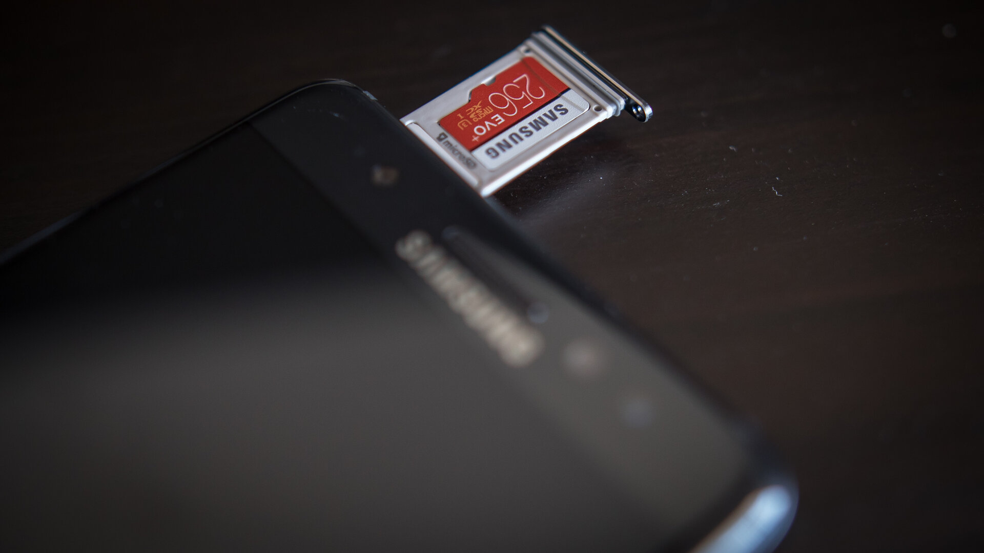
Despite the lack of higher RAM capacities, which would have been a great move supporting power users, Samsung did well to close the gaps in storage – 64GB is the built-in storage option, with no higher or lower options to be made available. Unification of the line, indeed. And even then, the ability to put in a microSD card is another boon to Samsung, who have just released a 256GB microSD card that we gladly popped into the phone for that added peace of mind.
Calls on the Note 7 all sound fine, with no real frills or thrills, even with Wi-Fi calling getting some front exposure depending on what carrier you are on – mine was on T-Mobile. Nonetheless, both ends had no issues with the call quality and there were no drops. The on-board speaker, unfortunately, doesn’t evoke the same sentiment – it is simply not loud compared to even other bottom mounted speakers, much less any front facing or dual stereo speakers we’ve seen on plenty of other phones. Simply put, it is continually one of the weakest points of the Galaxy line.
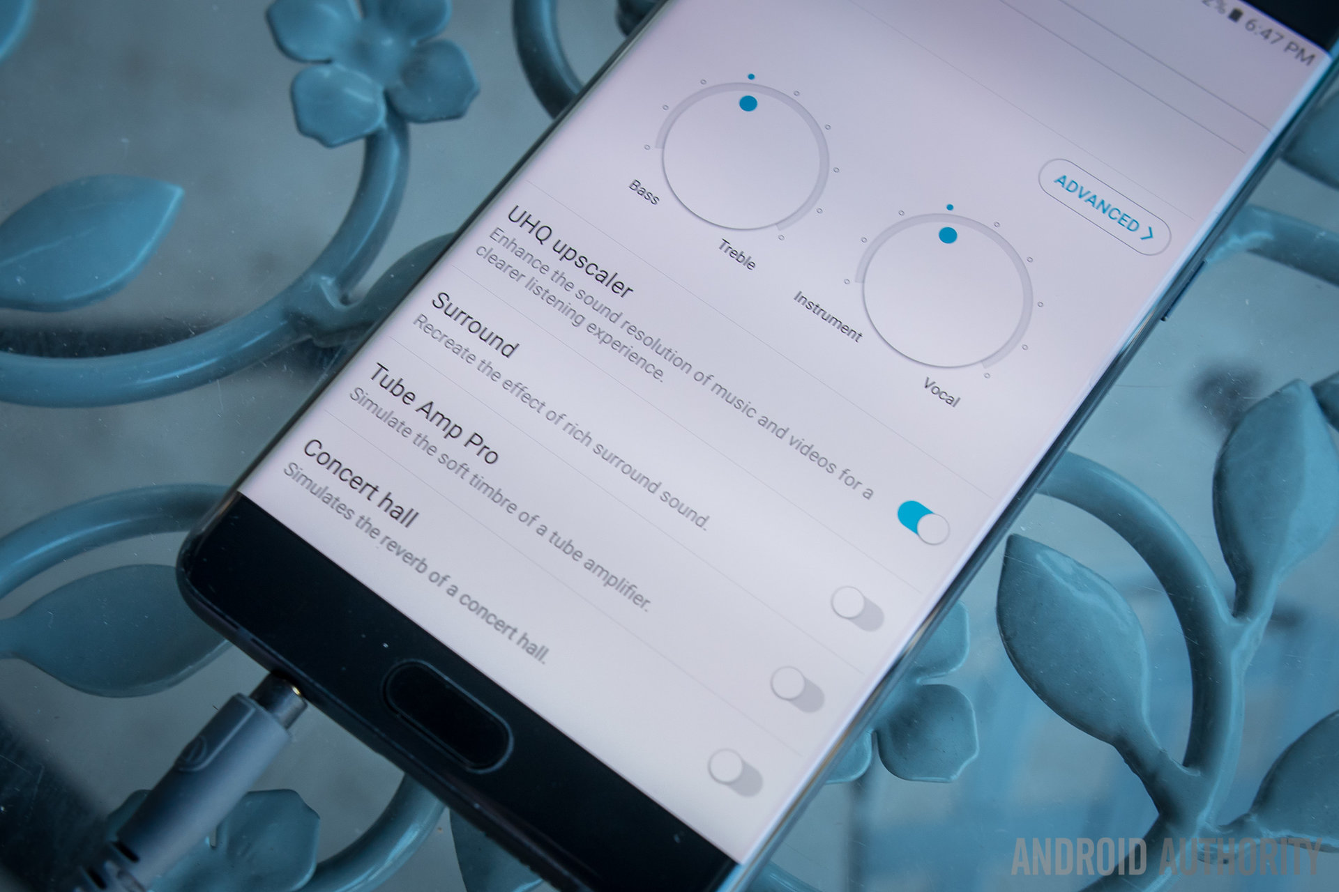
Plug some headphones into the headphone jack, and breathe a sigh of relief – if the headphone jack is to go away in the near future for Samsung, you might as well cherish it right now. Thankfully, the experience is above average, even if not by leaps and bounds. There is no dedicated DAC working in especially this Snapdragon 820 edition of the phone, nor is there an AMP to really drive a good pair of cans like my Audio Technica M50x headphones. That said, Samsung does put its best foot forward by providing plenty opportunity to tweak what they were given to work with.
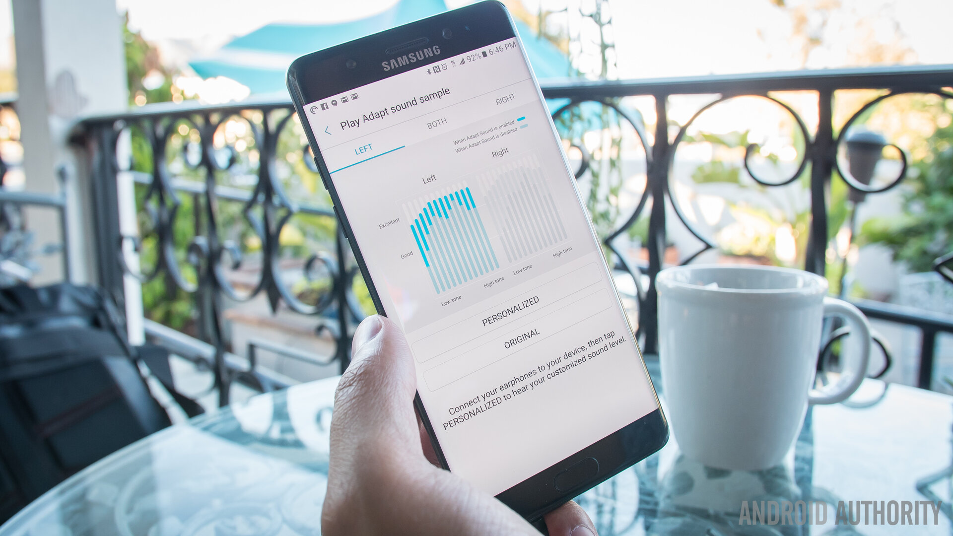
Some users might remember SoundAlive from a few other Samsung devices, and it returns in the Note 7 to provide sliders and dials to cater the sound coming out of that headphone jack. At its simpler level, emphasizing bass or treble and instrumentals or vocals can get the sound to lean more in the direction one wants, but for even more fine tuned control, the Note 7 can analyze and enhance plugged in headphones through a rather long process of beeps and user input.
By figuring out the headphones by way of the listener’s ability to hear said beeps, the EQ will adjust to bring out the best possible sound. Of course, this means little if the phone cannot drive headphones with the power audiophiles want, but I was plenty happy with what resulted. It might not be HTC10 levels of audio, but it is certainly in the right direction.
Battery Life
Battery life was a key focus in the Note 7, a phone that comes at moment in time when users are simply going to deal with what having bigger batteries entails. Thankfully for the Note 7, 3500mAh is the capacity standard and it is what users get in a pretty slender and sleek body. Anyone looking for more than this might have to contend with the brick of a phone that results, but at least with 3500mAh there is plenty to work with.
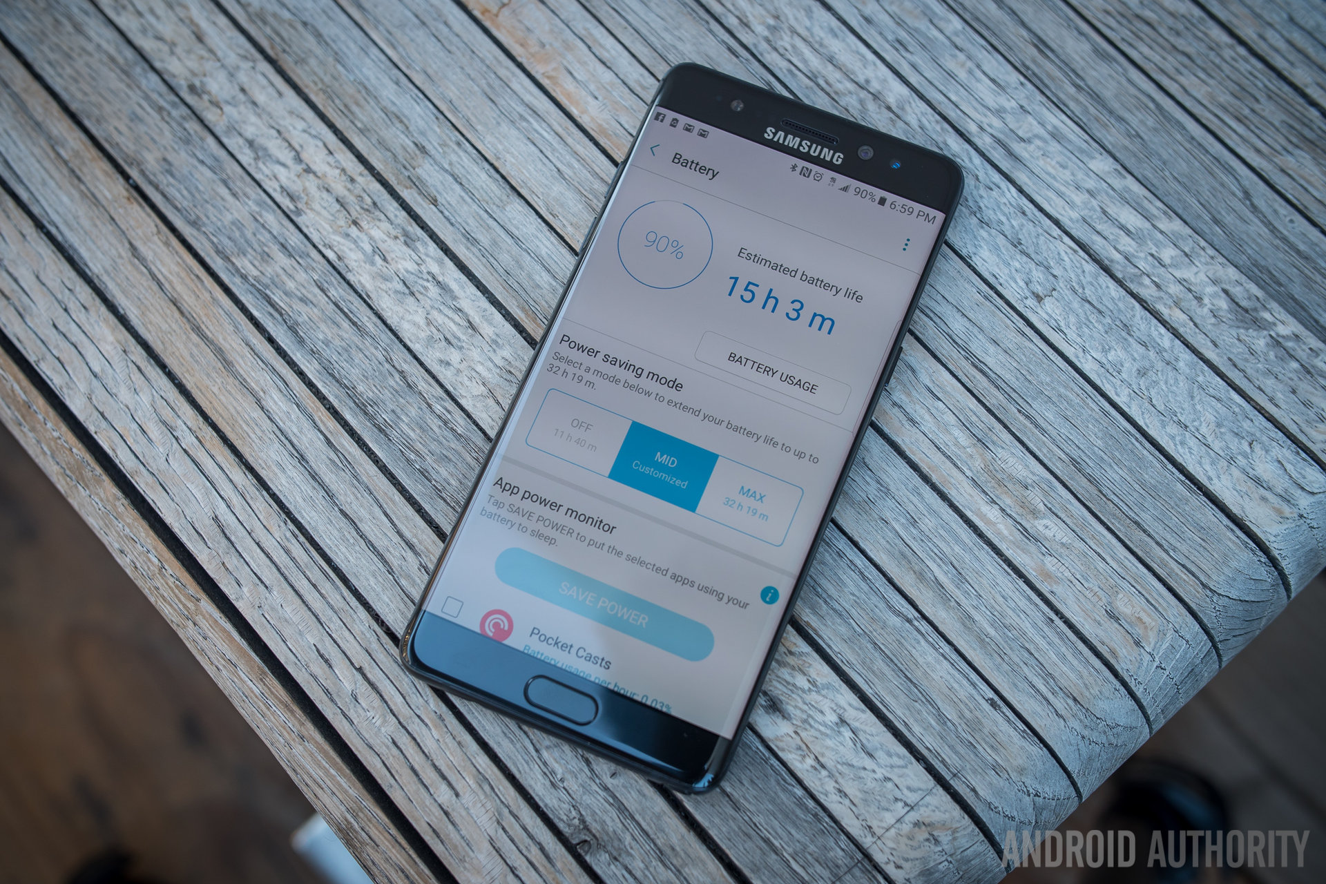
Thankfully, battery saving options are abundant, with a lot of customizable options to get the most out of the phone. This is all found in the Device Maintenance area of the settings, where a number of tweaks can be made to the user experience – clearing out some storage, some RAM, and changing some settings to get better battery life.
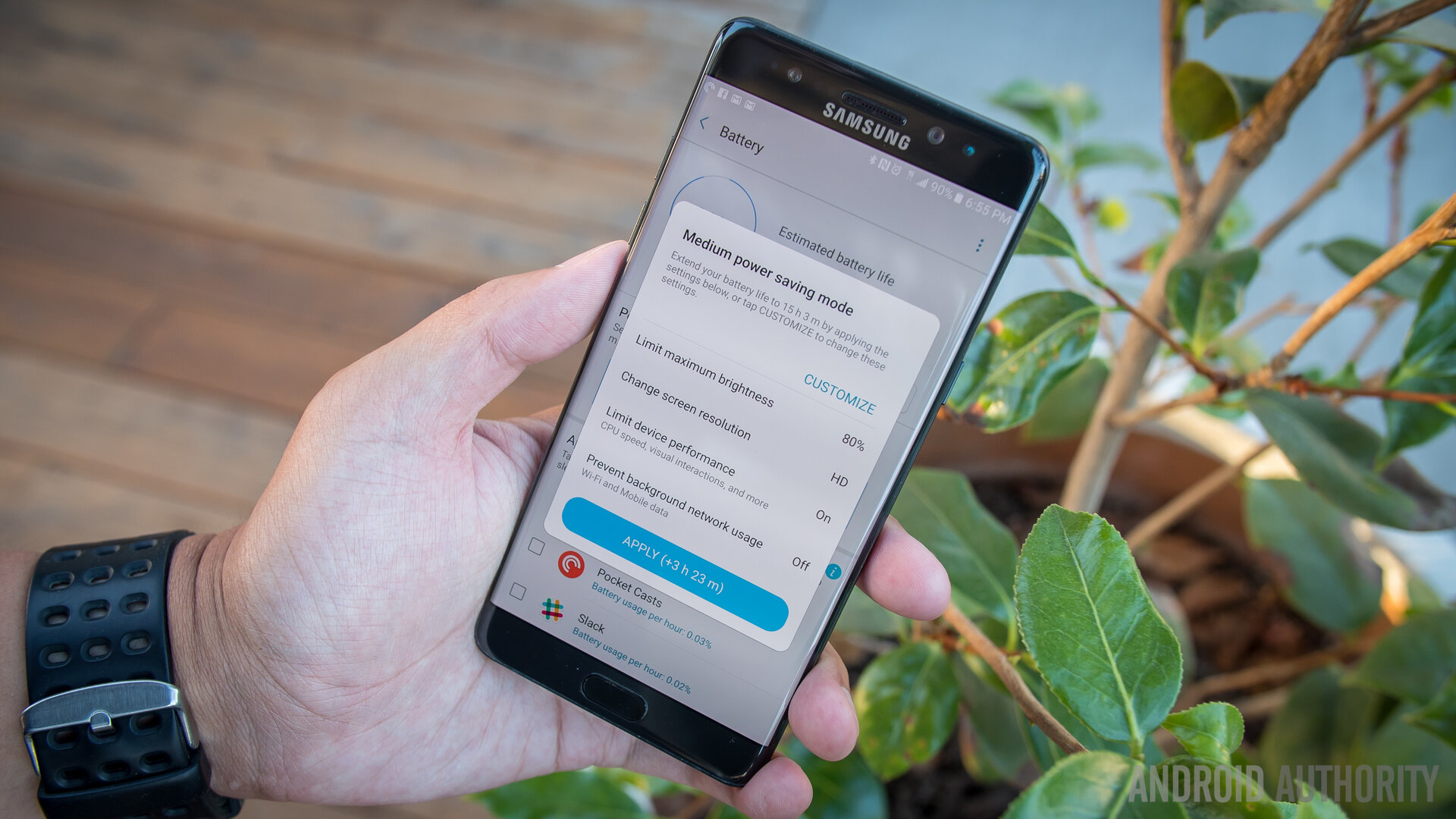
These options include not only the toning down of the processor power, but also the lowering of resolution in the screen. Yes, you can make the Quad HD capable display output only HD Android. All of these options can bring up the amount of hours one has left in the battery – according to Samsung – and it always seems to be a little generous, as always.
But our time with the Note 7 has been properly mixed, and by that I mean depending on one’s usage and circumstances, the battery can certainly go the distance. A short test from our own Android Authority battery testing app used a mixture of gameplay, web browsing, and video playback while on Wi-Fi, and predicted that the screen on time can be more than 6 hours.

In my own testing, I decided to try and recreate this with my own real life usage, I binged YouTube on my home Wi-Fi network for a very large portion of the day (for science!) and played some Final Fantasy before bed. Sure enough, the Note 7 was able to take the hour long episodes of the Game Grumps with no problems as it blasted past 4 hours, then 5 hours, and then conked out at around 6 hours and 15 minutes.
When circumstances change, however, the results should, as well. A very heavy usage day out and about on mobile networks and doing a lot of Google Maps Navigation brought the battery down to single digits in about 9 hours, with a screen on time of just under 3 and a half. Thankfully, a normal day shouldn’t be so hard on the Note that it only works in the extremes. Normal days with this phone were between the 4 and 5 hour marks in screen on time while easily making it to bedtime without any issues.
But we’re also in a time when fast charging is not just a great feature to have, but almost a full-on requirement of a smartphone. And in Samsung’s case, the USB Type C port brings its brand of fast charging that, they claim, can get the Note 7 charged up in the same time that the Galaxy S7 and its smaller battery took.
That has been largely true in our testing, as the Note 7 got to half battery in about half an hour – if you’re really hurting for juice, it’s little effort to plug in the phone or put it on a wireless charging mat (fast wireless charging is a thing, but when wired fast charging is so good, the convenience of a pad or mat is about all it can boast) in order to get the power you need. And even then, the included adapter will make microUSB cords play nicely with the Note 7 – just remember to use the charging brick included with the phone or there will be diminishing returns to the fast charging claims.
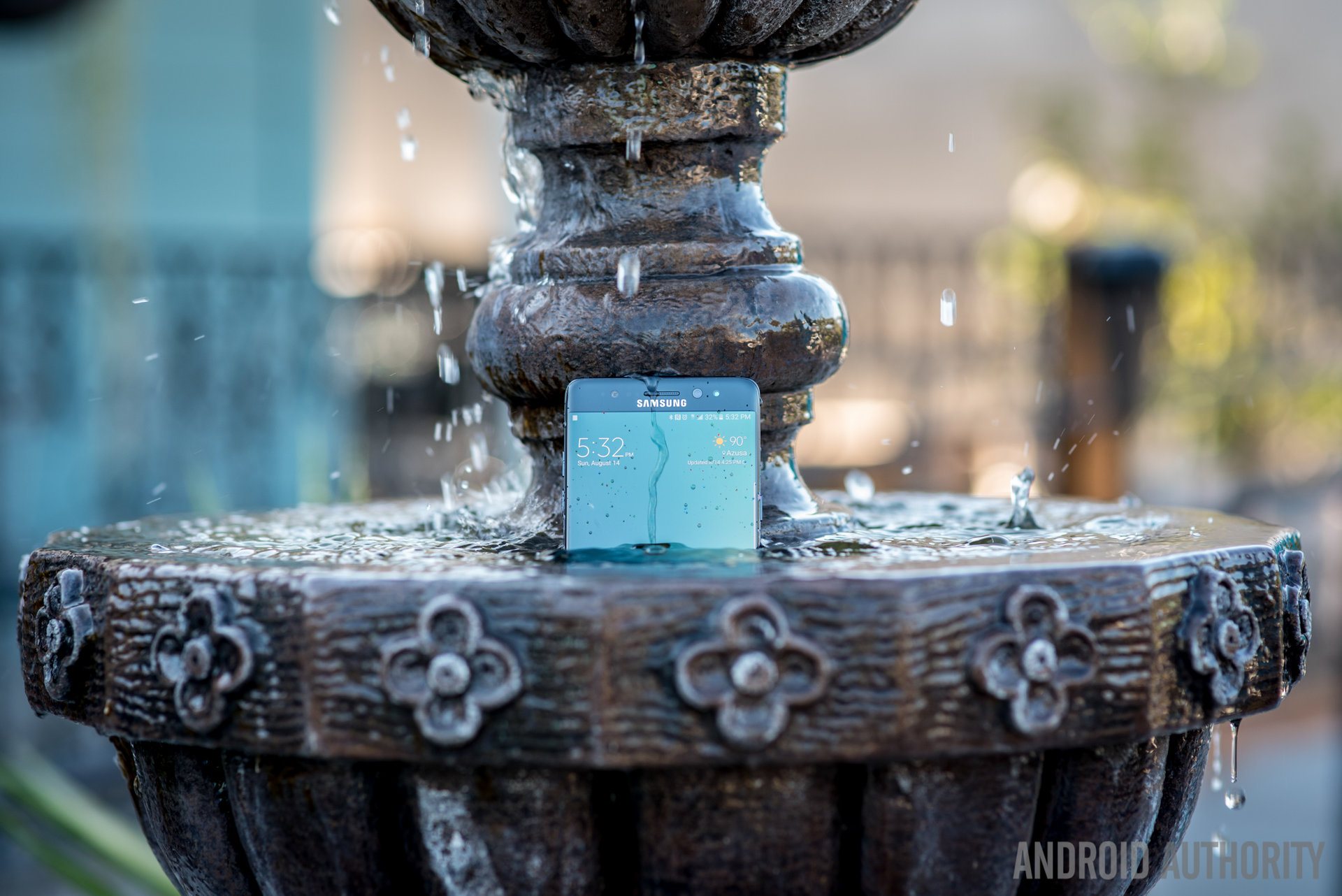
All of this goodness is now in a body that is IP certified – not only will dust never get into the device, but the Note 7 will keep on going even if it gets wet. This is a wonderful feature for everyone’s inner klutz, as a bit more peace of mind never hurt anyone. And though Samsung did try to really push the fact that this phone can write notes underwater – after all, the S Pen is also IP certified – we would just be happy with a phone that still works even in the rain or after picking it out of a spill.
Iris Scanner
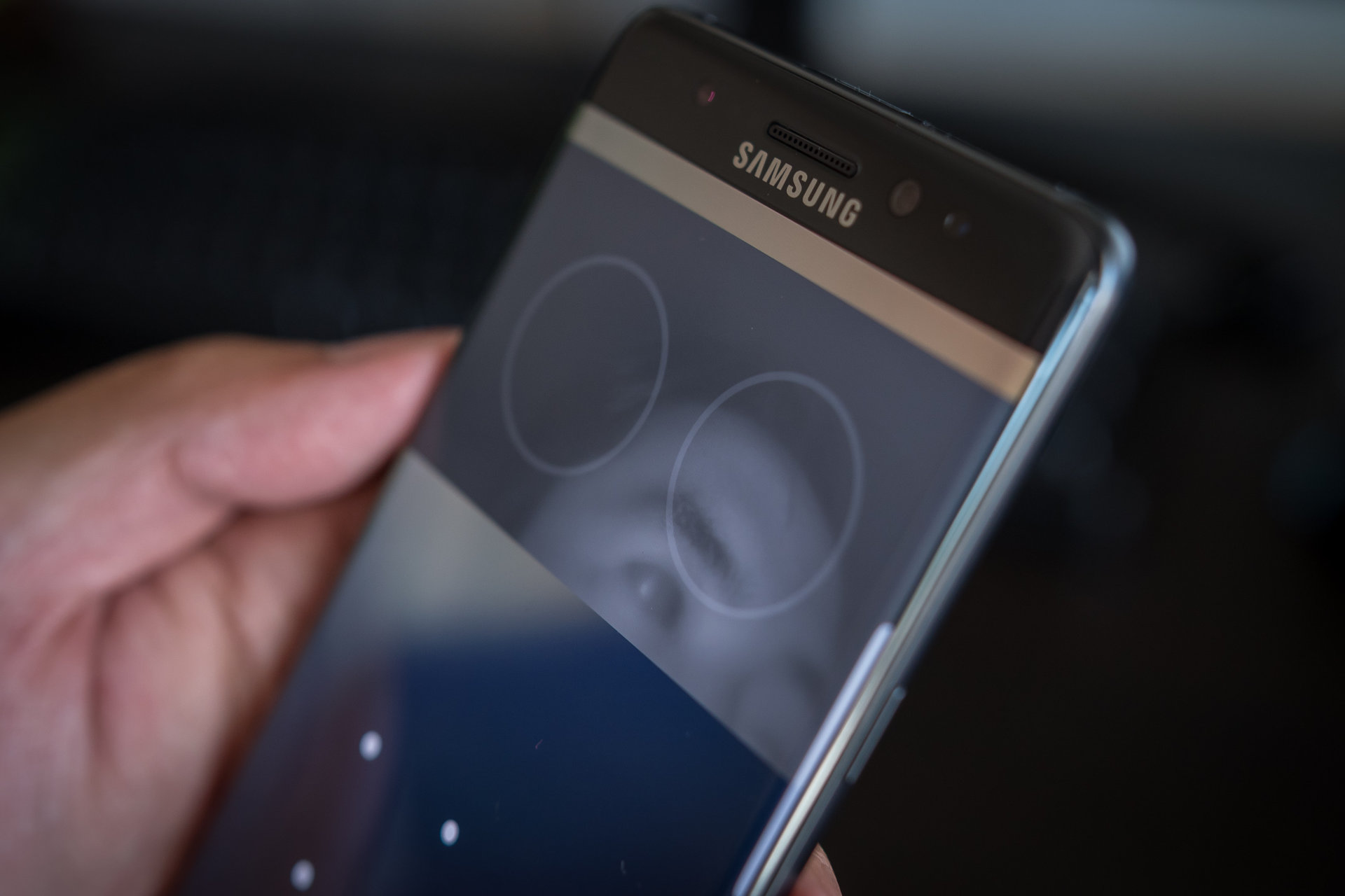
Finally, we come to the Iris Scanner. This is where we’ll talk about Samsung’s new foray into biometric security and it will do nicely as a segue into the Camera talk. After all, this is a new dedicated infrared camera that will scan one’s Iris – the composition of one’s eyes – as a way to unlock the device or other parts of the phone. It takes a little bit of setup, but not much – remove glasses and stare into the Scanner, keeping one’s eyes in the designated areas. After it gets a snapshot of one’s eyes, it’s all set. Having contacts or glasses on, Samsung disclaims after setup, can impede the Scanner’s ability to read Irises, so users have to be wary.
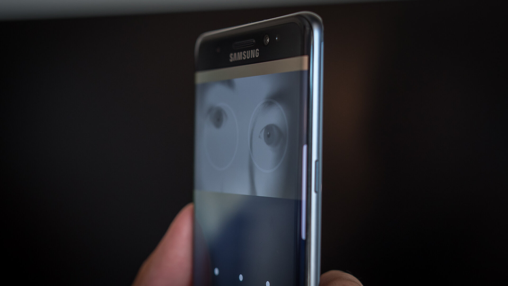
Honestly, after you get the hang of it, the Iris Scanner is surprisingly easy and fast to use. It is still debatable if this is actually faster than fingerprint readers, but the novelty will definitely stick around for a while. To unlock the phone with an iris, one has to wake the device and swipe to start the Scanner. Once we knew exactly where to look and got the muscle memory down to about how far the phone needs to be, this method of unlocking the phone was a piece of cake. All we had to do was already be looking at that part of the phone and when the wake and swipe commenced, the viewfinder didn’t even need to appear – the lock screen would just disappear in an instant.
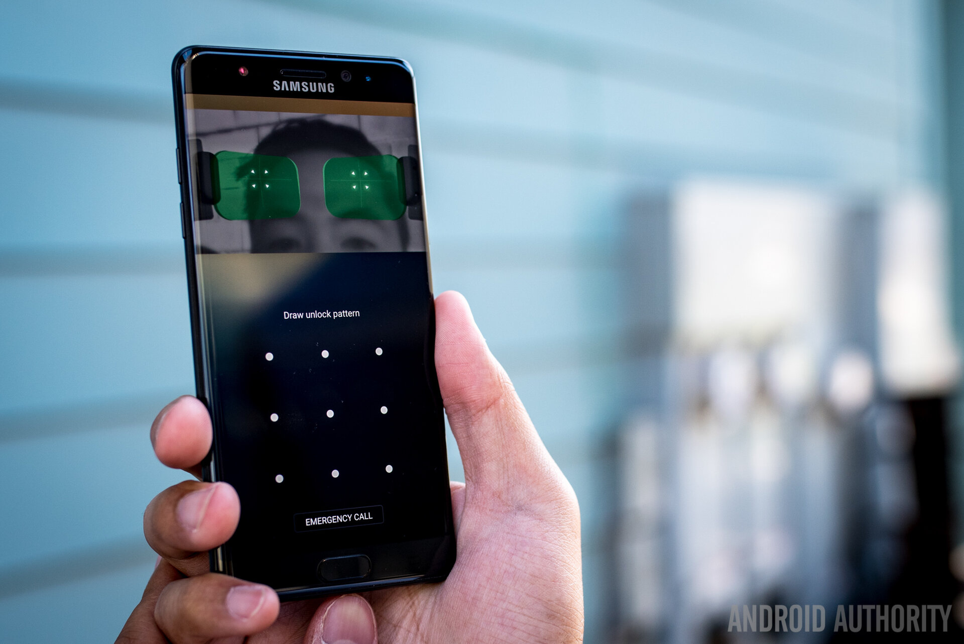
I just wanted to be sure my eyes were wide open for the Scanner.
If you do need some guidance as to where your eyes need to go, there are a few different masks that can make the job easier – or cuter, if you actually pick the cat or dog face ones. Still, the method and the requirements are the same. It can lead to some interesting reactions, but the best one that I’ve gotten was a friend telling me it looked like I hated my phone. When I asked why, she told me that I kept giving it the evil eye every time I held it up to my face. I just wanted to be sure my eyes were wide open for the Scanner.
Camera
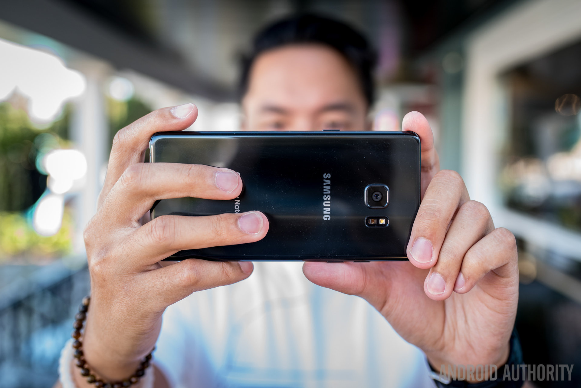
A whole other reason to look at that area above the display is when taking a selfie, and in the camera department, Samsung seems to be confident enough in what they’ve achieved with the Galaxy S7 that the same package makes an encore in the Note 7. Once again, unification of the line takes on a tangible quality.
So, the 12 megapixel f/1.7 dual-pixel shooter of the Note 7 is the same as before – that might not be a very bad thing, honestly, as the S7 was one of the top performing cameras of the year. That large, dual-pixel technology is supposed to help with fast autofocus and better low light performance, which we agreed did the job fairly well in the S7 . And finally, the front facing camera is 5MP still, at f/1.7 and wide angle.
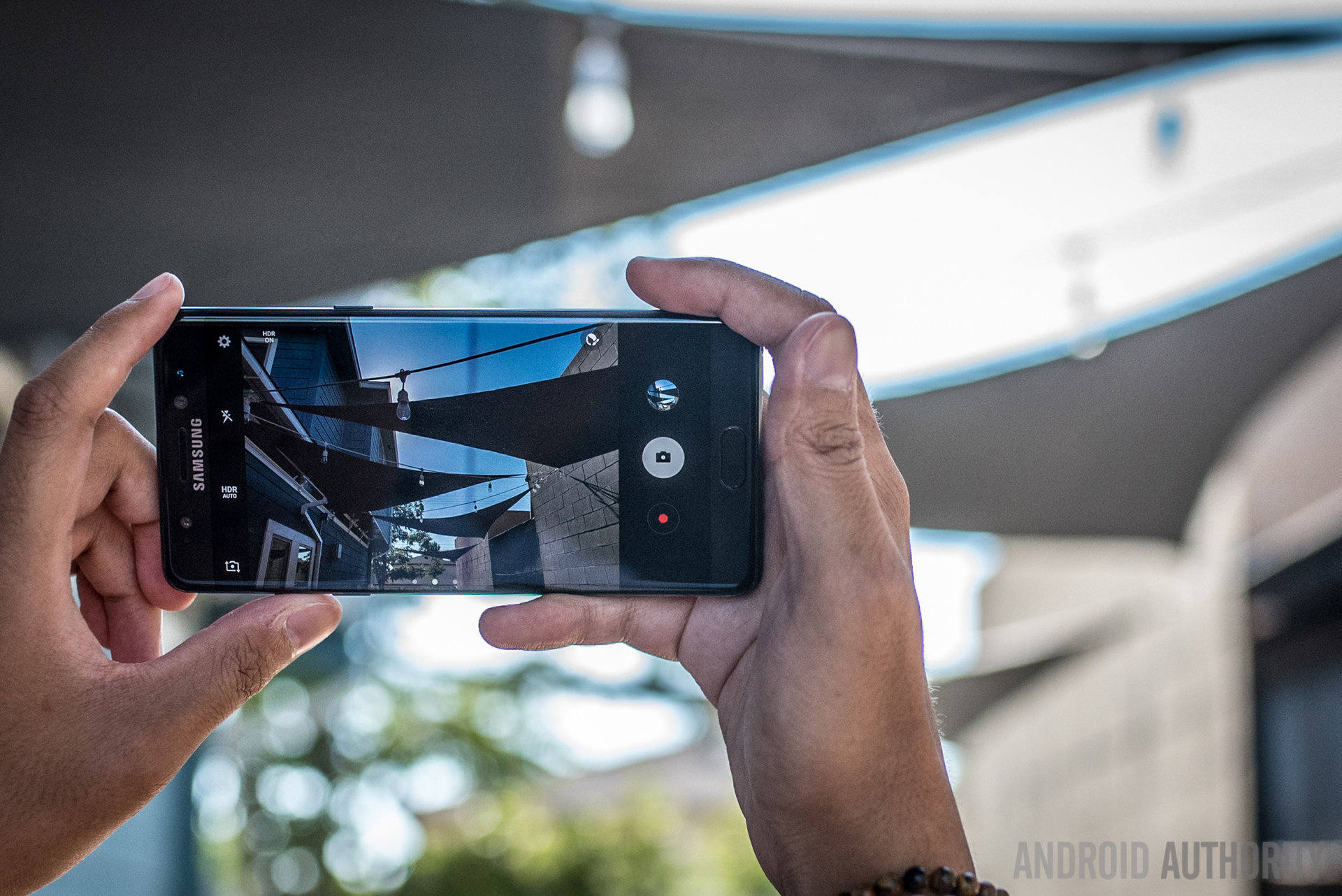
If there are any real improvements in the Note 7, it’s in the camera app, still easily launched via a double tap of the home button. Any users that found the app convoluted and full of too many options might not change their tune, still – but at the very least, all of those elements and settings are easily available using one hand.
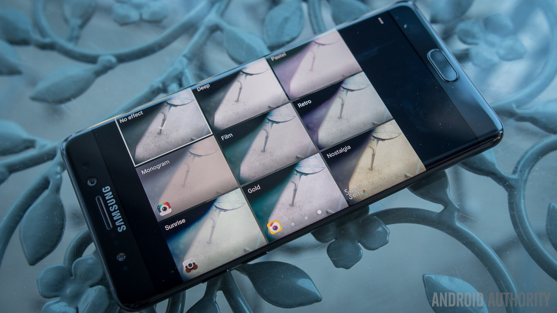
This is because key functions have been put into swipe actions on the viewfinder – swipe up or down to change which camera you’re using, and swipe left to access the different filters or right to bring up the many modes. The only viewfinder elements that are still out of reach for one hand are the deeper settings which probably should already be setup (to 4k video recording and Quad HD for the front facing camera, for example) and HDR (which could be on Auto already, anyway).
Anyone familiar with the Galaxy S7 and its top-notch camera quality will know what to expect from the Note 7. It is still capable of some of the better batches of photos in good lighting, providing good saturation and good colors bordering on almost oversaturated. For an even bigger punch in colors, HDR does a good job of bringing up the shadows in situations where it really calls for it – but don’t expect HDR to spruce up every single photo you take.
Details are captured quite well, with only some softness showing up when zooming into these photos – small text is still legible in some of these photos that have it.
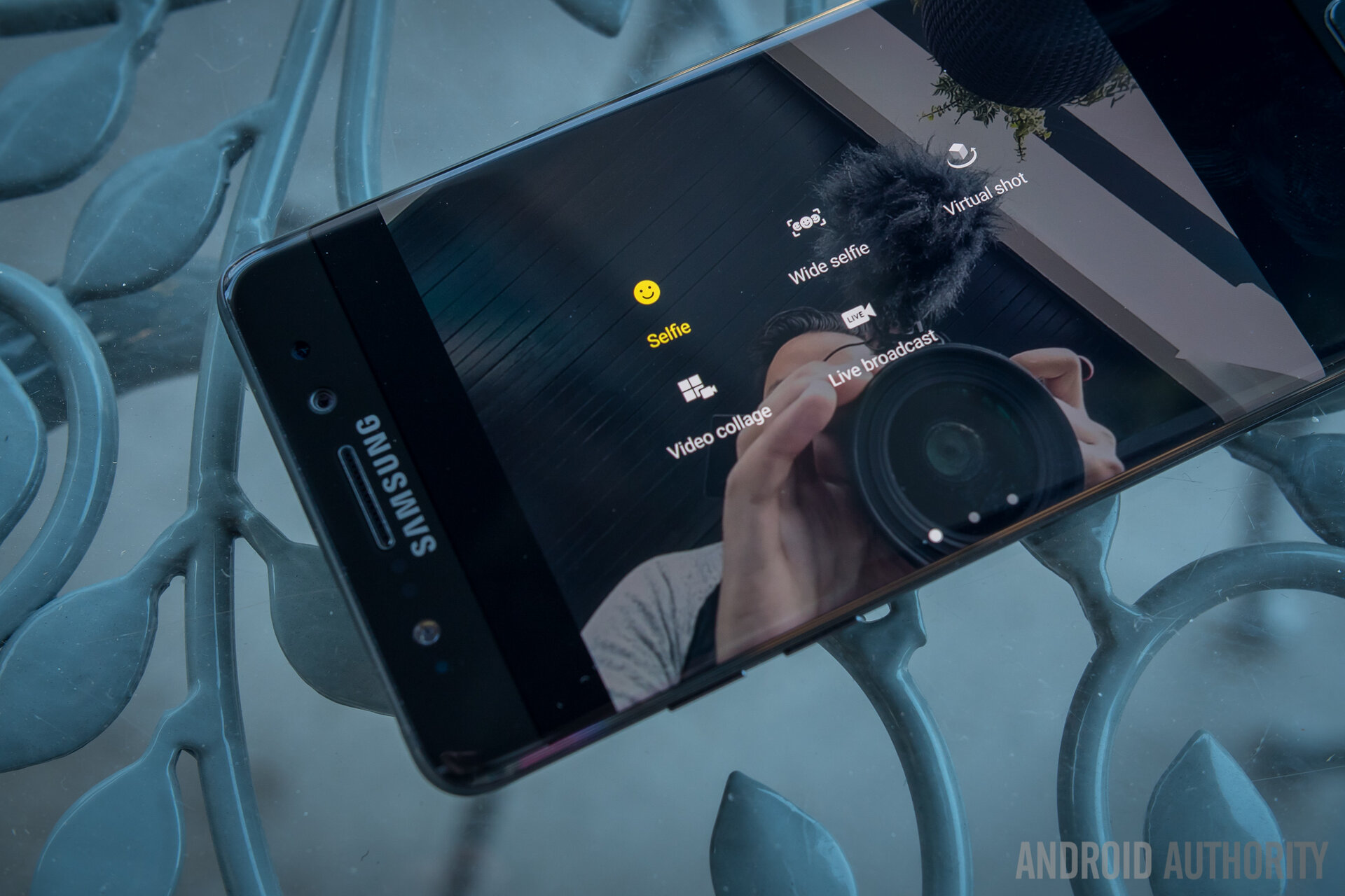
Self portraits are still not the super high quality that some might be expecting, especially in indoor conditions where lighting is less than the power of the sun. We will give all the credit in the world to the f/1.7 lens for doing what it can, but lower light will still hinder the quality of a selfie.
The same can somewhat be said for the main camera in low light, as its optical image stabilization, f/1.7 aperture lens, and large pixel construction all work together to bring passable dark photos. As we generally find the case to be in low light, the color temperature tends to get quite warm – and a steady hand can be required from time to time as shutter speeds have to get much slower to expose darker scenes. This didn’t happen to often, though, as we were happy with quite a few photos we got in dark, late night restaurant scenes – the foodies will still be proud with this camera package.
I think that this year has been a great one for videographers, as every flagship has had a big feature to boast for their video cameras – the S7 didn’t have a wide angle lens like the LG G5 or the OIS in the front facing camera like the HTC10, but it was the only camera to record front facing video at 2K resolution. This doesn’t sound like a huge deal, but it made the Galaxy S7 one of the better choices for vloggers like myself.
Galaxy Note 7 Camera Samples
With more resolution, there was quite literally a little more room to work with in terms of editing and quality. That same feature comes on the Note 7 – and coupled with the high onboard storage and the potential 256GB microSD card storage added on top, the Note 7 can be a powerful tool for videographers. (Until we get whatever LG has cooking with their manual video controls in the next V series phone, of course – that’s a comparison we’re excited to do.)
In the end, the cameras of the Note 7 prove as useful as ever, even if we’ve seen them before. But like much of this phone seems to be to Samsung, it’s a “if it ain’t broke, don’t fix it” kind of device. Easier handling of the camera app is nice to have, but ultimately it is the same experience as the Galaxy S generation we got this year – and that’s definitely not a bad thing.
Software and the S Pen

The software experience for a Note device always centers around the S Pen – that is definitely the case in the Note 7, but there have been some refinements to Samsung’s version of Android. Overall, the user interface has been given some unified colors in order to make everything feel more coherent. Lighter colors are abound, with only the important bits and buttons providing the splashes of color. The notification shade and the settings page are the best places to see this; and even then, the settings page has been simplified so that things are easier to navigate.
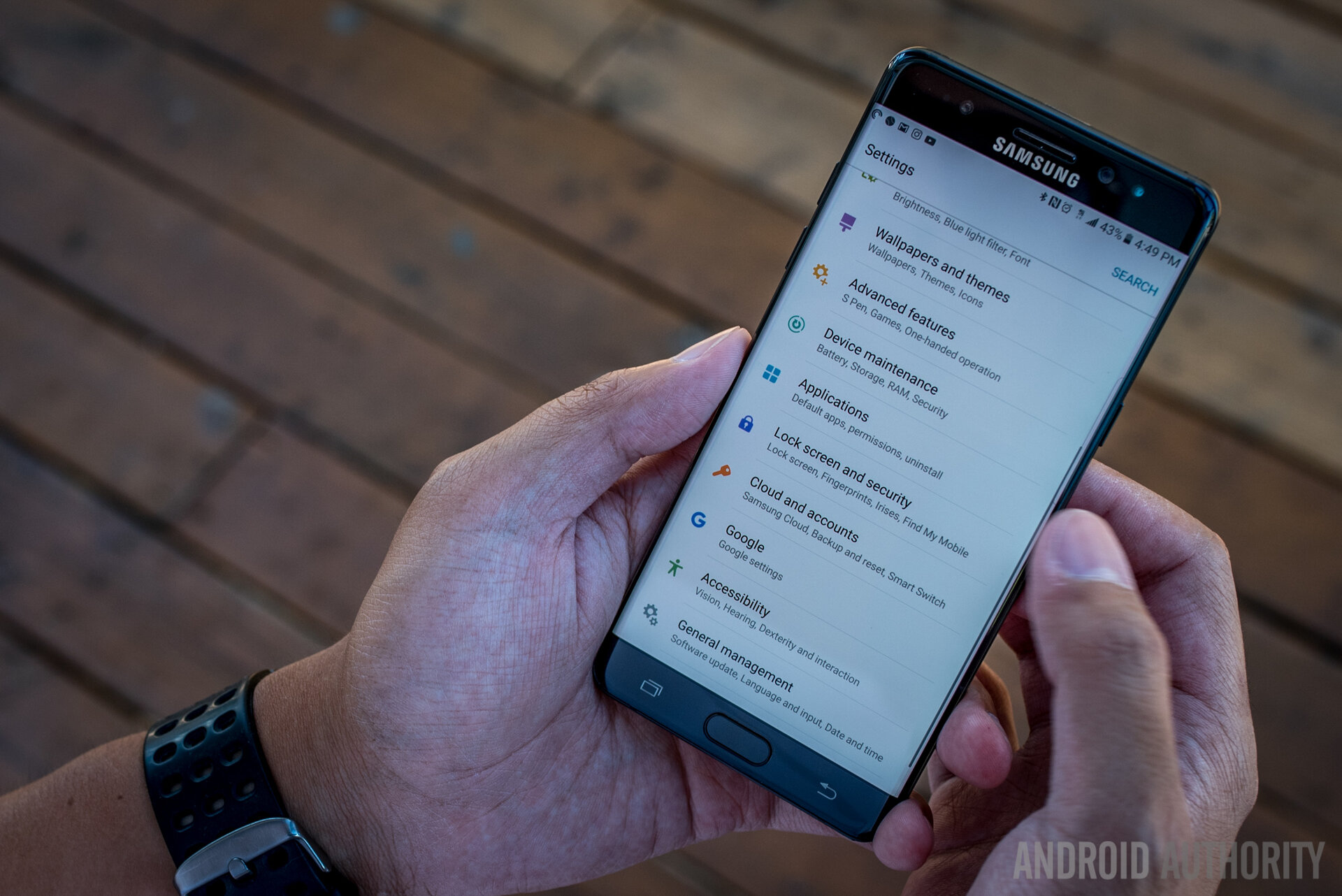
Sections of the settings page are consolidated in categories that include some main examples of what users might expect to find after going deeper, and this hopefully will make the usually daunting Samsung UI easier to navigate. Indeed, Samsung wants to guide the users more than ever without the pesky dialog boxes that used to appear out of nowhere and incessantly, which was more annoying than helpful in the past. Instead, there are little texts for just about every setting and there are arrows in the notification shade showing that pressing the text of an option will provide a little more information.

Of course, there are still all of the main tropes of the Samsung interface, including the rather cartoonish and rounded icons and folders, but the round backgrounds for non-Samsung apps can be removed. Briefing is still the news aggregator found to the left of the homescreens, but that can also be disabled. And all of this can be themed through the Themes area of the settings, which provides quite a few different options for changing the look of the interface without tampering with function.
Which brings us to the extras – the flourishes, if you will, of Samsung’s software design. Given that this is a curved display phone, the Edge UX makes an appearance and is largely the same as the one found on the Galaxy S7 Edge. Sliding from either the left or right side will bring up the Edges, a number of different panels that are able to house either contacts for quick dialing, icons for quick launching, or tickers for various forms of information like CNN News or a compass. If you find yourself actually using the Edges for their convenience, then these are welcome additions to an already fully functional Android launcher experience – if not, they are neatly out of the way and don’t really get triggered accidentally.
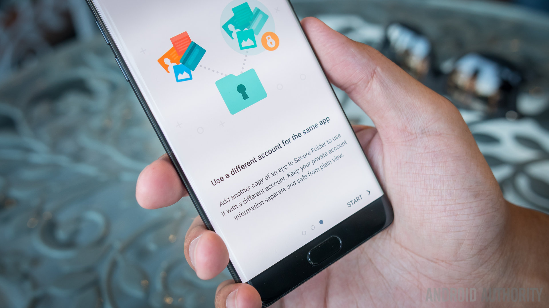
The other addition focuses on security – the Secure Folder. Used as a sort of triage area for apps and accounts, the Secure Folder can best be described as a clean slate area. Files, apps, and content put into it are locked under any of the same security measures that are used to unlock the device (yes, including Iris). It is basically like putting a second copy of an app on your phone – for example, when putting Instagram in the Secure Folder, opening it brought up the initial login page, so that I could feasibly put in a personal or work account there depending on what configuration I wanted. It’s a power little folder that can actually be hidden for even more security.
Various other features return from previous Galaxy devices like the MultiWindow and Pop Up View for multitasking, and the gesture for One-Handed Operation. Digging through the settings shows all of these different features that don’t appear in the annoying dialog boxes to throw themselves in your face – so, users are expected to dig and find these features to hopefully use them on the regular.
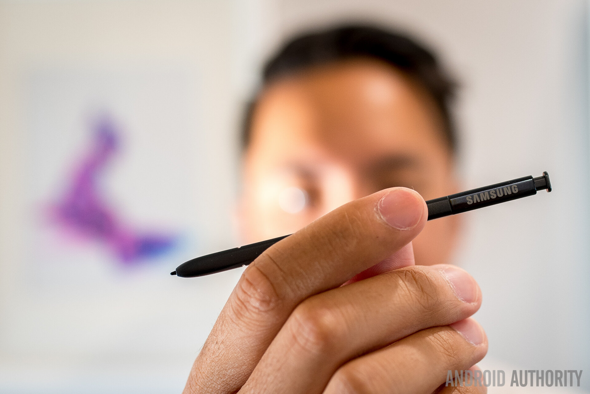
But, of course, the crux of the Note 7 is the S Pen – and there is a mixture of streamlining and adding to the formula to make this iteration probably the most practical one yet. Hovering the pen tip over the screen can still provide previews into various parts of the UI and selecting multiple items is still simple with the mouse-like nature of the S Pen and its button.
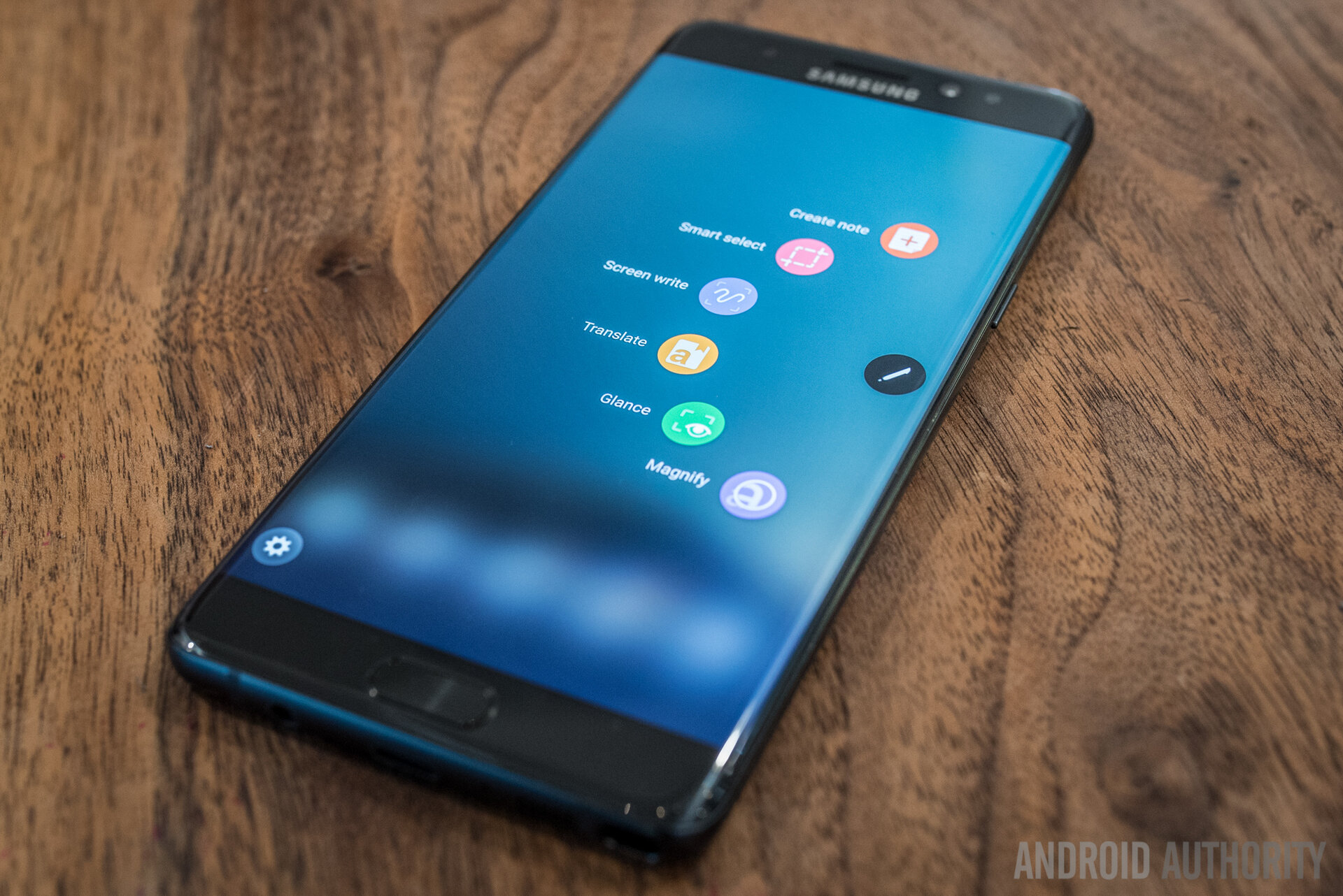
Removing the S Pen (again, can’t be put in backwards anymore) while the screen is on will bring up the Air Command menu, which has a few features that return from the Note 5 and the main additions now introduced. While these shortcuts can be edited to open up pretty much any application, the main ones for the S Pen still include a straight note creation, Smart Select for some more creative captures, and Screen Write for capturing what the screen is currently showing (or scrolling, if one is currently on a scrollable page) for writing and editing and sharing.
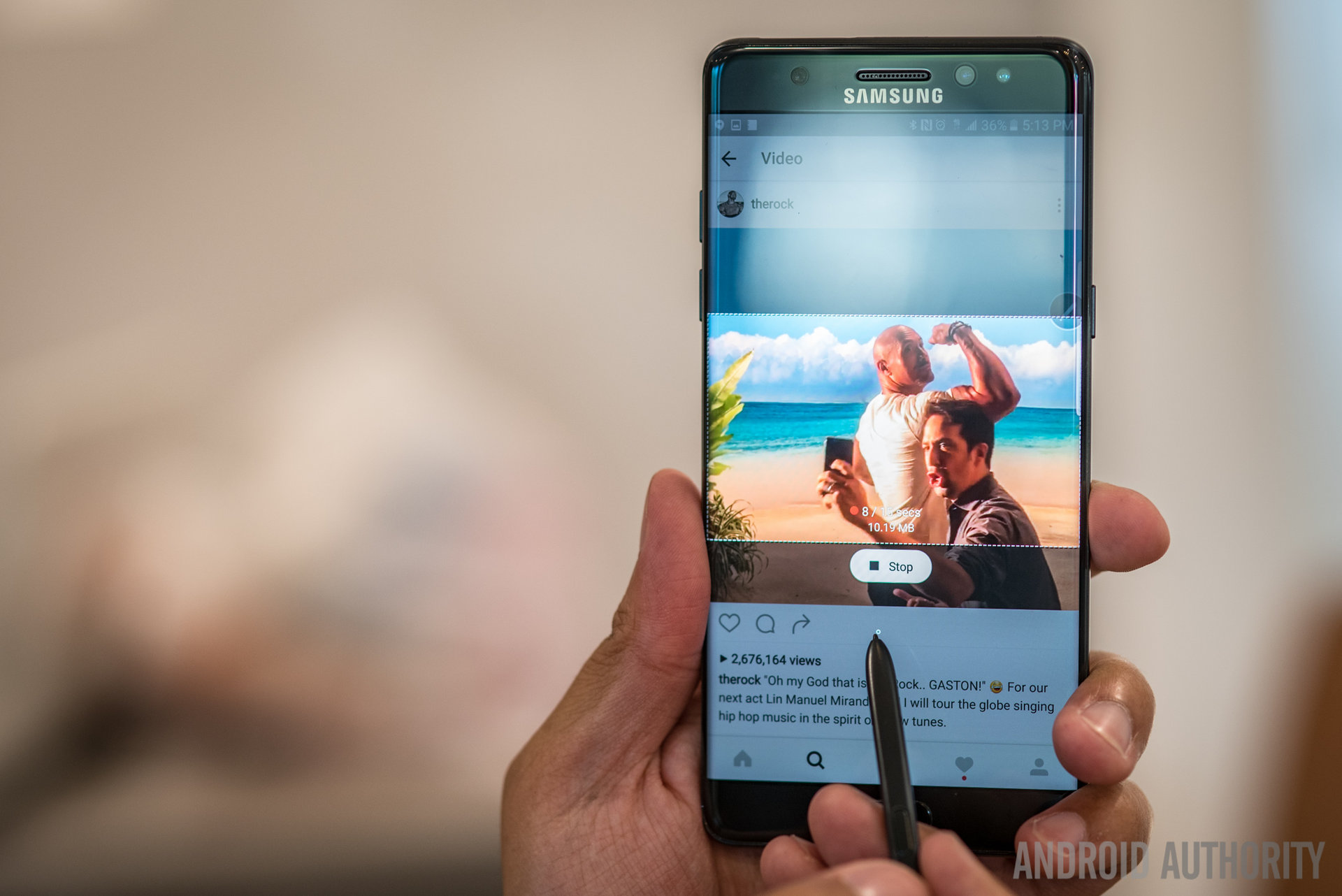
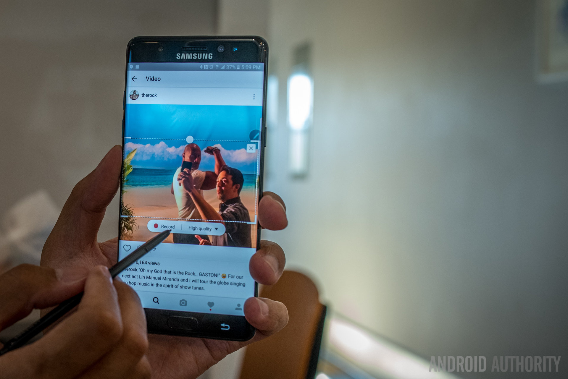
Smart Select got one of the bigger and probably funner additions, Animation select. A frame of any size the user chooses appears and can be put over any part of the screen to record a 15 second GIF, making GIF creation just about as easy as GIF searching. Or, if you ever have that GIF you can never find, now you have the method to save it.
The Smart Select Animation can quite literally capture anything, like video content from Instagram or YouTube for easy sharing in only the easy way the S Pen does it – just hit share and it goes straight to the place of your choice. In the age of the emoji and GIF keyboards, this might be one of the trendier additions Samsung has ever put into their phones, and after a few GIF shares, we’re liking it.
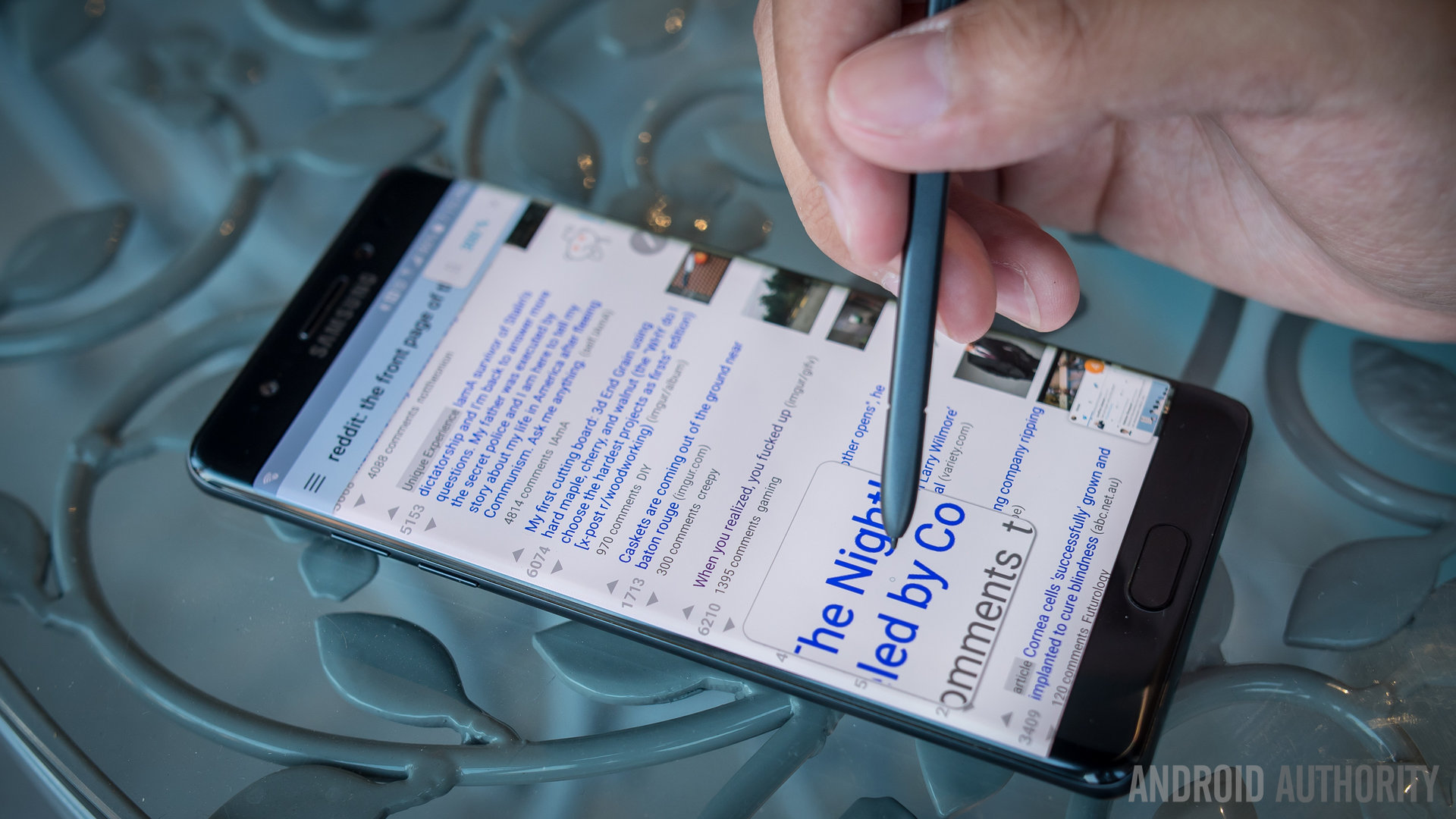
The other additions to the S Pen software family are not quite as deep, but they are useful in their own rights. Magnify provides a small square to magnify parts of the screen up to 300%, which can be useful for those times when users do need to get a closer look at something.
Glance is an interesting one that shrinks any app to a small square snapped to corners of the screen – hovering the S Pen over the square makes it large again for easy checking or for continued regular usage. It might be a nice way to tuck an app away for quick glances at any changes that may have happened on it, but the use cases still don’t feel very vast.
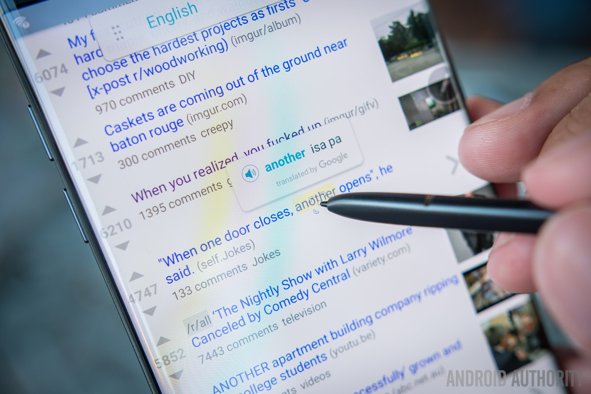
And finally there is Translate, perhaps the feature that we really want to see evolve. Translate uses the S Pen hover to quickly search for singular words’ translation in Google Translate – there are a myriad of languages available to go to and from, which makes this easy translation method already pretty robust. Though would like to see full sentences and phrase become a part of Translate, we applaud Samsung for included it in this new version of the Note.
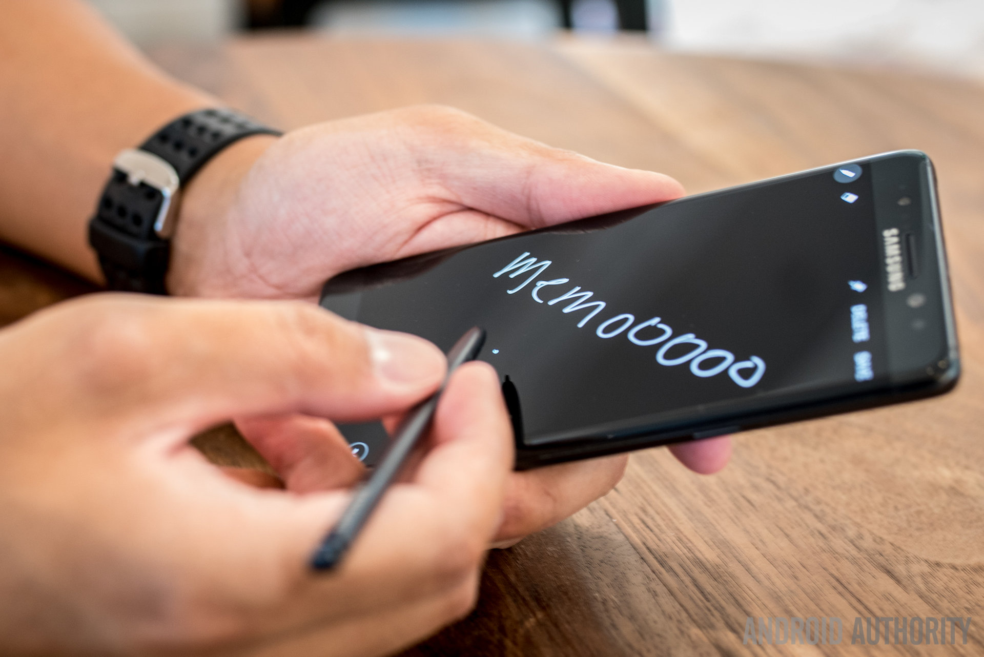
The final addition to the S Pen adds upon the Screen Off Memo, which was a feature well-liked from the Note 5. Removing the S Pen while the screen is off brings up a black screen where one can quickly jot down a scribble. Returning the S Pen to its slot puts the memo into the Notes app, just like any other note. However, now the memo can be pinned to the Screen Off Memo so that it is always within view. This can be useful for task lists or reminders you don’t need to be around for more than a short amount of time.
All of these notes are now put into one singular Notes application, which consolidates all of the different methods and abilities the S Pen used to have splashed across the UI – Action Memo and S Note, for example. By putting everything under one roof, the Notes application is now one of the most robust apps for notation and will eventually be made available for even the Galaxy S devices.
While the small but noticeable changes to the Android experience on the Note 7 are already welcome, it seems that this year Samsung really wants users to start pulling the S Pen out more. Why else include a GIF creator, if not to make it so that this year S Pen usage hopefully shoots up? After all, plenty of users report that they never use the S Pen or its myriad of features and instead just look at the Note as a standalone device with a lot of power. Will these features make that change? That remains to be seen, but there seems to be a lot of thought put into the S Pen this year and the effort is not lost on us here at Android Authority.
Specifications
| Samsung Galaxy Note 7 | |
|---|---|
Display | 5.7-inch Dual-edge Super AMOLED display 2560 x 1440 resolution 518ppi |
Processor | Quad-core 64-bit (2.15GHz Dual + 1.6GHz Dual) Qualcomm Snapdragon 820 or Octa-core Samsung Exynos 8890 |
RAM | 4GB, LPDDR4 |
Storage | 64GB |
MicroSD | Yes, up to 256GB |
Cameras | Rear: Dual Pixel 12MP sensor with OIS, f/1.7 aperture Front: 5MP sensor with f/1.7 aperture |
Battery | 3,500mAh Fast charging WPC and PMA wireless charging |
Water resistance | IP68 rating |
Connectivity | WiFi 802.11 a/b/g/n/ac (2.4/5GHz) MU-MIMO(2x2) 620Mbps Bluetooth v 4.2 LE ANT+ USB Type-C NFC Location (GPS, Glonass, Beidou) |
Sensors | Barometer, Fingerprint Sensor, Gyro Sensor, Geomagnetic Sensor, Hall Sensor, HR Sensor, Iris Sensor, Proximity Sensor, RGB Light Sensor |
Software | Android 6.0.1 Marshmallow |
Colors | Silver, Gold Platinum, Blue Coral, Black Onyx |
Dimensions and weight | 153.5 x 73.9 x 7.9mm 169g |
Gallery
Pricing and final thoughts
And, indeed, that effort permeates throughout the phone, where a number of different aspects have been either refined or straight up upgraded. The onboard storage and microSD card slots really speak to power users while the design will make this phone more accessible for many users who are even the slightest bit apprehensive toward larger displays. Even then, the display experience is growing to be more than just a conduit for showing off Android interfaces, and the S Pen is probably the most useful than it has ever been.
But users who are familiar with Samsung’s pedigree might scoff at these changes, knowing that plenty of things have remained the same from before – indeed, if you have a Galaxy S7 Edge, you are basically adding in the S Pen as the justification to pay so much for a new phone.
So, all of this comes at a price – not just a monetary price, which we will get to in a second – a learning curve that is different for every user. While the larger Note device will work really well for just about anyone, those who want to get a little more out of their phones have a lot of things to discover and learn deeper in the most feature packed phone Samsung has ever put out.
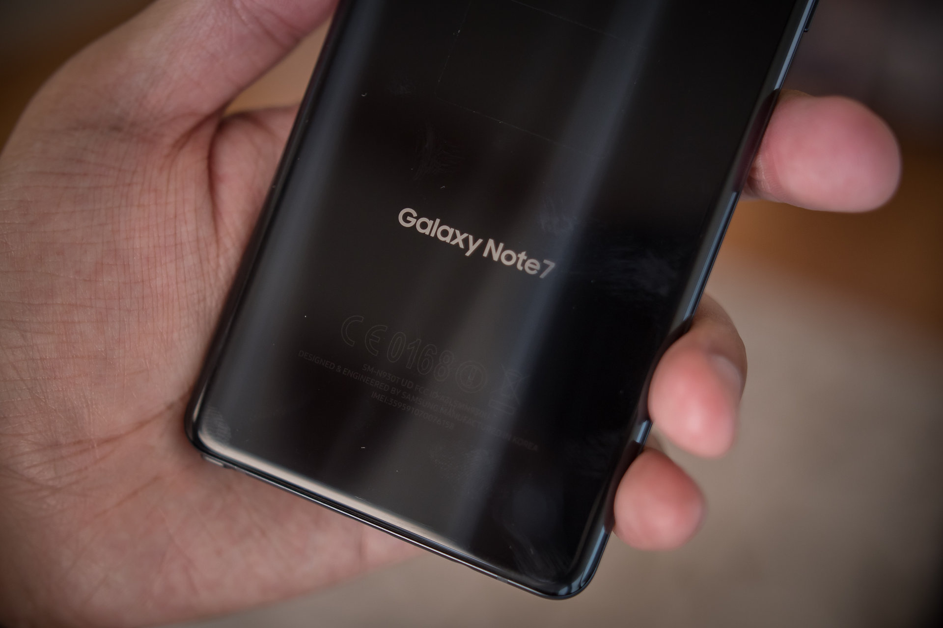
Just think about the different things you can do with this phone – GIF creation, MultiWindow, Pop Up View, One Handed Operation, Screen Off Memo, Edge UX, Always On Display customization, Theming, and SoundAlert, just to name a few. Each and every one of these features requires some familiarity, not to mention actually finding them in the settings menus or by chance. To get the most out of this device, users will have to do their homework – and we can’t say that will be a good or bad thing, as that answer might be different for everyone.
Bar none, the Galaxy Note 7 is the best big screen smartphone Samsung has ever made
Perhaps for one of the few times in their tenure, Samsung has made a phone that is trying its darnedest to justify its very high price point. Currently, on the Samsung website, the phone is available for a total $849.99 – a very steep price for a phone that simultaneously feels fresh yet undeniably familiar. With all that being said – bar none, the Galaxy Note 7 is the best big screen smartphone Samsung has ever made.
The images in this review were captured by @autom3otives
Thank you for being part of our community. Read our Comment Policy before posting.