Affiliate links on Android Authority may earn us a commission. Learn more.
So the Galaxy S8 and LG G6 look kinda similar huh?
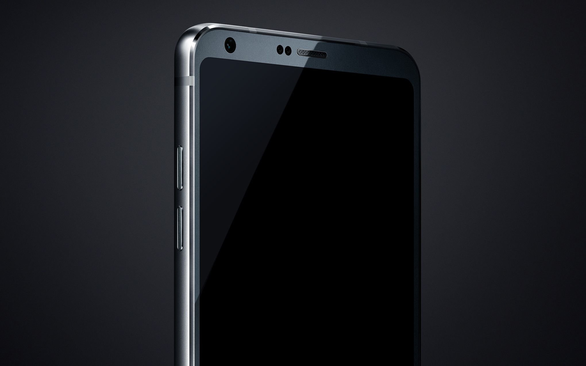
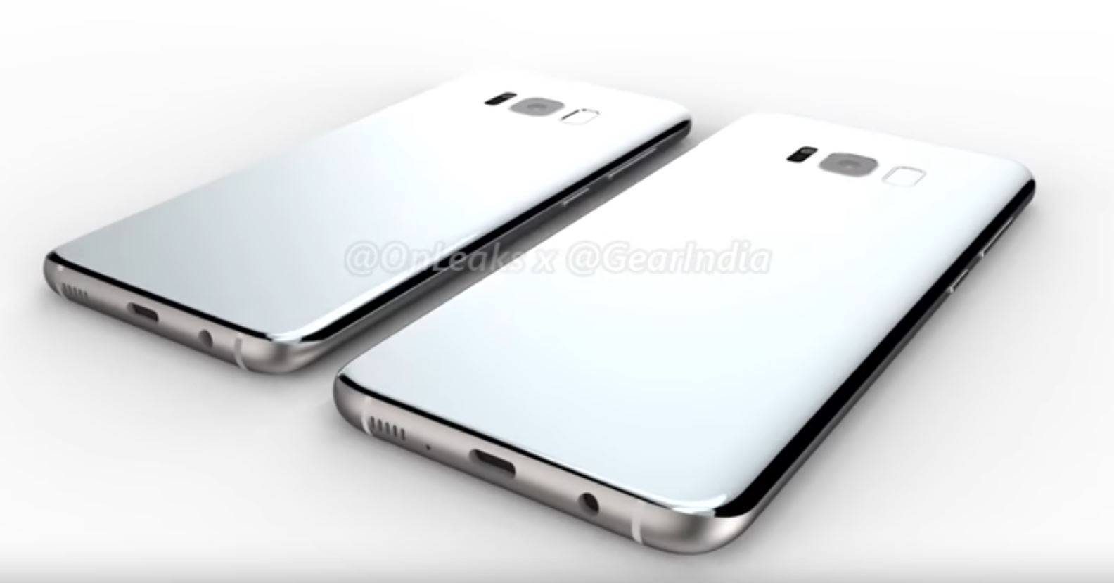
I know it’s hard to make a rectangle with curved corners look too different from other rounded rectangles, but the leaks we’ve seen so far of the Galaxy S8 and LG G6 are looking awfully similar. A cynic might even say the G6 looks like the flat-screened S8 Samsung isn’t making. But whether you believe in the pre-release renders, CADs and spy shots or not, there are some pretty simple explanations for why the Galaxy S8 and LG G6 look so samey.
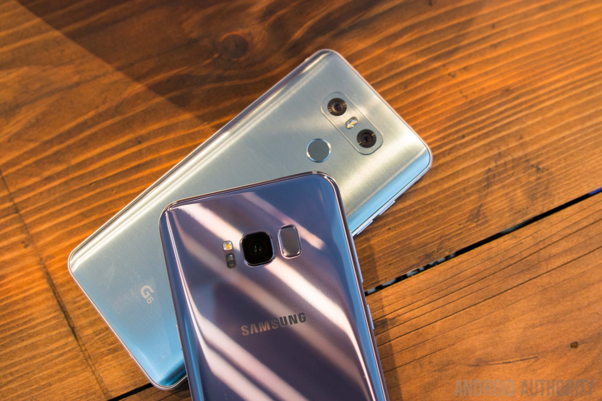
LG is playing it safe
There’s no need to kick a phone when it’s down, but it’s obvious at this point that the modular LG G5 didn’t exactly fly off shelves. So it’s no wonder LG would want to differentiate its next flagship both in terms of a new design aesthetic and a distinct lack of modularity.
Admittedly, the G5’s “startled robot” layout is still apparent in the camera and finger scanner setup on the G6 leaks, but the front looks a lot more like the new Galaxy than any other LG phone in recent memory. Some might say that LG is emulating Samsung in the wake of the failure of the G5, following the tried-and-true technique of copying a bigger competitor’s look in hopes of siphoning off a little of its luster.
How easy is it to differentiate when all you're left with is a thin sliver of glass at the top and bottom of the screen?
But there are a couple of things to consider here: for starters, just how easy is it to differentiate when all you’re left with is a thin sliver of glass at the top and bottom of the screen and you have sensors to accommodate? Likewise, there’s a reason the bottom edge of the G6 looks like the HTC 10, which looks like the iPhone 7, which looks like the Galaxy S7 and so on.
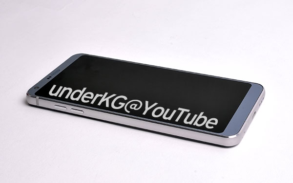
If you’re building a metal-framed phone, how many different configurations are there for port placement, antenna bands, chamfered edges and so on? Every element on the top or bottom edge of the phone also needs some space inside the chassis, further limiting creativity. That said, expect to see a lot more phones looking increasingly samey if we get the premium metal, bezel-less future many have been pining away for. The Xiaomi Mi Mix might have dodged that bullet, but its camera and speaker solution were not practical.
The LG G2 was renowned for being near bezel-less, so the G6 is a return to form.
We should also remember that LG can’t really be accused of copying a bezel-less approach from Samsung when the G series has the excellent G2 in its heritage. That phone was renowned for being near bezel-less, so the G6 is more of a return to form than a rip-off. And the glossy finish we saw on one leaked G6 image looks pretty reminiscent of the G2 to me.
But that doesn’t explain both new flagships featuring rounded corners on their display or their very similar aspect ratio: 18.5:9 for the S8 and 18:9 for the G6. Some have noted that the S8’s curves may account for the minor discrepancy or that LG’s choice is based on a 1440 square for VR purposes. Either way, both are deviating from the established 16:9 aspect ratio norm in favor of the newer 2:1 Univisium ratio preferred by Netflix. It’ll be interesting to see if other 2017 flagships follow suit.
Samsung is also playing it safe
After the Note 7 recall, pundits were positive that Samsung would go all out on the Galaxy S8. Not only to make up for lost sales of the Note 7, but also to compete with the 10th anniversary iPhone, which is also expected to be earth-shatteringly different (at least in the crystal balls of said pundits). From what we’ve seen of the S8 lately though, those forecasts don’t seem to be the case.
The Galaxy S8 is more S7 Edge than something radically new.
The under-glass fingerprint scanner looks to have definitively become a weirdly-placed rear-mounted scanner. Those touch-based power and volume buttons also look to have been scrapped. The dual camera never made it either.
While these features may still find their way into the Note 8 this year (which would be awesome), the S8 is more S7 Edge than something radically new. While this is to be expected in part, the leaked Galaxy S8 is very much in line with what we’ve seen from Samsung for years. For many though, just ditching the physical home button and going all-glass on the front are radical enough changes. And that screen-to-body ratio is lush.
So we may not be getting a completely reimagined Galaxy S8 in terms of looks, but a lot of what Samsung has been doing in terms of design lately has been very well received, so why fix what ain’t broke? (Remember too that Samsung was accused of copying Apple design when it first debuted its new metal frame on the Galaxy S6).
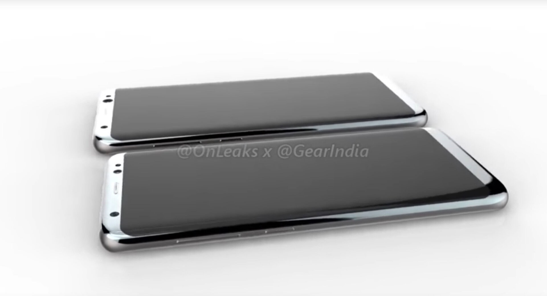
Other changes, like moving the scanner to the back may not be bad design or innovation so much as a necessity brought about by the rumored under-glass scanner not being available yet. Keep in mind the staggering volume of components Samsung needs for a flagship: sometimes a company just has to go with what’s available in time for its launch window.
Samsung still looking like Samsung is definitely not a bad thing. And in some markets, looking a lot like Samsung pays off. But when confronted with two very similar-looking phones, most average consumers will opt for the Samsung. Especially if they cost roughly the same, as the LG G6 likely will. Even folks that don’t particularly want a curved screen will probably still lean towards the Samsung if the G6 looks a lot like it.
LG’s design gambit – as safe and good-looking as it appears to be – may end up suffering from the same plight as the G5. Where that phone was too weird and different to sell, the G6 might be too safe and samey to sell against the likes of the S8. That said, copying Samsung design has worked fine for Xiaomi with the Mi Note 2 and HUAWEI with the Porsche Design Mate 9, so we’ll just have to wait and see.
Final thoughts
When all is said and done, there’s probably a mix of everything above in the G6 and S8: design copying and tradition, component availability and layout limitations, ergonomics and product differentiation, supply chain issues and problems with being backed into a bezel-less corner. The bottom edge is a tough spot to get creative, sensors have to be crammed atop the screen.
The canvas on which to differentiate is shrinking as screen-to-body ratios increase.
That leaves curved edges, camera layouts and buttons – the exact things that look different on these two phones. The canvas on which to differentiate is shrinking as screen-to-body ratios increase.
But there’s no denying that based on what we’ve seen, it looks like two of the biggest flagships of 2017 will end up looking pretty similar. So consumers are going to have to look at what sets them apart to make their choice instead: specs, camera, software and so on. The S8 looks to have better specs, new display tech and two screen sizes, while LG has dual cameras, faster updates and a more pocketable form factor.
Looking beyond the looks and features of the phones, LG still has that bootloop issue to put behind it and Samsung has exploding batteries to get over. There’s always a lot more to consider than just the look of a new phone, but which such similar looking flagships, Samsung and LG are placing a lot more emphasis on what their new phones can do than on what they look like. If that means better software, better battery and better cameras no matter which phone you choose, then I’m all for samey design.