Affiliate links on Android Authority may earn us a commission. Learn more.
Android 8 review: Oreo is for everyone
Published onAugust 25, 2017
Three years ago Google introduced us to its new design language called Material Design. It was flat, graphical and colorful. It was the visual change that ushered in the beginning of a new age for Android, one that focused less on the rapid expansion of Android’s feature set, and more on refining what already existed and paving the way for the future.
In many cases, Android’s maturation period included absorbing popular features that debuted elsewhere, whether in manufacturer skins, alternate launchers or via the custom ROM scene. More and more attention was placed on battery life, security, performance stability and fine-grained user-facing control. Not as sexy as a complete visual overhaul, perhaps, but vastly more significant.
Android 8.0 represents the current pinnacle of that effort, the very tip of the spear, fresh from Google’s workshop. Android 8.0 Oreo is as comprehensive a version of Android as there has ever been, and it is as stable, feature-rich and functional as ever. While on the surface it may lack grand visual changes, what lies beneath is stacked with usability improvements and polish.
This is the Android Authority Android 8.0 review.
Note: The software version I will be referencing in this Android Oreo review is the first iteration of Android Oreo found on the Google Pixel, which I’ve been using for the better part of a week now. Note that supported Nexus devices will have a slightly different experience, as will devices by other manufacturers when they get the Oreo update. So while your Oreo experience may look a little different, the underlying features described here will be fundamentally the same.
Android 8.0 Oreo is the most palatable mainstream Android version yet. It is visually consistent, simplified, feature-rich and polished. Oreo is clearly designed to appeal to as wide an audience as possible, from satisfying the die-hard Android fan with its comprehensive feature set and advanced customization potential, to accommodating the iPhone switcher or tech debutante with its simplified layout and intuitive user experience. OEMs are even on that list, and we've seen increasingly more of them give up the manufacturer skin game in favor of what Google serves up. Oreo is for everybody.
The review that follows will be broken up into four key sections. The first will focus on the visual aspects of Oreo, the second section will look at those features offering greater control, the third will explore the ‘rapid access’ side of Android 8.0 and the last part will cover the smarter side of Oreo. If you want to see the development history of Oreo, take a look down memory lane with our Android O developer preview feature tracker.
1. Looking good
Between Android Nougat and Android Oreo there are no major visual changes, but those that exist have primarily been made to improve usability, increase consistency or add a layer of future-proofing to everybody’s favorite mobile OS.
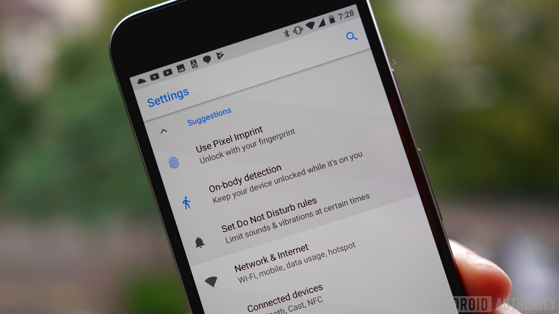
The Settings menu is the most obvious place to start, as it has been further refined from what we saw last year. Most notably, the Settings menu in Oreo has been greatly reduced in size from previous versions of Android, with a lot more nesting of options under larger categories. For example, Network and Internet covers everything under that umbrella: Wi-Fi, mobile network, data usage, hotspot and tethering, VPN and airplane mode.
The Settings menu in Oreo has been greatly reduced in size, with a lot more nesting of options under larger categories.
The upshot of this is that the Settings menu is much shorter – just a page and a half on the Pixel – and is arguably more logical, even if it does require more taps now to access key settings like Wi-Fi or Bluetooth (both of which are, of course, easily accessible in the Quick Settings and at the top of the notifications shade).
The downside of this change is that in some cases the useful information shown below the main heading in Nougat, like, for example, the Wi-Fi access point or Bluetooth devices you are currently connected to, has been replaced with a brief summary of the settings within that category. Some Settings categories, however, like battery and storage, do still show that critical information.
Even within those categories things are kept simple. What Google considers to be more advanced options appear in a drop down menu. In the Display settings for example, you’ll only see four options up front: brightness, Night Light, adaptive brightness and wallpaper – the kinds of settings a casual Android user would need. Tap the caret next to Advanced though, and you’ll see the full gamut of display settings: display timeout, screen rotation, font and display size, screen saver, ambient display and so on.
For the most part, Oreo’s Settings look like Nougat (minus the slide-out hamburger menu): a largely monochrome affair on a light background with a few touches of a single color to draw your attention to key information, like Google’s Suggestions, which occasionally appear at the top of the Settings menu, or important features that have been activated, like Airplane Mode, Do Not Disturb or Data Saver.
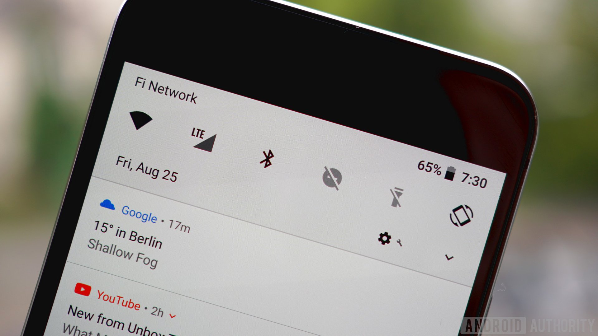
The same lightening up of the UI can also be felt in the Quick Settings and notifications area. Swipe down once for the notifications shade and at the top you’ll see the six on/off toggles on a light gray ground, to keep things more visually consistent with the white notification cards below them. Above the toggles you’ll now see carrier info, status bar icons, battery info and the time, while the date is now found below the toggles in a more legible font.
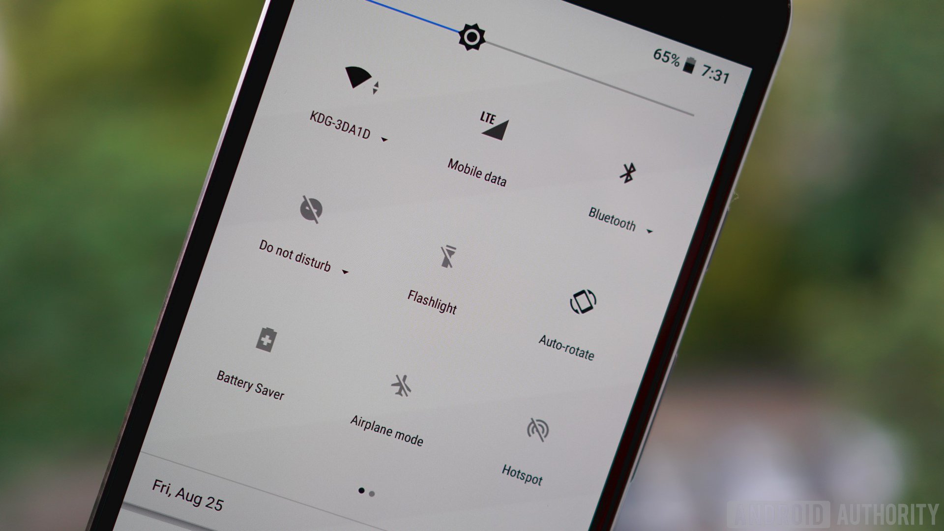
Swipe down again and you’ll see the full Quick Settings area, which is tabbed if you have more than nine settings visible. As with Nougat, several toggles here simply activate and deactivate a setting, like the flashlight, Battery Saver or Airplane Mode. But others, including Wi-Fi, Bluetooth and Do Not Disturb, provide access to a mini menu so you can make minor changes without leaving the Quick Settings area.
You can rearrange the order of the Quick Settings, which will be reflected in the on/off toggles at the top of the notifications shade, and long-pressing an icon still takes you to the full Settings menu for that feature. You’ll also note that the User, Edit and Settings icons have now migrated to the bottom of the Quick Settings area for easier access on large-screened devices. Note: long-pressing the Settings icon here will still enable the System UI Tuner in the Settings, but it still only features toggles for status bar icons and some settings for Do Not Disturb mode.
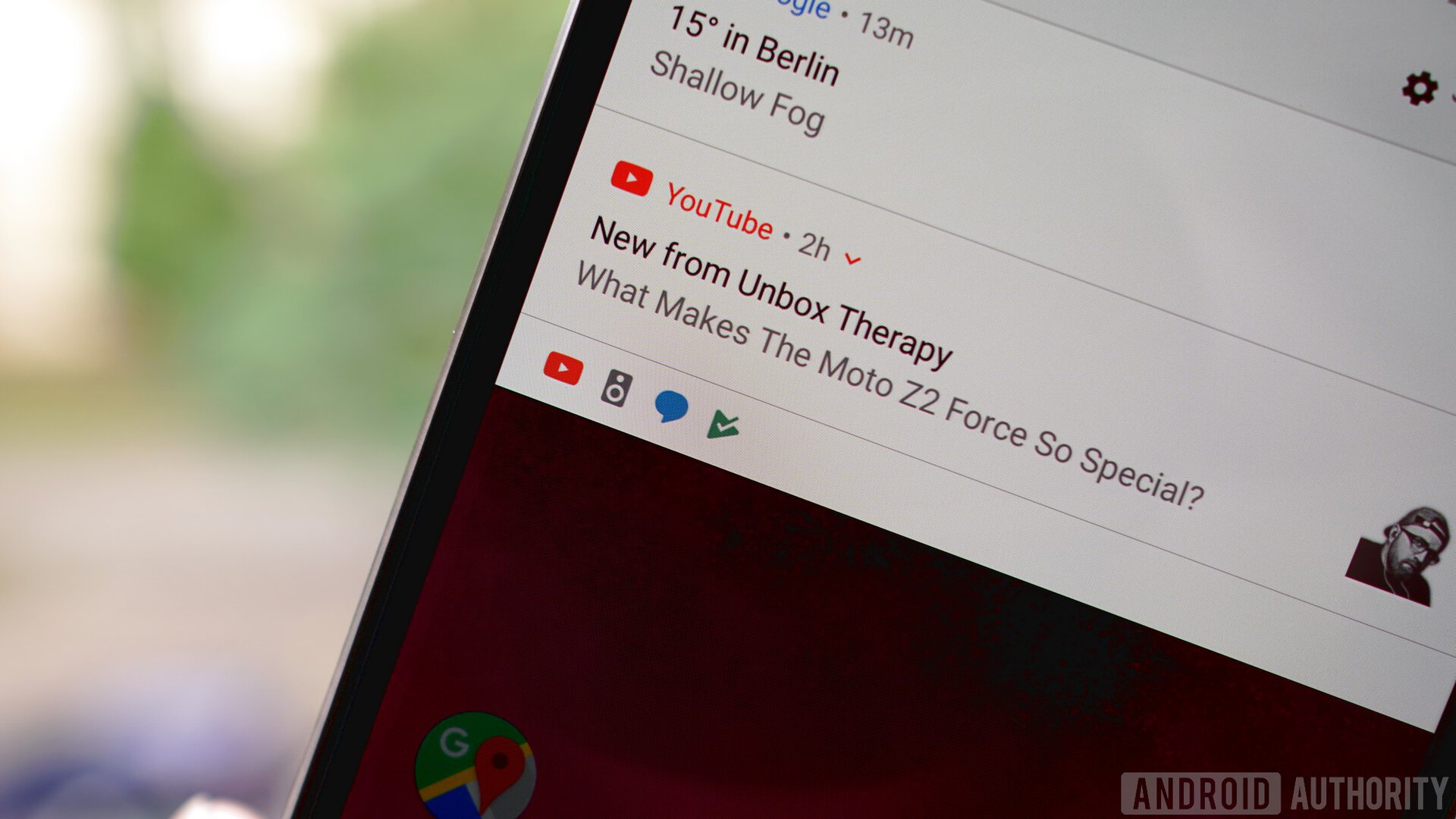
Google has also streamlined the notification cards. If you have more notification cards than can fit on the screen, at the very bottom you’ll see a series of app icons indicating the remaining notifications. As you expand and contract the notifications list you’ll see those icons pop up into full notification cards or pop back down to the little icon tray.
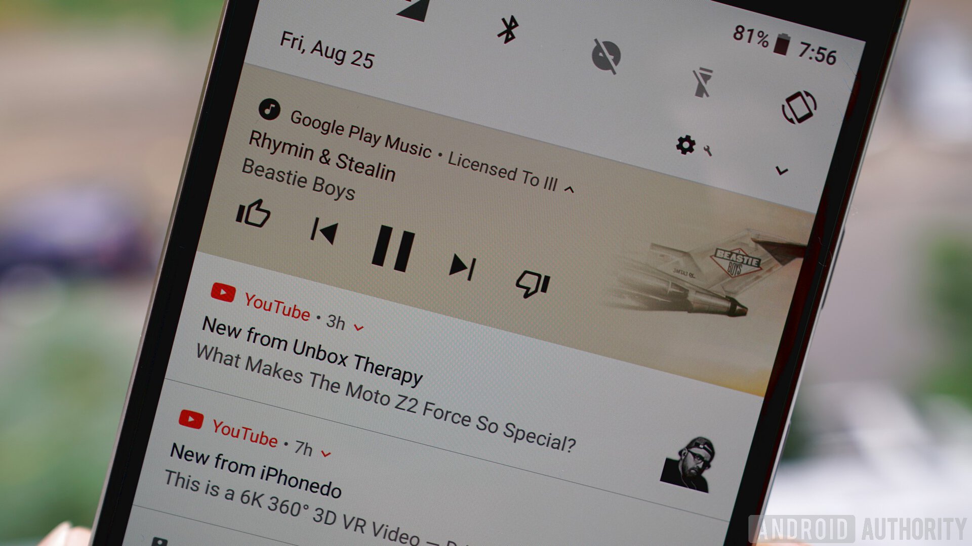
Persistent notifications, like for apps running in the background (password managers, weather, Tasker and the like), will appear in more condensed notification cards, which you can expand for more information. Multiple notifications from the same app will still be bundled together as in Nougat, and Quick Reply for supported apps is still on board. For fans of Google Play Music, the media controls in the notification shade will now adopt the color palette of the album artwork, and this will be reflected in the lock screen background as well.
The launcher experience (at least on the Pixel) is much the same, but when you launch the app drawer, accessible simply by swiping up anywhere on the home screen, you’ll see the navigation buttons at the bottom of the screen switch from white to black for better visibility. Long pressing the home screen will bring up options for changing the wallpaper, adding widgets or accessing the home screen settings.
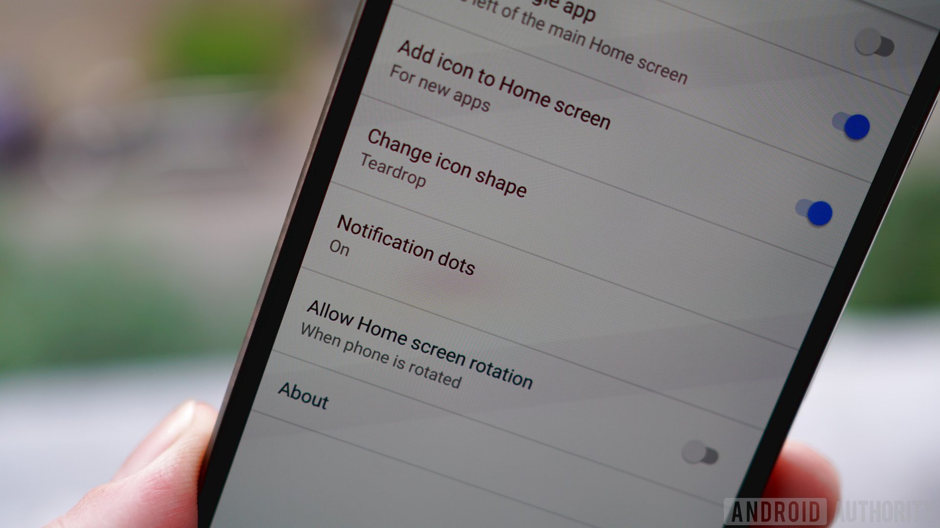
In the home screen settings you can enable or disable the app suggestions at the top of the app drawer, toggle what we used to call Google Now on or off, enable home screen rotation, decide whether you want new app installs to add an icon to your home screen and get access to two new Oreo settings: adaptive icons and notification dots (we’ll cover the latter a little further down).


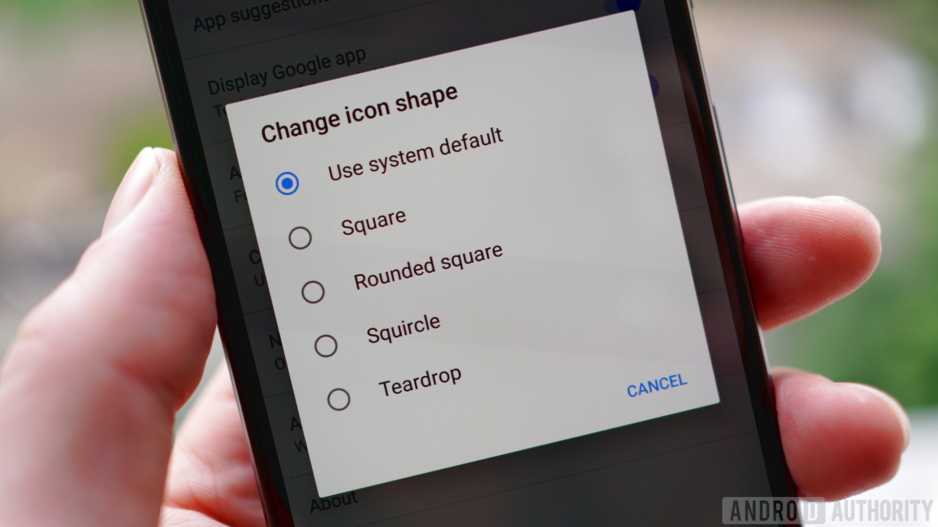
Adaptive icons are one of the simplest ways Google has come up with to increase the consistency of the Android experience across devices from multiple OEMs, many of which use different shapes to Google.
Developers simply create a larger than necessary background for their app icon, which can then be masked with various shapes to create a more consistent look to the app icons on your phone.
The best part is that Oreo lets you decide which shape you like best: system default, square, round, rounded square, squircle or teardrop (like the Allo and Duo icons). Of course, not every app developer has jumped on board yet, but Android Studio has a simple wizard to guide devs through the process so it shouldn’t take long to catch on. If you want to know more about adaptive icons, read Gary’s excellent explainer on downloadable fonts and adaptive icons.
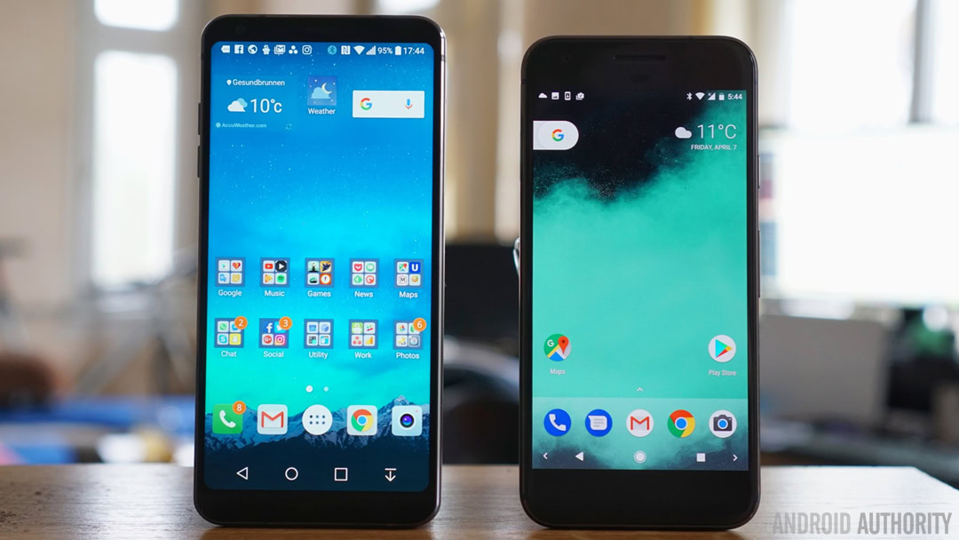
In terms of future-proofing the visual side of Android, Oreo has also included a couple of new features to keep up with the times. In previous Android versions, there was a maximum screen aspect ratio of 1.86:1, which is basically the widescreen cinematic standard. With the emergence of taller and narrower aspect ratios including 18.5:9 on the Galaxy S8 and Note 8, and 2:1 on the LG G6, Oreo no longer has a default maximum aspect ratio – it is simply the default aspect ratio of the device. Now we just need to get app developers on board to properly adapt their apps to the new formats.
Oreo also has built-in support for wide color gamut apps, essentially meaning that on devices with the requisite HDR display technology, apps can display a much larger range of colors. There aren’t a lot of phones out there with the necessary display hardware to take advantage of this yet, but that number will increase greatly as Android 8.0 Oreo continues to roll out next year.
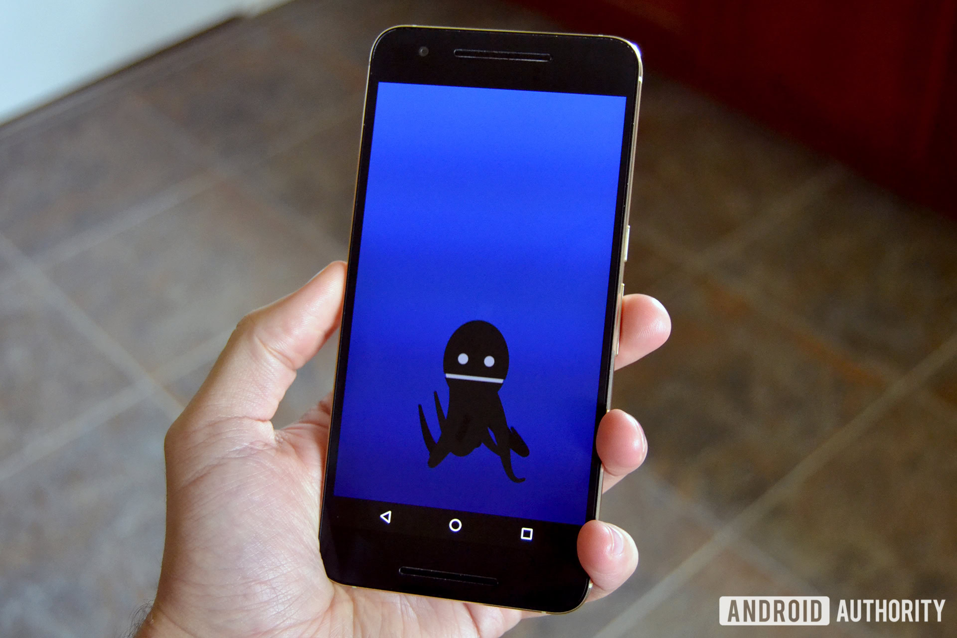
And finally, everybody’s favorite: the Android Easter Egg and emoji. As discovered in the final Android O developer preview, the Android Oreo Easter Egg is an…octopus. He floats around the screen, changes sizes when you rotate your device and can be dragged around the screen. And…that seems to be about it.
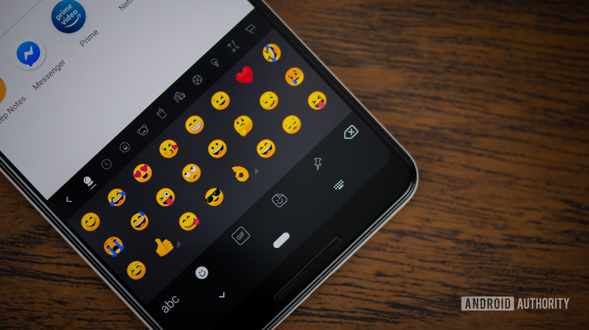
Android 8.0 Oreo also officially delivers the new circular emoji at the expense of the blob emoji that were loved and hated in equal measure. We’ve written about this elsewhere on the site, including Google’s reasoning for making the change, so I’ll leave you to your brooding.
What I hope has been apparent in this section is that Google is finally paying attention to the small stuff. Lightening up the UI, introducing adaptive icons and new emoji may not seem like a big deal, but they make the Oreo experience more consistent. Condensing the Settings menus, moving icons around and collapsing persistent notifications make Oreo more usable. And adding full color gamut support while removing maximum aspect ratios ensures Android 8.0 will look great on devices that aren’t even out yet.
2. Taking control
Android 8.0 is also more about assuming control than any previous version of Android. Whether it’s Google putting the brakes on rampant resource-hungry app processes or users having more power to limit what apps can access and how notifications are handled, Oreo has it in droves.
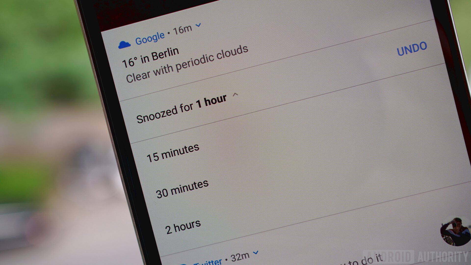
New in Oreo is the ability to snooze notifications. Partially swipe a notification away and you’ll now see two icons: one leading to the notification channel settings for that app and another that sets a timer before the notification reappears. By default it’s one hour, but you can also choose from 15 minutes, 30 minutes or two hours.
Another key part of Oreo’s notification handling is the introduction of notification channels. Apps that target Oreo’s API 26 must include notification channels (while apps that don’t will continue to behave as they currently do). App developers then identify as many different types of notifications in their app as they like and Oreo lets users decide which app notification channels they want to be alerted to, and how.
Once you’re in the notifications settings for a particular app, you’ll see several options. You can disable notifications entirely, allow notification dots (more on this in the next section), or flip a switch for each kind of notification channel the app developer has identified. Some apps will have very few, but others, like the Google app, can have more than a dozen.
Each notification channel gives you three basic choices: disable it entirely, take it as is, or fine-tune it the way you like. For the first two, simply flip the switch to the on or off position. For the latter, tap the channel name and you’ll see various options including setting the importance for that notification channel (including the Urgent setting which makes use of a universal and thus, more consistent, app overlay alert type), changing the notification sound associated with it, enabling or disabling vibration, and so on.
Benefiting from notification channels is a gradual process - start with the defaults and limit particular notification types as they annoy you.
To do this for each and every notification channel in each and every app on your phone would be a herculean task, but what matters is the fact that it exists and you have complete control over it. Benefiting from notification channels is a gradual process: start with the defaults and limit particular notification types as they annoy you. Power users may want to devote their first weekend with Oreo to customizing every single notification on their phone, but everyone else can either ignore them or cherry pick as necessary.
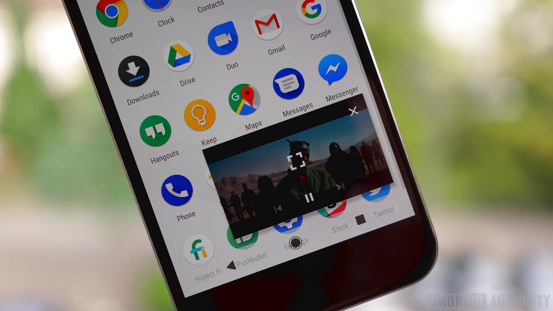
Picture-in-Picture mode (PiP) is one of Android 8.0’s flagship features, previously available on Android TV, but not mobile. Primarily for video players and apps in which you watch content like Chrome, PiP lets you keep watching what you’re doing in a small floating window while otherwise going about your Android business – it’s a little like a free-form video version of split-screen, which also returns in Android 8.0.
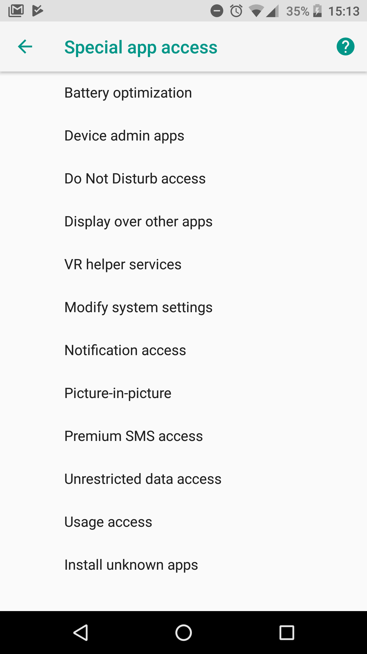
In supported apps, hitting the home button will keep your video playing in a movable window in the bottom right of the screen. You can drag it around the screen and tap it to access playback controls or make it full screen. Of course, you can also disable this feature on an app by app basis if you don’t like it. Simply go to the App Info page for the app in question, or visit the Special app access section in Apps and Notifications to see all apps with support for PiP.
Background execution limits are one way Google has devised to throttle the amount of resources used by background processes. As you know, many apps like to keep various processes running in the background, whether to more quickly serve you notifications or to keep track of where you are. But you know what they say about giving someone enough rope, so with Oreo, Google has said enough is enough.
In Android 8.0, rather than allow apps to run rampant with your battery life in the background, Oreo limits their requests to scheduled windows of activity. Gary has covered how this all works in a great background execution limits explainer, but what it all means is better battery life for you and less strain on your device. By default, these limits only apply by default to apps targeting Android O, but you can enable them for any app by going to the Battery usage section in the App Info page and turning the toggle for Background activity off.
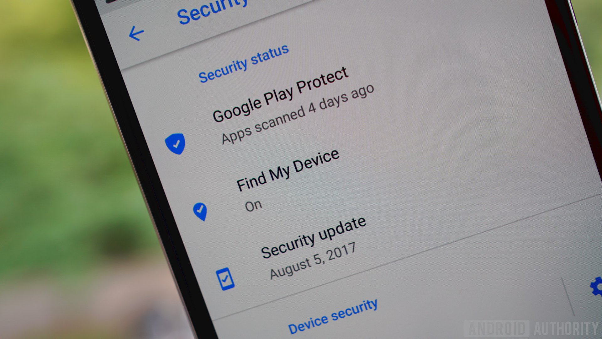
A couple of other features available prior to Android 8.0 Oreo are also aimed squarely at keeping you in the driver’s seat where your device security is concerned. Google Play Protect lets you know even before you install an app that it has been certified safe by the Google Play team. Then, Play Protect scans billions of apps in Google’s marketplace daily to ensure things stay on the up and up.
As in Nougat, Oreo makes a note on the App Info page of where each app was installed from. Previously, enabling Unknown Sources used to be a blanket action, but now each app that wants to download another from anywhere but Google Play must have permission granted on a case-by-case basis. This access can, of course, be revoked at any time.
Android Device Manager is now known as Find My Device, a much easier to understand method for tracking, locking down or remotely wiping a lost device. Both Google Play Protect and Find My Phone can be accessed either via the Security and Location section or by going to Settings > Google > Security.
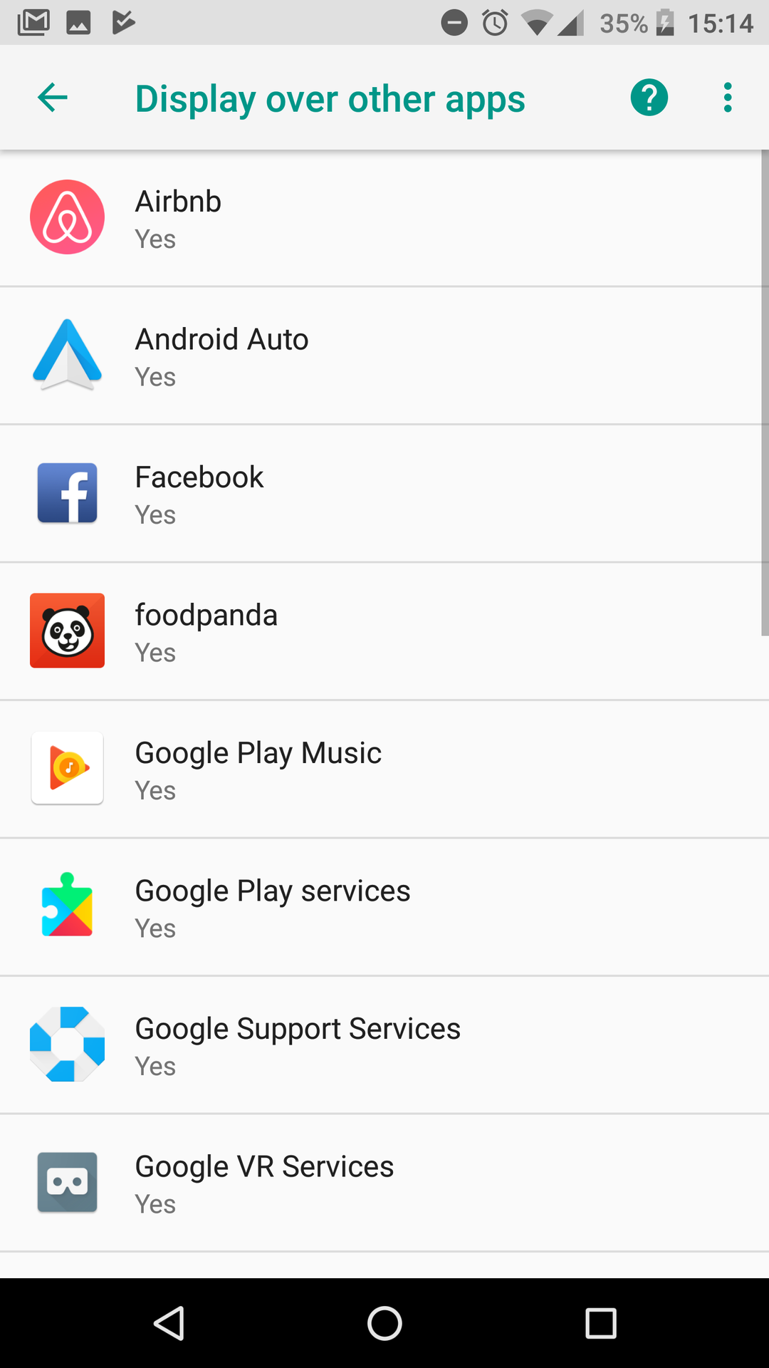
You still have granular control over the app permissions granted to each app on your phone, either by permission category or on a per-app basis. But you can now also monitor special app access settings, like the ability to display over other apps, have unrestricted data access, use PiP mode or modify system settings. Again, these settings will not appeal to everybody, but as with everything else in Oreo, it’s a power user feature safely tucked away where it’s accessible but not confusing to the casual user.
Which brings us to Vitals. Announced earlier this year, Vitals is another initiative by Google to improve system performance and stability. It includes security tools, OS optimizations and various tools for developers to monitor their app’s usage on your device. Again, what all this analytics means is that app developers can optimize their apps for your device, giving you better battery life and app performance.
And finally, Android’s Accessibility options get a nifty new Settings menu area where you can enable an accessibility shortcut – including from the lock screen. Simply choose your preferred accessibility service, either Talkback, Select to Speak or Switch Access, and press and hold both volume buttons to activate and deactivate the service. You can even add a preset accessibility button to the on-screen navigation area.
The new settings have been kept largely out of sight to avoid cluttering up what has traditionally been a daunting OS for beginners
Like most of the other settings we’ve seen so far, Oreo still provides power users with the advanced tools and options they’ve come to expect from Android. But they are again kept largely out of sight to avoid cluttering up what has traditionally been a daunting OS for beginners. Google has also added a lot of stuff in the background to get you better battery life and performance than ever before, and that’s always a welcome addition.
3. Quicker access
From Google Now to Google Assistant, Google wants to deliver the most pertinent information when it is needed, if not just before. Each successive Android iteration has become more intuitive, with increasingly greater attention paid to helping you get things done faster. Nowhere is that more evident than in Android Oreo.
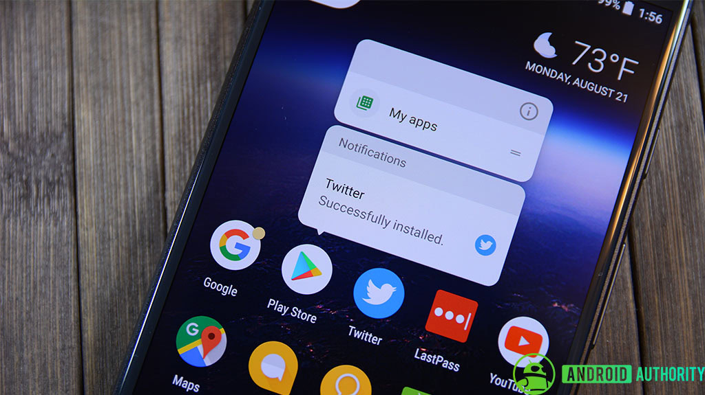
We’ll start with notification dots. Notification dots are Google’s answer to unread badges. A small dot, with a color matched to the app icon on which it appears, will alert you to any notifications you may have missed. Dots are visible in both the app drawer and on the home screen, and a long press of the app icon will reveal a condensed version of the available notifications. These can swiped away as per normal or opened up for action.
Notification dots are Google's answer to unread badges, nicely paired with app-specific launcher shortcuts.
When you long-press an app icon anywhere in Android 8.0, you’ll also get app-specific launcher shortcuts for each app. These are available whether or not a notification dot is present and can jump you straight into a variety of common actions.
For Twitter it might be search, post a tweet or send a DM. For Gmail you can compose an email or jump straight into one of your accounts and Photos will offer to free up space or take you to the search results for a particular set of your photos. Long pressing an app icon is also the quickest way to access the App Info page for each app or to add a widget.
Another speedy Oreo feature is smart text selection. This will be pretty familiar to anyone that regularly translates foreign words in Marshmallow or Nougat, but in Oreo it’s even smarter. Whereas Translate and Web Search were previously relegated to the overflow menu when you highlighted a section of text, Android 8.0 will not only anticipate the phrase you’re trying to highlight, but it will also predict which app you’re likely to want to use next and put it at the front of the copy/paste menu.
Following on from this, Oreo can learn your sharing habits too. On a basic level, Smart sharing connects apps with activities. So, for example, it will know to pair a photo of a receipt with an expense app or a selfie with messenger and social media apps. But Smart sharing will also begin to learn your habits and adapt to the apps with which you typically share specific types of content. It works with images, video, audio and text.
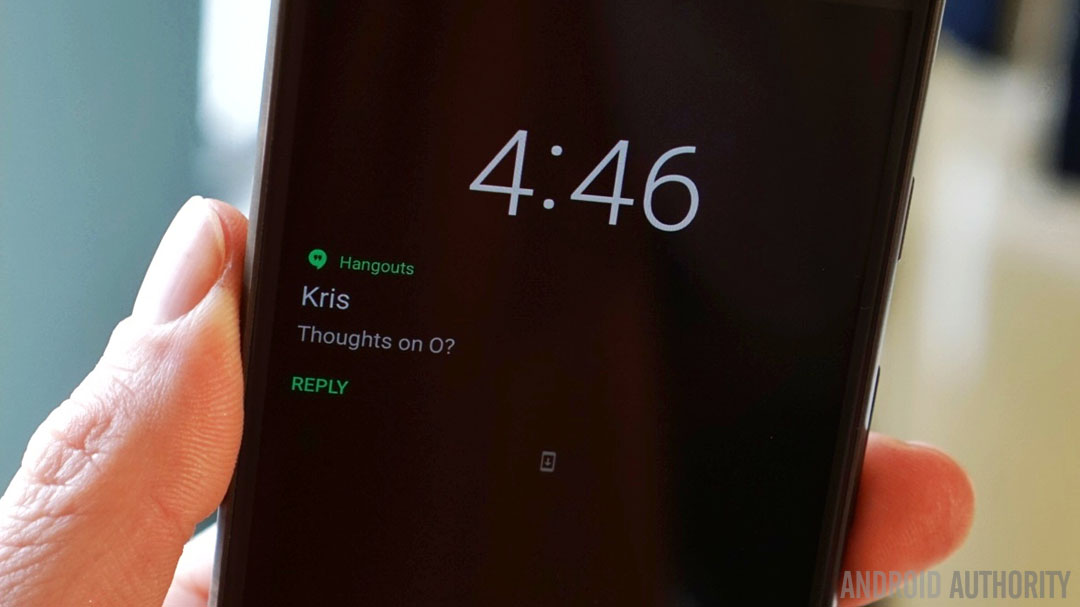
Android Oreo also introduces an improved Ambient Display. The familiar time and notification icons still ‘breathe’ on screen when you lift your device up, but now you’ll get larger notifications when a notification first comes in. Sadly, the ability to customize the lock screen shortcuts, present in the first developer preview, didn’t make it in the final build.
Further adding to the time-saving aspects of Android 8.0 is the new Autofill API, which promises to save you bucketloads of time on the web. Simply grant a service like Google’s Autofill or a password manager like LastPass permission to collect your passwords, credit card information and personal details and Oreo can offer to automatically complete web forms and log you into various accounts in future. Obviously, keeping your device safe and lock screen protected is essential here, but it’s a huge time saver.
One of the least touted features of Android Vitals is faster boot times. On the Pixel the boot up process is noticeably faster – twice as fast in fact. What used to take ages is now done in seconds, complete with a ‘powered by Android’ logo.
Whether it's through home shortcuts to popular app functions, smarter text selection, autofilling forms or simply booting your phone up twice as fast, Oreo will have you doing what you need to do in record time.
Meanwhile, Project Treble, which separates the vendor implementation from the Android OS framework, allows each to be updated independently. This means that OEMs can simply update the Android part of their phones without requiring anything from silicon vendors, which theoretically means you’ll get updates faster (I’ll believe it when I see it). Treble will be a part of all new devices launching with Oreo, although current Pixel phones are also supported.
As with other recent Android versions, Oreo wants to help you get to the things that matter quickly. Whether it’s through home shortcuts to popular app functions, smarter text selection, autofilling forms or simply booting your phone up twice as fast, Oreo will have you doing what you need to do in record time.
4. Being smarter
Android 8.0 is also the smartest of all Android versions, benefiting from the impressive Google Assistant and all the machine learning Google’s software has done over the last years. But there’s still room for some good old-fashioned man-made improvements too. Here are a few of the smarter decisions Google has made with Android Oreo.
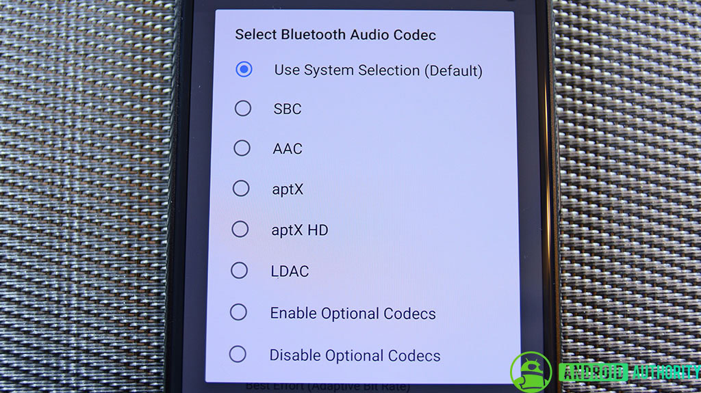
High performance Bluetooth audio was one of the first Oreo features to capture the attention of the Android masses. Sony donated its LDAC codec to Google for inclusion in Oreo, opening up the mobile OS to superior audio connections on supported hardware. I won’t go into detail here, as Rob’s LDAC explainer and Oreo audio feature articles do the topic much better justice, but suffice to say Oreo supports audio quality that surpasses both what the human ear can discern or what the vast majority of high-end audio equipment can even reproduce.
High performance Bluetooth audio was one of the first Oreo features to capture the attention of the Android masses.
Bluetooth 5 support is another well-publicized feature of Android 8.0. Offering such enticing benefits as double the data throughput over short distances or quadruple the range with less throughput, Bluetooth 5 is a big deal.
There has been a lot of confusion surrounding the tech though, so much so that our very own Gary Sims has published several articles outlining what Bluetooth 5 does (hint: it has nothing to do with streaming audio), how effective it is and how many devices can make use of it yet (hint: close to none). Like HDR display support for full gamut color apps, Bluetooth 5 is an investment in the future. Fortunately, the first devices to launch with Bluetooth 5 hardware and Oreo out of the box are very likely right around the corner.
Oreo also delivers a new multi-display mode, which allows you to pick up on a large screen whatever you were just doing on the small screen. Your phone will also be able to detect which display it should be running on and switch back and forth seamlessly. TextView auto-sizing will allow app developers to let Oreo automatically resize the text in their apps according to the available screen real estate.
Mouse pointer capture is another forward-thinking addition in Android 8.0, which opens up Android-powered devices like Chromebooks and others to mouse input (physical keyboard support, including for navigation, has also been added). I tried it on the Pixel and it absolutely works as advertised but as you can probably imagine, it’s super weird to use a mouse with a smartphone.
Android Instant Apps are another new introduction we’ve covered in greater detail elsewhere, but the ability to use select functionality of apps you don’t actually install on your phone is a revolutionary idea. AIA will massively reduce the need for keeping those occasional-use apps on your device, freeing up storage space for things you want, like photos or music, while still allowing you to access all the benefits of app-based activities. Check out Adam’s great video on the significance of AIA.
Downloadable fonts are yet another under-the-radar Oreo feature that most people will never think about twice. The short version is that 800 Google supported font libraries can now be accessed via a ‘provider’ app. This means that rather than every app on your phone requiring its own font library, naturally resulting in duplicates, apps can now simply call upon a shared library in the provider app, further reducing app file sizes. The best news is that this feature has been back-ported to API 14 (Android 4.0). Upgradable graphics drivers also make their debut on devices that ship with Android 8.0 Oreo out of the box.
Pushing the memory management in a different direction now, Android 8.0 includes disk space limits for cached data too. Under this new system, each app on your phone gets a certain amount of storage space for cached data. But whenever the system needs to free up disk space, any cached files above that per-app threshold will be purged. The good news for users is smaller cached file sizes overall.
Android 8.0 Oreo expands the capabilities of the OS by baking in additions like Bluetooth 5 and Wi-Fi Aware – neither of which are even supported by any hardware yet.
On the Wi-Fi front, Oreo makes use of a service called Wi-Fi Aware, also known as Neighbor Awareness Networking. Wi-Fi Aware basically lets you create micro Wi-Fi networks with other devices around you without using a traditional internet access points. Apps will be able to communicate in both directions between connected devices, although at this moment no supported hardware is available, so stay tuned.
Android 8.0’s Wi-Fi Assistant allows you to enable the Assistant to automatically connect you to high quality public wireless networks. The setting is disabled by default but it can be flipped with a switch, accessible via your Wi-Fi preferences in Settings.
While some of these Oreo features are more behind the scenes, niche-level stuff, like Sony’s LDAC codec for high quality Bluetooth audio connections, others, like Android Instant Apps, have the potential to dramatically change the way we think about apps. At the same time, Android 8.0 Oreo expands the capabilities of the OS by baking in additions like Bluetooth 5 and Wi-Fi Aware – neither of which are even supported by any hardware yet.
Android Oreo features: final thoughts

I can confidently say that I’ve never been as impressed with a new Android version as I am with Android Oreo. Even the bugs that typically plague a new update in the days immediately following its release haven’t settled on my trusty Pixel. Unlike some, I even managed to get through the developer previews with barely a hiccup, certainly an encouraging experience for the now-public version I’ve been enjoying these past few days.
A lot of features first introduced in Android Nougat and before have found their true home in Oreo, which finally seems to get everything right. It will surely have its detractors, but even they will have to admit this is easily the most polished and reliable version of Android Google has ever released.
Like its namesake, Oreo very much strives to be the OS for everybody, and Android finally seems to get everything right.
As we mentioned at the beginning, and like its namesake, Oreo very much strives to be the OS for everybody. I can easily see how an iPhone user could pick it up and run with it, just as easily as I can see Android fans adoring all the new advanced features and customization options.
The fact that HTC, OnePlus, Lenovo/Motorola and even the Essential Phone are all basically using stock Android these days is a testament to great software. If you’re in the market for a new phone this year, rather than recommend this device or that, my suggestion would be to buy whatever will get you Android Oreo. Because for the first time in a long time, the software is the real star here, the hardware is simply the stage on which it shines.