Affiliate links on Android Authority may earn us a commission. Learn more.
Is TouchWiz on the Galaxy S8 the best Android skin?
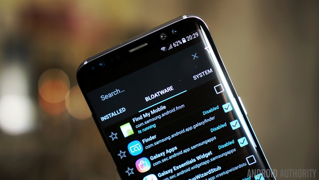
For most smartphone enthusiasts over the past few years, there was always one interface that seemed to polarise users like no other. Samsung may have had excellent hardware but its software failed to match it, until now that is. No longer called TouchWiz – it’s now officially known as the Samsung Experience – here’s why the software on the Galaxy S8 shows that patience really can pay off.
In previous generations of the Galaxy S line, software was always considered to be Samsung’s biggest downfall. The company first used the TouchWiz moniker way back with the original Galaxy S, but seemingly dropped any mention of it on the Galaxy S2. The lack of an official alternative however meant that the name TouchWiz stuck, and with it came the unwitting connotation of a poor software experience.
In 2017 however, this all looks set to change with Samsung launching its new Samsung Experience in December last year and with it, what appears to be an impressive change of focus when it comes to software. The Samsung Experience is both similar and different to TouchWiz of old, with a few of the concerns with previous iterations still present, albeit as part of a vastly improved interface.
From the Galaxy S6 to the Galaxy S7 Edge, Samsung made some big improvements, which proved to be necessary after the debacle that was TouchWiz on the Galaxy S5. The past two years have seen Samsung adopt a more minimalist approach to software, that was in line with improvements that Google made to its Android interface, while also improving the performance and reducing the amount of useless bloatware.
I say useless as there’s preinstalled apps and then there’s bloatware, and it’s important to recognise the difference between the two. Some of the preinstalled apps can be genuinely helpful – Samsung Health, Microsoft Office, Google’s apps, Samsung Gear and Smart Switch come to mind – and on my unlocked Galaxy S8, that’s all that is present. However, on carrier devices, you’ll likely find a lot more apps and on our T-Mobile branded Galaxy S8 Plus, there are several apps that serve no purpose. The latter isn’t in Samsung’s control and unlike previous iterations, the unlocked version has a very small set of installed apps.
One of the reasons I’ve been a fan of TouchWiz for years is that it reminds me of the old Symbian days thanks to the mountain of customisation options available out of the box. Yet, a lot of these have often felt weird, cumbersome and even pointless, and, while some continue to do so on the Galaxy S8, most feel relatively well thought out.
Take the settings menu – in previous years, it’s been a myriad of options with choice layouts like tabs and menu items hidden in inexplicable locations. On the Galaxy S8, you still have a lot of the options but they’re housed where you expect to find them and the new “Looking for something else?” section at the bottom of each sub-menu is very useful for navigating quickly to common tasks.
Diving into the settings further is where you’ll find new options to remove the ‘frames’ (aka backgrounds) from icons as well as the option to scale the display resolution between WQHD+, FHD+ (the default scaling) and HD+ as needed. The taller display also saw Samsung remove the home button and opt for on-screen keys and there’s now the option to switch them back to the default Android method. Interestingly, Samsung didn’t include the ability to add additional buttons, despite other Android OEMs such as Huawei and LG offering this on their devices.
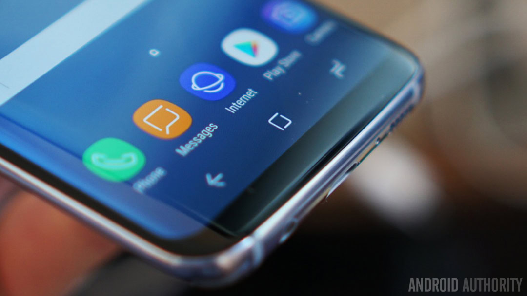
To offer a familiar experience to Android users, both existing and potential, Samsung has also adopted a lot of the shortcuts you can find on other phones. For example, the removal of the home button means you double press the camera button to launch the camera on the Galaxy S8, just like Google’s shortcut, while double tapping the recent apps key lets you quickly switch to the app you most recently used.
A new feature that I particularly like is that you can now swipe up or down on the home screen to access the app screen, which not only frees up an icon on the dock but replicates the gesture found on the Pixel phones, as well as popular Android launchers such as Nova. You can have the app screen icon if you really want it – but, why would you?
Another excellent new feature is the ability to customise the sound profile out of the headphones, directly to your tastes. Coupled with the in-box Galaxy S8 AKG headphones, this allows you to experience audio that you’ve customised to your exact needs. The Galaxy S8 also comes with the option to stream audio to two Bluetooth headphones or speakers at once. If you’re like me, this means you can finally have a Bluetooth headset and your car connected to your phone at the same time with calls routed to the headset and navigation / music routed through your car speakers.
Looking around the latest version of TouchWiz, one thing is immediately apparent: Samsung has focused on its interface, rather than have it feel like it was designed by engineers or accountants. There’s the skilled hand of experience at play, with the all-new app icons, subtle round corners and azure colors all providing an experience that feels complete in many ways.
A part of this comes from several features that are familiar from previous iterations of TouchWiz, albeit with more polish in the execution. The Secure Folder provides a welcome area that’s under lock and key and means you don’t need to worry about truly sensitive apps and information when letting someone else use your phone. The Edge UX has gained the Smart Select feature that’s shown when using the S-Pen on the late Galaxy Note 7.
Notifications are also vastly improved compared to previous years. I personally prefer more content on my screen and have scaled the display and font on my Galaxy S8 to smaller to offer this. The result is a notification menu that’s incredibly useful and rather nice to look at. When there are no notifications, it takes up barely any space and there seems to be a lot less persistent notifications for Samsung’s features compared to previous years.
Samsung clearly knows it makes great hardware and, with the Samsung Experience, the company is tapping into hardware-software synergy that few companies manage to achieve. Nowhere is this more prevalent than when you get a notification and the beautiful blue pulse of light that traces the edges of the stunning screen.
Of course, the Samsung Experience isn’t perfect and yes, it continues to replicate some of Google’s own apps, but the number is relatively limited. Want an AI-based assistant? You’ve got Google Assistant and Samsung’s Bixby. Want to browse the web – you can choose Google Chrome or the Internet browser, albeit the latter is a necessity to provide the best experience for Samsung DeX users. Unlike previous years however, the number of duplicated apps is minimal and where Samsung has replaced Google’s apps with its own – such as Calendar, Contacts and the Dialer – some of its apps are actually much better than Google’s own.
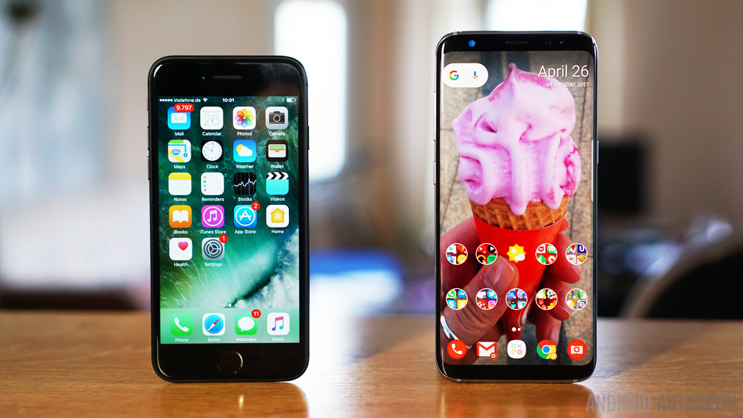
In a lot of ways, the Samsung Experience reminds me of Google’s Android… but better. Yes, there’s still bloatware on carrier variants, a little lag when scrolling over to Bixby home and the odd niggle here and there, but these small gripes aside, the software on the Galaxy S8 is Samsung’s best yet, and some may say, it’s the best Android OEM interface currently available.
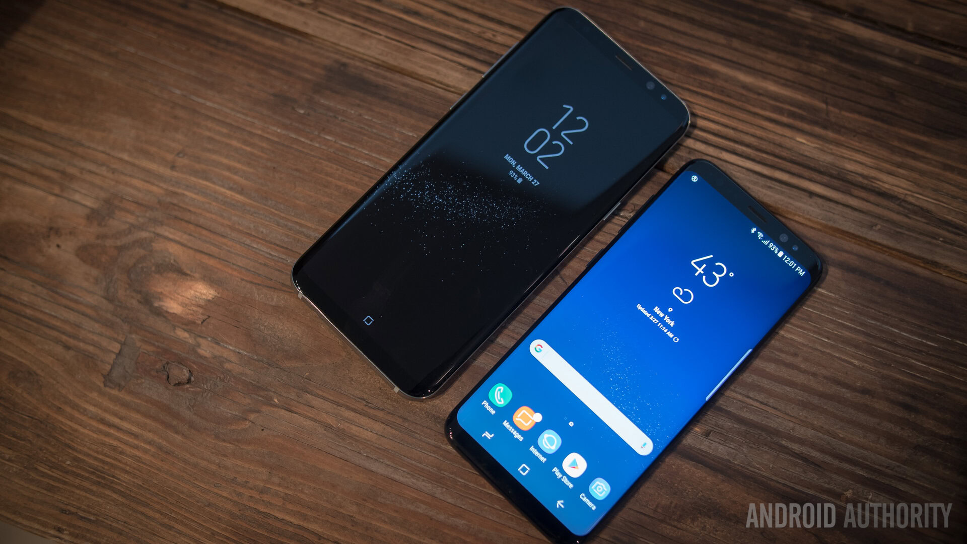
Samsung has made great hardware for many years, but it’s taken a while for the company’s software division to catch up. I’ve used TouchWiz for several years and with the release of every new Samsung flagship, it’s often felt like a case of two steps forward, one step back. While the Galaxy S8 continues this – thanks to questionable hardware decisions like the position of the fingerprint sensor – the Samsung Experience is every bit the platform that Samsung’s hardware deserves.
What’s your take on TouchWiz? Were you in the camp of hating it with a vengeance and has the Galaxy S8 swayed you? Let us know, down below and check out our full Galaxy S8 review!