Affiliate links on Android Authority may earn us a commission. Learn more.
Using CoordinatorLayout in Android apps
Published onJuly 19, 2016
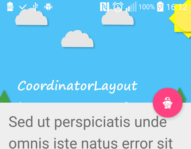
The CoordinatorLayout is a new layout, introduced with the Android Design Support Library. The CoordinatorLayout is a super-powered FrameLayout (according to the official documentation). If you have used a FrameLayout before, you should be very comfortable using CoordinatorLayout. If you haven’t used a FrameLayout, do not worry, it is pretty straightforward.
By default, if you add multiple children to a FrameLayout, they would overlap each other. A FrameLayout should be used most often to hold a single child view. The main appeal of the CoordinatorLayout is its ability to coordinate the animations and transitions of the views within it. Using xml only, you can describe a layout where a FAB moves out of the way of an incoming Snackbar, for example, or have a FAB (or any other View really) that is apparently attached to another widget, and moves on screen with the widget.
For this article, we are going to show three different out of the box ways that using CoordinatorLayout can simplify your code, by making views respond to changes in the layout or position of other views. Then, we will discuss how this behavior is achieved in code, and show a fourth method, where you learn how to implement your own custom behaviors between views. By implementing custom behaviors, you can easily create amazing interdependent animations, transitions and effects, limited only by your imagination (and coding ability :D).
Preparation
Before using CoordinatorLayout in your app, you must import the Android Support Design Library into your project, by adding the following dependency to your app build.gradle file
dependencies {
    ...
    compile 'com.android.support:design:24.0.0'
}
And we are all set.
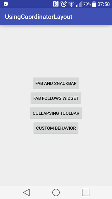
The demo app, available on github, has a MainActivity, with four buttons, for each of the different ways of using CoordinatorLayout we discuss below.
1. Snackbar and FAB
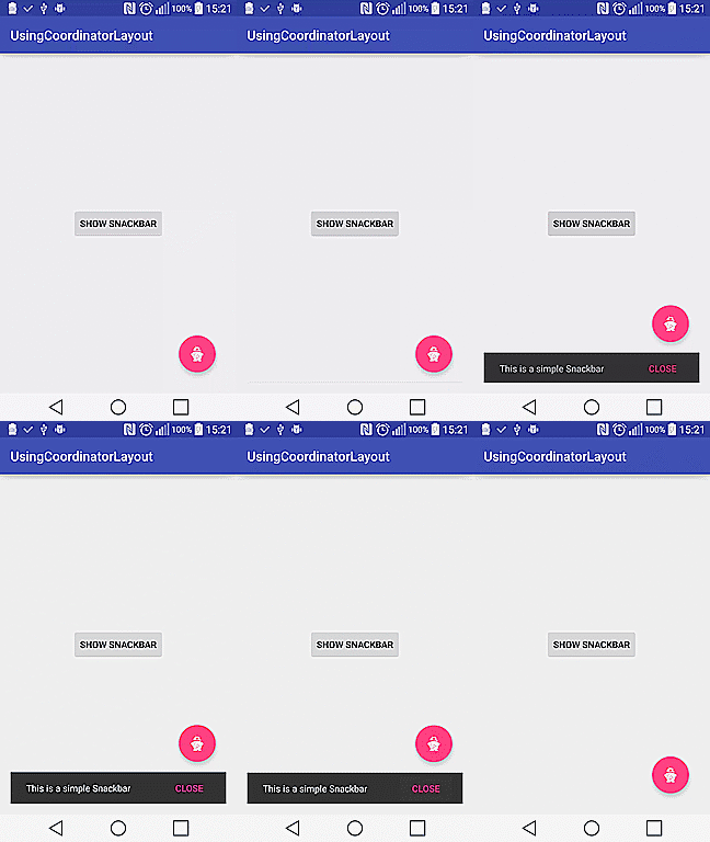
For the first activity, we want to build a layout with a FAB that automatically slides out of the way, when a Snackbar is displayed. This is kind of the “HelloWorld” program for the CoordinatorLayout, and with good reason. The functionality is completely implemented in a very simple layout xml file, and it just works.
The layout is pretty straightforward. The CoordinatorLayout is the root layout. Within it, we have a button, that is centered on screen, and a FAB, that’s positioned at the bottom right of the screen, with a little margin to ensure we abide by the material design guidelines.
<android.support.design.widget.CoordinatorLayout
    xmlns:android="http://schemas.android.com/apk/res/android"
    xmlns:tools="http://schemas.android.com/tools"
    android:id="@+id/coordinatorLayout"
    android:layout_width="match_parent"
    android:layout_height="match_parent"
    android:paddingBottom="@dimen/activity_vertical_margin"
    android:paddingLeft="@dimen/activity_horizontal_margin"
    android:paddingRight="@dimen/activity_horizontal_margin"
    android:paddingTop="@dimen/activity_vertical_margin"
    tools:context="com.sample.foo.usingcoordinatorlayout.FabAndSnackbarActivity">

    <Button
        android:id="@+id/showSnackbarButton"
        android:layout_width="wrap_content"
        android:layout_height="wrap_content"
        android:layout_gravity="center"
        android:text="@string/show_snackbar"/>

    <android.support.design.widget.FloatingActionButton
        android:id="@+id/fab"
        android:layout_width="wrap_content"
        android:layout_height="wrap_content"
        android:layout_gravity="bottom|right"
        android:layout_marginBottom="@dimen/activity_vertical_margin"
        android:layout_marginRight="@dimen/activity_horizontal_margin"
        android:src="@android:drawable/ic_popup_disk_full"/>

</android.support.design.widget.CoordinatorLayout>
The only addition we make to the Activity class is to implement an OnClickListener on the Button, to show a Snackbar. We set the root View for the Snackbar to the CoordinatorLayout. This way, the CoordinatorLayout knows about the Snackbar and the FAB, and the transition animation is handled automatically, to make sure that both widgets do not overlap.
public class FabAndSnackbarActivity extends AppCompatActivity {

    private Button mShowSnackbarButton;
    private CoordinatorLayout mCoordinatorLayout;

    @Override
    protected void onCreate(Bundle savedInstanceState) {
        super.onCreate(savedInstanceState);
        setContentView(R.layout.activity_fab_and_snackbar);

        mCoordinatorLayout = (CoordinatorLayout) findViewById(R.id.coordinatorLayout);

        mShowSnackbarButton = (Button) findViewById(R.id.showSnackbarButton);
        mShowSnackbarButton.setOnClickListener(new View.OnClickListener() {
            @Override
            public void onClick(View view) {
                Snackbar.make(mCoordinatorLayout,
                        "This is a simple Snackbar", Snackbar.LENGTH_LONG)
                        .setAction("CLOSE", new View.OnClickListener() {
                            @Override
                            public void onClick(View v) {
                                // Custom action
                            }
                        }).show();
            }
        });
    }
}
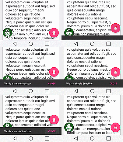
Run the activity, and observe that the FAB automatically slides up and out of the way for the snackbar, when it is shown, and slides down and back to it’s position, when the snackbar is exiting from view.
2. FAB follows Widget
Unlike the previous example, this time the CoordinatorLayout is not the root layout. Rather, the root layout is a RelativeLayout, and the CoordinatorLayout is it’s only child. This is because we do not want the CoordinatorLayout’s children to slide out of view of the screen. Within the CoordinatorLayout, we have a NestedScrollView that contains a single LinearLayout. The LinearLayout, contains multiple CardViews.
An overview of the layout:
<RelativeLayout>
    <CoordinatorLayout>
        <NestedScrollView>
            <LinearLayout>
                <CardView/>
                <CardView/>
                <CardView/>
            </LinearLayout>
        </NestedScrollView>
        </FloatingActionButton>
    </CoordinatorLayout>
</RelativeLayout>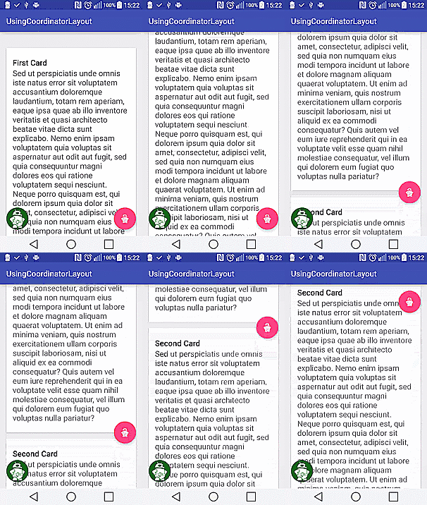
As above, the FAB is a direct child of the CoordinatorLayout. However, rather than position the FAB with layout_gravity, we anchor the FAB to the first CardView in the LinearLayout, and specify that it should be anchored to the bottom right of the view.
The layout
<RelativeLayout xmlns:android="http://schemas.android.com/apk/res/android"
    xmlns:app="http://schemas.android.com/apk/res-auto"
    xmlns:tools="http://schemas.android.com/tools"
    android:layout_width="match_parent"
    android:layout_height="match_parent"
    android:fitsSystemWindows="true"
    tools:context=".FabFollowsWidgetActivity">

    <android.support.design.widget.CoordinatorLayout
        android:layout_width="match_parent"
        android:layout_height="match_parent">

        <android.support.v4.widget.NestedScrollView
            android:layout_width="match_parent"
            android:layout_height="match_parent"
            app:layout_behavior="@string/appbar_scrolling_view_behavior">

            <LinearLayout
                android:layout_width="match_parent"
                android:layout_height="match_parent"
                android:orientation="vertical"
                android:paddingTop="24dp">

                <android.support.v7.widget.CardView
                    android:id="@+id/cardView1"
                    android:layout_width="match_parent"
                    android:layout_height="wrap_content"
                    android:layout_margin="@dimen/card_margin">

                    <LinearLayout
                        style="@style/Widget.CardContent"
                        android:layout_width="match_parent"
                        android:layout_height="wrap_content">

                        <TextView
                            android:layout_width="match_parent"
                            android:layout_height="wrap_content"
                            android:text="@string/first"
                            android:textAppearance="@style/TextAppearance.AppCompat.Title" />

                        <TextView
                            android:layout_width="match_parent"
                            android:layout_height="wrap_content"
                            android:textSize="20sp"
                            android:text="@string/long_latin" />

                    </LinearLayout>

                </android.support.v7.widget.CardView>

                <android.support.v7.widget.CardView
                    android:id="@+id/cardView2"
                    android:layout_width="match_parent"
                    android:layout_height="wrap_content"
                    android:layout_marginBottom="@dimen/card_margin"
                    android:layout_marginLeft="@dimen/card_margin"
                    android:layout_marginRight="@dimen/card_margin">

                    <LinearLayout
                        style="@style/Widget.CardContent"
                        android:layout_width="match_parent"
                        android:layout_height="wrap_content">

                        <TextView
                            android:layout_width="match_parent"
                            android:layout_height="wrap_content"
                            android:text="@string/second"
                            android:textAppearance="@style/TextAppearance.AppCompat.Title" />

                        <TextView
                            android:layout_width="match_parent"
                            android:layout_height="wrap_content"
                            android:textSize="20sp"
                            android:text="@string/long_latin" />

                    </LinearLayout>

                </android.support.v7.widget.CardView>

                <android.support.v7.widget.CardView
                    android:id="@+id/cardView3"
                    android:layout_width="match_parent"
                    android:layout_height="wrap_content"
                    android:layout_marginBottom="@dimen/card_margin"
                    android:layout_marginLeft="@dimen/card_margin"
                    android:layout_marginRight="@dimen/card_margin">

                    <LinearLayout
                        style="@style/Widget.CardContent"
                        android:layout_width="match_parent"
                        android:layout_height="wrap_content">

                        <TextView
                            android:layout_width="match_parent"
                            android:layout_height="wrap_content"
                            android:text="@string/third"
                            android:textAppearance="@style/TextAppearance.AppCompat.Title" />

                        <TextView
                            android:layout_width="match_parent"
                            android:layout_height="wrap_content"
                            android:textSize="20sp"
                            android:text="@string/long_latin" />

                    </LinearLayout>

                </android.support.v7.widget.CardView>

            </LinearLayout>
        </android.support.v4.widget.NestedScrollView>

        <android.support.design.widget.FloatingActionButton
            android:layout_width="wrap_content"
            android:layout_height="wrap_content"
            android:layout_margin="@dimen/activity_horizontal_margin"
            android:src="@drawable/mascot_icon"
            app:layout_anchor="@id/cardView1"
            app:layout_anchorGravity="bottom|end" />

        <de.hdodenhof.circleimageview.CircleImageView
            android:layout_width="56dp"
            android:layout_height="56dp"
            android:layout_margin="@dimen/activity_horizontal_margin"
            android:src="@drawable/mascot"
            android:layout_gravity="bottom|start"/>
    </android.support.design.widget.CoordinatorLayout>
</RelativeLayout>
The activity
We make absolutely no changes to this Activity file. The Activity simply inflates the layout file. Running this activity produces an effect where the FAB scrolls with the first CardView, till the CardView is out of the screen. Note that the FAB doesn’t scroll off screen with the CardView. This can be done with other widgets and views. Also note that the FAB is anchored to a View that is not a direct child of the CoordinatorLayout. You can anchor a view (let’s call it ChildView) to any other view (let’s call this DependecyView) that is within the CoordinatorLayout hierarchy (except when DependencyView is a child of ChildView).
The Activity:
public class FabFollowsWidgetActivity extends AppCompatActivity {

    @Override
    protected void onCreate(Bundle savedInstanceState) {
        super.onCreate(savedInstanceState);
        setContentView(R.layout.activity_fab_follows_widget);
    }
}
3. CollapsingToolbar and Appbar
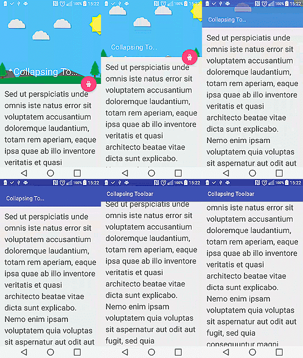
Another excellent use of the CoordinatorLayout is with the CollapsingToolbar and Appbar. The CollapsingToolbar is another of the amazing features of the Android Support Design Library. For this activity, we are going to build a layout with a FAB that is anchored to the Appbar. The FAB scrolls with the Appbar, and disappears when the Appbar is collapsed.
The layout
<android.support.design.widget.CoordinatorLayout
    xmlns:android="http://schemas.android.com/apk/res/android"
    xmlns:app="http://schemas.android.com/apk/res-auto"
    xmlns:tools="http://schemas.android.com/tools"
    android:layout_width="match_parent"
    android:layout_height="match_parent"
    android:fitsSystemWindows="true"
    tools:context="com.sample.foo.usingcoordinatorlayout.FabAndSnackbarActivity">

    <android.support.design.widget.AppBarLayout
        android:id="@+id/appBar"
        android:layout_width="match_parent"
        android:layout_height="300dp"
        android:theme="@style/ThemeOverlay.AppCompat.Dark.ActionBar"
        android:fitsSystemWindows="true">

        <android.support.design.widget.CollapsingToolbarLayout
            android:id="@+id/collapsingToolbar"
            android:layout_width="match_parent"
            android:layout_height="match_parent"
            app:layout_scrollFlags="scroll|exitUntilCollapsed"
            android:fitsSystemWindows="true"
            app:contentScrim="?attr/colorPrimary"
            app:expandedTitleMarginStart="48dp"
            app:expandedTitleMarginEnd="64dp"
            app:title="@string/collapsing_toolbar">

            <ImageView
                android:id="@+id/toolbarImage"
                android:layout_width="match_parent"
                android:layout_height="match_parent"
                android:scaleType="centerCrop"
                android:fitsSystemWindows="true"
                android:src="@drawable/bg"
                app:layout_collapseMode="parallax" />

            <android.support.v7.widget.Toolbar
                android:id="@+id/toolbar"
                android:layout_width="match_parent"
                android:layout_height="?attr/actionBarSize"
                app:popupTheme="@style/ThemeOverlay.AppCompat.Light"
                app:layout_collapseMode="pin" />
        </android.support.design.widget.CollapsingToolbarLayout>
    </android.support.design.widget.AppBarLayout>

    <android.support.v4.widget.NestedScrollView
        android:layout_width="match_parent"
        android:layout_height="match_parent"
        app:layout_behavior="@string/appbar_scrolling_view_behavior">

        <TextView
            android:layout_width="match_parent"
            android:layout_height="wrap_content"
            android:textSize="28sp"
            android:lineSpacingExtra="8dp"
            android:text="@string/long_latin"
            android:padding="@dimen/activity_horizontal_margin" />
    </android.support.v4.widget.NestedScrollView>

    <android.support.design.widget.FloatingActionButton
        android:layout_height="wrap_content"
        android:layout_width="wrap_content"
        android:layout_margin="@dimen/activity_horizontal_margin"
        android:src="@drawable/mascot_icon"
        app:layout_anchor="@id/appBar"
        app:layout_anchorGravity="bottom|end" />
</android.support.design.widget.CoordinatorLayout>
As before, we make absolutely no code changes to the Activity. It just works(TM).
public class CollapsingToolbarActivity extends AppCompatActivity {

    @Override
    protected void onCreate(Bundle savedInstanceState) {
        super.onCreate(savedInstanceState);
        setContentView(R.layout.activity_collapsing_toolbar);
    }
}
4. Implementing custom behaviors
Of course, some code must have been written to govern the behaviors of the widgets and Views in our samples above. The CoordinatorLayout automatically does all this already. However, you might want to define your own reactions and behaviors, rather than use the default and standard behaviors. It is remarkably easy to do. The complexity lies in how unique a behavior you want, and not in implementing a behavior. Our custom behavior is really simple. From the FabFollowsWidget sample above, we want the CircleImageView to grow larger as the user scrolls to the end of the Cards.
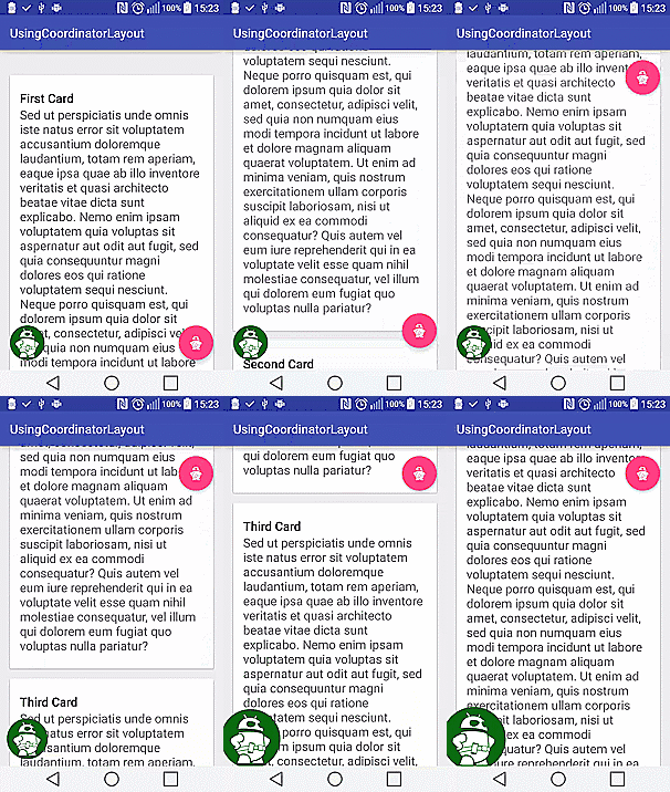
To define a custom behavior, we create a CustomBehavior class, that inherits from CoordinatorLayout.behavior class. We want the View that uses our behavior to have it’s layout depend on another View. To achieve this, we override the layoutDependsOn method specifying what class of Views we want to watch out for. We also override the onDependentViewChanged method, which specifies what should happen when the dependent view has changed. In the sample below, we check for the position of the Toolbar relative to the CircleImageView, and increase the size of the CircleImageView correspondingly using setScale().
public class CustomBehavior extends CoordinatorLayout.Behavior<CircleImageView> {

    private final static String TAG = "CustomBehavior";

    public CustomBehavior(Context context, AttributeSet attrs) {
        super(context, attrs);
    }

    @Override
    public boolean layoutDependsOn(CoordinatorLayout parent, CircleImageView child, View dependency) {
        return dependency instanceof Toolbar;
    }

    @Override
    public boolean onDependentViewChanged(CoordinatorLayout parent, CircleImageView child, View dependency) {
        int[] dependencyLocation = new int[2];
        int[] childLocation = new int[2];

        dependency.getLocationInWindow(dependencyLocation);
        child.getLocationInWindow(childLocation);

        float diff = childLocation[1] - dependencyLocation[1];
        if(diff > 0) {
            float scale = diff/(float)childLocation[1];
            Log.d(TAG, "scale == " + scale);
            child.setScaleX(1+scale);
            child.setScaleY(1+scale);
        }
        return false;
    }
}
The layout is identical to the FabFollowsWidget layout above, except for the inclusion of an Toolbar at the buttom of the screen. There is really no reason why we chose a Toolbar, and it could be anything you want. The Toolbar is anchored to the last CardView. Recall that in the CustomBehavior class above, the CircleImageView layout depends on a Toolbar. When the Toolbar moves with the last CardView (cardView3) the CircleImageView begins to grow.
<RelativeLayout>
    <android.support.design.widget.CoordinatorLayout>
        <android.support.v4.widget.NestedScrollView>
            <LinearLayout>
                <android.support.v7.widget.CardView
                    android:id="@+id/cardView1"
                </android.support.v7.widget.CardView>

                <android.support.v7.widget.CardView
                    android:id="@+id/cardView2"
                </android.support.v7.widget.CardView>

                <android.support.v7.widget.CardView
                    android:id="@+id/cardView3"
                </android.support.v7.widget.CardView>
            </LinearLayout>
        </android.support.v4.widget.NestedScrollView>
        <android.support.design.widget.FloatingActionButton />

        <de.hdodenhof.circleimageview.CircleImageView
            android:layout_width="56dp"
            android:layout_height="56dp"
            android:layout_margin="@dimen/activity_horizontal_margin"
            android:layout_gravity="bottom|start"
            android:src="@drawable/mascot"
            app:layout_behavior="com.sample.foo.usingcoordinatorlayout.CustomBehavior" />

        <android.support.v7.widget.Toolbar
            android:layout_width="wrap_content"
            android:layout_height="wrap_content"
            app:layout_anchor="@id/cardView3"/>
    </android.support.design.widget.CoordinatorLayout>
</RelativeLayout>
That is it. To achieve our desired behavior, we really do not need to change the Activity class.
public class CustomBehaviorActivity extends AppCompatActivity {

    private FloatingActionButton mFab;
    private CoordinatorLayout mCoordinatorLayout;
    @Override
    protected void onCreate(Bundle savedInstanceState) {
        super.onCreate(savedInstanceState);
        setContentView(R.layout.activity_custom_behavior);

        mCoordinatorLayout = (CoordinatorLayout) findViewById(R.id.coordinatorLayout);

        mFab = (FloatingActionButton) findViewById(R.id.fab);
        mFab.setOnClickListener(new View.OnClickListener() {
            @Override
            public void onClick(View view) {
                Snackbar.make(mCoordinatorLayout,
                        "This is a simple Snackbar", Snackbar.LENGTH_LONG)
                        .setAction("CLOSE", new View.OnClickListener() {
                            @Override
                            public void onClick(View v) {

                            }
                        }).show();
            }
        });
    }
}
Finally
If you look closely at the final activity above, you will notice that we included an OnClickListener to the FAB, to show a Snackbar. Showing this Snackbar animates the FAB out of the way, but ignores the CircleImageView. Can you fix this?
The complete source code for the app developed above is available on github and can be used by all for free.
The CoordinatorLayout class simplifies a lot of the animations and transitions we expect to see between views and widgets, and it should definitely be very familiar to every serious Android developer. There are a lot of cool and interesting ways of using the CoordinatorLayout and the behaviors that it’s children can define. Do you have such a use? On github (or other source code hosting services), or do you know of any project that has used the CoordinatorLayout in a novel way? Share with the community in the comments below. Happy coding.