Affiliate links on Android Authority may earn us a commission. Learn more.
Popular photography app VSCO totally redesigned for Android and iOS

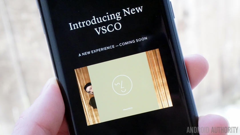
A new VSCO update is bringing an entirely new user interface and community-focused experience to the popular photography app. The new update bases everything around four simple swipe gestures: up, down, left and right and promises to bring more content to you quicker and easier than before.

Once you’ve got the updated version, navigation follows a simple logic: swiping left takes you to your personal space for editing and posting content, swiping right takes you to community content, swiping down takes you to search and up opens the camera.
VSCO has become a popular photography app in part for its solid camera features, but also for its impressive editing functions and extensive filters. VSCO prioritizes content over the social side, so all you see is an endless stream of beautiful photography rather than a cluttered mix of likes, comments and share totals.
Keep an eye out for the Google Play update prompt, or hit the button below to check for the new version. The Play Store is showing an update day of June 2 although the version number remains at 3.7 for now (which has been out for a couple of weeks). VSCO has promised the new version will be rolling out “shortly”.
Have you got the new update yet? What do you think of the new interface?