Affiliate links on Android Authority may earn us a commission. Learn more.
Xiaomi Mi Mix
What we like
What we don't like
Our scores
Xiaomi Mi Mix
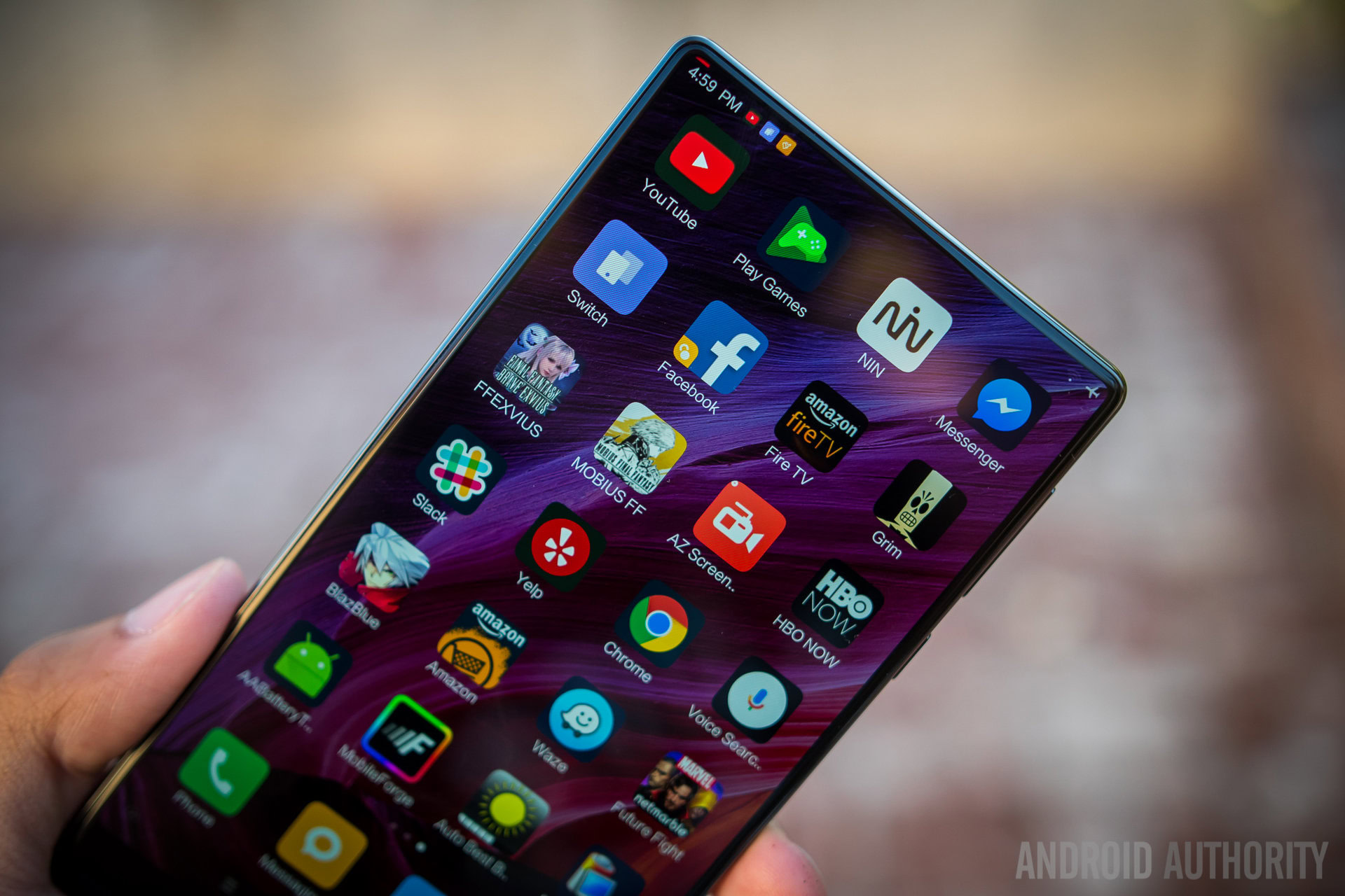
Xiaomi made quite a splash with what they called a ‘concept phone”; a phone that, they hope, will give us a glimpse into a future where smartphones are slabs of glass that project the magic that lies within. Considering we don’t have the technology (yet) that can make our phones achieve this, they went with the best we can do right now – a phone that is all display, all the time.
I’ve been using it for some time now, trying to figure out if a phone that is basically entire display actually makes sense for our daily lives. After all, doing this to a phone means that some changes have to be made to the very way that we see and use our smartphones. Does it work and is this the future of smartphones? Let’s find out in this, our Xiaomi Mi MIX review.
Design
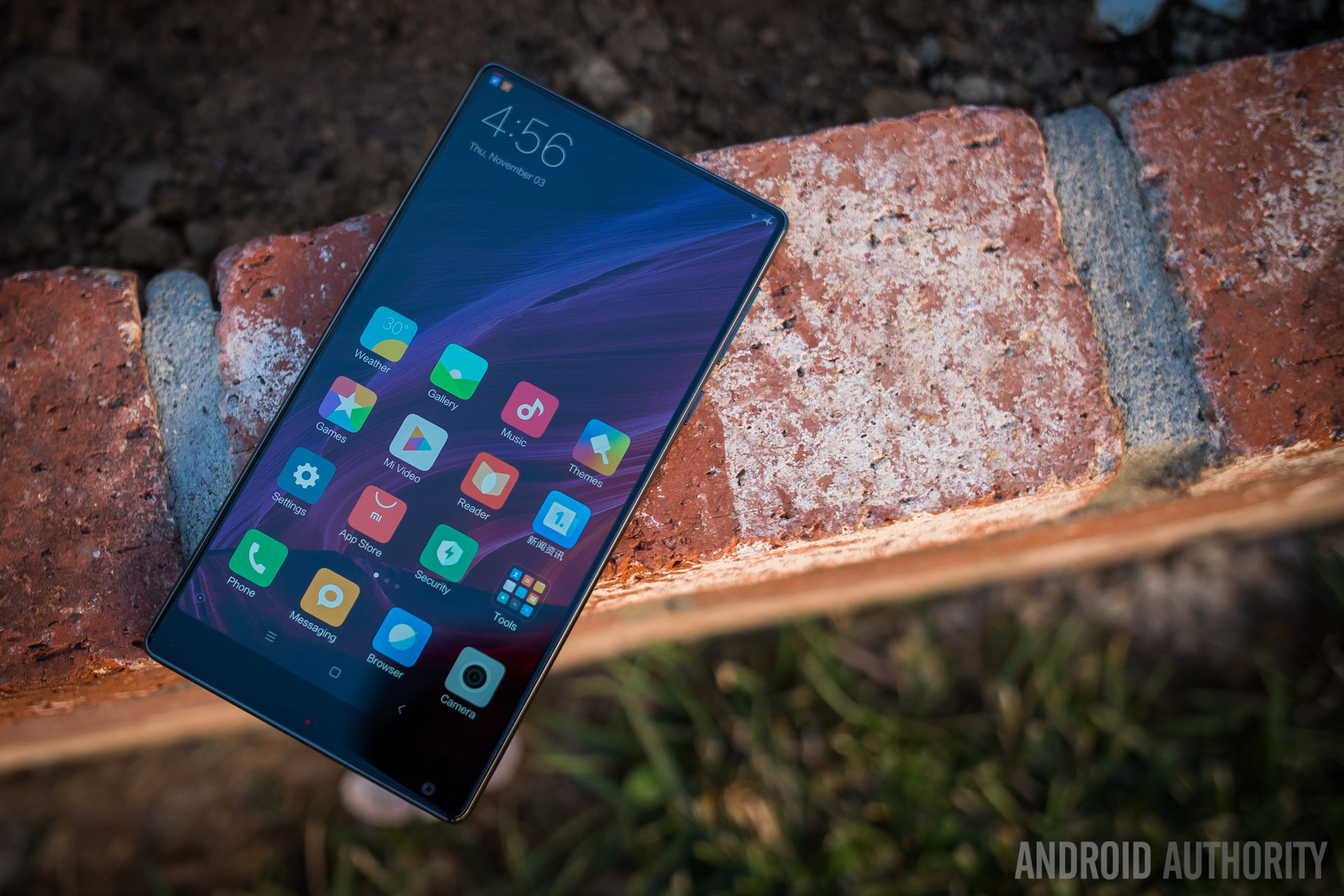
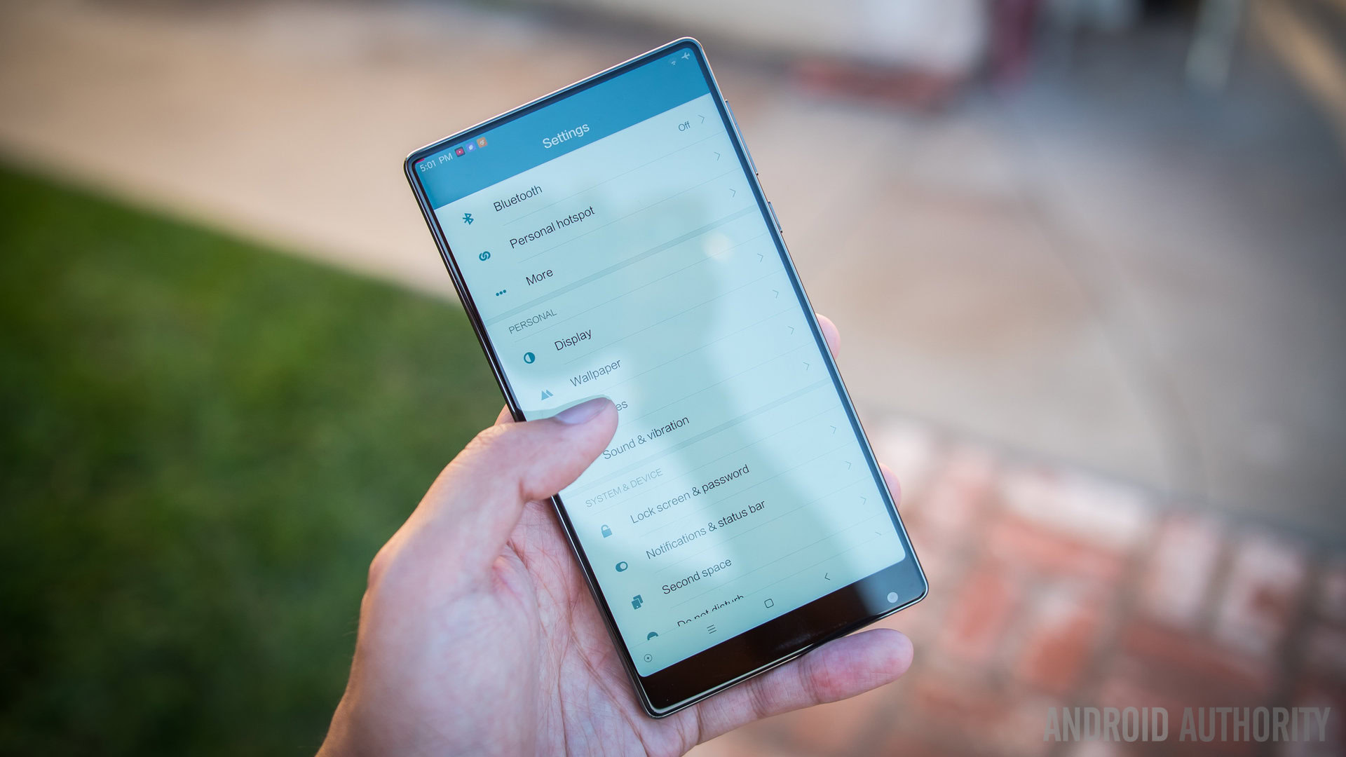
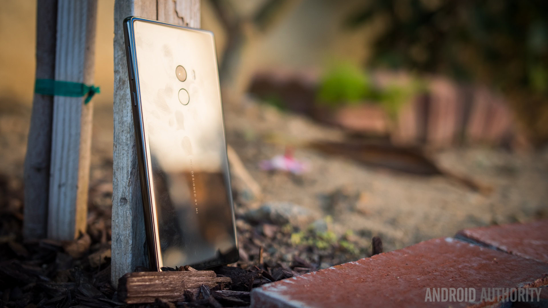
To make room for the massive display, Xiaomi had to move many of the current conventions of the smartphone around, but to make the shell holding it all together just as appealing, the company made this large 6.4-inch phone utilize full ceramic for its material. The result is a very shiny, very sleek block that is highly eye-catching and, honestly, really slippery. I’ve almost dropped the phone multiple times as a result. It seems a little ironic to me that this phone is supposed to be all about the display yet it can be broken quite easily due to its large size and slippery body.
Luckily, there is a premium leather case that Xiaomi made a big deal of, citing its high quality and the premium price for it. Even more luckily, it is included in the box. There was little time between my actually using the phone and then sliding it in the case for safety.
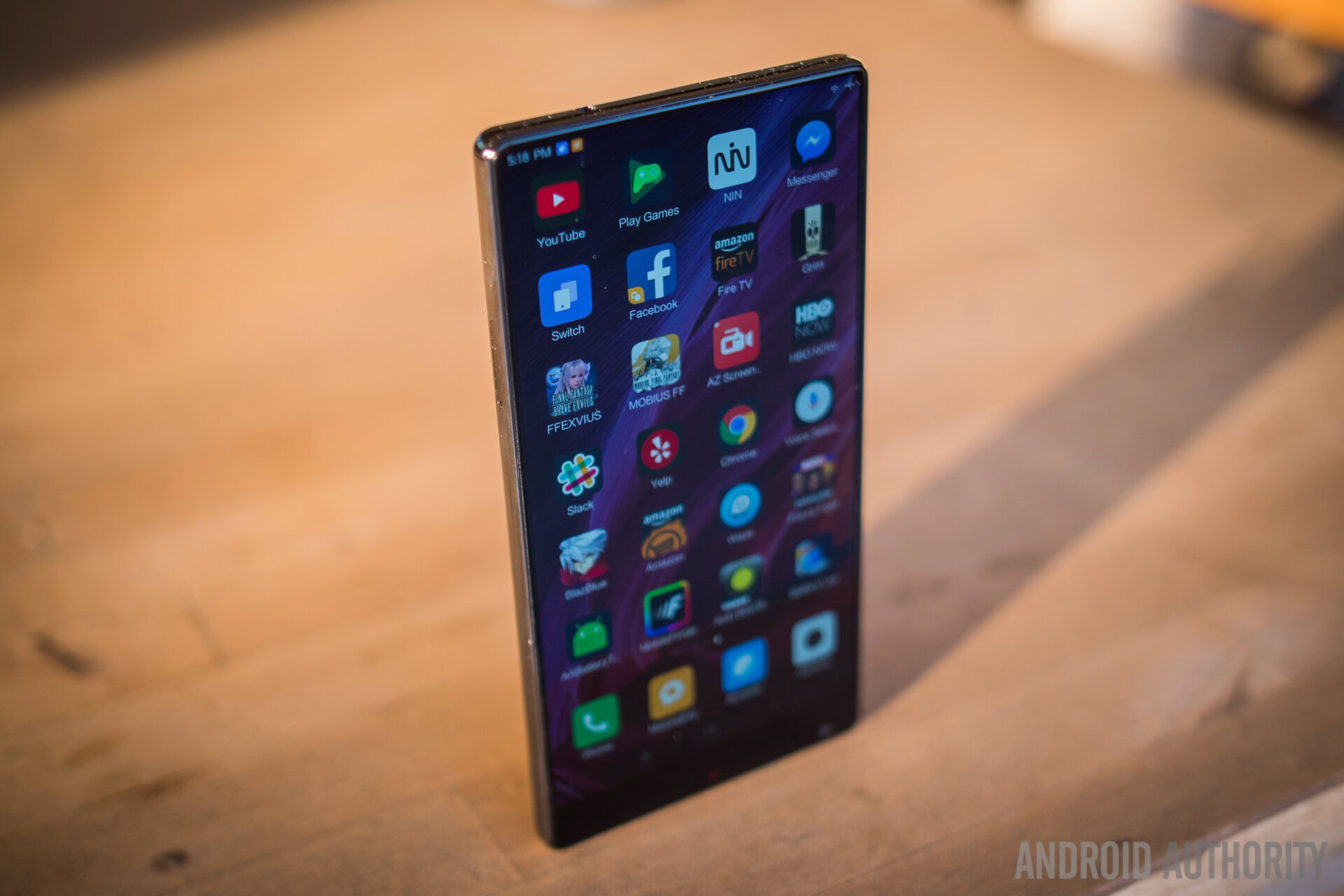
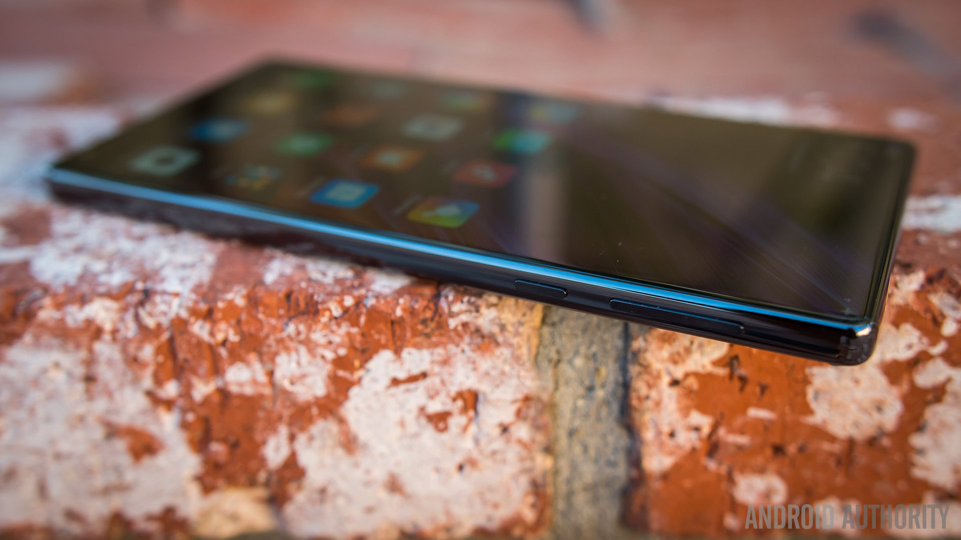
That said, plenty of what makes a smartphone recognizable remains, at least on the sides and the back. Prominent power and volume buttons on the side are easy to feel for, and the rear elements of the camera and the fingerprint reader are a bit lower on the upper third than might be typical. This phone does come with a headphone jack up top and the USB-C port on the bottom is flanked by the microphone and surprisingly good speaker.
It’s when we get to the front of the phone that we see where things have been shifted around. The top of the device is where some of the magic of the display takes place, as there is virtually no bezel around three sides of the screen. The parts of a phone that we are used to seeing up there are moved either underneath the screen or to the bottom. And below the screen is, mainly, the front facing camera – the location of this camera is not the most ideal, not only because the upward angle isn’t the most flattering for selfies, but also because thumbs and palms might show up in the corner of the frame.

Otherwise, the proximity sensor is now sonar based, which will figure when the top of the phone is close to a subject. And the phone speaker is now a piece of ceramic just below the screen that emits sound through vibrations. Both of these will be considered further in the hardware section.
it seems like this phone is a great concept for not just phones but also for tablets
Display

The IPS near bezel-less display has one big caveat right off the bat – it is only a 1080p display. Technically, it is actually 2040×1080, which makes it have an aspect ratio of 17:9 and slightly wider than the typical video frame. Though this almost Full HD is not bad by any means, flagship devices have made this kind of choice feel like more of an aberration than it probably should be. For a phone like the Xiaomi Mi MIX, Quad HD would have really elevated what is already a sight to behold.
With a 91.3% screen to body ratio, there is so much real estate for just about any form of entertainment – or work, if that is what you want to do – and everything displays really well. The IPS screen gets quite bright even under daylight, but there is also a lot of control over the backlight that Xiaomi put in because bringing the brightness down to 0 seemingly shuts it completely off. Its saturation has also been bumped up a bit to make it a little more pleasing to the eye. As a result, gaming and streaming YouTube videos on the Xiaomi Mi MIX has been very enjoyable, to a fault.
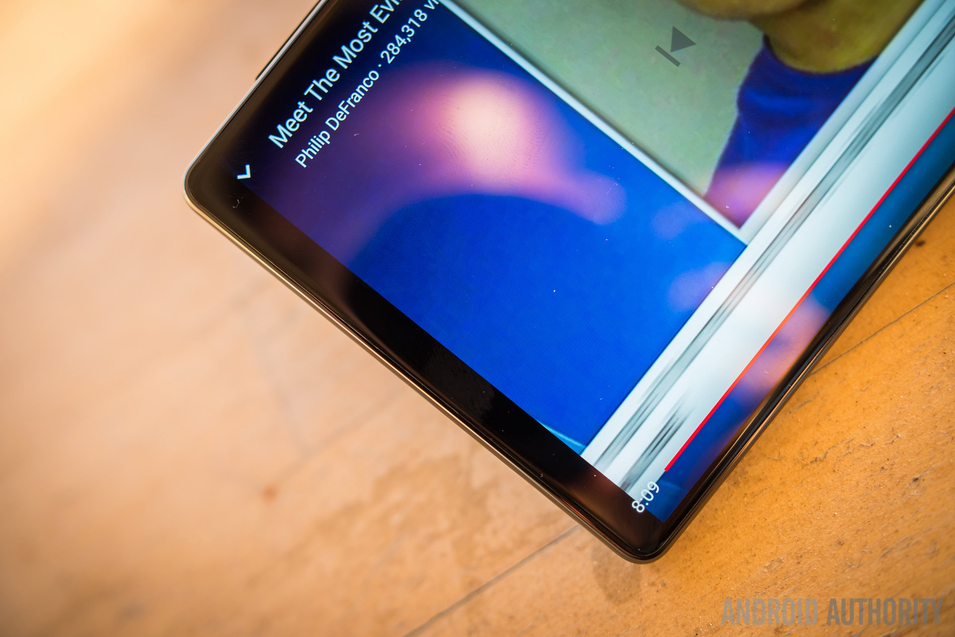
Let’s go back, for a second, to the resolution and some of the issues that it presents. As mentioned before, Full HD is not bad, but 17:9 has proved to be a little problematic. Videos are, typically, 16:9 aspect ratio and when they are viewed on any display that is higher in ratio, letterboxing occurs. This is the case and problem I found on the MIX. YouTube videos, in particular, show small black bars on the sides of the video, taking away from the immersion that the bezel-less construction is supposed to provide. So, with that in mind, the magic of having almost no bezel is replaced by the simple but common enjoyment of having a large screen.
The opposite is true for many games that I played on the MIX, because they are coded to ‘best-fit’ the aspect ratio the display – and in most cases, the elements on the very edges of the HUD bleed just past the boundaries of the screen.
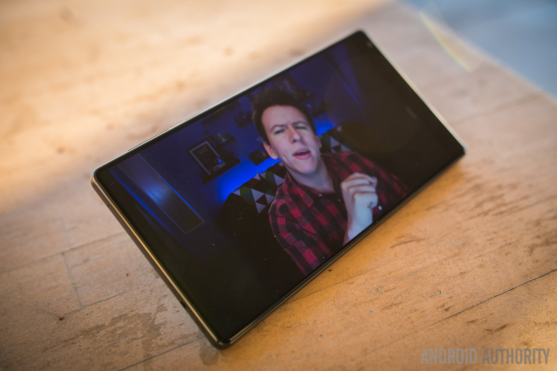
And finally, having a 1080p display on such a large display makes for a lower overall pixel density, which means a bit of loss in sharpness. This is less a problem for static content and more of an issue with motion, as there is an apparent motion blur as text scrolls and in many videos and games there is just enough of it to remind me that this is not a Quad HD screen. Again, there is no problem with having Full HD in general, but the MIX seems to have missed an opportunity by omitting it.
Does this kind of screen really work for a smartphone? It totally can, but the compromises that it requires are the pain points. Without a phone speaker, the vibrating ceramic underneath was Xiaomi’s alternative and it honestly does not do the job nearly as well. The proximity sensor becoming a sonar sensor works pretty well, and the bottom mounted front facing camera is a compromise that can be solved by holding the phone upside down.
But for a whole different segment of the space – the tablet – the bezel-less display could be one of the best and widely sought after features. A tablet doesn’t quite need all of these features that had to be shifted around in a smartphone – the entire front of a tablet can become ‘all display, all the time’ when the proximity sensor, the phone speaker, and even the front facing camera can all be left out. Perhaps Xiaomi had this in mind when designing this phone – after all, they believe that if this phone is successful, the concept can become real for future devices. Not just their phones, but their future devices.
Performance

Despite all that this phone is trying to introduce outside of the typical smartphone box, much of what we would expect remains. The Xiaomi Mi MIX (and the Mi Note 2) sports the Snapdragon 821 and either 4 or 6GB of RAM depending on the version (and price). As a result, the MIUI speeds through all of elements smoothly and without stutters or issues in and out of applications. Though MIUI (and – if I may have some candor – many Chinese Android iterations) is not my favorite experience, I cannot deny how well it is presented and how easy it is to enjoy all of my apps despite the Xiaomi UI that splatters it all over its homescreens and not in an app drawer.
As a small aside, I would like to give credit to Xiaomi – and, indeed, to Chinese manufacturers at large these days – for putting higher capacities of RAM in their new phones. Though the version that I have is the 4GB RAM edition, having a couple more should only mean better performance in terms of recent apps caching and multitasking.
Hardware
And to that end, the higher capacity for the RAM is helped by another big addition – larger storage. The base model of the MIX comes with an 128GB of onboard storage to make up for the fact that it does not have a microSD card slot. Go up to the more premium 6GB edition and that amount gets even larger at 256GB! This is something that definitely needs to become more common, even in this current landscape where microSD cards are more common and Google wants to make you pay for more storage or just use their cloud backup services.
Another good portion to the hardware was a little surprising – the speaker. Audio through the headphone jack is already standardly good, without the extra power of an amp or the customization options that can come with a dedicated DAC. However, I was actually pleasantly surprised to find that the bottom mounted speaker next to the USB-C port was pretty loud and had some body to the sound. While this is not a particularly common situation, I found myself watching or playing content on the MIX without any headphones connected, simply because the screen was the focus of my testing. But when doing so, I got accustomed to just relying on the speaker and didn’t find myself really reaching for my earbuds. It isn’t super loud and won’t do particularly well in very high noise environments, but indoors and in typical situations at home it was definitely more than adequate.
Speaking of the USB-C port, charging the massive 4400mAh battery that comes in the MIX is a pretty standard, fast charging affair. Despite the claims of the phone getting up to 83% in about half an hour, the reality for me was actually closer to 70% with a full charging time of around 2 and a half hours. However, the big story here is that huge battery, which is helped primarily by the Full HD resolution in the screen.
Despite the very large display, the big battery does a great job of making the phone go the distance, as I found my typical usage (a lot of audio playing, some YouTube, GPS navigation, a bit of gaming, and a lot of productivity app usage) to yield up to 7 hours of screen on time. In our testing using the Android Authority Battery Tester, the Xiaomi Mi MIX scored a very respectable 9 hours SOT in our gaming test. Battery life is one of the best parts of this phone, even if it is partly due to the Full HD display and the fact that this phone does not connect to LTE networks in the States (or pretty much anywhere in the West, really).
Which finally brings us to the main hardware changes in this phone, the phone speaker and the proximity sensor. As mentioned earlier, I did not find any issues with the sonar detector that replaces the usual proximity sensor – the phone performed properly during calls, as the screen turns off when the phone is at my ear. Speaking of calls, there is really no other way to put it – the ceramic vibration that replaces the phone speaker is just not a good alternative. Not only because of the nature having just one piece of vibrating material, but also because it is tucked below the layer of screen and ceramic.
There is simply not enough sound emitting from the top of the phone to make calls comfortable to listen to, much less in loud environments. I moved the phone around a lot because I thought I was just landing it improperly on my ear, but it was just not loud enough for my calls. Though the sonar worked well and the bottom mounted front facing camera can be made to work, this vibrating ceramic needs to go back to the drawing board or there must be a better way to make calls work on a device like this. (If anything, see my previous remarks about this bezel-less concept working on a tablet.)
Camera
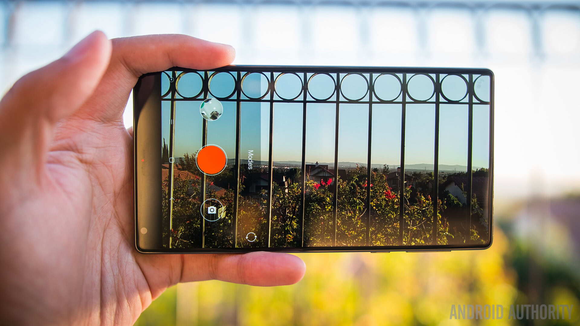
The camera spec of the Mi MIX are less important for this concept phone compared to where they were located, at least in the case of the front facing camera, as we have mentioned it a few times already in this review. That said, the specs are nothing to snooze on – the main camera is a 16MP shooter at f/2.0 aperture while the front facing camera is a 5MP shooter and is located below the screen this time.
We have had a couple examples in the past of bottom mounted cameras, so this isn’t exactly a new thing. However, the tradeoffs for this location are apparent the moment the camera is opened – an upward angle is just not great for selfies. And even then, when reaching with, in particular, one’s right hand in order to hit the shutter button, one’s thumb gets right in the field of view and ruins the picture. These are annoyances, sure, but at least Xiaomi understood this and made the camera app always reversible. Just turn the phone upside down and it’s like a regular smartphone for selfies. All things said, the front facing camera is decent, not very high achieving, and has the pretty aggressive beauty mode on at default.
The app, in general, is a pretty standard affair – some controls are available and there are quite a few modes that can help the creative smartphone photographer. HDR is auto-capable, though its effect is not too aggressive and does more to add a little saturation to the photo rather than really bringing back the highlights in an otherwise blown out shot.
With so many good cameras coming out this year, it is harder to excuse a camera that does a good job rather than a great job. The picture quality of the MIX is adequate but definitely didn’t blow me away. The app and the processing is, as usual, the achilles heel for this camera because it tends toward pretty flat colors and lacks detail in even well lit situations.
Getting closer into the pictures shows that there is a significant noise reduction that makes photos lose their sharpness and this only gets much worse in lower light situations. Videos don’t seem to suffer from these issues, since that software processing is not something that can be done on the fly during recording – at 4K, I actually thought the videos looked better than the photos.
Also, it still looks pretty damn cool when the viewfinder shows up across the entirety of the screen.
Xiaomi Mi MIX camera samples:
This review is supposed to posit the potential for the new concepts as the future of smartphones, but it is disappointing that the camera is still a sore point for Xiaomi. Perhaps if the ‘all display, all the time’ concept becomes a reality for more phones, the next step is for these companies to really up their game in the camera department.
Software
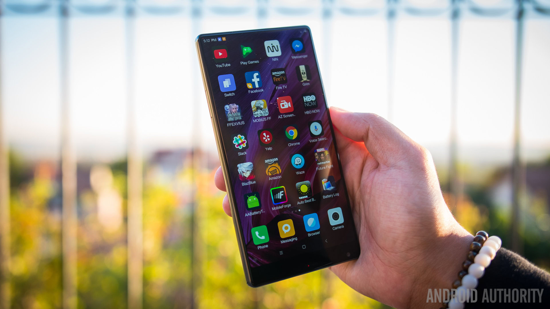
And finally, we have software, which is actually very much affected by the fact that this phone is only available in China. Not only did that mean HSPA+ for my mobile data, but also a translated but not localized version of the MIUI. Xiaomi was able to get Google Play Services installed on this and any other Western review units, but because the phone is not meant for our markets, there will be no global MIUI to review here.
With that in mind, we take a look at what we can in the MIUI – the app drawer-less version of Android that is actually very popular in the Chinese market. Xiaomi evolves their operating system based on user feedback quite frequently, and the result seems to be a pretty smooth iteration of the Android ecosystem. While the tedium of putting all my applications in folders strewn about the homescreens is something I may never get used to, actually getting around the interface was a largely painless experience.
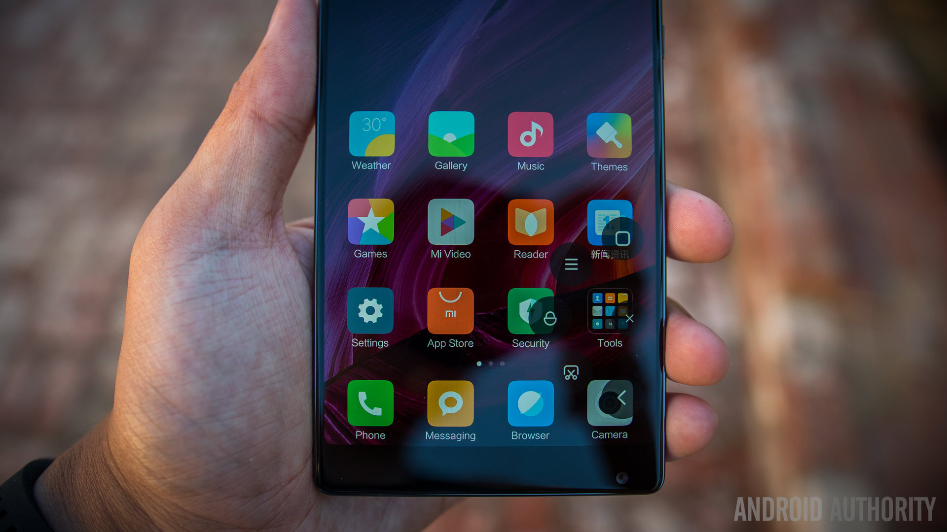
The notification dropdown shows the quick settings on the side and provides a lot of options, while the setting area is robust and includes a number of features that we don’t get in Western UIs. For example, the Dual App feature which virtualizes a second space or account and allows certain applications to be accessed in two different states. Using Facebook as an example, one can be signed into the app with one account and then turn it on via the Dual App area – another iteration of the Facebook icon shows up in the homescreens (which means more organization required, ugh) and when opened, it is like a freshly installed version of the app.
This, interestingly enough, can be done with many applications and is a small taste of a bigger feature called the Second Space. Instead of just one application being duplicated, one can create a whole new interface much like the Spaces in Windows or the Workspaces in Mac OS, in which one can have certain apps and setting put into one and other available in the other. The Second Space can be accessed and moved out of via a notification in the dropdown, and it’s an interesting take on dual accounts without actually having dual accounts installed in Android at large.
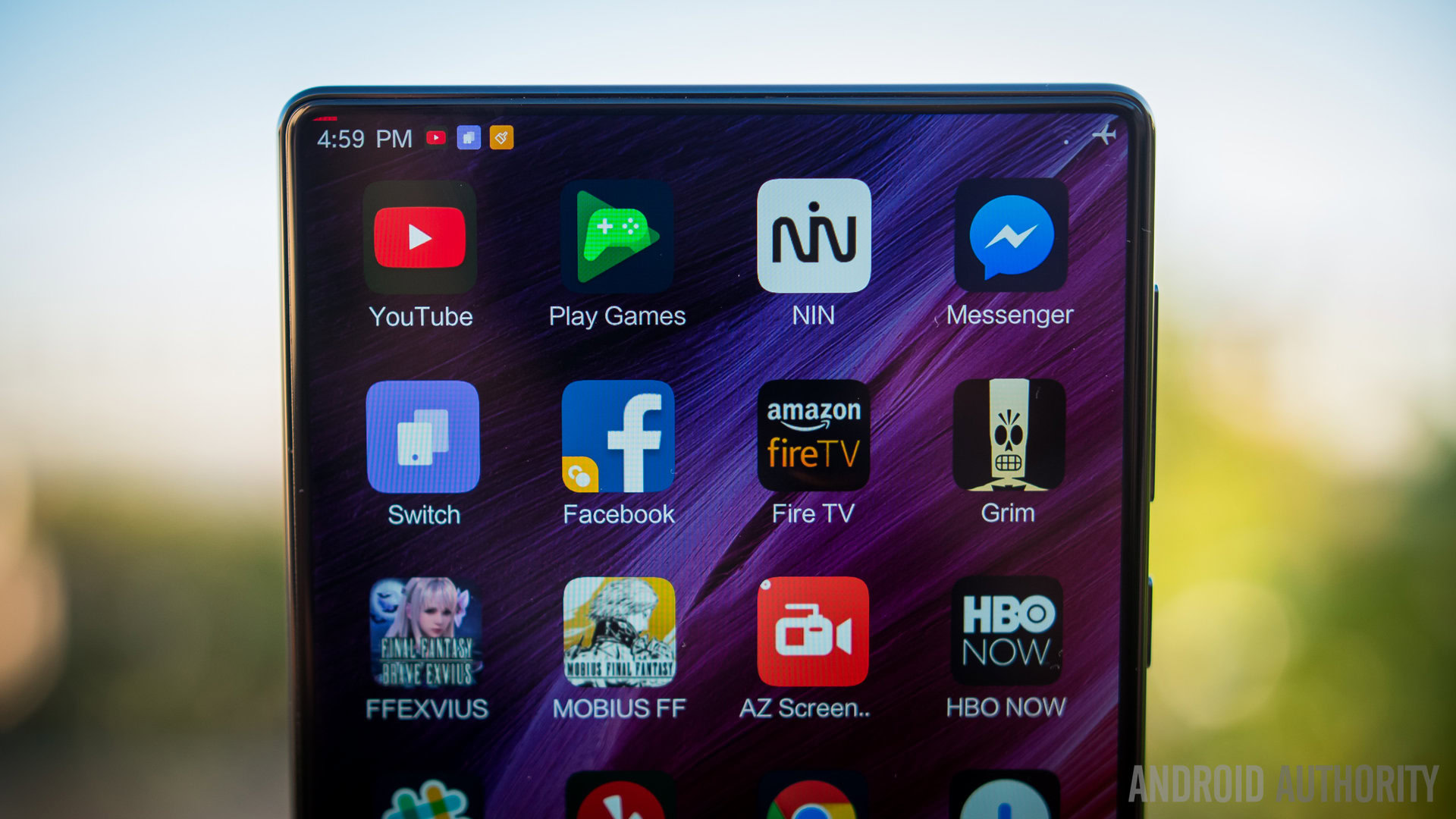
As far as other features go, it is important to note that while a screen like this (and the curved display of the Mi Note 2, for that matter) can mean new and different features that leverage their construction, there are none found in their newest phones. Xiaomi did say that this can change in the near future, however.
Overall, the MIUI is a different take on Android that doesn’t hinder or really add too much to the experience of Google’s OS as a whole. While there are a couple features that MIUI users (and users of other Chinese interfaces) enjoy compared to their Western counterparts, they do not make or break what is otherwise a standardly useful affair.
Specifications
| OnePlus 3T | |
|---|---|
Display | 6.4-inch IPS display 1920 x 1080 resolution, 362ppi |
Processor | 2.35GHz Qualcomm Snapdragon 821 |
GPU | Adreno 530 |
RAM | 4GB / 6GB |
Storage | 128GB with 4GB RAM 256GB with 6GB RAM |
MicroSD | No |
Ports | USB Type-C Dual nano-SIM slot 3.5 mm audio jack |
Audio | Speakers: Bottom-facing speaker |
Cameras | Rear: 16MP, f/2.0 aperture, EIS (gyro), phase detection autofocus, dual-LED flash Front: 5MP |
Sensors | Fingerprint, Accelerometor, Gyroscope, Proximity, Compass, Barometer |
Connectivity | Wi-Fi 802.11 a/b/g/n/ac Bluetooth 4.2 NFC |
Battery | Non-removable 4,400mAh Quick Charge 3.0: 83% charge in 30 mins |
Software | Android 6.0 Marshmallow MIUI |
Colors | Black |
Dimensions and weight | 158.8 x 81.9 x 7.9mm 209g |
Gallery
Conclusion

So, does this mean that the MIX is the future of smartphones, or perhaps the future of personal devices? Yes and no.
Chinese users will get a big kick out of using this phone on the daily, especially those that consume and stream media a lot (a highly common occurrence in the East). And for a concept phone, it is surprisingly affordable – the RMB price roughly converts to just over $500 in the base model. This is mostly due to the small quantities that Xiaomi is actually manufacturing – they want to get the phone in as many hands as possible without creating so many that the price needs be higher to cover those costs.
A global version of a phone like the MIX could indeed make a splash here, but this one in particular has a few too many tradeoffs.
There are definitely some great experiences to be had with the MIX, especially from a media consumption standpoint. The bezel-less screen is a sight to behold and still proves to be rather exciting even after the time I have used it. But there are some drawbacks that affect its nature as a smartphone – the phone speaker is the biggest pain point, because the alternative presented by Xiaomi is simply not good enough. And because media at large is set up in a particular way, the immersion factor of the big screen can break rather easily. And finally the sheer size of this phone makes it rather impractical for anyone that does not enjoy hand gymnastics.
The Xiaomi Mi MIX is, at best, a glimpse into our future. At worst, it might be a look into how that future is further than we hope.