Affiliate links on Android Authority may earn us a commission. Learn more.
YouTube app gets a home screen makeover, deep neural network recommendations

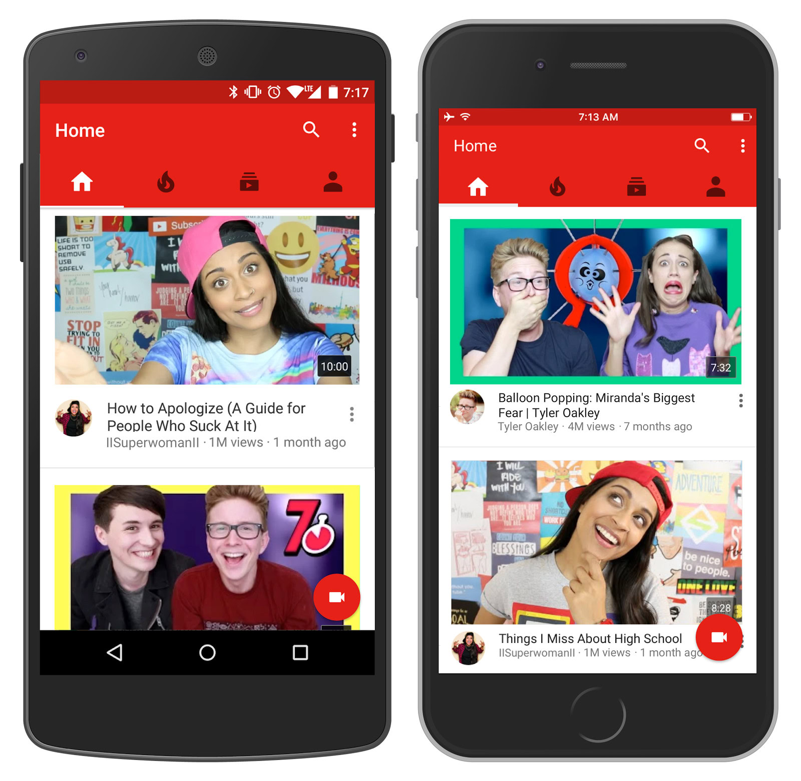
The YouTube app has long been the go-to streamer for video addicts on the go, but in spite of how widely YouTube is used, the app has really had a kind of cluttered home screen for quite some time. In fact, many users steered away from the home screen as soon as possible, going directly to the search bar or their subscribed lists. Now, however, YouTube is taking some design cues from the likes of Instagram to make their home screen far cleaner and more enjoyable.

Gone are the cramped videos splattered across the screen like a dropped shoebox filled with polaroids. Instead, suggested videos take up the entire width of the screen with only about two being visible at once. This friendlier look encourages scrolling and makes the app feel slicker and tidier all around. The update is live now, so check your app and see if it’s hit your device yet.

That’s not all this update brings to the table. The devs have also toyed with the algorithms for recommending videos, meaning the videos you see on your home screen are more relevant and personalized than before. These alterations make use of deep neural network technology, so the app will continue to learn your preferences and habits to deliver you content you’ve never seen but are sure to enjoy. The company claims that users who have had test versions of this update have spent more time watching new videos from the creators they subscribe to.
If you don’t have the YouTube app yet because you’re some kind of time traveler from the Early Modern Period, click the button below to get the latest version from the Google Play Store. Give the new design a whirl, then let us know what you think in the comments!
