Affiliate links on Android Authority may earn us a commission. Learn more.
4 tips to make your app's user interface shine
Published onJuly 28, 2016
Your app’s user interface is your most direct connection to the user, so you’ll want to make sure it’s perfect. While there’s loads of best practices out there on how to create the kind of UI that people will love using, in this article we’re going to look at four tips you might not have heard of.
Invest some time in design
If you don’t plan your user interface in advance, it can seem like your UI is something that just happens, as you add all the UI elements that each screen needs to deliver its functionality. Don’t just settle for whatever you end up with! Take some time to wireframe and prototype each screen in advance.

Putting some thought into your user interface’s design is one of the most effective ways of creating a UI that’s dressed to impress, and while wireframing and prototyping are tools of the design trade, the good news is that they don’t require any specialist design skills or fancy image-editing software (although you can use specialist software, if you really want to).
To create a wireframe, simply grab some paper and a pen or pencil, and sketch a rectangle to represent your typical smartphone or tablet screen. Then, add all the UI elements you want to include, starting with the most important (such as navigational elements, headings and images) and working your way down the content hierarchy to the least important UI elements.
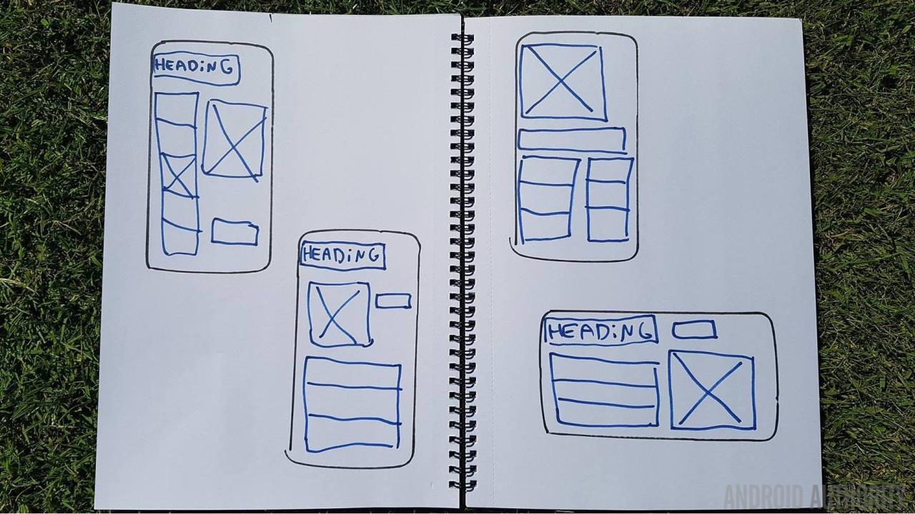
Okay, so this may sound simple, but that’s kind of the point – creating a wireframe is so quick and easy, that it’s the perfect way to test out lots of different ideas. Ideally, you should aim to produce several potential wireframes for each screen. You can then compare these wireframes (maybe even by physically placing them side-by-side) and then decide which one is the ultimate version that you’re going to use in your application. The best bit is, if you’ve explored all these variations and arrived at the best possible version of your screen, you didn’t need to spend ages working on complex, detailed designs, plus you didn’t even have to write a single line of code!
Once you have a wireframe you’re happy with, you should put this plan to the test by creating a digital prototype. A prototype allows you to see how your design translates onto a real Android device, and across devices with different screen configurations.
Conveniently, Android Studio doubles up as an Android prototyping tool, thanks to its powerful layout editor. The easiest way to create a prototype, is to open the layout editor’s ‘Design’ tab and drag widgets from Android Studio’s palette onto the canvas. If you do need to make some specific adjustments to your layout, you can always delve into its underlying XML by selecting the editor’s ‘Text’ tab.
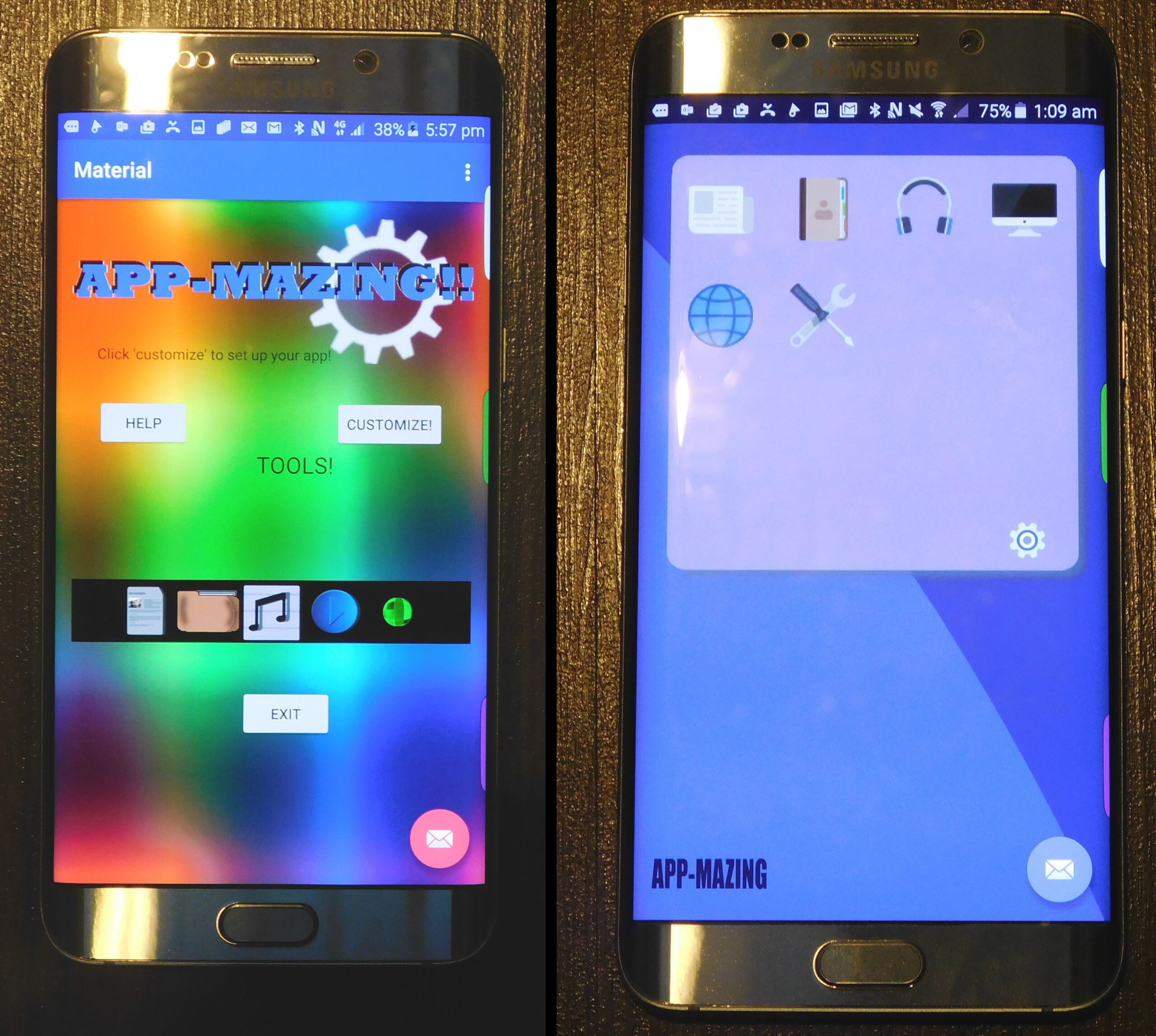
Once you’ve pieced together your prototype, you can install and test it on your Android smartphone or tablet, and across multiple AVDs. If this testing flags up any flaws in your design, or areas you could improve on then you should make these changes to your wireframes so you’ll know to incorporate them into your project when it’s time to start developing (your wireframes are your project’s blueprints after all).
Rinse and repeat until you’re confident you’ve reached the best possible version of every single screen that makes up your app. Now the only thing left to do, is create a new Android Studio project and start bringing your creative vision to life.
[aa_content_ad aa_single_ad_type=”single_750_more” aa_single_ad_pos=”center” ][/aa_content_ad]
Experiment with different UI elements
Do you feel like you’re stuck in a bit of a rut with your user interfaces? Simply grabbing items from Android Studio’s palette, dropping them onto the canvas and making adjustments to the underlying XML in the ‘Text’ tab is all well and good, but maybe you need to shake things up a bit!
If you feel like your UI is lacking, consider experimenting with some UI elements that you won’t find in Android Studio’s palette:
- Bottom sheets. This is a sheet of material that slides up from the bottom edge of the screen in response to user action, such as the user swiping onscreen. A bottom sheet can be persistent, which means it remains visible even when the user isn’t interacting with it (handy when you need to display supplemental content that’s related to, but removed from, the current screen). Alternatively, a bottom sheet can be temporary, so the user has to dismiss it before they can interact with the content below. You can use temporary bottom sheets as an alternative to menus, dialogue boxes and popups.
- CoordinatorLayout. This is a new layout, introduced with the Android Design Support Library. The CoordinatorLayout is a super-powered FrameLayout. If you have used a FrameLayout before, you should be very comfortable using CoordinatorLayout.
- Floating action buttons. Does your app have a persistent promoted action that the user needs constant easy access to? Then you may want to consider placing this action inside a floating action button (also known as a FAB).
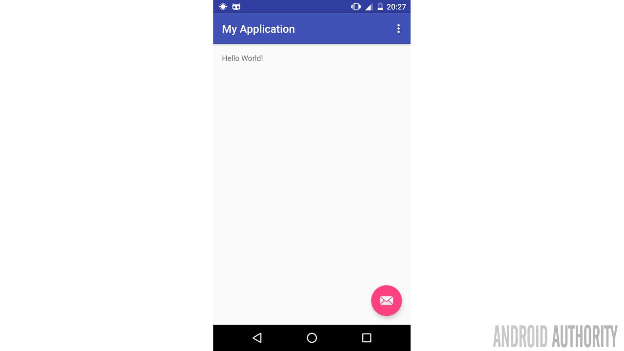
You create a FAB via your project’s XML:
<?xml version="1.0" encoding="utf-8"?>

// CoordinatorLayout helps you coordinate your views (the clue’s in the title!).
// Since I want my FAB to remain in the same location even when the user is scrolling,
// I’m going to place this particular FAB inside a CoordinatorLayout //

<android.support.design.widget.CoordinatorLayout

...

  <android.support.design.widget.FloatingActionButton
    android:id="@+id/fab"
    android:layout_width="wrap_content"
    android:layout_height="wrap_content"

    // In this example, I’m anchoring my FAB to the bottom of the action bar //

    app:layout_anchor="@id/actionbar"

    app:layout_anchorGravity="bottom|right|end"
    android:layout_margin="@dimen/fab_settings"
    app:elevation="10dp"
    android:src="@android:drawable/sendmail" />

</android.support.design.widget.CoordinatorLayout>
Get specific about configuration qualifiers
Android is diverse platform, available on many different types of devices, so it’s pretty standard practice to provide multiple versions of your app’s resources, for example creating alternative drawables that are optimised for different screen densities.
But what about supporting different screen sizes?
There’s no shortage of advice out there on how to create flexible layouts that can adapt to a range of screen sizes (such as always using match_parent and wrap_content, and avoiding absolute units of measure like pixels at all costs) but even the most flexible of layouts can only stretch so far!
When you’re testing your app, you may discover that one (or more) of your layouts has a breaking point, for example your layout may start to look strange or no longer function correctly when the screen dips below, or goes above a certain width or height.
As always, the solution is to provide resources that are optimised for different screens – in this instance, that’s layouts that are optimised for different screen sizes.
Prior to Android 3.2, Android provided configuration qualifiers for several generalized screen sizes: small, normal, large, and xlarge. However as smartphones got bigger and bigger, and tablets started entering the fray, the Android team decided to replace these generalized groups with some new configuration qualifiers. These new qualifiers allow you to get seriously specific about screen sizes, to the point where you can define the exact dpi threshold at which your app should display a particular layout. This is perfect for guaranteeing a good user experience even on devices with unusually large, or unusually small screens, but also for supporting different screen orientations.
So, what are these powerful new configuration qualifiers?
The most useful of the bunch, is sw<N>dp, as this allows you to specify the minimum width that needs to be available before the system can use a particular layout. So, if during testing you discovered that your layout can’t deal with screens that are 800dpi or wider, you’d create a res/layout-sw800dp directory, create a layout that’s optimised for this kind of screen, and then place your layout inside this directory.
Just be aware that sw<N>dp doesn’t take the device’s current screen orientation into account, so the “available width” won’t change if the user tils their device from portrait to landscape mode (and vice versa).
If you do need the system to consider the current screen orientation when selecting a layout, then you should specify the width your layout needs using the w<N>dp configuration qualifier.
Finally, it’s not unusual for an app to scroll vertically when a layout contains more content than can fit neatly onto a single screen. However, if you don’t want the user to have to scroll to see this additional content, then you may want to specify that your layout requires a minimum amount of available height. You do this using the h<N>dp configuration qualifier, for example if you create an alternate layout that requires 500dpi or more of available height, then you’d create a res/layout-h500dp directory and place that layout inside.
Localise your UI
If you’re going to deliver the best user interface regardless of the user’s geographical location, then you may want to consider providing localised versions of your UI – which means translating all of your app’s text. While this may sound like a huge task, the good news is that adding translated resources to your project follows the exact same formula as adding any other alternate resource – yep, you guessed it, you just need to create a directory with the correct configuration qualifier and place your alternate strings.xml file inside.
Start by whipping our project structure into shape. For the configuration qualifier, you need to use the corresponding two-letter lowercase ISO code for the language you’re targeting, for example if you wanted to provide an Italian translation you’d create a res/values-it/strings.xml file and directory.
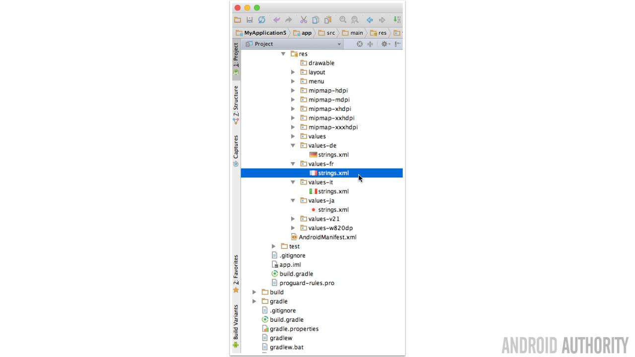
Once you have all your directories and strings/xml files in place, you need something to put in them! Unless you happen to be fluent in the language(s) you’re translating your app into, you’ll need to enlist the services of a professional translator.
As with everything these days, you can often find everything you need online, so your first stop should be performing a Google search for freelance translators or companies who specialise in translation services. Alternatively, you may want to check out the Developer Console, which includes a Google Play App Translation Service.

Once you’ve translated your strings, add them to the appropriate strings.xml file. And then the only thing left to do is test that your translates text displays correctly in your layouts, and then your app is ready for its global launch!
Wrap-up
Hopefully these four tips will help you refine your app’s user interface and give your app a wider appeal. Do you have any other tips for creating more effective user interfaces? Share them in the comments below.