Affiliate links on Android Authority may earn us a commission. Learn more.
10 awesome examples of material design (updated)
Published onJanuary 25, 2016
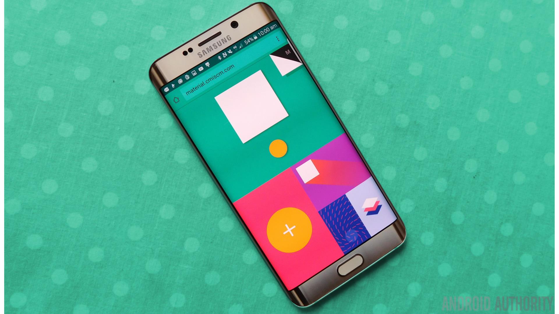
Update: Following some great feedback in the comments, I have updated this article with some more awesome examples of material design: Textra, Fabulous: Motivate Me, and Material Design Lite. I have also added a few animated GIFs to demonstrate some of these brilliant designs in action.
When material design first debuted in 2014, it changed the way our Android devices looked and behaved, and in most cases this change has been for the better. This is a design language that comes from Google itself that emphasizes a minimalistic layout, stunning animations, high contrast colors and a sense of physical interaction all to great effect. When done well, material design is crisp, clean, intuitive and can look fantastic. What’s more, it lends a sense of cohesion to the Android experience that makes everything feel that much more seamless.
In this countdown, we’ll be looking at 10 great examples of material design done right. Whether you’re a developer looking for a little inspiration for your own UIs, or you just want to fill your phone with stunning apps that perform well, you should find something to admire here.
Matrand
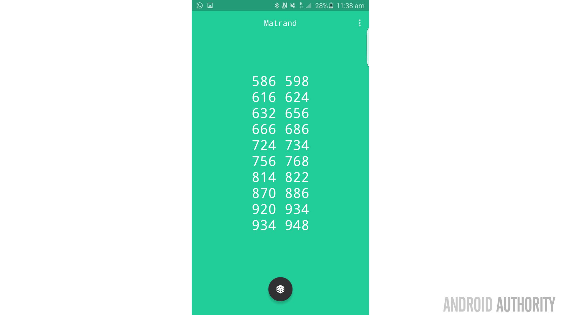
Matrand may be ‘just’ a random number generator but it is the type that a real mathematician would probably appreciate (as in, it’s properly random) and it sports a great look and feel that elevates it above similar offerings.
Most of us don’t have a massive need to generate random numbers but anyone can appreciate how this app looks. This is a simple, minimalist looking app with lots of blank space and a clear green-white color palette. The die icon is very fitting and manages to convey what the app is about. Clicking on said icon to generate the numbers intentionally evokes the motion of rolling the die.
Another nice touch is the monospace dialog box which gives the experience a retro-computer vibe that will make old-school coders feel right at home.
Phonograph Music Player
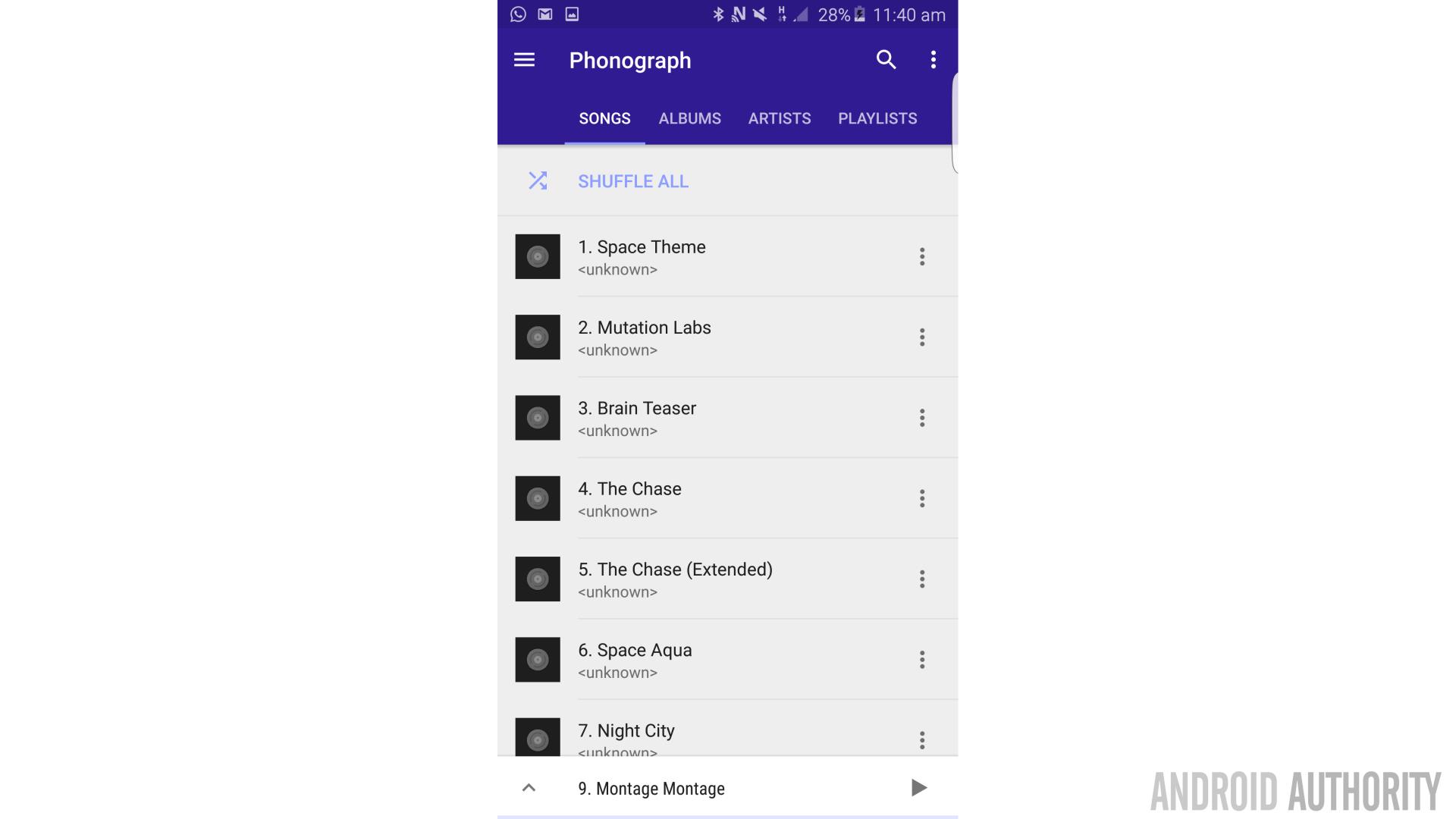
Phonograph Music Player is actually an app that was recommended by reader C.P. in the comments section of a previous article. As the name might suggest, it’s a music player in the same vein as Google Music, but it actually takes the minimal look a little further.
Phonograph ticks all the material design boxes with a flat looking icon, an interface that moves around the user (rather than the other way around) and a clean, fast, interface.
Since this is a music player, Phonograph looks best if you have lots of tracks stored on your device with big, attractive album covers. Also cool is the option to select your own primary and secondary colors for the palate. Not a fan of green? No problem!
Google Calendar
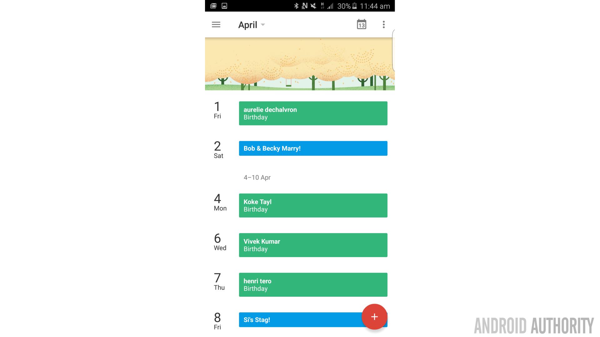
When looking for examples of material design, it makes sense to look to apps from Google itself. After all, it was Google that introduced the concept and so it follows that they should know their way around it. And perhaps their best example of material design is the Calendar App, which features everything we’ve come to love about the new look.
For starters, Google’s app finally did away with the conventional skeuomorphic design most calendar apps use that mimics the layout of a physical planner. We are no longer restricted by the need to fit our schedule onto paper, so why show only entries for the previous month when we’re on day 28? Instead, Google’s calendar gives you a vertical layout and places the current day at the top of the page. This way, you only see the upcoming days and events. Days where nothing is happening are condensed and this further streamlines the experience to show you only what’s actually useful.
Google’s app finally did away with the conventional skeuomorphic design most calendar apps use that mimics the layout of a physical planner.
This single change to the interface simultaneously allows the user to remain at the center of the experience so that the UI moves around them. Throw in some parallax scrolling and you have a really great looking app that combines.
Google+
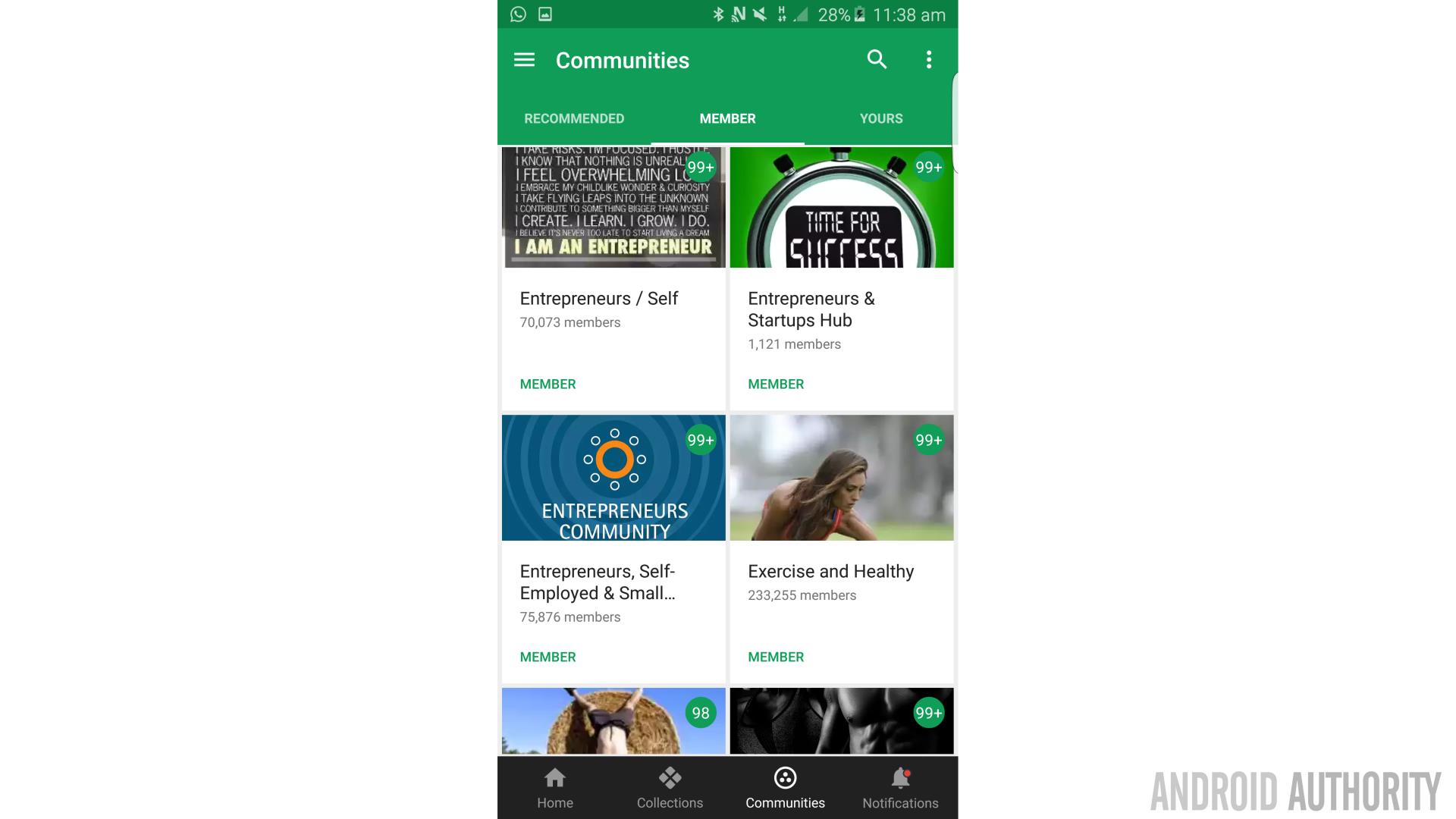
Google+ is another example of Google nailing their own design principles. Both the app and the website look great with a scrolling interface that puts big images front and center. A red and white color palette throughout, monochromatic icons, great animations and scrolling navigation round out the experience (and the circular profile pictures look great). The Members and Collections panes look particularly good too as a scrolling grid of images.
Google+ may still be lagging behind other social networks in terms of users, but at least it has the edge over Facebook in the looks department!
Bing Bong
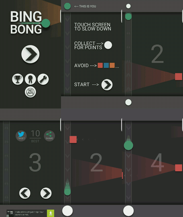
Bing Bong is one of several games from Nickervision Studios that takes very clear cues from Google’s material design. Other games from the developer’s catalogue include Side Swipe and Pivot (which make me think of Transformers and Ross from Friends respectively) and each of these relies on a similar look using flat geometric shapes against high-contrast backgrounds. Simple mechanics echo the simple designs too with all three being playable with just one hand. BingBong has to be the most addictive of the three though.
This is a pretty unique use for this kind of design which just goes to show that all kinds of apps can benefit from Google’s design mandate. It also goes to show that not every indie app has to be pixel art. Choosing a material design look is just as effective as a way to stand out with a stylish look that doesn’t require an AAA budget to produce. You could even make the argument that Thomas Was Alone has a similar aesthetic…
Material.cmiscm
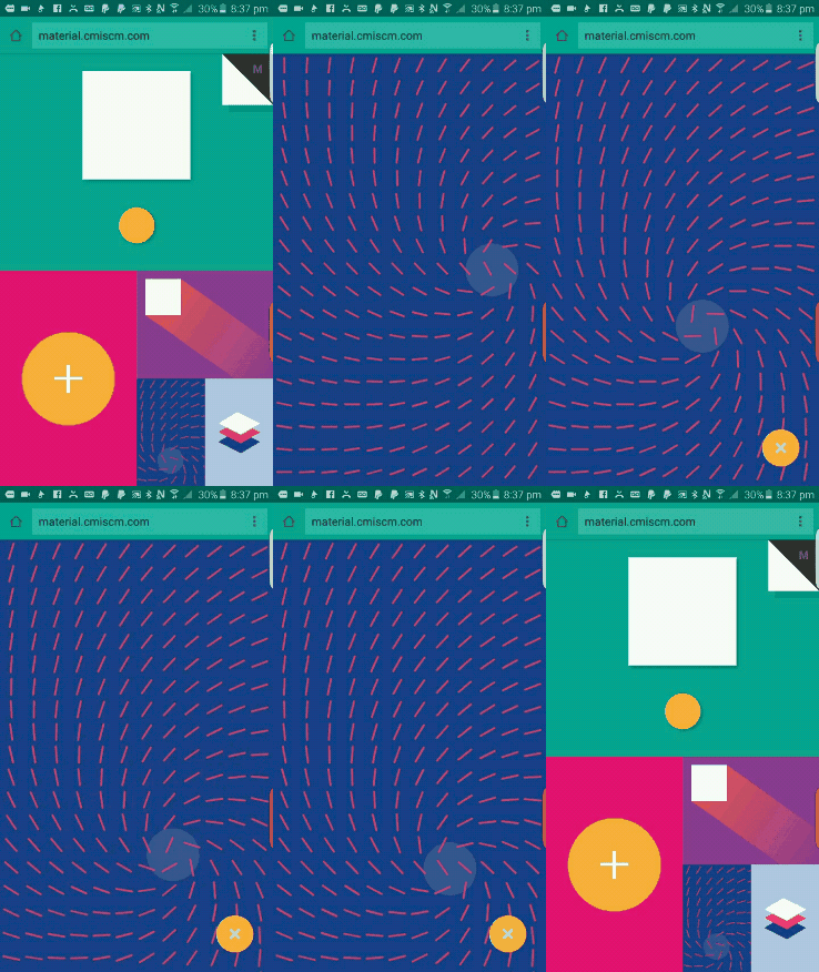
Material.cmiscm isn’t an app but rather a site that loads in your browser. It’s also not really a web page but rather an ‘interactive experience’ showcasing the design principles of material design. It’s kind of like a strange museum of UI and it certainly looks amazing. Better yet, it also features an entirely responsive layout which is among the best implementations I’ve seen. Definitely worth a look.
Headspace
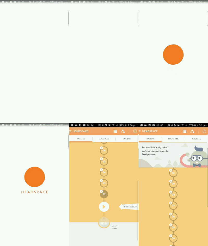
It’s only fitting that an app about meditation should have a very minimal design, which is probably why Headspace has perhaps the simplest icon of any app on the Play Store; a lone orange dot against a white background.
From there the app continues with its shades of orange and grey-white and you can scroll through sessions from the bottom upward. The block-color cartoons that decorate the app also contribute to the material design feel.
Evernote
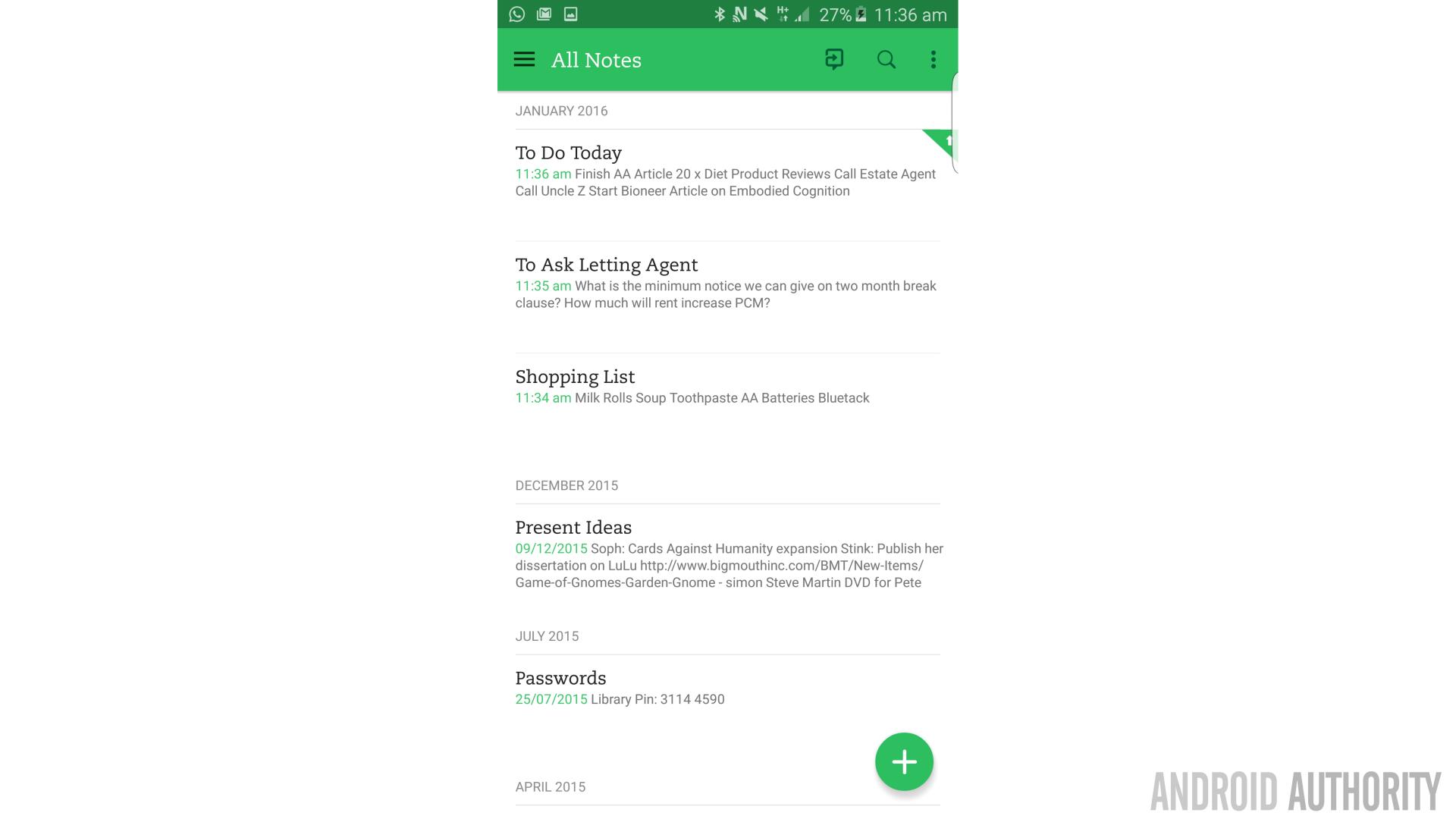
Evernote is often praised for its take on material design and with good reason. The app has a strong and consistent color scheme throughout and is as well-designed as it is functional. Icons clearly and efficiently denote whether it’s a text note, a hand-written note or a photo you’ll be taking. The Elephant icon is simple and elegant, while the website, iOS and Windows 10 apps are also just as thoughtfully designed and laid out.
Microsoft Health
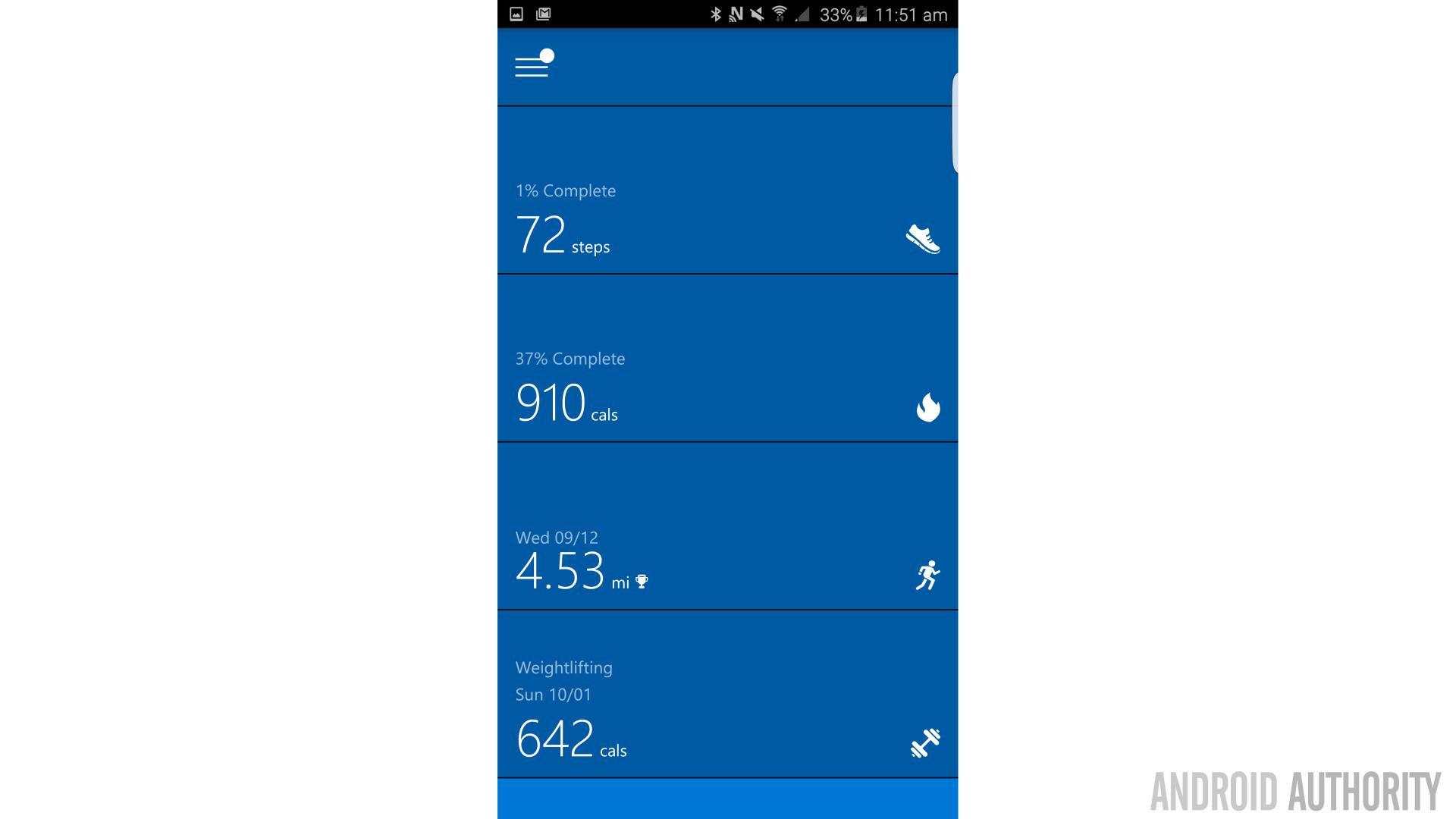
Microsoft has its own ‘Metro UI’ design guides for Windows but has been very good at playing ball on Android by adhering to a material look and feel. And Microsoft Health is actually one of the better examples on the Play Store.
The app is designed to work with the Band fitness tracker and shows all your stats in a simple vertical layout along with plane white icons (against a Microsoft-blue background). Click on one of these headings and the panel will ‘open out’ to reveal your stats. The UI is great for letting you get an overview at a glance while having the option to go deeper if required, which is a hallmark of good app design.
Nova Launcher
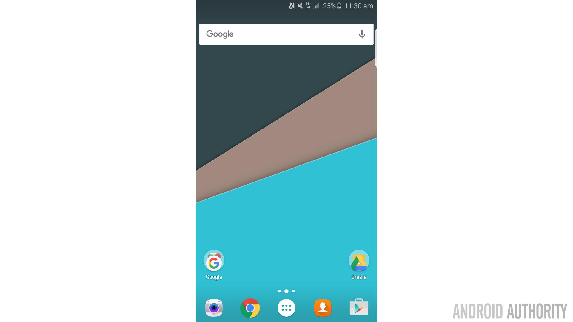
Not enough to be diving in and out of all these smart looking material design Apps? Sick of your Galaxy’s TouchWiz UI? Nova Launcher gives your homescreen a look much more consistent with stock Android and also happens to be highly customizable, very stable and lightning quick. It introduces some great animations too.
In fact, Nova is arguably actually a better implementation of material design than Google’s own Google Now Launcher, with smaller icons and more options (such as rotation, which is missing from Google’s offering). Beaten at their own game!
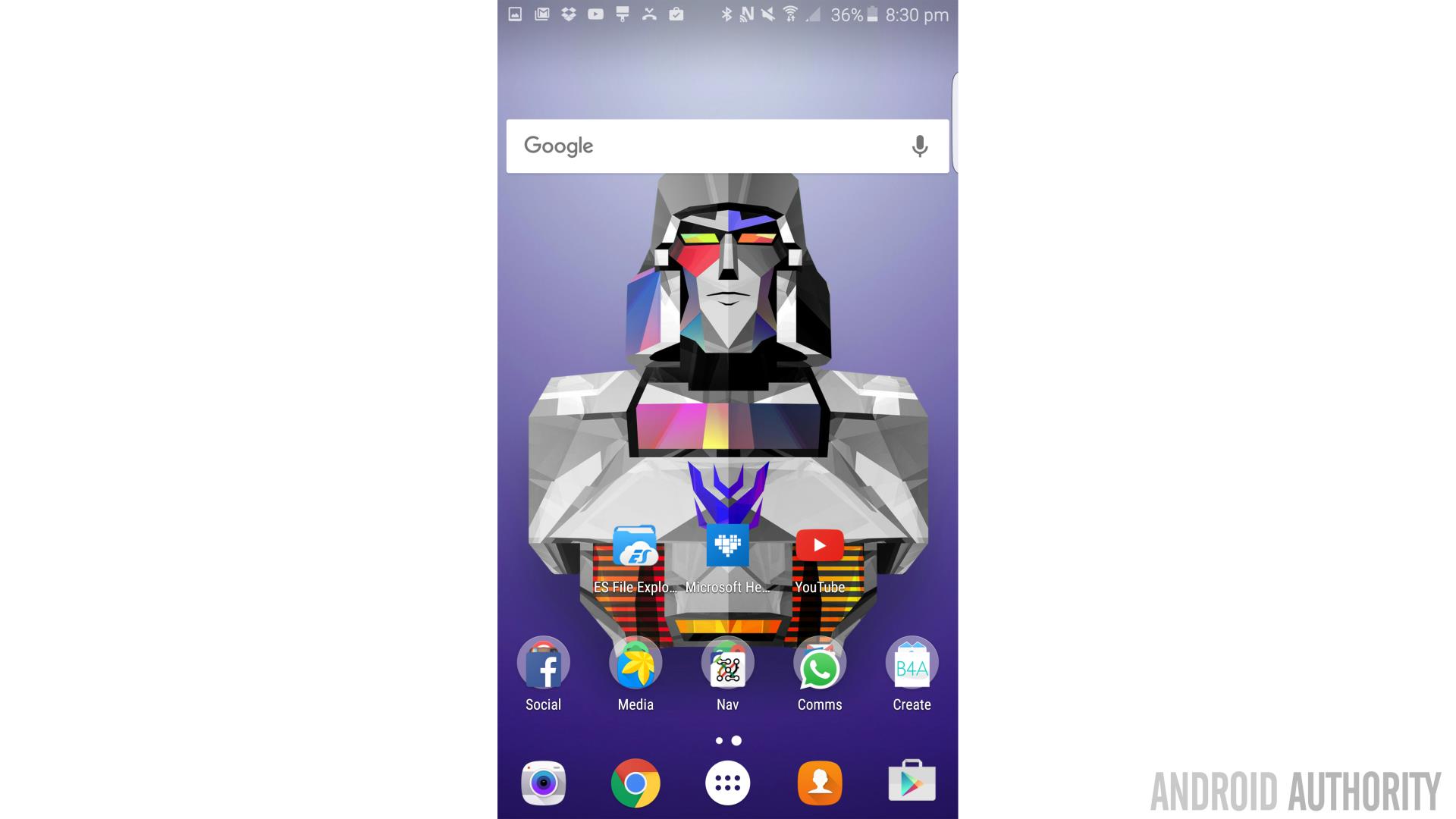
To take the look even further you might also want to try adding an icon pack for those pesky inconsistent icons. Urmun is a great choice, as is the straightforwardly named ‘Material Design Icons’. And of course you’ll want a great wallpaper to go along with that – my recommendation is something from the stunning Facets app…
Textra
After looking around a little further and also reading your very awesome suggestions in the comments section, I decided to add a few more examples to round the list out! The first one is Textra.
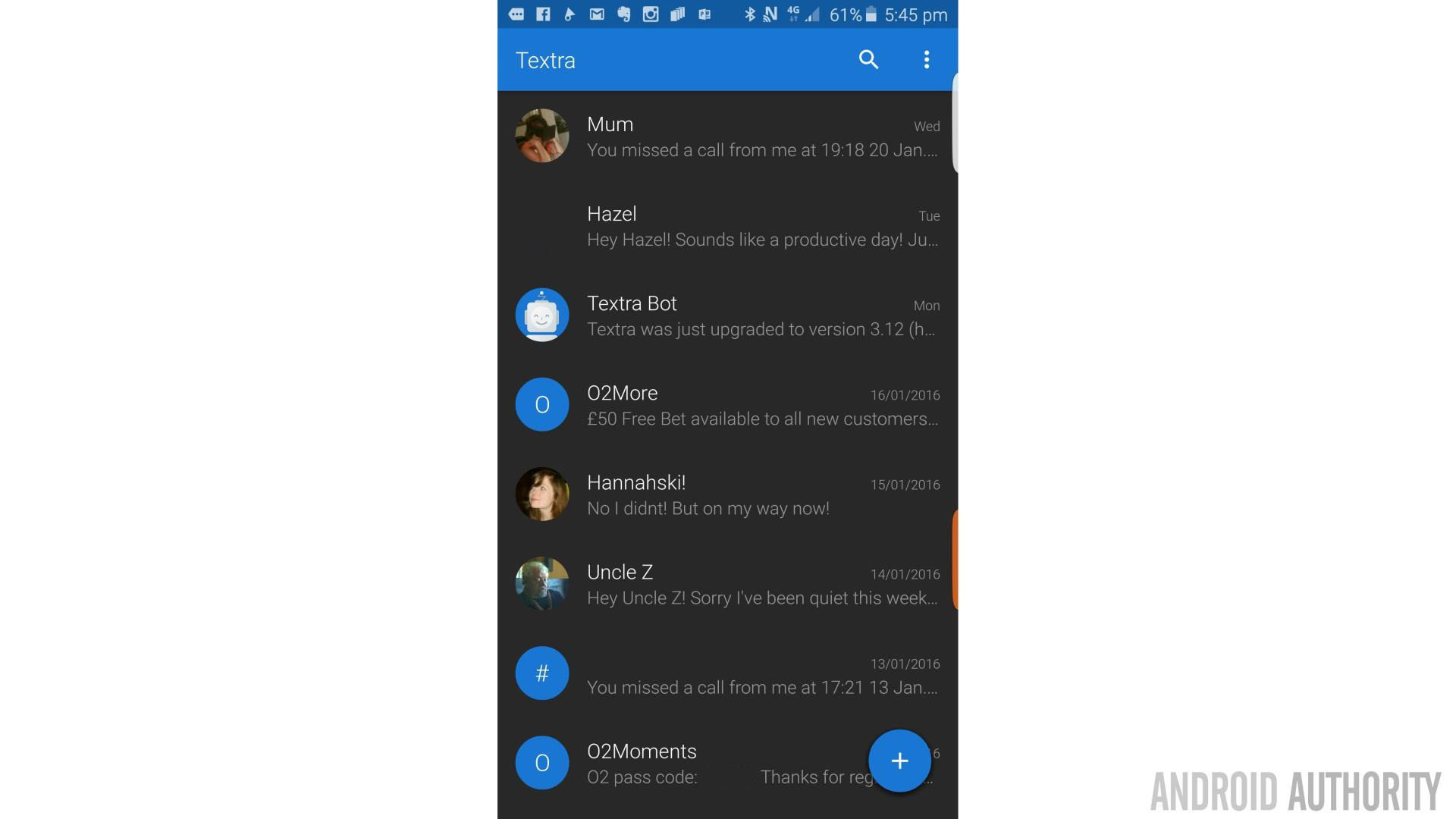
You want more Material Design, you say? Not satisfied with using a material design launcher with a material design background to launch material design apps?
Then maybe you should try adding Textra to your roster. This will replace your default SMS app with something a lot more pleasing to the eye. Block colors, a transparency effect that lets you see your homescreen while responding to messages and color customization options all add to the effect. It’s almost a shame that WhatsApp is what most of us use for the majority of our messaging these days…
Fabulous: Motivate Me
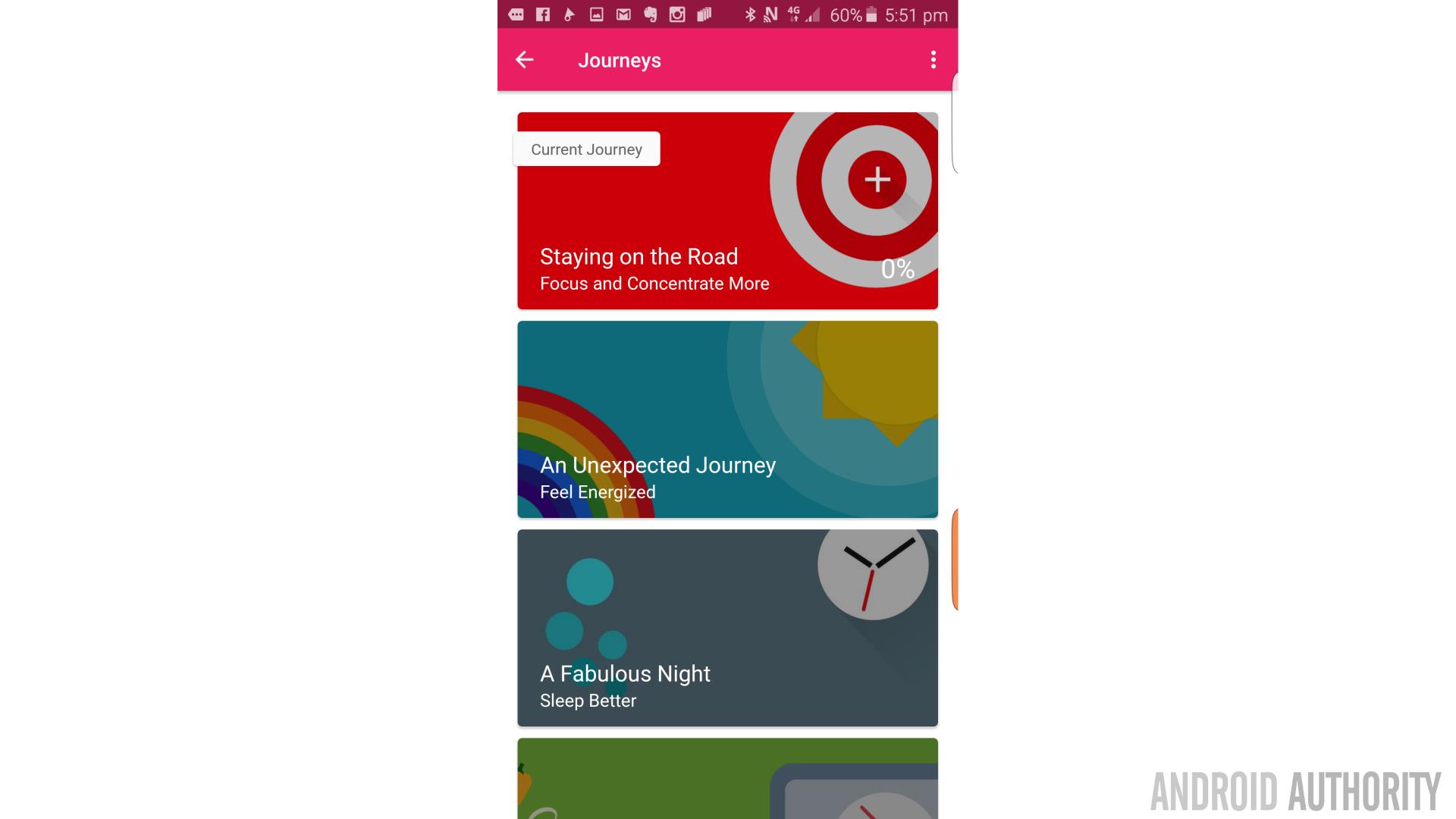
Fabulous: Motivate Me is a beautiful app that was recommended by SaurabhKoolkarni in the comments. Not only does this adhere to material design principles in all the normal ways with its crisp, flat images and bold colors but it also has some of the most attractive animations on the Play Store.
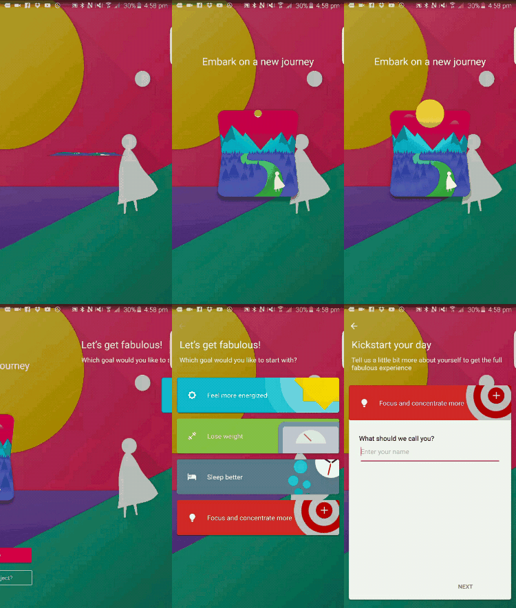
It’s actually a really good app generally too with lots of features and thoughtful design choices. If you’re looking for something to help you reach your goals (it’s still January after all…), then this app is as likely as any to get you there.
Material Design Lite
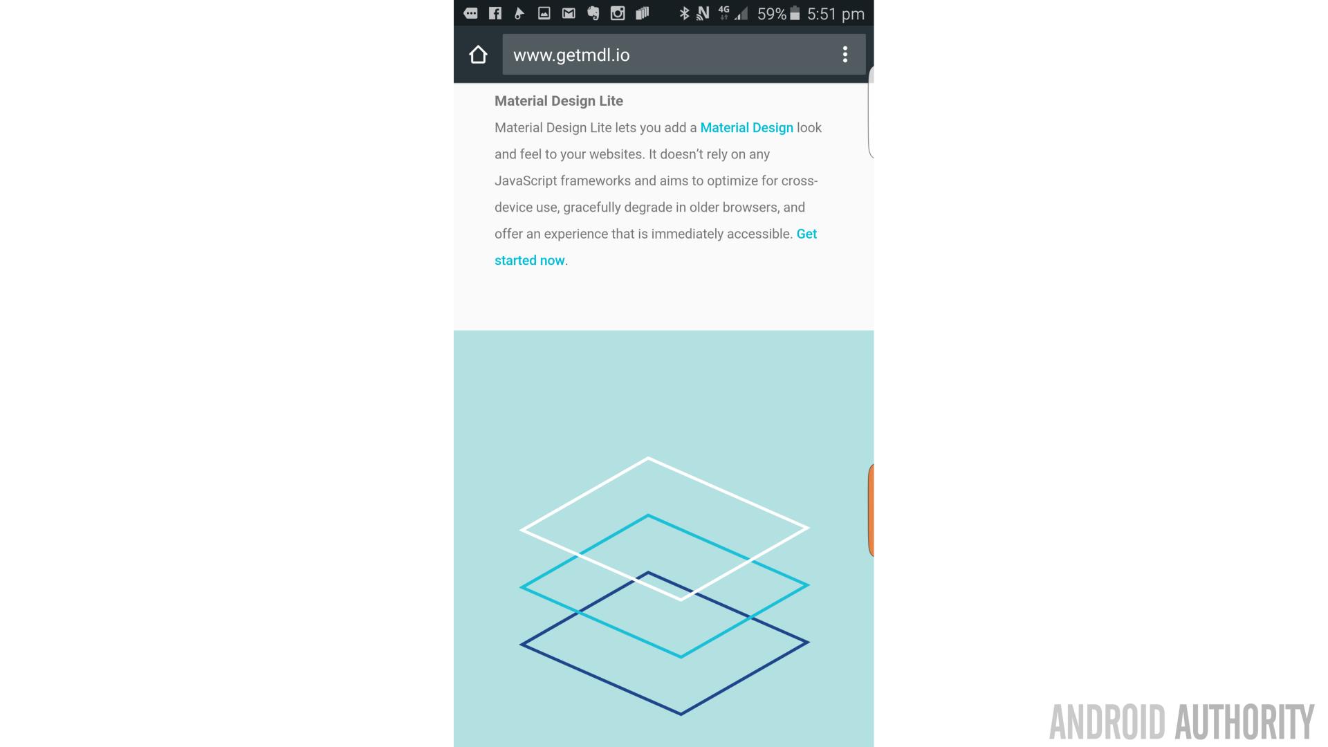
Material Design isn’t just for apps. Google is also keen to push web developers to get on board and so has provided some templates and code here to help them get started. There are some great examples of attractive material design here and better yet, they’re all free for you to use!
Final Thoughts
If you’d like to see more then I also recommend checking out MaterialUp which curates the very best examples and lets you browse through them.
As you can see then, there’s certainly no shortage of great looking apps on the Play Store thanks to material design and there’s a lot that the budding developer can learn from these. honorable mentions also go to IF, Google Keep, Citymapper, Stitcher and the Play Store itself. Which apps do you think feature the best examples of material design?