Affiliate links on Android Authority may earn us a commission. Learn more.
7 crucial considerations for your app's UX design
June 21, 2016

You can be the best coder in the world with a fantastic idea for a mobile app but that does not guarantee success. Too often, great apps made by great programmers fall at the first hurdle; before they’ve even left the minds of their creators. It’s during the initial inception of the app, while it’s still just an idea, where things can end up going wrong. Especially if you consider yourself more of a coder and less of a designer.
Very often, the missing link is knowing how to bridge the gap between software and wetware. How do you convey the purpose of your app in a way that is intuitive and easy for people to use? In a way that sparks imagination and compels people to download and then tell their friends?
In other words, the user experience (UX) is just as important as the utility itself. How does the user interact with the app to achieve the desired end? It’s not sufficient to think of your UI and your functionality as two separate entities – you can’t just build an app and then ‘make it pretty’. Rather, the function of your app should inform the way it looks and the way the user interacts with it. This is where UX design (user experience design) and ‘design engineering’ come into play and it’s where a little planning early on can make all the difference. Here are five crucial considerations for your app design:
App onboarding
Feeling smug at your newly completed Android app? A quick way to bring yourself crashing back down to Earth is to give it to someone who has never used it before and watch them get confused and frustrated as they try to find their way around.
This learning curve is referred to as ‘app onboarding’. This is the stage at which a new user is experiencing your app for the first time and trying to get to grips with the UI and the controls. It may also be where you get them to register or sign up. It’s one of the most critical points in your app’s life-cycle, especially taking into account the 15 minute refund period offered by Google Play.
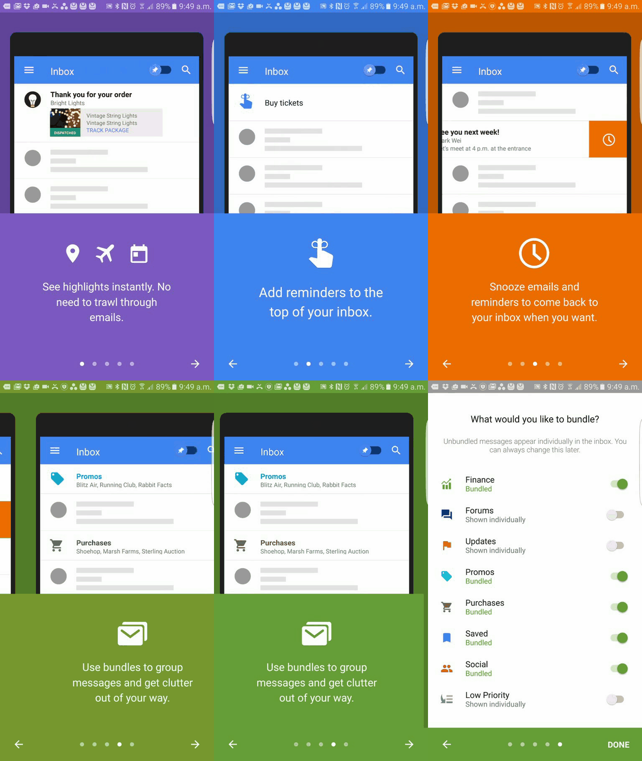
In short, you need to think about how you’re going to educate your new users about how to interact with your app and how to find their way around. Sometimes, this means including some form of tutorial that auto plays on their first boot. Or it may mean directions that can be dismissed when they’re no longer needed. But there are arguments against tutorial screens too. For instance: what if someone wants to use your app in a hurry? What if someone is borrowing your app from a friend’s device – normally a good opportunity for you to market yourself?
If your app’s buttons and gestures can telegraph themselves well enough, new users should intuitively know how to interact with them
The best type of onboarding is the type that is not explicit. In other words, if your app’s buttons and gestures can telegraph themselves well enough, new users should intuitively know how to interact with them. This is the mark of a great app design and it’s what a lot of design languages are all about. But it won’t always be possible and ultimately the most important thing is that your new users do not get lost and frustrated.
Avoiding feature bloat
One way you can keep your app relatively simple and easy to use is to try and create a tool that does one thing. Identify the key feature of what you’re making and then try to avoid dressing it up with extra things you don’t really need.
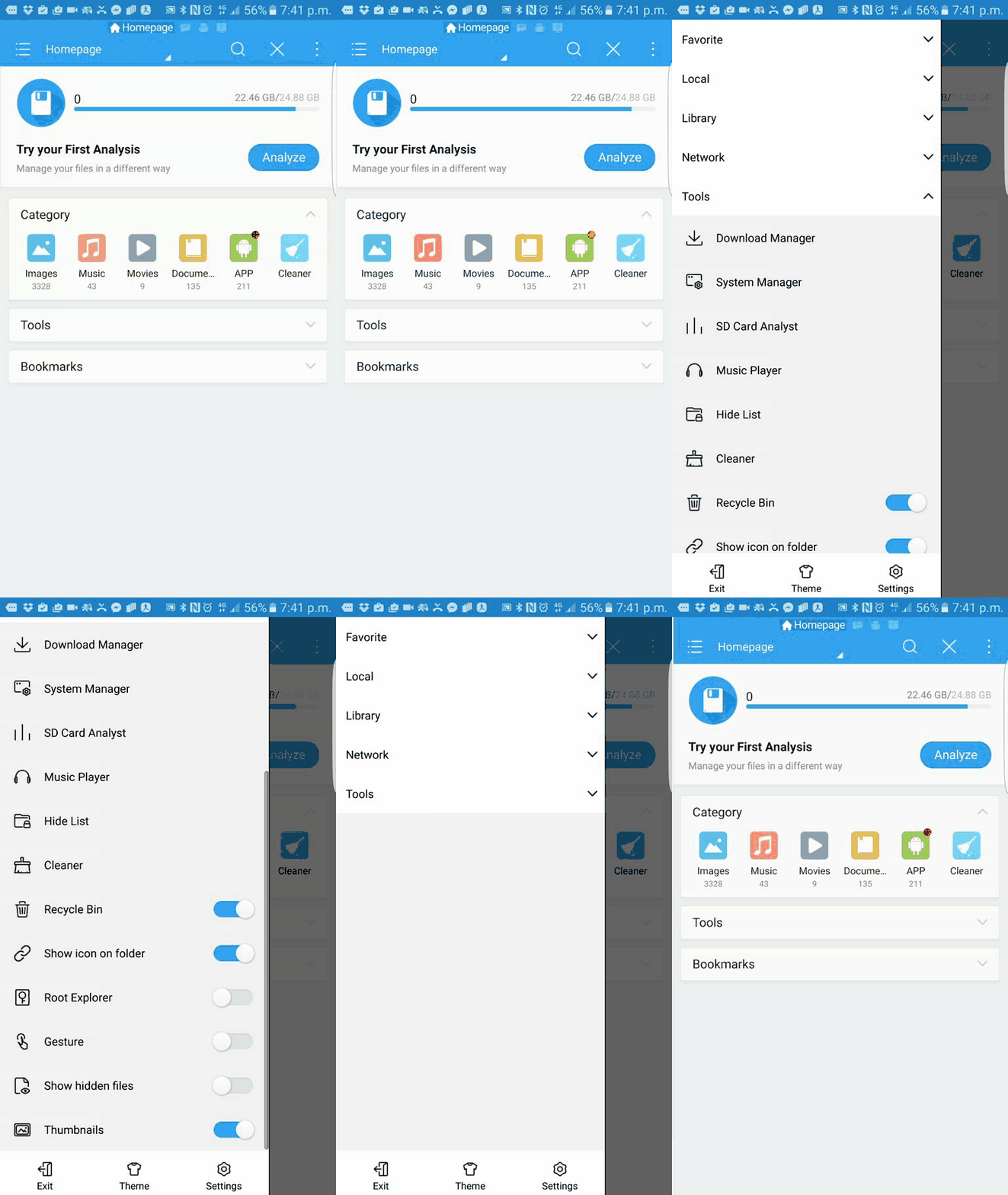
It’s tempting to think that the more functionality you add to your app, the more value it will offer. In reality though, there are over a million apps on the Play Store, many of which will already do the things you’re proposing to add – for free. Using intents rather than building features into your own app, you can streamline the experience for your users, avoid adding too many permissions and give your own app one simple purpose that is easy to communicate in your marketing. Think of your app as one tool in a much broader ecosystem and that way your users can pick and choose the features they want. If you’re really keen to add something, why not release a second app with the same branding?
Designing for others
The temptation to add unnecessary features to an app often ultimately comes down to ego – and it can be very hard to switch off from that. You want your app to be the best in the store and thus you want it to be able to do ‘everything’.
Design for the user first
Ultimately, this comes down to designing for yourself and not for others. And the same motivation can often be responsible for poor onboarding (of course you know how to use your app…), strange color choices or other bad decisions. The thing to remember is that you’re not really building your app for yourself, you’re building it for your users. That means it’s important to try not to be ‘too close’ to the project and let your personal preferences and experience influence your design. Just because something is obvious to you, that doesn’t mean it will be obvious to everyone. And the best way to make sure your app satisfies as many people as possible is to keep getting feedback at every stage of its creation. Design for the user first and do this by iterating in response to the feedback you receive.
Customization
Another way to ensure that your app suits your audience is to let them make changes to the UX themselves. This might mean allowing them to change the look of your app (and several popular apps allow you to edit the color scheme) or it might mean letting them make more in-depth changes such as alterations to the layout or the size of certain elements. Maybe they can set bookmarks, or hide features they don’t use entirely.
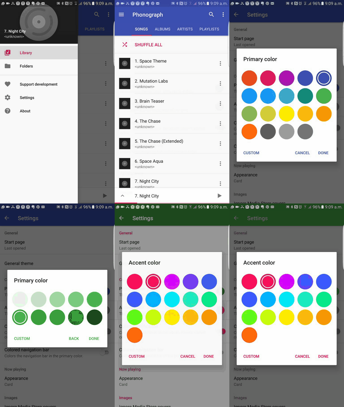
Essentially, if your app can be used in a number of different ways depending on your users’ requirements, then they should be able to put the elements they need front and center. This will result in an experience that feels more tailored and that is ultimately quicker and more satisfying as a result.
Efficiency and speed
That last point is an example of making your app as efficient and as quick to use as possible. One hallmark of good UX design we already discussed was having an intuitive layout that hinted at its own interactions. Another good sign is a UI that manages to reduce the number of actions that a user needs to take before they get their desired result.
Let’s say your user wants your app to help them find a place where they can work in a new city. If your app is very efficient, then it will have network awareness that allows it to show contextually relevant information. Likewise, avoiding feature bloat will mean that when someone loads up your app, you can reliably guess what it is they want to do. Look at the number of steps your users have to take, then apply Occam’s Razor to get that number down as far as possible.

Another way you can make your app more efficient for users is to allow them to queue slow tasks. Instead of making them upload files one at a time for instance, let them select a number of files to upload and then leave your app to it. Once again, getting others to use your app regularly is important as you’ll need to find the specific processes that are taking up the most time – it won’t always be obvious.
Likewise, think hard about downloading HD images from the web, having long intro screens or doing anything else that might add some kind of load time or wait period.
Growth
While you don’t want to keep piling on features as we’ve already discussed, chances are that you’ll want to add more functionality over time as your app grows and develops. With that in mind, it’s important to leave ‘space’ for new features to occupy in future and to think about how your additional functions will fit into your existing flow.
One way to do this is by ensuring you include lots of negative space. This basically means having blank portions of your UI without buttons, images or text and is generally one of your most valuable assets in fact – negative space also helps to prevent an app from looking cluttered and makes it easier for you to communicate your intended interactions. It can be tempting to think that ‘more is more’ but very often removing unnecessary elements can help to improve flow and better communicate to the user where you want their attention to be.
Further to this, try to keep an idea of how you want your app to evolve in the back of your mind so that you know how extras will fit into the design and you don’t have to have a complete overhaul. If you have a set number of icons on a page, is there space to add more with time?
Originality
In this post and previous ones, I’ve spoken a lot about adhering to Material Design principles, keeping things minimal and functional and generally working within pre-established guideliens.
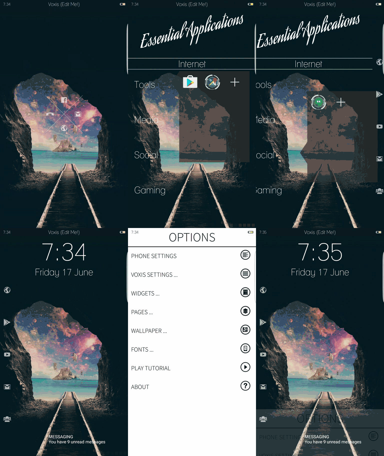
But what’s important throughout all this is that you don’t forget to be original with it. There is a fine line to be walked here; for while maintaining a consistent experience for users between Android apps is a worthwhile endeavour, it’s also important to create memorable experiences, tell stories and stand out from the crowd. From a marketing standpoint alone, having a unique aesthetic is a smart move. So make your app functional, listen to Google’s design guidelines but then don’t be afraid to flex your creative muscles within that framework. Don’t be a slave to Material Design, minimalism or anything else if you have a great idea that just doesn’t fit into those boxes.
Remember that rules are there to be broken, that’s why they’re called breakthroughs!
Thank you for being part of our community. Read our Comment Policy before posting.