Affiliate links on Android Authority may earn us a commission. Learn more.
vivo V11 Pro review: well done basics with half-baked extras
Published onSeptember 5, 2018
Vivo V11 Pro
What we like
What we don't like
Our scores
Vivo V11 Pro
vivo has been making waves recently by adopting futuristic technologies ahead of anyone else. It’s at the forefront of the bezel-free display movement and was the first to put an under-glass fingerprint scanner in a device.
Just six months after the launch of the iPhone X-like vivo V9, the V11 is now here, complete with an in-display fingerprint scanner and tiny teardrop notch. This is the vivo V11 Pro review.
A Note on the vivo V11 Pro review: In this vivo V11 Pro review we'll primarily be talking about the global version known as the V11. The V11 Pro in India is the same phone, just with 64GB of storage. I used the vivo V11 for a week during IFA 2018 on the Blau.de network and Wi-Fi. The phone received multiple updates during the review period, but for the majority was running FunTouch OS 4.5 on Android 8.1 Oreo with build number PD1814F_EX_A_1.6.7. A final update to PD1814F_EX_A_1.7.2 arrived just before publication but didn't deliver any significant changes.
Design
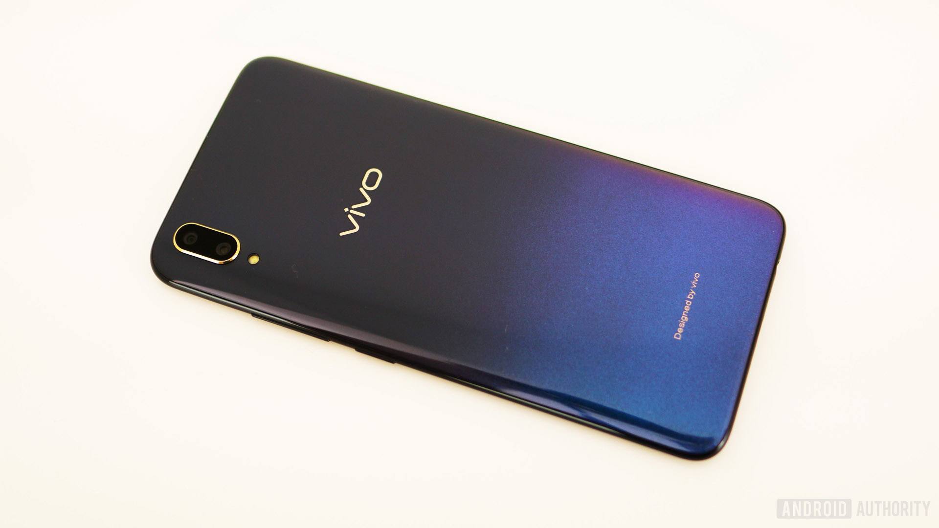
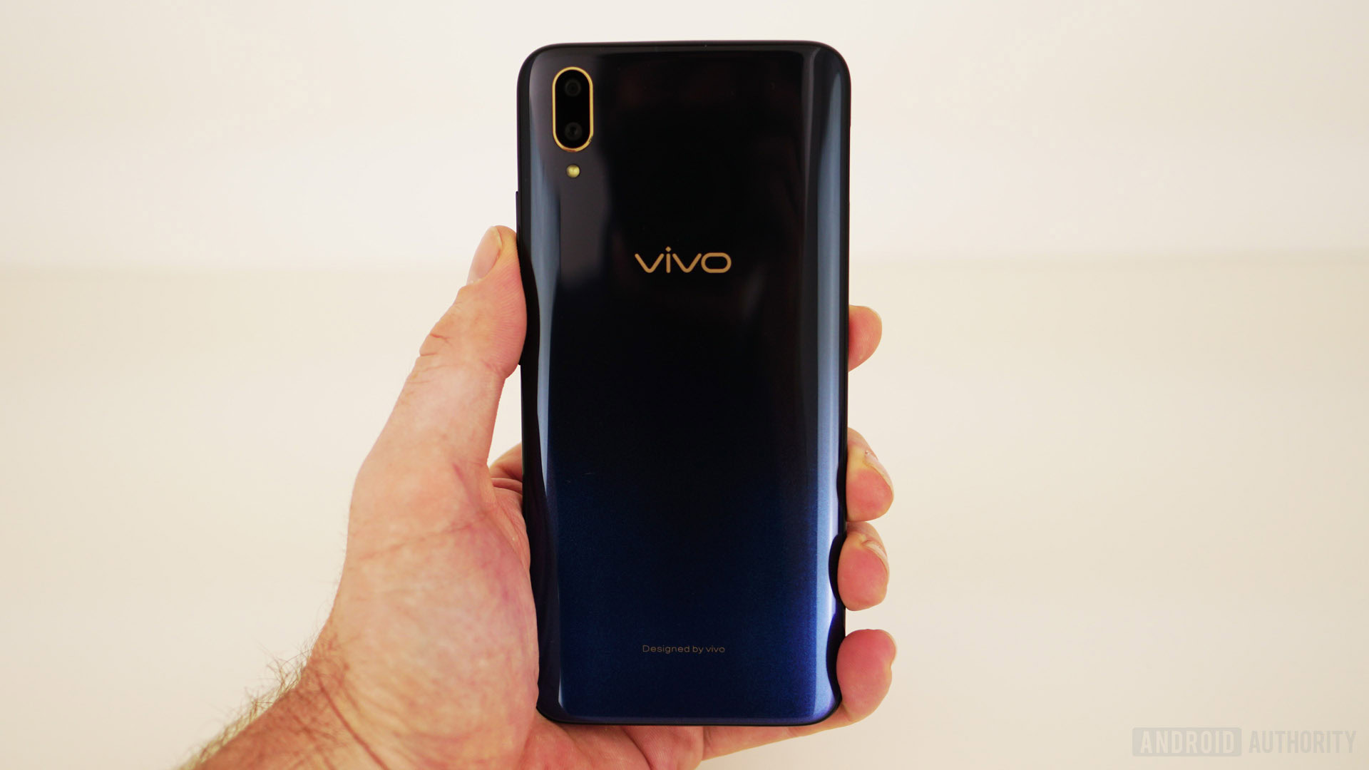
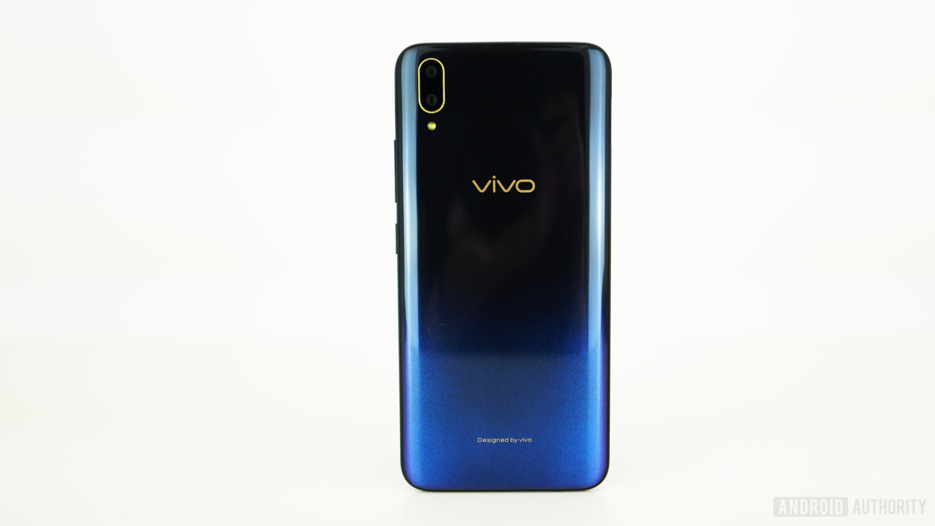
To say the vivo V11 has shaken off the V9’s iPhone X exterior would be an understatement. The tiny teardrop notch is unique and far less intrusive than the broad notch of the V9. The in-display fingerprint scanner delivers a little bit of the future and the gradient color on the back adds a touch of flair. The vivo V11 is a really striking-looking device.
The tiny teardrop notch is unique and far less intrusive than the broad notch of the V9.
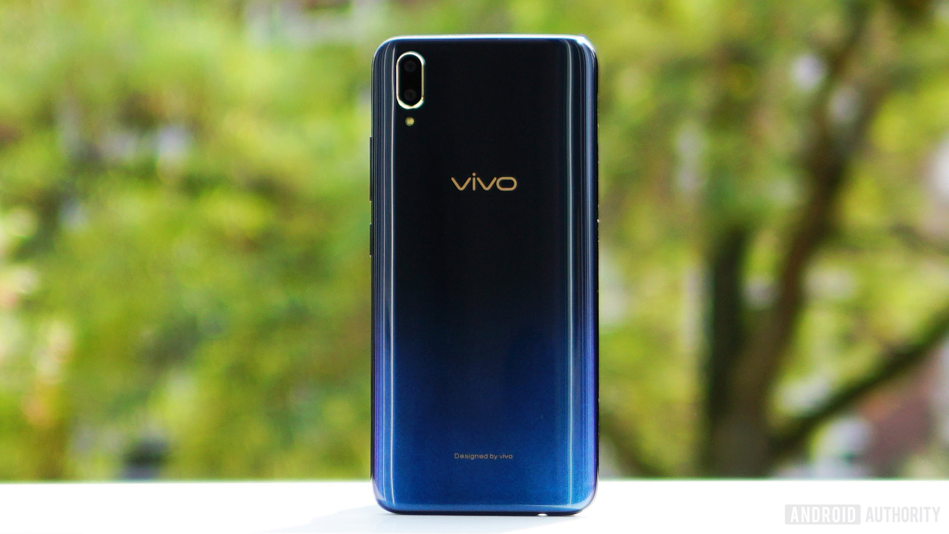
The starry night colorway I have shifts from a blueish purple at the bottom to an inky blue-black at the top. There’s a little bit of sparkle to the color at the bottom, shifting between blue when viewed front-on to purple at an angle. It’s a relatively superficial accent, but it definitely adds a little character. The other color option is called nebula and shifts from purple at the bottom to blue at the top.
Like its predecessor, the V11’s shiny polycarbonate back panel collects fingerprints very quickly. It’s quite a light device and feels a little cheap compared to the glass sandwiches common today. Nevertheless, plastic has many benefits, like impact resistance, cellular reception, and weight, so it’s far from a bad choice.
At 156 grams, the vivo V11 is lightweight and durable, but expect micro-abrasions to start appearing almost immediately. The gradient design covers these imperfections admirably, but if you like a scratch-free phone put a protective case on it. vivo includes a free clear plastic case in the box for just this reason. There’s a screen protector pre-applied too, but it was so prone to picking up scratches, I (perhaps counterintuitively) ended up taking it off.
Display
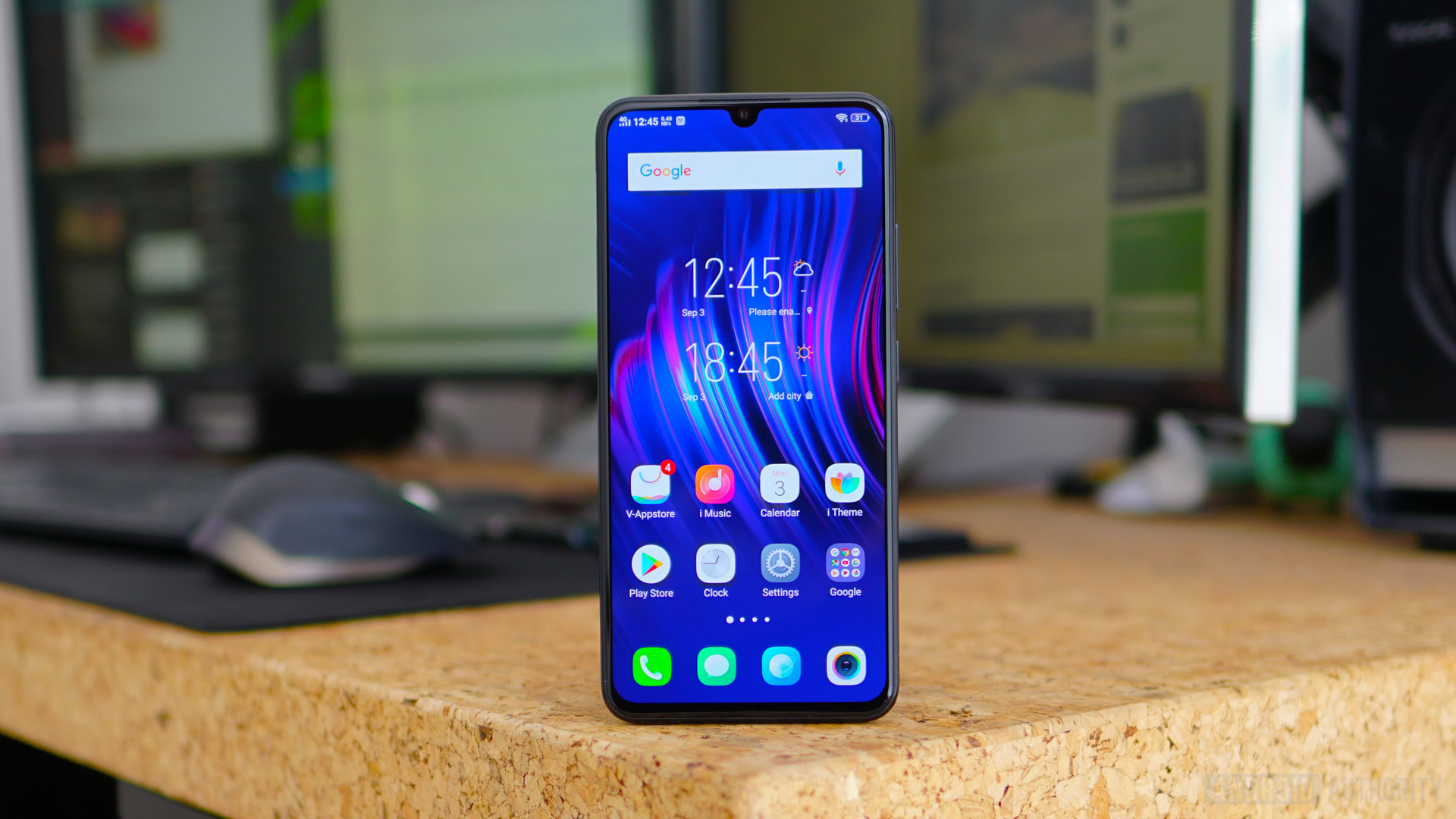
The vivo V11 display is really good, making the jump to a Super AMOLED panel. With side bezels of just 1.76mm combined with a teardrop notch and a small chin, the 19.5:9 screen occupies 91.27 percent of the V11’s footprint. At 6.41 inches, the display is really big, but the V11 never feels like a large phone. It’s FullHD+ with a 2,340 x 1,080 resolution and a pixel density of 402ppi.
At 6.41 inches, the display is really big, but the V11 never feels like a large phone.
The colors are rich, the contrast is great, the blacks are suitably deep, and the V11 gets plenty bright enough outdoors. There is an always-on display option in the lock screen settings, and you should definitely take advantage of it now that the V11 uses OLED display technology. Because this is the global version, WhatsApp is now supported alongside phone and message notifications.
The small notch at the very top of the screen is discrete and far less invasive than other notches. Unfortunately, you can’t disguise it in the settings, so you’ll have to get used to it.
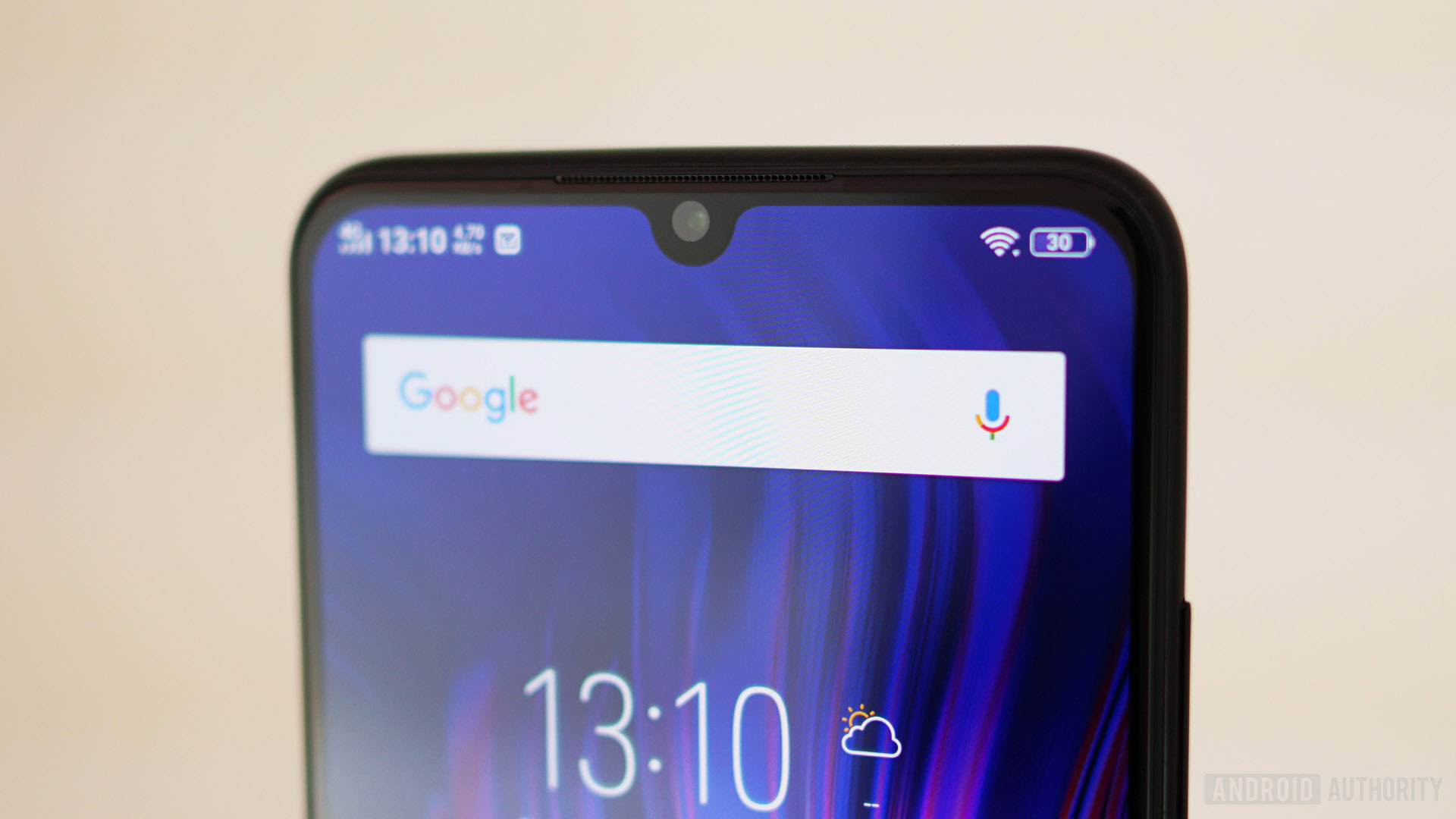
Despite the notch’s small size, you still get truncated app notification icons in the status bar. You can remove some icons in the settings, like the network speed indicator, but the order is all out of whack. If network speed and cellular reception were on the other side of the notch next to the Wi-Fi signal and battery icons, there’d be more room for notification icons on the left.
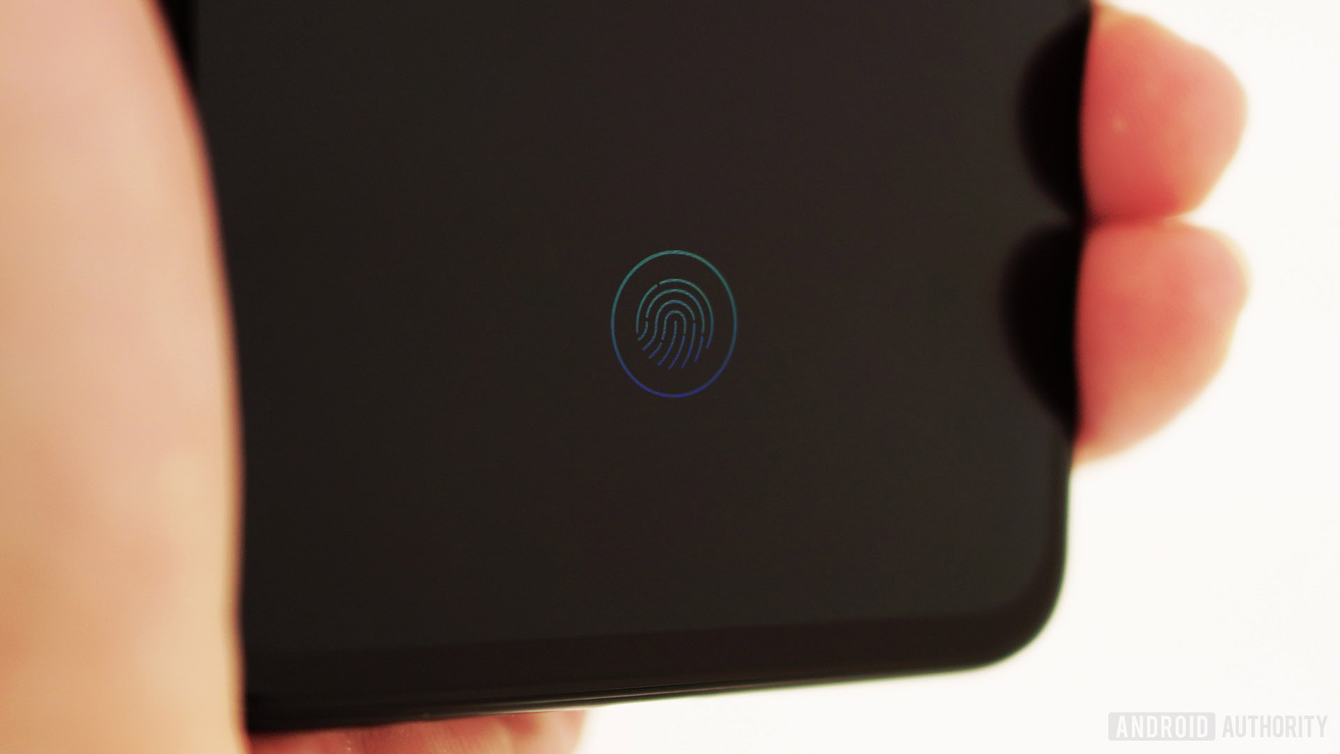
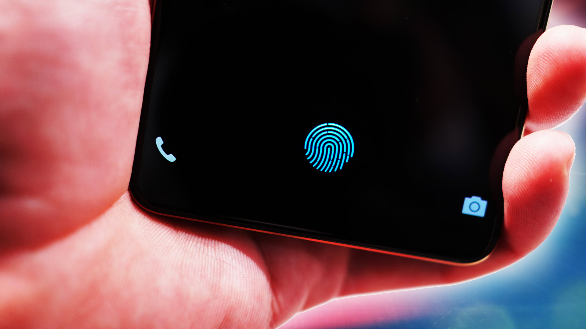
The in-display fingerprint scanner occupies a small space at the bottom of the screen and it does just fine. While it works most of the time, it’s noticeably slower than some other in-display scanners and far slower than your average capacitive scanner. You also need to give it a decent press to recognize your print. Still, the fact there’s an in-display fingerprint scanner on a mid-range smartphone already is a good sign of things to come.
vivo has improved its infrared face unlocking too, using 1,024 facial feature points to unlock your device, even in the dark. In my experience, the V11 unlocks faster by using your face than your fingerprint. I highly doubt it’s as secure as a fingerprint, but it rejected the faces of multiple other people every time. It even works at fairly sharp angles, which adds to the convenience on the one hand and to my security suspicions on the other.
Hardware
The vivo V11 specs break the V9’s mold, adding a higher-powered Snapdragon 660 AIE with eight Kryo 260 cores and an Adreno 512 GPU, along with 6GB of RAM and 128GB of storage. The Indian “Pro” version drops the storage to 64GB.
The vivo V11 adds the higher-powered Snapdragon 660 AIE along with 6GB of RAM and 128GB of storage.
There’s a 3.5mm headphone jack here, but for a phone as futuristic-looking as the V11, the inclusion of micro-USB for charging beggars belief. One can only assume it was a cost-cutting decision, but on a near bezel-less phone with an under-glass fingerprint scanner, it’s a retrograde choice. Another cost-cutting omission worth mentioning is the lack of an IP rating.
There’s no NFC here either, though the V11 supports USB OTG and USB 2.0 connection speeds. There are two nano-SIM card trays and a dedicated microSD card slot for expandable storage. Bluetooth 5 is supported and you can switch out your preferred audio codec to SBC, AAC, aptX, aptX HD, or LDAC if you’re using Bluetooth headphones.
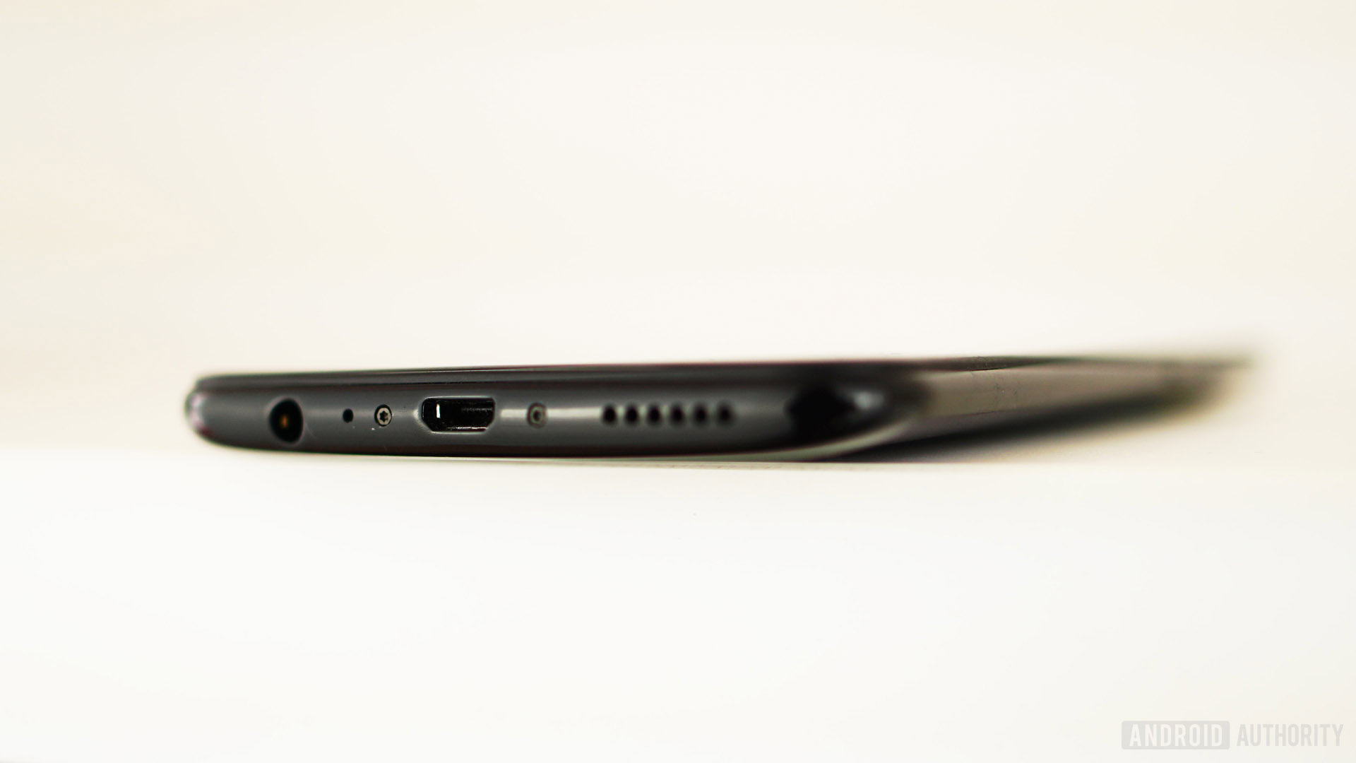
There’s a single bottom-firing speaker next to the micro-USB port and it’s the only speaker used for music or media playback. It’s loud and actually sounds pretty good, with crisp, clear highs and decent mids, though bass isn’t as strong as I would like. So far so good.
Things get a little weird with the wide sliver of an earpiece speaker above the notch though. It’s so small you probably wouldn’t even notice it until you answered a call. But it’s so loud it sounds like you’ve got speakerphone on, broadcasting your call to everyone around you. The only way to address this is to lower the volume to the point where you really have to line things up right to hear properly.
Given the V11’s very loud earpiece speaker, it seems strange not to use it as one half of a stereo audio pair for music.
Going as close to bezel-free as possible requires some compromise and this speaker is still preferable to weird alternatives like the piezoelectric speakers we’ve seen elsewhere. I’m guessing vivo didn’t use the Screen SoundCasting technology from the Nex for cost reasons, but given the V11’s very loud earpiece speaker, it seems strange not to use it as one half of a stereo audio pair for music.
Performance
The vivo V11 generally handled itself well throughout the testing period. With the Snapdragon 660 and 6GB of RAM, response rates were what you’d expect and on a par with other devices with similar specs. Plastic isn’t as good a transmitter of heat as glass or metal, but I didn’t notice the V11 heating up, even during benchmarking or gaming. Here are some benchmark scores so you can compare apples to apples.
Software
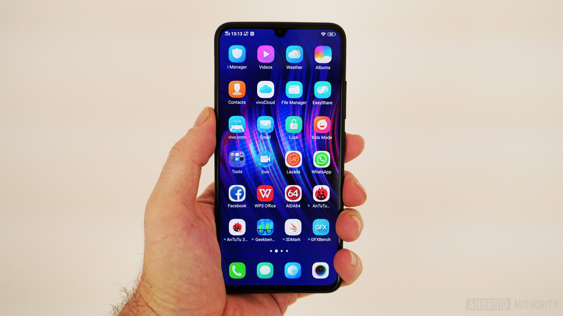
Because I have a global version of the V11, I didn’t suffer any of the compatibility issues I had with the Chinese version of the Nex. Google Play is installed out of the box along with a bunch of standard Google apps, and Gmail notifications came through just fine. There are a couple dozen pre-installed vivo apps to contend with, but some of them can be uninstalled.
Vivo’s FunTouch OS 4.5 sits atop Android 8.1 Oreo (no dates for the Pie update yet, sorry folks) and delivers a lot of additional functionality. It’s still a blatant iOS ripoff, but if you don’t mind that it’s manageable. Unfortunately, there’s still no option to enable the app drawer.
The V11 supports iOS-like gesture navigation that’s a little different from what was introduced in the Pie beta, but it’s pretty easy to adapt. On the V11, a swipe up from the bottom left takes you back a step. Swiping up from the center takes you home and swiping up and holding brings up the app overview screen. A swipe up from the right opens the control center and swiping down from the top of the screen drags down the notifications shade. It’ll be interesting to see if any of this changes with the update to Android 9.
Unfortunately, if you switch to gesture nav you’ll no longer have a convenient way to summon Google Assistant, which is otherwise accessed by long pressing the on-screen home button. You also can’t switch between apps as quickly as with virtual buttons, so the additional screen real estate gesture nav enables comes at the cost of some lost functionality.
The Jovi virtual assistant is back, but there’s no dedicated hardware button like on the Nex. Jovi largely seems relegated to managing your in-game interruptions in Game Mode and handling some AI camera tricks. I can only assume Jovi still doesn’t support English and primarily only works with Chinese retailers for visual product searches, hence those not being included on the global version. Fortunately, the V11 has g and Google Lens on board, so most Westerners will likely not even notice Jovi’s limited applicability.
Because the V11 is a global unit, switching launchers is simple and doesn’t require a Chinese phone number or a vivo account. Simply download Nova Launcher (or another launcher), tap the alert at the top of the app and select Nova as your preferred launcher. If you do this, you might want to re-enable on-screen navigation buttons, as Nova clashes with some of the V11’s swipe gestures.
There’s a convenient app safe for protecting apps and files with your fingerprint or face ID, and you can duplicate social media and messaging apps for multiple logins. There’s a bunch of gesture-based controls here too, including silencing your phone and shaking it to turn on the flashlight and so on. You can also set your own shortcut for long-pressing the volume down button while the screen is off. I opted for launching the camera but you can choose from a few options.
Battery

Vivo’s FunTouch OS doesn’t list screen-on time so I can’t give you the usual battery usage stats. I can tell you the 3,400mAh battery on the vivo V11 lasts at least a day and more like a day and a half. Even during IFA 2018 when I was on my phone far more frequently than usual, it never looked even close to running out of juice. There’s an 18W 5V/2A-9V/2A quick charging brick included in the box and vivo’s Dual Engine Fast Charging tech fills the V11 up in less than an hour and a half.
The 3,400mAh battery on the vivo V11 lasts at least a day and more like a day and a half.
Camera
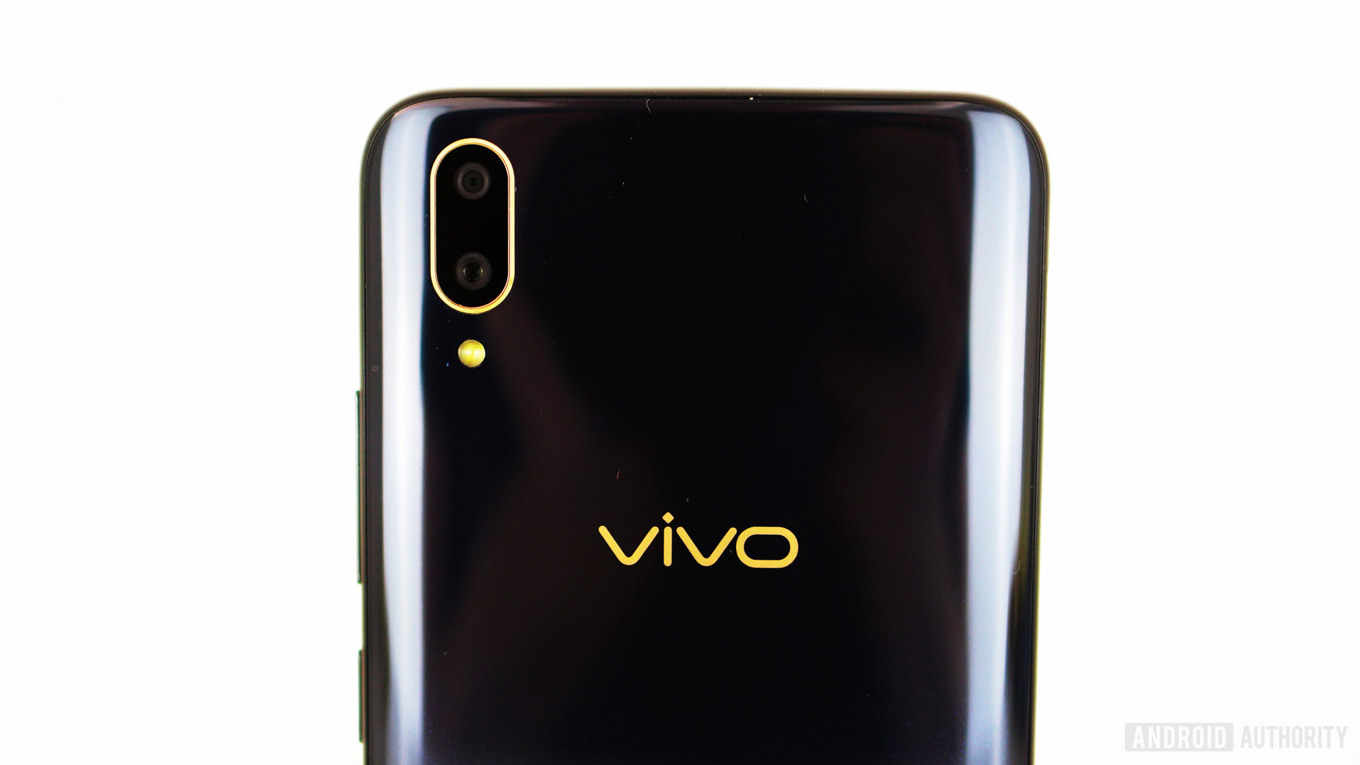
I’m of two minds about the vivo V11 camera. It performs well enough with the basics like daytime, low light, and high-contrast shots, but only in very specific conditions. The host of AI additions here are fairly unnecessary, often serving only to butcher an otherwise decent image. If you want a basic smartphone camera for pretty good shots in most conditions, the vivo V11 is fine. If you want all the extra bells and whistles or need a versatile camera for a variety of tricky shots, this is not the phone for you.
The V11 camera performs well enough with the basics like daytime, low light, and high-contrast shots, but only in very specific conditions.
The main camera is a 12MP f/1.8 with 1.28-micron pixels backed up by a 5MP f/2.4 camera for portrait mode bokeh shots. In the main camera settings, you can switch to 24MP, making me think vivo is using interpolation to bump resolution without adding any extra detail. However, an app like AIDA64 lists the primary camera as 24MP, so vivo could be downsampling a 24MP image to 12MP. I’ll update this review if I get confirmation either way. On the front, there’s a 25MP f/2.0 camera.
I was really impressed by the HDR mode on the vivo V11. It didn’t overdo the results, nicely balancing areas of deep shadow and brightness without giving it that telltale HDR look. In fact, the camera’s HDR was its biggest standout for me.
Daytime shots are generally good but you’ll need to stick with the primary camera. The 25MP front-facing camera just adds too much noise to make the resulting photos worthwhile. I very quickly gave up on it for selfies because the shots it took were grainy and lacked sharpness. The 12MP camera captures a decent amount of detail so you can still get some good shots, but it can’t stack up to more expensive sensors.
Low light and night-time photography was a mixed bag. Given a static subject and sufficiently steady hands, the V11 can capture some good-looking images. Add a person or moving subject to the scene and the image is noticeably worse. Just take a look at the girl’s shoe in the foreground of the image below to see what I mean. The V11 doesn’t crush blacks as much as phones like the HUAWEI P20, so expect a lot of noise in the dark. Blown-out highlights in things like street lights were a problem at night too, which is a shame considering how well the V11 handles dynamic range in the daytime.
Panorama stitching is very spotty, with blurry stitching points and general fuzziness across the image. In all fairness I wouldn’t recommend using it. The same goes for basically all of the “AI” camera features. The lighting effects are pretty cheesy and not terribly well done. The monochrome background effect worked well, but the color added to faces in the foreground throws things off.
Background blur in portrait mode shots still looks too fake for me, and the edge detection is just as bad here as most phones, especially around hair. If you really like portrait mode shots, you’ll probably be able to live with it, but it’s far from convincing.
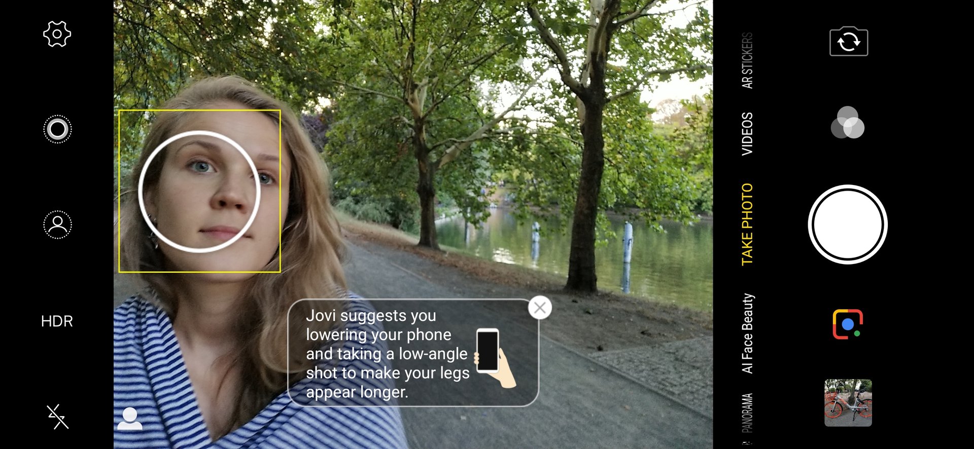
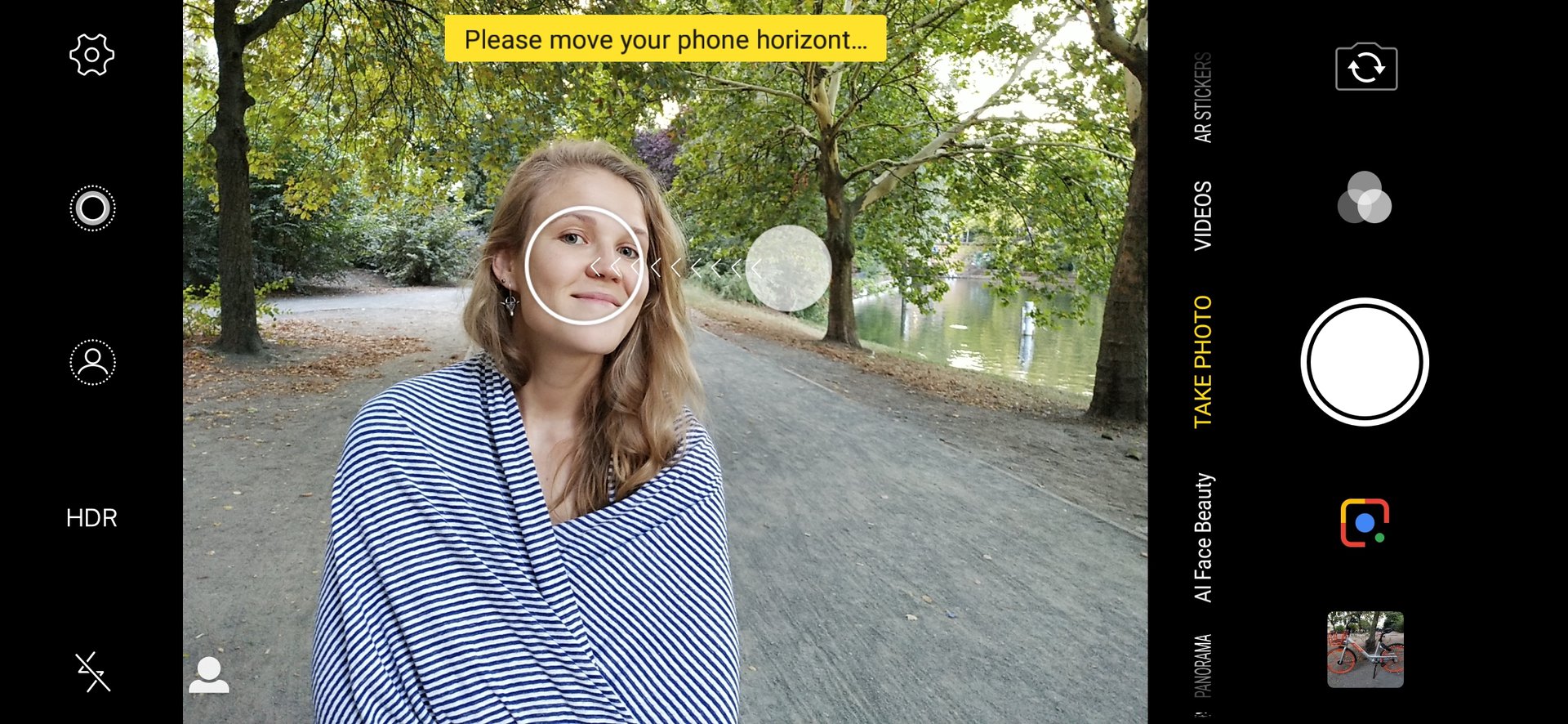
AI beauty modes have never been my cup of tea, and that hasn’t changed with the V11. However, they offer a huge range of reality-bending tweaks here, from the position and size of your nose and eyes, to the length of your chin, width of your face, and your skin tone. This software was developed with the Asian market in mind, where giving yourself cartoon-like features is popular. If you’ve ever wondered what you’d look like as a pink wax alien, the V11 will get you there. Used in restraint you can get some decent effects, but as with most beauty modes the skin smoothing is just far too heavy-handed for me.
The V11 is a capable shooter if your photography needs are fairly straightforward but the majority of the gimmicky extras aren't done well.
The AI scene recognition wasn’t quite as full on as other phones, typically doing a good job subtly tweaking the settings just enough to enhance the image. In some cases, the V11 overdid things, like the yellow leaf in the gallery, which pops so much it makes my eyes hurt. You can disable the AI scene recognition in the settings. Because it usually takes a while to kick in, you can also take one shot before and another after the AI enhancements for comparison.
Video wasn’t great on the V11. The lack of image stabilization was very noticeable unless you were resting the phone on something. There’s support for slow-motion video and time-lapse, but no 4K.
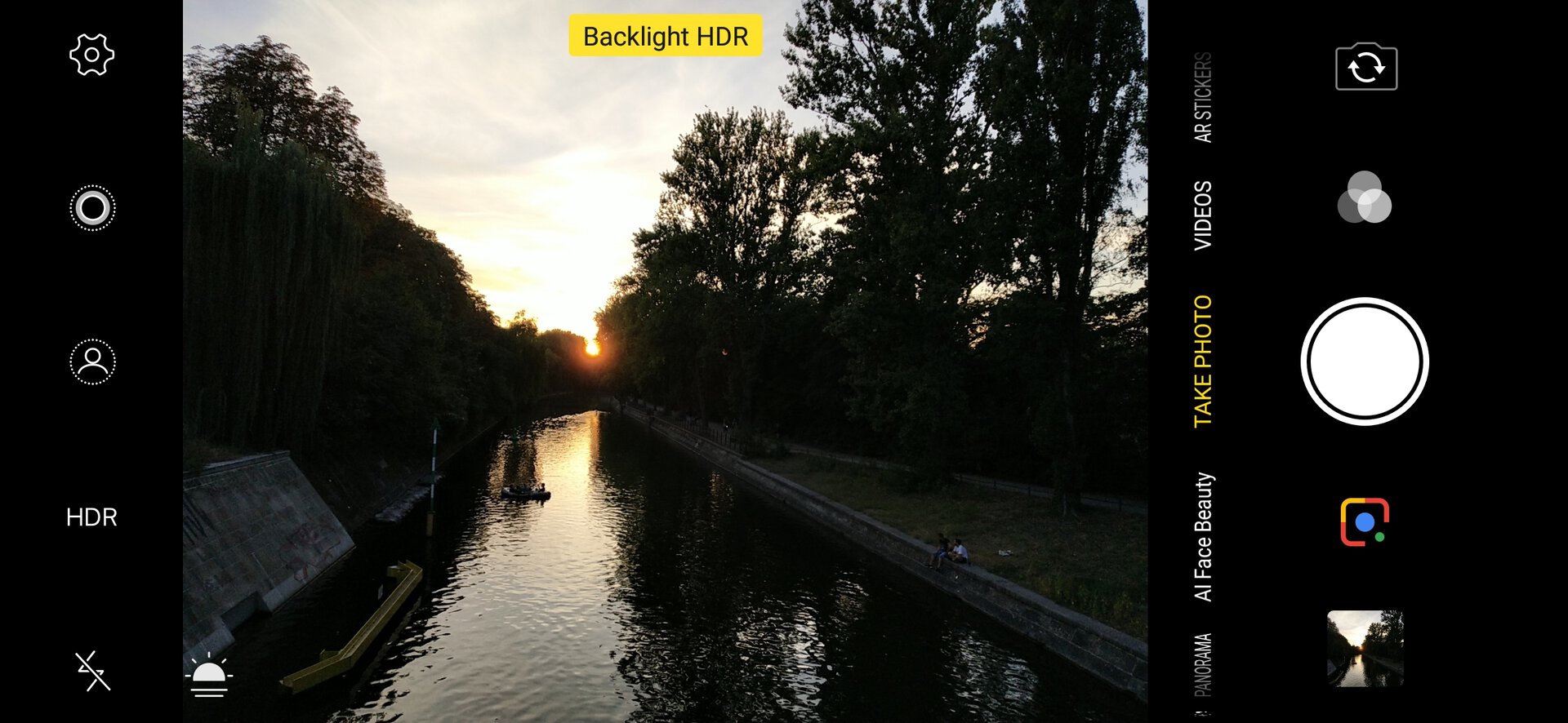
When all is said and done, the vivo V11 camera is far from great. It is a capable shooter if your photography needs are fairly straightforward. The vast majority of the gimmicky extras ladled on are not done well enough to be impressive, only serving to clog up the camera experience. I would’ve much preferred it if vivo had just focused on improving the consistency of the basic smartphone camera requirements and left the rest out.
There are a lot more capable smartphone cameras in this segment, so if your main concern with a phone is its camera, you might want to shop around. However, I got several updates during the vivo V11 review period, so camera performance could well improve in time.
Specs
| vivo V11 | |
|---|---|
Display | 6.41-inch Super AMOLED 2,340 x 1,080 19.5:9 aspect ratio |
SoC | Qualcomm Snapdragon 660 |
GPU | Adreno 512 |
RAM | 6GB |
Storage | 128GB Expandable |
Cameras | Rear: Dual camera Main: 12MP, f/1.8 aperture, 1.28 micron pixels, dual-pixel autofocus Secondary: 5MP, f/2.4 aperture Front: 25MP, f/2.0 aperture |
Audio | Headphone jack |
Battery | 3,400mAh Non-removable |
IP rating | N/A |
Sensors | Accelerometer Ambient light Proximity E-compass In-display fingerprint |
Connectivity | MicroUSB Wi-Fi Bluetooth 5.0 |
Software | FunTouch OS 4.5 Android 8.1 Oreo |
Dimensions and weight | 157.91 x 75.08 x 7.9mm 156g |
Colors | starry night (black and blue) nebula (blue and purple) |
Gallery
Pricing and Final Thoughts
While the vivo V11 has a lot going for it, a lot of it seems superficial. It’s not that there’s no substance. The phone handles the basics really well. It looks great, with a great screen, good performance, and outstanding battery life. But its camera is sub-par, and at the equivalent of $365 – $440 depending on your market, it’s competing with alternatives sporting even better specs and cameras. Exact pricing for the V11’s markets will be revealed during the official launch in India on September 6.
Vivo’s software experience won’t be for everyone, and the use of micro-USB is a head-scratcher to be sure. The lack of an IP rating, NFC, and wireless charging will also disappoint many, although the inclusion of the 3.5mm headphone jack partially makes up for it.
The mid-range market has seen plenty of high-performance phones bringing flagship specs at lower prices lately. The vivo V11’s problem is it attempts to bring so many high-end features that its price point simply can’t deliver the quality those features demand.
I’m not saying mid-range phones don’t deserve flagship features, but if the attempt falls short, I for one would prefer the basics done well with no extra gimmicks at all. The vivo V11 bites off more than it can chew, but if it had taken a slightly smaller bite it would’ve ended up being much more fulfilling.