Affiliate links on Android Authority may earn us a commission. Learn more.
vivo V15 Pro review: Pop goes the selfie
February 20, 2019
Vivo V15 Pro
What we like
What we don't like
Vivo V15 Pro
vivo has had an interesting year. From the Apex concept to the vivo NEX, and then the vivo NEX Dual Display, the company has surprised us with its ability to innovate and offer something different. Like them or not, the pop-up camera and rear display unit definitely added some much-needed pizzaz to the phones’ otherwise me-too designs. Enter the vivo V15 Pro, a device that takes a lot of inspiration from higher-end devices and brings it to a more mainstream price point.
This is Android Authority’s vivo V15 Pro review.
Design
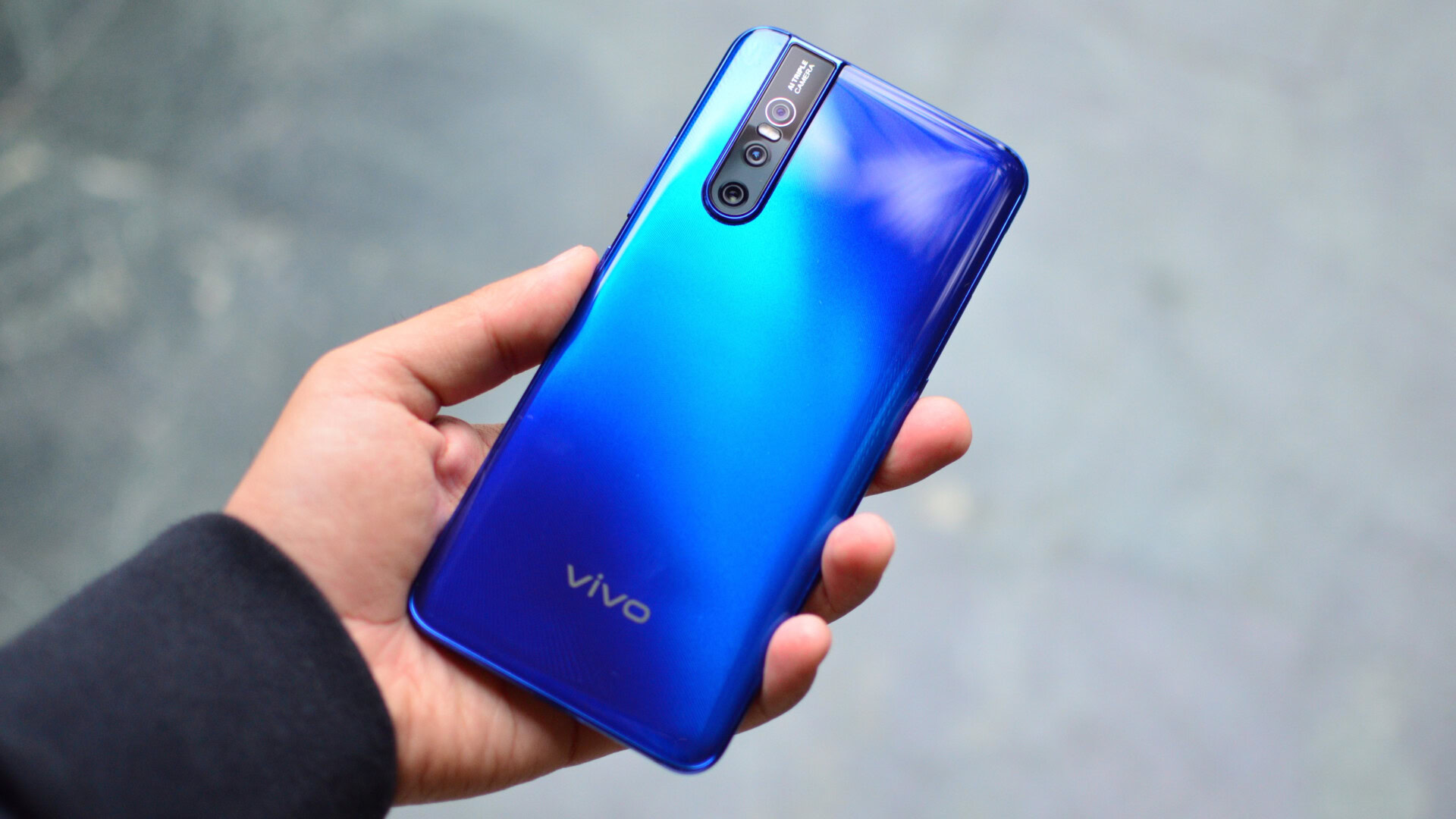
The vivo V15 Pro looks really damn good. There, I said it. That massive screen at the front offers an expansive viewing field that is as close to the concept of all-screen devices as we’ve gotten to so far. It doesn’t hurt that the screen looks really good too (more on that later).
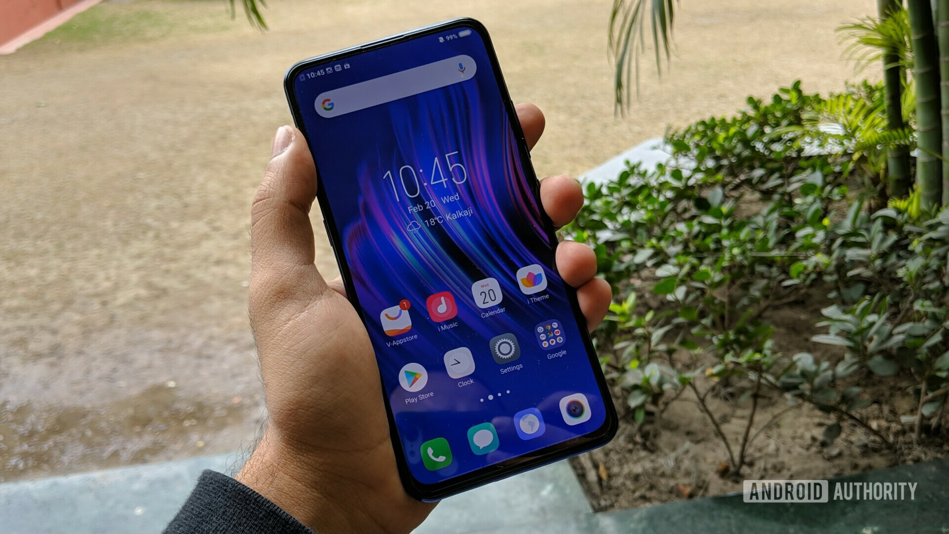
I’ve spent almost a week with the vivo V15 Pro and the dimensions have grown on me. This is not a small phone, but the gently curved edges and back make it very comfortable to hold. vivo did a really good job with weight distribution, and the phone nestles very easily in the palm of your hand.
The ergonomics, however, aren’t quite perfect. The volume rocker, in particular, is rather flush with the side of the phone and it’s often hard to make out whether a button press registers without looking at the visual feedback. Perhaps it’s just me, but I found the volume rocker on my vivo V15 Pro review unit was a bit too high up for my hands, requiring a little shimmy to reach.
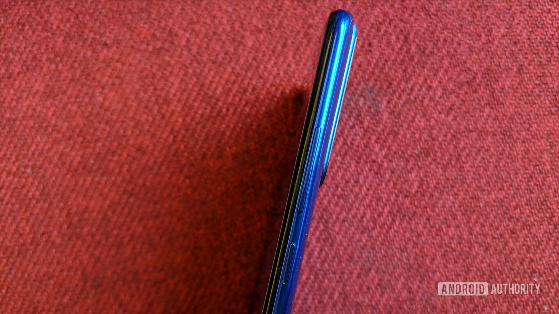
The power button, on the other hand, was easy to reach and had sufficient give, though I wouldn’t mind a “clickier” button. There’s a direct shortcut for Google Assistant on the left side of the phone. Double clicking the button activates Google Lens or vivo’s own Jovi image recognition.
The back of the phone is all sorts of interesting. Gradient style colorways are all the rage at the moment, and the vivo V15 Pro is joining in, sporting a finish that goes from an inky almost-black, to a bright electric blue, and then back again. It looks splendid. Coupled with the ripple-like design underneath, it’s definitely going to turn heads.

Since the vivo V15 Pro has a glass back, the usual caveats apply. The phone is extremely slippery and more than once, I caught it slipping down a couch. It is nearly impossible to keep the back clean of fingerprints and smudges.
vivo is throwing a case in the box, which adds a bit of bulk to the phone, but we’ll take that over constantly wiping the back clean. The case is rather nicely designed and combines a transparent back with rigid side panels.
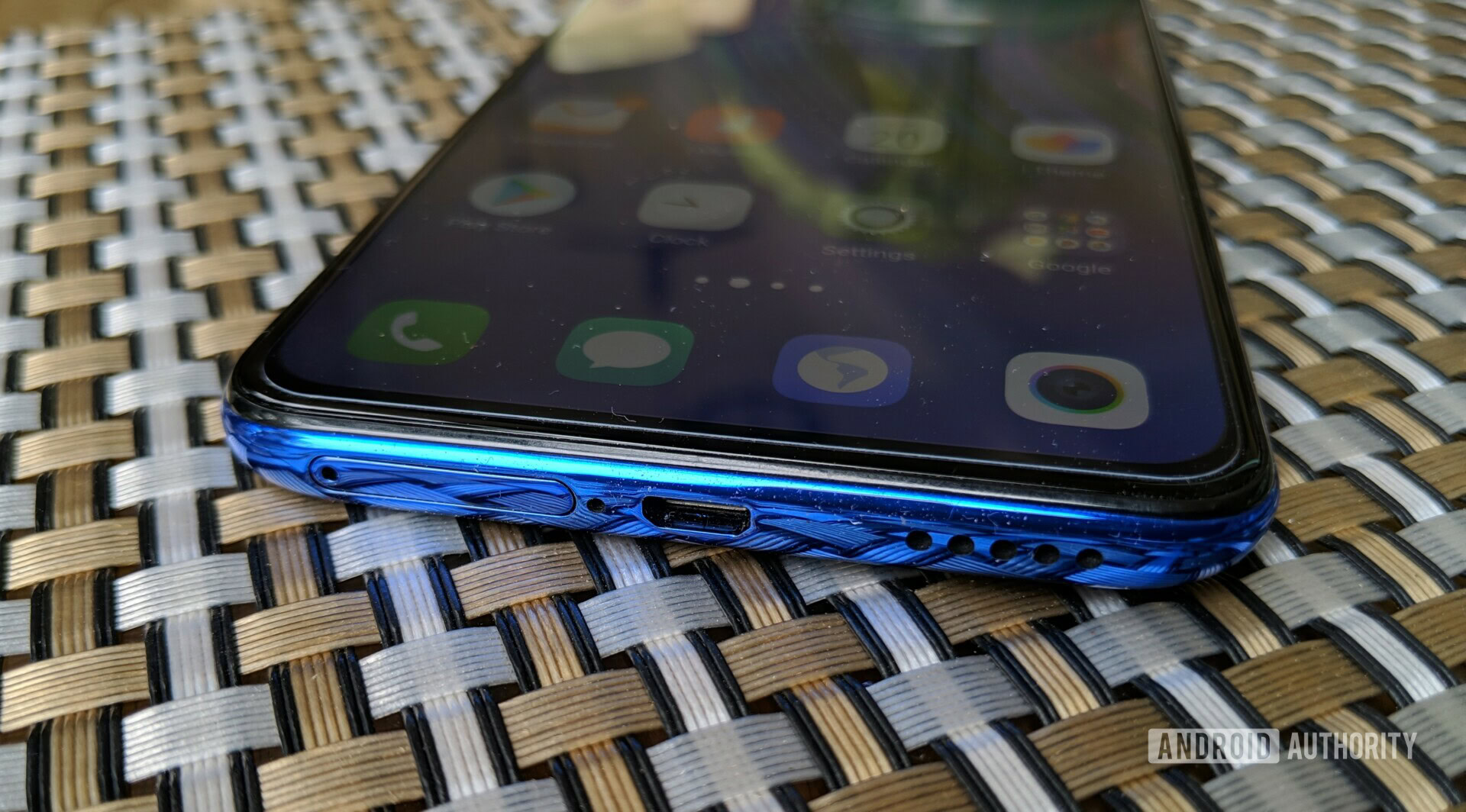
Along the top of the phone, there’s a 3.5mm audio jack. The bottom edge has a speaker grille and Micro-USB charging port. Yes, it’s 2019 and the vivo V15 Pro has a Micro-USB charging port. There is no justification for this, especially at this price point.
There’s a fifth-generation in-display fingerprint scanner under the screen here and I found it worked perfectly well. It isn’t quite as fast as a standard fingerprint reader, but unlike last year’s models, the speed of the fingerprint reader is no longer an impediment. However, I have an issue with the location of the fingerprint touchpoint. It is set too low on the screen and I found myself having to bend my thumb over a bit too much to unlock the phone.
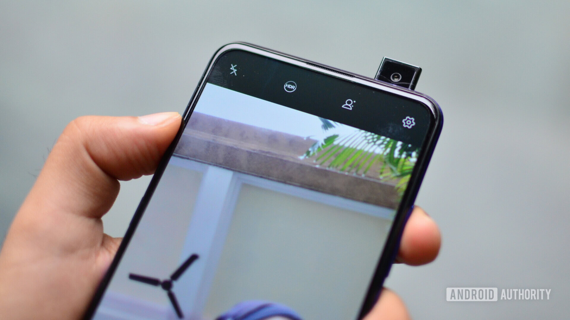
If you are reading this vivo V15 Pro review, there’s a good chance that the pop-up selfie camera has you intrigued. In fairness, it could be overkill, but I absolutely love it.
The selfie camera on the vivo V15 Pro pops out in under half a second. It’s fast enough. Located at the top right corner, the camera pops out for face recognition or if you are taking selfies in the camera app. It works just fine even in Instagram.
Display
The vivo V15 Pro has a 6.39-inch Super AMOLED display with Full HD+ resolution. The screen is nice and sharp with crisp text rendering.
Being a Super AMOLED panel, the display is particularly vibrant and excellent for media consumption. I found the white point very accurate. Personally, I prefer a slightly warmer color tuning, something it’s possible to adjust via a slider in the settings.
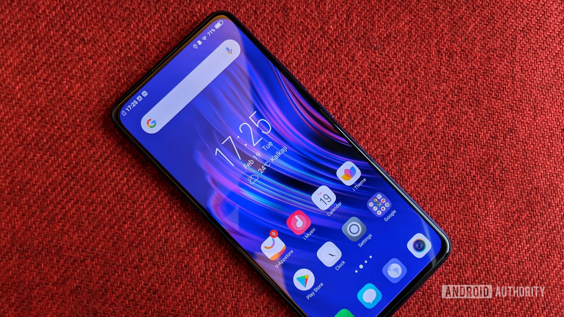
The screen itself gets sufficiently bright for outdoor use in direct sunlight. However, the phone is a bit aggressive with automatic brightness control and in low ambient light, it would often drop down a bit too far. It’s nothing that can’t be fixed with a quick swipe up of the settings shade, but a pain nonetheless.
The same goes for the default font size which takes way too much space. It is easy to adjust the font size and you can further change the font style as well, should you choose. Additional fonts are available via vivo’s themes app.
The pop-up selfie camera on the vivo V15 Pro is the reason why you have that expansive uninterrupted screen. The bezel at the top is 2.2mm while the chin at the bottom is a bit thicker. I really wish vivo had opted for similar dimensions on both ends for the sake of symmetry.
Hardware
Powering the vivo V15 Pro is an all-new Snapdragon 675 chipset. The processor hasn’t been used in many phones yet and in fact, the V15 Pro was our first experience with it. It really isn’t a top of the line chipset but our experience with it was rather satisfactory.
The Snapdragon 675 is an octa-core chipset using a combination of six Kryo 460 Silver cores clocked at 1.7GHz and two Kryo 460 Gold cores at 2.0GHz. This combination of efficiency and performance cores should assist with getting long battery life and just enough power when you need to push the phone. The chip uses an Adreno 612 GPU, a big step up above the Adreno 512 in the Snapdragon 660, but not as good as the Adreno 616 of the Snapdragon 710. Finally, the chip’s onboard Hexagon 685 DSP should help with AI-related tasks.
The Snapdragon 675 uses a combination of six Kryo 460 Silver and two Kryo 460 Gold cores.
The vivo V15 Pro pairs the Snapdragon 675 chipset with 6 or 8GB of RAM depending on the variant. In India, only the 6GB version of the phone will be available. Storage is capped at 128GB on both versions though you can expand storage using a microSD card in case you need more. About 110GB of free storage is available at first boot.
The phone supports dual nano-SIM card slots. Network performance was quite decent. It might have a bit of trouble in low network areas but phone calls generally sounded loud and crisp at both ends. NFC support is restricted to limited markets like Russia, Hong Kong, Singapore and Taiwan.
Performance
The Snapdragon 675 processor on the vivo V15 Pro is an interesting beast. Technically, it ranks below the Snapdragon 710, but everyday performance was generally on par. Navigating through the interface and jumping between apps on my vivo V15 Pro review unit was usually very smooth.
Playing games like PUBG was a very enjoyable experience.
I was pleasantly surprised by how well the phone did with gaming. With graphics set to high on PUBG Mobile, the phone maintained a solid framerate and the gameplay experience was very enjoyable. Guns of Boom, another online PvP shooter looked and played really well on the V15 Pro.
That said, it was obvious the phone was working hard to maintain performance. The phone gets noticeably warm along the upper half with anything more than a few minutes of gaming. Battery drain is also noticeable. I observed a six or seven percent drop in battery life over a 10-minute PUBG session.
Software
I have a love-hate relationship with vivo devices. I love what it does with the hardware, but not so much the software. The interface picks up elements from all over iOS, but doesn’t quite have the soul of what makes the iPhone’s operating system endearing. The vivo V15 Pro runs Funtouch OS 9 on top of Android Pie.
To start with, there is no app drawer so to speak. All the app icons are on the home screen. There is no option to change this in the settings. The notifications shade and quick toggles have also been split between two separate panes. Like iOS, the notifications shade can be pulled down from the top while the quick toggles are pulled from the bottom left corner. This is a complete departure from how things work on stock Android.
There are other changes and additions all around. By default, the phone cycles through wallpapers every time you tap the power button. This can be turned off. There are a whole bunch of preloaded apps as well. Our Indian vivo V15 review unit shipped with apps for PhonePe, UC Browser, Gaana, PayTM, and a whole lot more. Most of these can be uninstalled. This is in addition to vivo’s own take on photo gallery app, theme store, and other extras. The phone even has a dedicated Game Mode to turn off all possible distractions while gaming.
The settings menu is a gold mine if you really like to customize your experience. From the optional gestures to changing the font as we’d mentioned earlier, you can do a lot here. It’s great that vivo lets you choose whether you want to use the button on the side for Google Assistant, Google’s visual search tool, or Jovi. Speaking of Jovi, the search tool works as advertised as far as identifying objects is concerned, but search results for shopping links were always a bit off. I don’t really see anyone using this over Google Lens.
We’ve talked about all the additions made to the software, but the vivo V15 Pro falls a bit short with changes to its existing software. The company made some questionable decisions about how apps are handled, and there are a few bugs here and there. The keyboard often refused to pop up despite multiple taps on a text entry field. The phone would also force close apps or drop off network connectivity in the middle of a download if the screen was turned off. This aggressive app management might result in better battery life, but it also ruins the otherwise pretty decent user experience. It can and should be fixed by vivo with a software update.
Camera
The vivo V15 Pro has three different rear camera modules. There’s a 5MP depth-sensing camera, an 8MP wide-angle sensor and most interestingly, a 48MP primary camera. The primary camera has a Sony sensor that combines four adjoining pixels to improve sensitivity. While you can shoot full resolution, 48MP, shots from the camera, it works best when pixel-binned to 12MP.

Dull and gray Delhi does not make the ideal spot for testing out cameras, however, the vivo V15 Pro did a very decent job at evenly lighting up the foreground, despite a hazy sun shining straight at the camera. Generally, images from the primary camera look pretty good. Pixel peeping reveals the heavy noise reduction in play — grass, in particular, gets reduced to green splotches. The phone will suffice if all you do is share images on social media.
For close up shots, we did a quick comparison between the full resolution and binned 12MP images. On the left, see how the 12MP shot has lower levels of noise in shadow regions. This is also where the “AI Engine” kicks in, giving the image a slight boost in saturation. Meanwhile, the full resolution shot has a bit more noise and no obvious benefit over the binned version.
I’ve long maintained an ultra wide lens makes much more sense than a telephoto camera on a phone. The 8MP ultra-wide camera on the vivo V15 Pro is a really nice way to get a very different perspective. The shot above simply wouldn’t have been possible without the ultra wide sensor. The image quality is satisfactory for social sharing and on-screen use. Pixel peeping reveals a lack of detail and heavy noise reduction.
vivo made a big deal out of the 32-megapixel selfie camera on the V15 Pro. I’m not entirely sure who would ever need such a high-resolution image from the front camera but hey, it’s there. Image quality is alright. This is certainly no Google Pixel, but the vivo V15 Pro can make you look good on camera.
vivo made a name for itself with selfie-focused cameras and it shows here. The beauty mode can lighten your skin and perform all sorts of mutations like enlarging your eyes and forehead, or slimming your jaw structure, and more. Even with the beauty mode turned all the way down, I could sense a bit of work done to the shot. I get it, there’s an audience for these features. However, not everyone wants to see a dolled-up version of themselves and a bit more natural looking shot in the normal mode would have definitely helped.
Battery
Powering the vivo V15 Pro is a 3,700mAh battery. It isn’t quite as good as the 4,000mAh batteries on certain competitors but usually manages to last a full day. I found the battery life varied quite drastically with what I used the phone for. On an average day, with a few hours of social media, web browsing and calls, the phone would still have a bit of juice left over to go on till the next morning.
Gamers might be disappointed by the battery life.
Gaming, however, draws a big chunk of battery on the V15 Pro and I could see a six or seven percent drain with just 10 minutes of use. Avid gamers might not be satisfied with the battery life on the vivo V15 Pro. Overall, with mixed use, I observed about six hours of screen on time but your mileage may vary depending on use.
The phone supports vivo’s “Dual Engine” charging and could be charged up quite quickly. The company’s claim of a 25 percent charge in fifteen minutes roughly matched our experience. Topping off from 25 percent to a full charge took just about an hour and twenty minutes.
Specs
| vivo V15 Pro specs | |
|---|---|
Display | 6.39-inch Super AMOLED 2,340 x 1,080 19.5:9 aspect ratio 2.5D curved glass 91.64 percent screen-to-body ratio |
SoC | Qualcomm Snapdragon 675 |
GPU | Adreno 612 |
RAM | 6/8GB |
Storage | 128GB Expandable up to 256GB with microSD card |
Cameras | Rear cameras: 48MP primary sensor, ƒ/1.8 aperture, .8μm pixels 8MP super wide-angle secondary sensor 5MP depth sensor Front camera: 32MP elevating front camera |
Battery | 3,700mAh Dual-Engine Fast Charging Bundled 5V/2A charger |
Sensors | 5th gen in-display fingerprint sensor Accelerometer Ambient light Proximity E-compass Gyroscope |
Connectivity | 802.11 a/b/g/n/ac Bluetooth 5.0 USB (USB 2.0) GPS OTG NFC (only in Hong Kong, Taiwan, Singapore and Russia) MicroUSB |
Software | Funtouch OS 9 Android 9 Pie |
Dimensions and weight | 157.25 x 74.71 x 8.21mm |
Colors | Gradient Blue and Gradient Red |
vivo V15 Pro – The verdict
The vivo V15 Pro is an intriguing device. It looks pretty damn amazing, and the expansive display is gorgeous for heavy multimedia consumers. It doesn’t have the sheer power that performance seekers will want. It’ll perform all your daily tasks and let you juggle social media apps, but if you’re always trying out the next high-end smartphone game, the Snapdragon 675 chipset might seem a bit limiting.
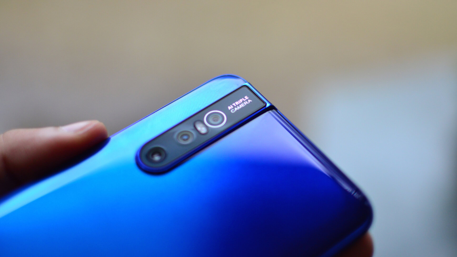
The camera aims for AI enhancements and beauty modes over flat out image quality. The sheer number of modes letting you manipulate your face and body are borderline eery. It is not a bad camera at all but competitors like the Pocophone, HONOR View 20 and OnePlus 6T all take much more natural looking images. Priced at ~$400 (28,990 rupees), the vivo V15 Pro is a great option for the social media generation. The vivo V15 Pro is up for preorder on February 20 and goes on sale in India on March 6, 2019.
What do you think about the vivo V15 Pro? Do you think design and AI camera enhancements can trounce better hardware and imagery? Let us know in the comments section.