Affiliate links on Android Authority may earn us a commission. Learn more.
Android 6.0 Marshmallow - New features explained
Published onOctober 9, 2015

After months of waiting, the beginning has arrived. We’ve been excited about the changes that Android 6.0 Marshmallow is bringing to the table. Not just new features, but bug fixes and stability improvements over Lollipop as well. The first official builds of Android 6.0 Marshmallow have hit and it’s time to see what this operating system can really offer!
Changes to the UI
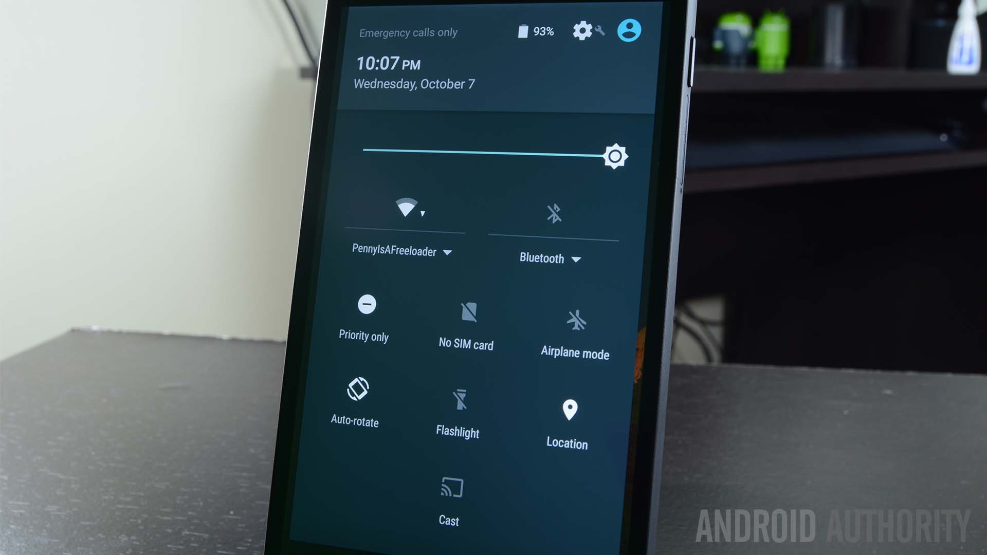
Let’s start with the UI because not a lot has changed over Lollipop. The home screens are set up the same way with new screens being added at your request with Google Now off to the left side. The quick settings are still just a swipe away and even the Settings menu is set up pretty much like it was before. If you’re coming from stock Lollipop, you should have no trouble finding your way around.
There are a few changes that are more notable than others. The apps section of the Settings menu has been changing to accommodate the new permissions system which we’ll talk about more in a minute. The priority notification settings that caused quite a stir in Lollipop have now been relegated to the Quick Settings. Other minor changes include a more colorful Google Search bar, a new app drawer which we’ll talk about in a moment, and dragging app icons around the home screen now provides a shortcut to uninstall.
There are also a host of new animations that are too numerous to list here. Some of the more notable ones include the new Google Search animations and a more streamlined set of animations for opening and closing the app drawer and applications. Text selection also got a slight revamp with a little box that pops up now with the usual set of controls.
New app drawer
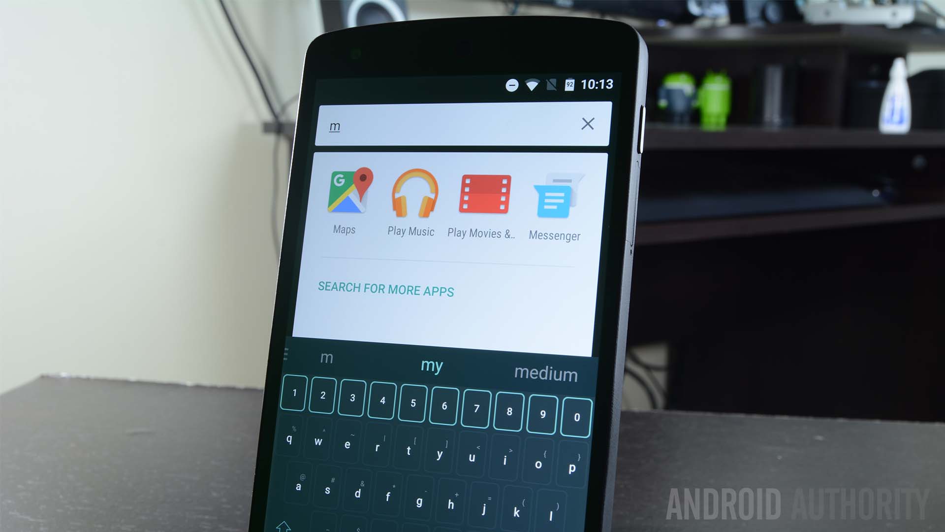
One of the bigger changes in Lollipop is the new app drawer. The horizontal app drawer which has ruled the day since the good old days of Jelly Bean is now gone, replaced with a vertical app drawer. This allows for much faster browsing of your applications and puts an end to scrolling many pages horizontally to find the app you want.
In addition, you can now grab the scroll bar on the right side and scroll quickly through the apps with a letter popping up to denote where you are in the list. We found this helpful if you’re looking for something quickly and it matches the kind of mechanics found in the Contacts app, most music apps, and any other app with long lists of items.
Perhaps the most prominent change is the addition of an app search bar at the top. Using this, you can quickly tap in a few letters and find the app you’re looking for. This is the quickest way yet to find something buried in the app drawer and it’s definitely a welcome addition.
Google Now on Tap
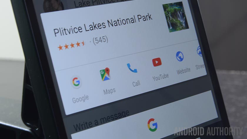
Google Now on Tap is the latest big feature to hit Google Now. The premise of Now on Tap is to give you information far more quickly than if you were to search for it in a web browser. For instance, if someone mentions a place, you don’t have to leave the messaging app, travel to the browser, and look it up. Instead, you long press the home button and Now on Tap pops up to tell you all about that place.
For now, it’s a hit and miss service. This was expected because it is brand new and Google is still adding things to the already impressive list of recognizable keywords that Now on Tap can utilize. We expect this to become better over time or at least much better by the time non-Nexus devices start picking up Marshmallow. You’ll have to browse through the Google Now settings to enable it, but otherwise it’s very easy to use.
Chrome Custom Tabs
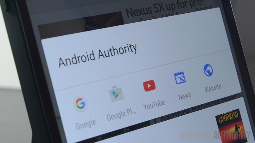
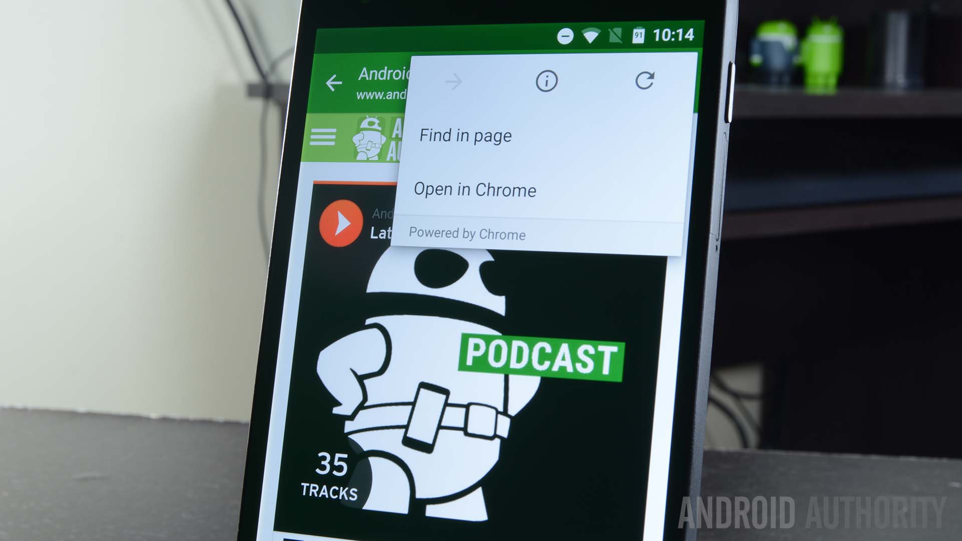
Chrome Custom Tabs is something we’ve not heard a lot about since it was announced at Google I/O earlier this year. The premise for Chrome Custom Tabs is simple as it provides developers a way to have an in-app browser without having to build their own. It essentially opens a Chrome Browser tab inside of the application that developers can control and customize to suit their app’s needs and thus eliminate the half-baked, usually slow built-in browsers like you see in apps like Pinterest, Facebook, Twitter, and others.
Unfortunately, there aren’t a lot of examples available. Ars Technica had to build an app using an open source demo in order to preview it but we managed to find at least one application that uses it right now. It’s not altogether different from most in-app browsers except you’ll have features from Chrome baked in such as auto-complete, various website cookies, and log-in history so you don’t have to do that over again. It is infinitely better than custom built-in browsers and we hope it gets a higher rate of adoption.
You can easily identify apps using Chrome Custom Tabs by looking in the overflow menu where you’ll see a small banner that says “Powered by Chrome”.
App permissions exist now
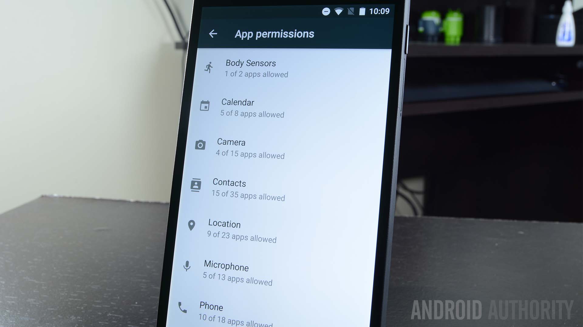
Having more control over app permissions has been a long time request of many power users. In Marshmallow, those wishes have been granted and the new permission system has been released in Marshmallow in full force. You now have more control over app permissions than you’ve ever had before. If you use the gear icon in the top right corner of the Apps section in Settings, you can see which apps use certain permissions on your device.
In the Settings menu, you can access application permissions and opt to turn certain ones on or off as needed. To avoid any potential conflicts with turning off a permission, Google has a built-in system that feeds fake data to the app so it keeps on chugging along as expected. That means you shouldn’t have to worry about legacy apps crashing when you disable permissions. That said, we still don’t recommend you turn off vital ones like the Camera permission for the Camera app.
Another addition includes pop up boxes that will show up whenever an app wants to access a permission for the first time. The most frequent example is the Location permission as apps all over Android seem to love asking for it at various times. You can confirm or deny permission when it pops up. This is an amazing addition because it allows even the less tech-savvy to engage with application permission regularly and they can prevent apps from having those permissions if needed.
Doze Mode
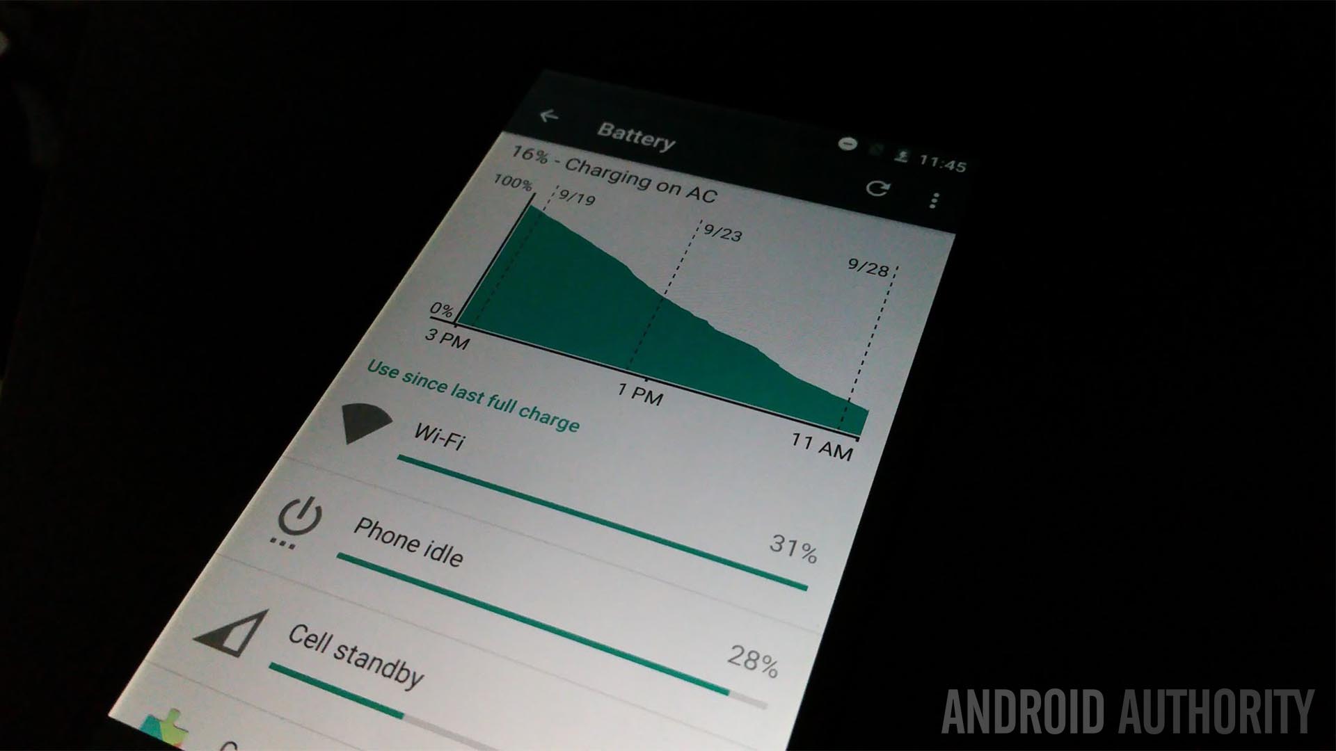
Doze Mode is a new addition to Marshmallow that’s supposed to help improve standby time. The idea is that once the phone has been off for a while, it’ll enter into Doze Mode. In this mode, it will ignore pretty much everything and just kind of exist in a state of stasis. Screenshots and reports have shown this can keep even the Nexus 5 alive for days, sometimes weeks, at a time.
Unfortunately, there are a few issues with this one. The device has to be off long enough to engage Doze Mode which really only happens if you’re one of those few people that don’t check their phones at work. The other is that Doze Mode can be ignored by applications if the app is set to priority. Since developers choose whether or not their app qualifies as a priority in Doze Mode, we expect most apps to simply bypass this battery saving function almost entirely.
Still, it’s a nice addition overall and we hope to see it expanded and maybe improved in future iterations of Android.
Volume has returned to normal
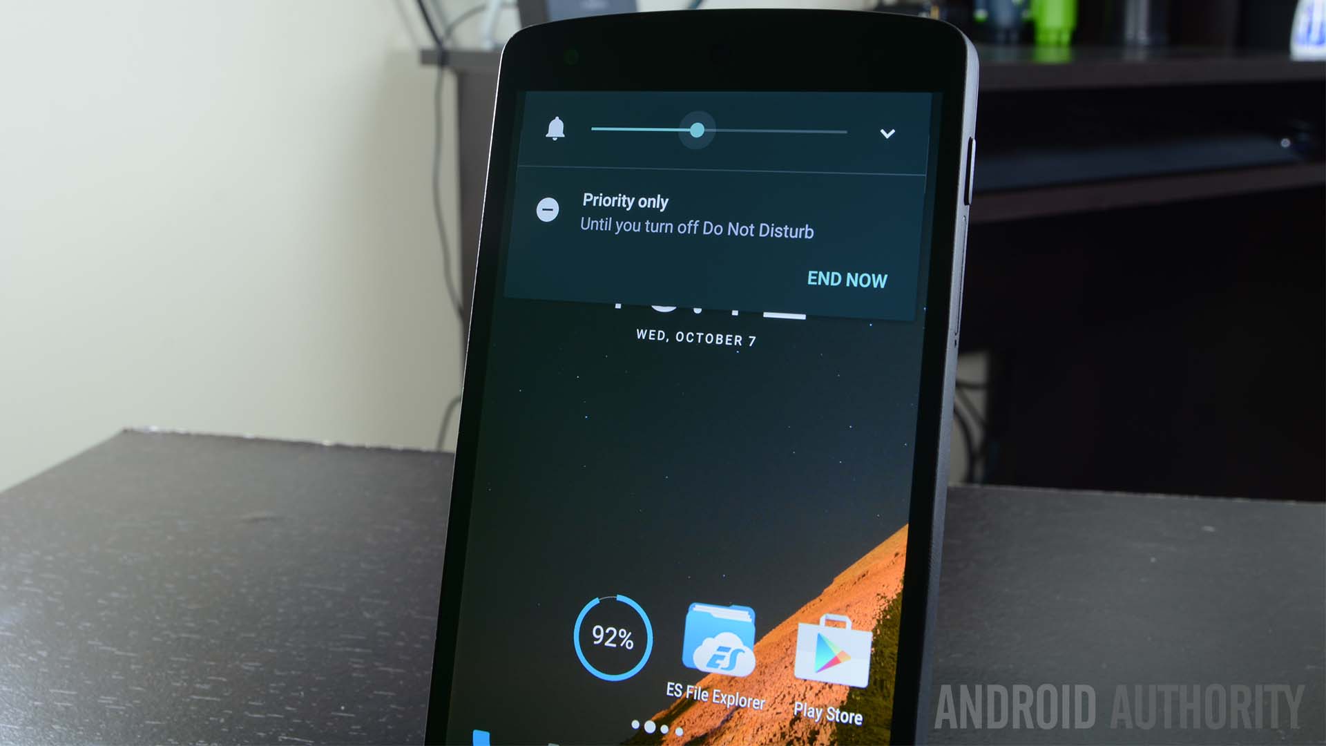
One of the less important complaints about Lollipop was its newfangled volume slider system. Instead of the customary way this used to work, with a silent mode, Google added in a Priority Mode where only certain apps, mostly alarms, could send you notifications and a Do Not Disturb Mode which silenced everything, including alarms. The problem was this was way too much information to deal with in a volume slider.
In Marshmallow, the volume slider returns to its old school ways. Lowering the volume all the way puts you in vibrate mode with one more lowering bringing you to a modified Do Not Disturb Mode that lets only alarms through. The aforementioned Priority Mode has been sent to the Quick Settings where you can tweak it there. This is, in my opinion, the perfect compromise between the way things used to be and the way things were in Lollipop. It’s a subtle change, but a welcome one.
For what it’s worth, tapping the icon on the right side of the volume slider bar still lets you change the system volume and media volume which was an addition in Android 5.1 Lollipop.
Fingerprint API brings a lot to the table
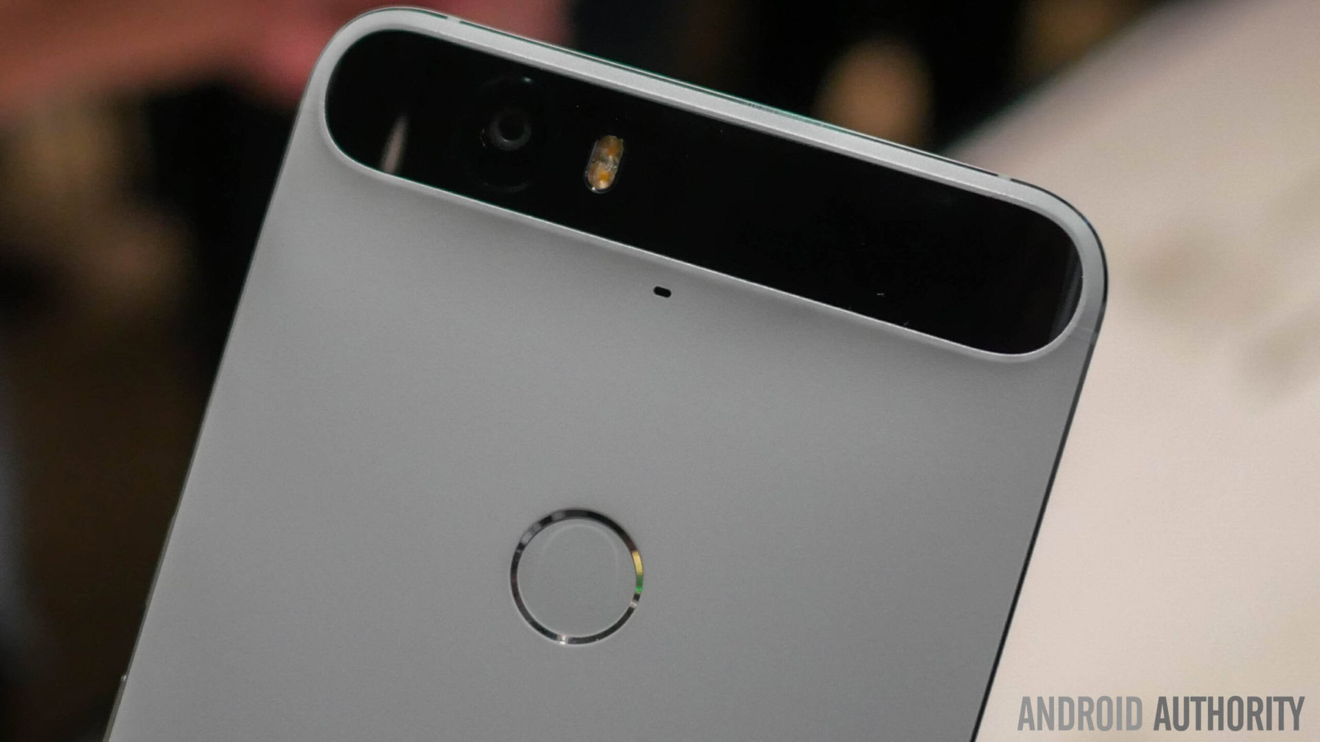
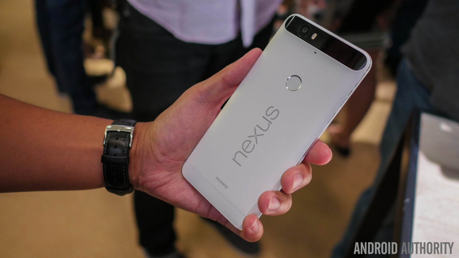
One of the more exciting APIs that should make its way across the Android ecosystem is the new Fingerprint API. There aren’t a lot of uses for this one yet but that’s going to change. The new Nexus devices both have Fingerprint scanners that can be used to turn on the device and bypass the lock screen. You can also use the fingerprint scanner in Android Pay.
This one is going to take a while to shine because it is so new. The API itself gives developers the capacity to fully integrate fingerprint scanning into their application in a variety of ways. You’ll be able to unlock apps like Android Pay, pay for items, and more. Really, the sky is the limit here and it’ll be fun to see the creative ways this gets implemented in the future.
App Links
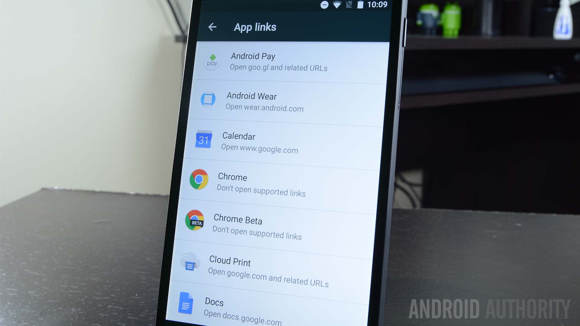
App Links is another feature announced back at Google I/O. This one is pretty simple to explain. Remember all those times a box popped up asking which app you’d like to use for a link you clicked on? Well App Links aims to remove that as much as possible by giving apps the ability to take ownership of their own links. For instance, if you click on a Twitter link, the Twitter app will just automatically open instead of asking you first.
This will save some time in the long run and help applications keep control over their own content. The box will still pop up in some instances, like if you have two browsers installed. In most cases, though, the app that owns the link should automatically grab it up and open the app itself. It’s a small thing, but it contributes to a more seamless experience between Android and applications.
Under the hood and other changes
There were plenty of other, smaller changes and additions that are worth noting even if they are minor in terms of scope and every day use. Some of them include:
- A new API that lets other assistant apps do what Google Now on Tap does. Thus, you could use something like Hound and it could read the text on your screen just like Now on Tap. This gives you the option to choose your personal assistant as long as you don’t mind it reading what’s on your screen.
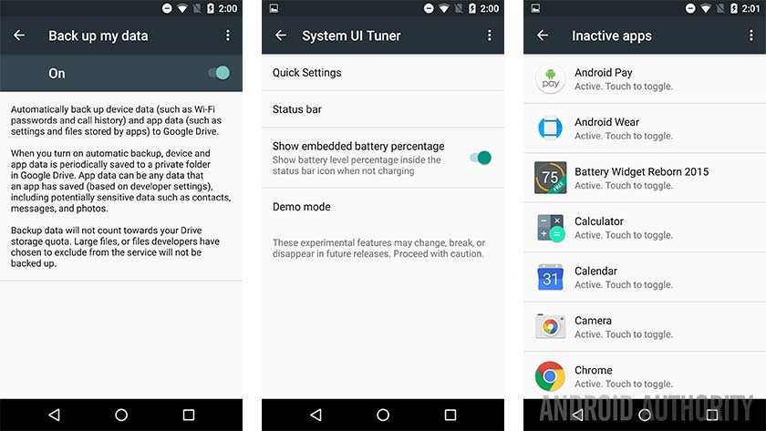
- Auto Backup is a new addition to Marshmallow that improves over the previous backup and restore functions in Android. With Auto Backup, it will backup the majority of your data along with the app. That means when you restore it, you’ll be able to continue more or less where you left off before. It’s better than it was before and a welcome change.
- Adoptable Storage allows you to insert an SD card into your device and then make it work like your internal storage. That means if you have 32GB of on-board storage and a 32GB SD card, you can use adoptable storage to essentially give you 64GB of on-board storage. There are some caveats and bad things happen if the SD card dies or gets removed, but it’s definitely something to consider if you have a device with an SD card slot.
- App Standby is a feature that hasn’t gotten a whole lot of press. This feature essentially takes applications you don’t use and puts them in a sort of standby mode, rendering them unable to stay open while sucking down processing power, data, and memory. Do note that this feature only occurs on battery power. When you’re plugged in, these apps can more or less roam free again.
- Direct Share is a new sharing feature enabled in Marshmallow. What it does is remembers who you share things with and in what apps you do your sharing. Over time, it will begin recommending people you can directly share to over the app you generally use to communicate with them. It’s a small thing, but it could save a lot of time if you always share to the same people.
- Some new devices are now natively supported in Android, including MIDI devices and the Bluetooth Stylus. We imagine the Galaxy Note series will take advantage of the latter next year.
- There is now a System UI tuner. You can access this by long-pressing the gear icon in the Quick Settings. This allows you to organize your Quick Settings, remove buttons from Quick Settings, and enable a battery percentage read-out on your status bar. It’s not overly useful, but it’s there and fun to play with. Just be warned that it can break stuff.
Of course, there were tons upon tons of other, smaller improvements including bug fixes, security patches, and a lot more. If you’d like to discuss them more, leave us a comment and talk to us about it!
Stuff they could have added or done better
Of course, no operating system is perfect and Android 6.0 Marshmallow has its share of flaws too. Some of them include:
- There still isn’t a clear-all button in the recent apps. That means you still have to clear these out one at a time. Of course, there’s a debate as to whether this does anything at all but a clear-all button seems like such a minor thing to not include.
- Unfortunately, Doze Mode seems destined to have problems. Developers have control over whether or not their apps qualify as “priority” in Doze Mode and we imagine most developers will make theirs a priority. This is likely negate many of the good things about Doze.
- On the lock screen, the left side shortcut used to be to get to your phone dialer. Instead, it’s now a shortcut to voice search. We understand Google wants us to use voice search more often, but removing the phone dialer from the lock screen feels awkward.
- They removed the dark theme and all dark theme aficionados were disappointed.
- Multi-window support didn’t make it in time for Marshmallow, but Google teases us by having at least part of the framework in there which can be enabled. Think of it like ART support in Kit Kat. It’s there, you can turn it on, but it doesn’t work all that well yet.
- A lot of Google’s security improvements won’t translate to OEM skinned devices. It’s been continuously reported that Google wants to do monthly security patches and there are parts of the OS where you can see that. As one could guess, these monthly patches will likely take eternity to reach devices assuming they reach them at all.

Wrap up
Overall, Marshmallow is a big step forward over Lollipop. There isn’t much change in the UI but we can’t expect a design overhaul every year. That’s unreasonable. Under the hood, Google has shored up a lot of the weaknesses and complaints of Lollipop while adding some truly unique, useful, and functional new features. Is it perfect? Of course not, but it’s a lot closer than Lollipop was. If you agree or disagree, tell us why in the comments! To see even more of Android 6.0 Marshmallow, check out the video at the top or the gallery below.