Affiliate links on Android Authority may earn us a commission. Learn more.
Accuweather fails to predict stormy response to botched Material Design overhaul
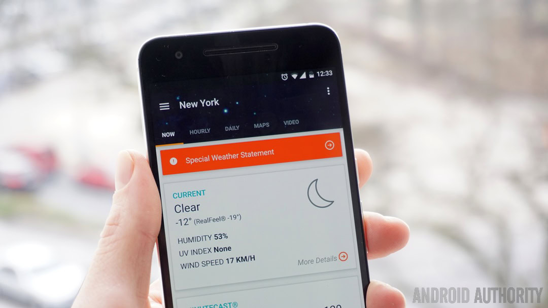
Ostensibly the update brings Accuweather v4.0 in line with Google’s Material Design guidelines, although the degree to which that is true is up for debate. There’s certainly more Material Design in Accuweather than there was before, but branding this as a “Material Design update” is not exactly true.
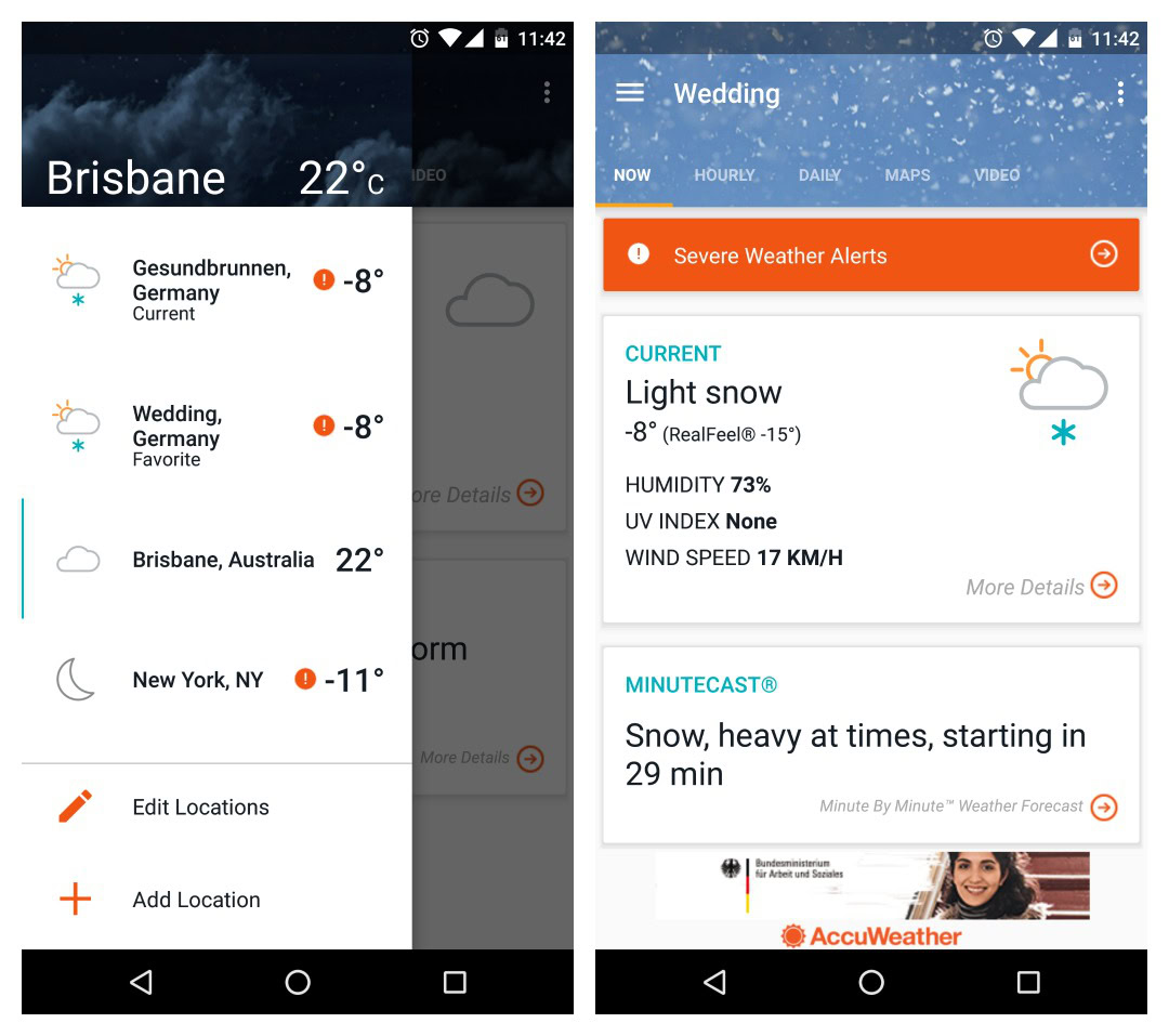
The app now features a slide-out navigation drawer where your various locations are listed for easy switching. (previously, locations were switched with a drop-down box at the top of the screen). Many Google Play reviewers are claiming the update loses saved locations.
The free version of the main app is now divided into five tabs: Now, Hourly, Daily, Maps and Video. The Now tab no longer displays a visual of the current weather and shows less detailed information than the previous version. To access further details beyond temperature, humidity, UV index and wind speed you’ll have to tap a “more details” button.
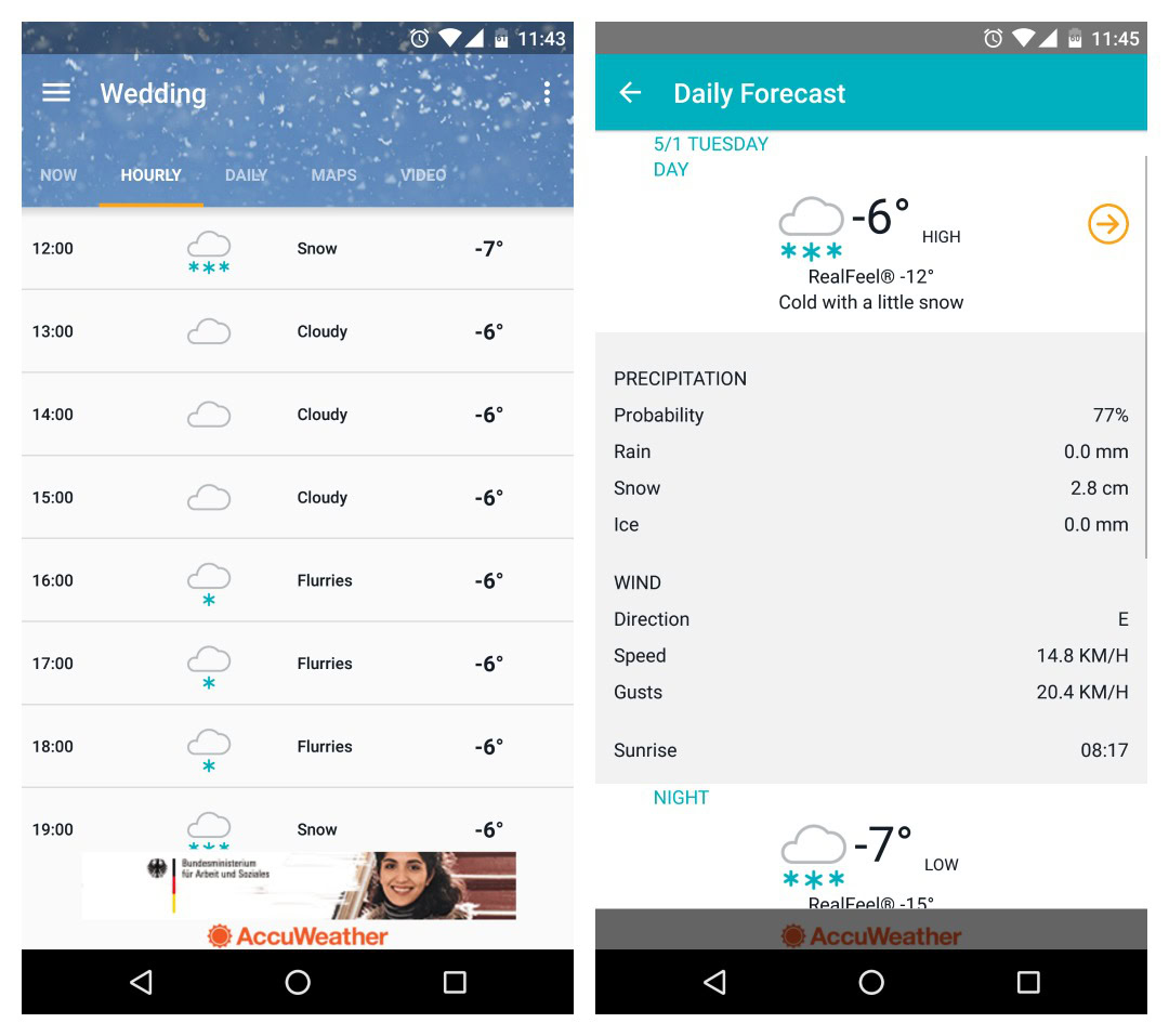
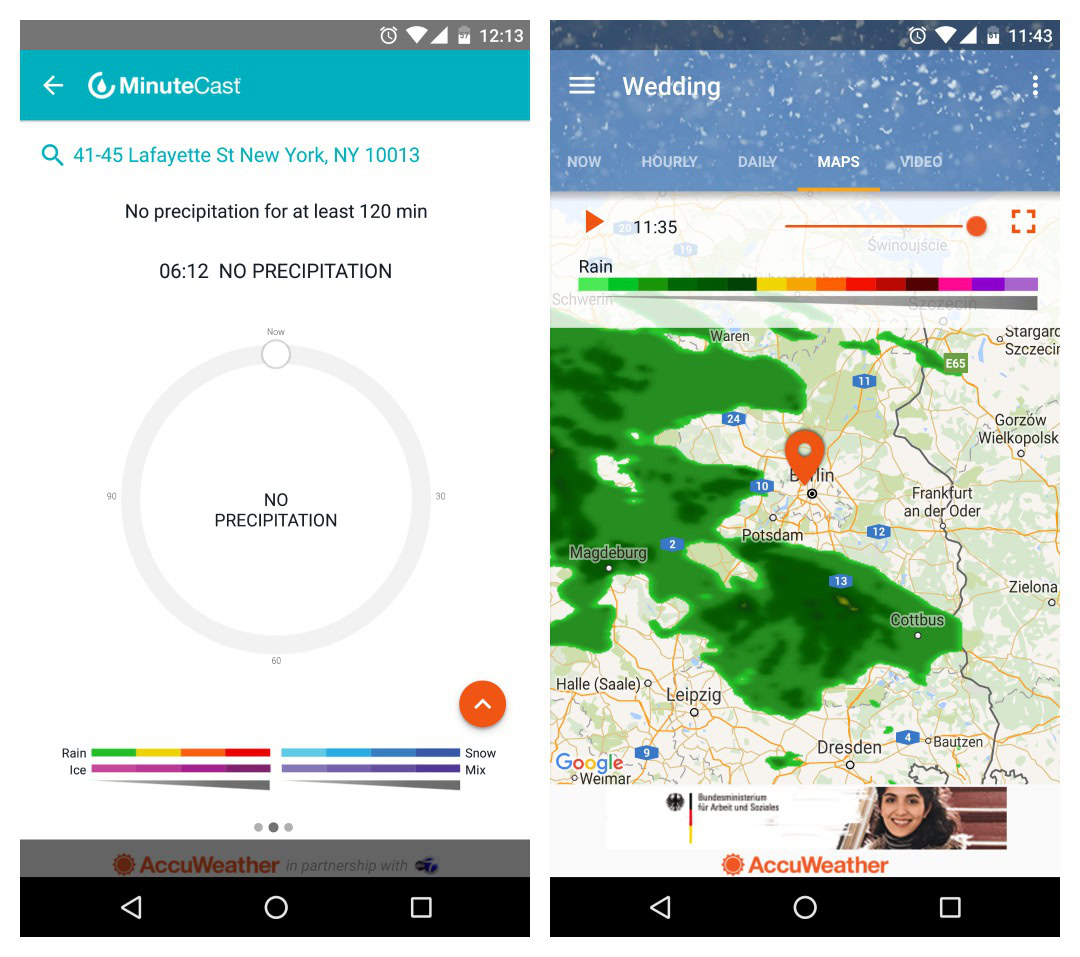
The Hourly and Daily tabs now show simplified lists of the forecast and there are no temperature or precipitation graphs to be seen. The MinuteCast tab is also gone, now only accessible via another shortcut on the Now tab.
The Maps tab has also been overhauled with separate color keys for snow, ice, cloud cover and rain. The individual keys indicate conditions from light to severe with not-exactly-logical color transitions (in which spectrum does pink follow black?).
Users are also complaining about changes to the apps’ widget options. Where there were previously multiple options including a dark themed widget, the new Material Design update only offers one option. This take-it-or-leave-it widget provides a light-themed three-day forecast that isn’t resizable, making it basically useless.
It’s not all doom and gloom though. Some parts of the update are good, like the nav drawer, but overall Accuweather seems to have missed the point, both on what Material Design is and what its users want. I’m all for streamlining and cleaning up an app, but when it comes to predicting the weather, more information is almost always better than less.
The good news is that considering the consistency of the backlash, Accuweather can’t be unaware of it. With any luck the next update will reintroduce temperature and precipitation graphs, a MinuteCast tab and more widget options.
What do you think of Accuweather’s update? How much weather information do you like?