Affiliate links on Android Authority may earn us a commission. Learn more.
Android 10 on OnePlus 7 Pro: Hands-on with all the new OxygenOS features
Published onSeptember 14, 2019
Android 10 is here! Well, it is if you happen to have a Google Pixel or an Essential Phone. The rest of us have to wait a little longer, but if you happen to be a OnePlus 7 or OnePlus 7 Pro owner you can get a taste of what’s to come with the Android 10 OxygenOS open beta.

I’ve been running the first open beta on a OnePlus 7 Pro for a few days now and there are a bunch of fairly significant changes along with some more subtle tweaks, most of which are expected to carry over to the stable release of OxygenOS based on Android 10 in the near future.
Before we get going with my hands-on impressions, it should be noted that the open beta is a fairly buggy affair. It may be tempting to “upgrade,” but be warned that there are inevitable instability issues. The problems I encountered — UI elements freezing, auto brightness inconsistency, stuttering transitions — are by no means exhaustive. You can give the beta a spin yourself via the button below, but if you do encounter any issues be sure to report them to OnePlus here.
With that out of the way, let’s see what’s in store for Android 10 on the OnePlus 7 Pro!
Hello new gestures, goodbye “pill”
I’ve been flitting between the OnePlus 7 series and a Pixel 3 XL for months now and during that time I’ve been using Google’s awkward two-button “pill” navigation on both for consistency’s sake. The OxygenOS Android 10 beta has thrown all that out of the window because the pill is gone, perhaps for good.
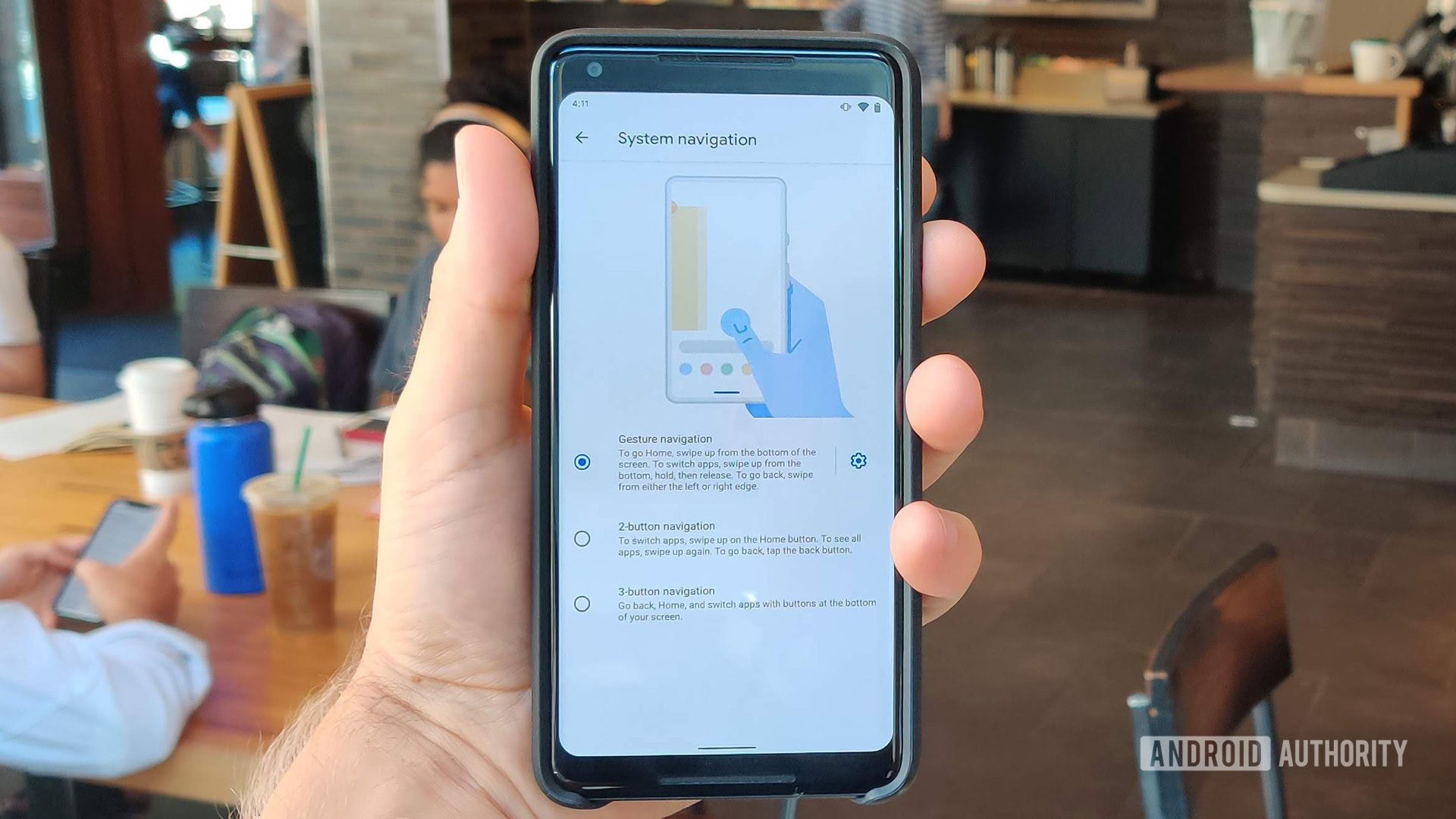
You still have three choices in total, with the old school three-button bar and OxygenOS’ upward swipe gestures still available as options. The third option now mimics Google’s new, distinctly iOS-esque gestures introduced with “stock” Android 10, with horizontal swipes introduced to go back on top of short vertical swipes for recents and a longer upward swipe for the app drawer.
Whether you like them or not gestures aren’t going anywhere and this is inarguably the best implementation so far. OnePlus has actually gone a step further by addressing the hamburger menu dilemma.
Unlike Google’s clumsy hold-and-peek band aid, if you swipe from the top left edge of the screen on a OnePlus phone running Android 10 you’ll still summon the hamburger menu instead of going back. As shown in the GIF above, it works perfectly, and Google should absolutely take note.
I actually miss the pill.
With all that said, and it might be Stockholm Syndrome talking at this point, I actually miss the pill. Is it objectively worse? Maybe. Would I have liked the option to stick with it? Absolutely.
Another minor tweak to navigation is the ability to hide the gesture guide line at the bottom of the UI. While this is mostly a visual change that gives you a tiny bit of extra screen real estate for general use, it also means you have to “throw” recent apps (a diagonal swipe from the middle) to cycle through them rather than swiping left and right on the bar.
Telephoto and wide-angle video, wide-angle Nightscape, and more
The camera has always been one of OnePlus’ weaker areas, but the Chinese brand has, to its credit, always improved overall quality and added new camera features post launch. This trend continued in the months following the OnePlus 7 and 7 Pro’s release and it’s due to get yet another boost with Android 10.
Related: We went behind the scenes with the OnePlus camera team. Here’s what we learned.
The headline additions are the ability to capture video using the wide-angle and telephoto cameras, as well as Nightscape support for the wide-angle lens.
As you can’t flip between the three cameras on the fly, the telephoto zoom feels a little redundant, but wide-angle video is great for capturing landscapes. In fact, video capture in general is vastly improved thanks to the 1080p-locked Super Stable mode that can be toggled on via a new icon in the top right of the Camera app.
Wide-angle Nightscape is also a neat option to have in theory, but you gain a ton of noise switching from the primary to wide sensor and the overall image quality you are left with is really quite poor if your hand moves even half an inch. You can also now take zoomed portrait shots using the telephoto lens and that fares much better.
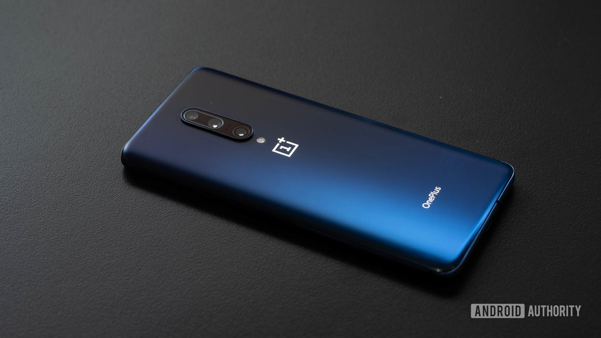
On the selfie side, Focus Tracking now follows moving subject’s faces around and keeps them in focus. This apparently also works on cats and dogs, but I couldn’t get my obstinate feline into shot long enough to test it.
One feature that’s been widely reported on but isn’t here in the open beta is a Super Macro mode, though that could still arrive with the stable release or as a future update to the OnePlus Camera app. There is, however, a newly added option to hide any photos in a “Hidden Collection” album in the Gallery app which should be great for those, well, private photos. Moving on.
Zen Mode gets even more chill
OnePlus’ surprisingly popular Zen Mode has gotten even better in the Android 10 beta with the much-requested addition of timer options. Instead of the default 20 minute break, you can now silence your notifications and apps for 30, 40, or 60 minutes as well.
If you’re not into Zen Mode’s extreme approach to digital health, you’ll be happy to hear that the full Digital Wellbeing app that was missing on Android Pie-based OxygenOS has now finally arrived too. This is the latest version, so it also includes parental controls like screen time and app limits via Google’s Family Link suite.
Game on with Game Space
OnePlus doesn’t technically make gaming phones, but its phones just so happen to be among the best handsets you can buy for playing games thanks to all of that top-end hardware.
With the Android 10 beta, OxygenOS has also come to play with the new Game Space app. The app is essentially a mini launcher where you can access all of your games, much like the game launchers we’ve seen from Asus and Samsung.
As well as the smart, clean design, Game Space is also the new home for Gaming mode and Fnatic mode, which had previously been haphazardly stuffed into the nondescript Utilities sub menu in Settings. These are all smart and stylish changes that — combined with upgraded screen recording that now supports QHD and 60fps — make the OnePlus 7 Pro an even better phone for gaming on the go.
Improved Ambient Display
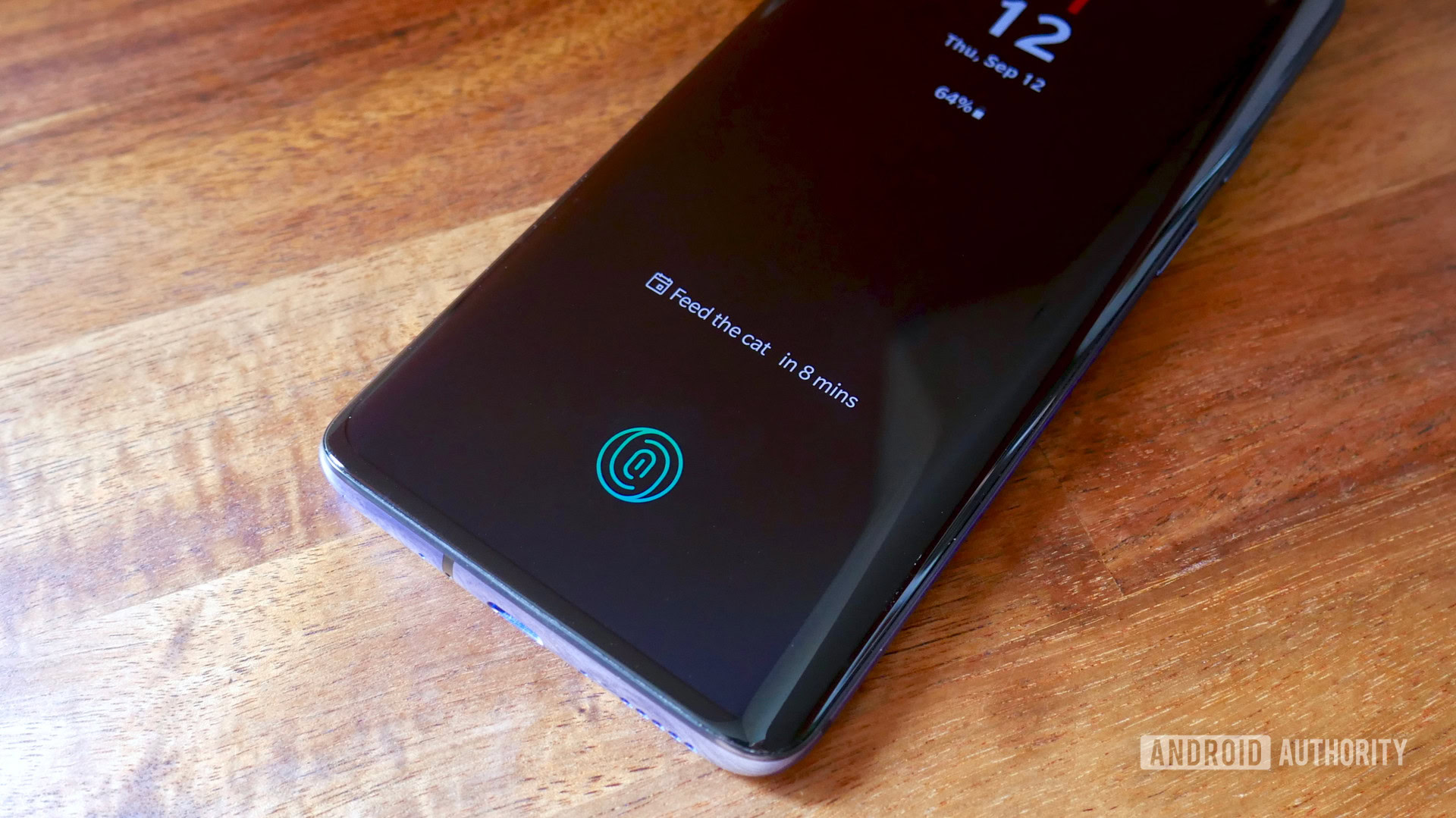
Let’s get the disappointment out of the way first: There’s still no always-on display.
As a sort-of solution to what’s still an utterly baffling omission, OnePlus has improved the Ambient Display. Following the Android 10 update, the Ambient Display shows weather reports and calendar events that adapt depending on the time of day and your location.
Ambient Display has been upgraded, but it's baffling there's still no Always-on option.
There’s also apparently a new feature which, much like the Now Playing feature on Pixel phones, shows you the song and artist name for any music playing with just a tap on the Ambient Display. I say apparently because I couldn’t ever get this to work.
The priority and grouping changes to the notification bar in stock Android 10 also make it over in the OxygenOS open beta in full.
Dark mode and Customization
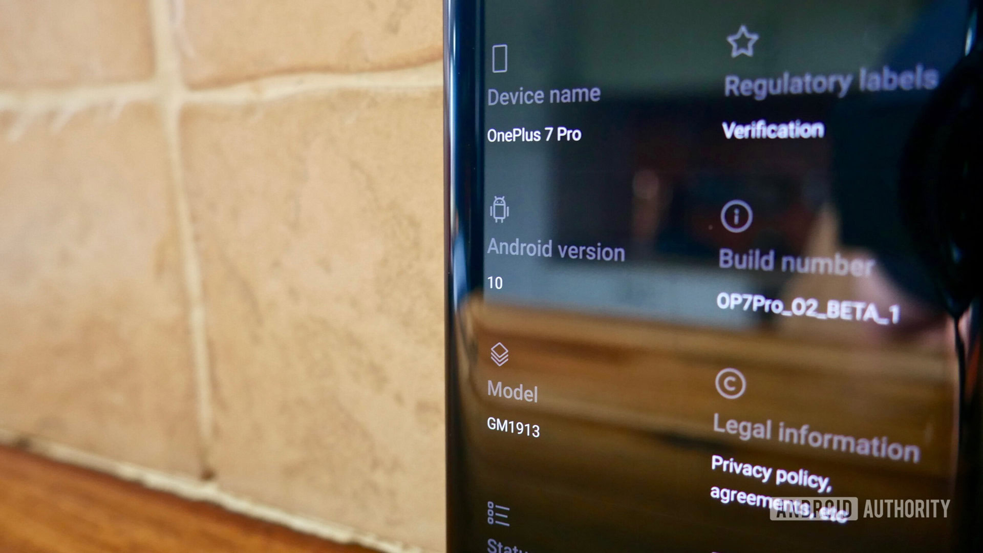
OnePlus was always far from the worst offender when it comes to OEMs transforming the Settings menu into a cluttered mess (looking at you, Huawei), but things get even tidier with Android 10 thanks to the new Customization menu.
Related: Does “true black” dark mode save more battery than dark gray? Yes, but also no
Instead of throwing all of OxygenOS’ customizable elements into different categories, this new sub menu bundles together almost all of the optional cosmetic UI changes. This includes accent colors, UI icon shapes, app icon packs, fonts, and all lock screen customization like wallpapers, in-display fingerprint animations, and the color of the Horizon Light for notification flashes along the curved edge.
It’s also where you’ll find OxygenOS’ take on a proper, AMOLED-friendly, system-wide dark mode. The option appears under Customization > Tone alongside the regular Light theme and a Colorful mode which mixes light and dark elements with colorful icons. Alternatively, you can select the “Nuanced dark” preset theme which also changes other UI elements like the Ambient Display clock and fingerprint animation.
Unfortunately, OnePlus’ dark mode mixes jarring gray tones into the deep blacks, most notably in the quick settings panel. This won’t be a deal breaker for many, but dark mode purists will no doubt hope this changes for the stable release. It’s also worth noting that there isn’t a dark mode shortcut in quick settings as there is in stock Android 10.
Other features and UI tweaks
We’ve covered most of the core changes in the OxygenOS open beta, but on top of other base Android 10 changes, such as the new privacy options, there are plenty of minor tweaks that are exclusive to OnePlus’ skin.
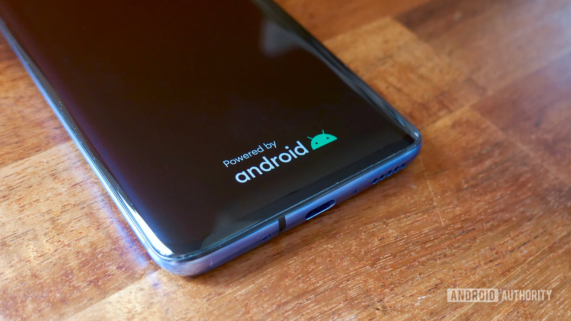
Many of these are aesthetic changes that are as small as the freshly disembodied Bugdroid icon now appearing on the boot screen and the relocation of the battery indicator to the left side of quick settings.
OxygenOS packs in a raft of major and minor changes that improve on 'stock' Android 10.
Others, like the revised volume panel with multiple sliders in one small panel, are useful but easy to miss. There’s also Intelligent Control which automatically adjusts background power for apps based on their characteristics and your own usage.
Raise to Switch is actually one of my favorite new features. With Raise to Switch any calls you make or answer will automatically switch over from any Bluetooth headsets or headphones you might have accidentally left on when you lift the phone to your ear.
Many of these additions and changes are relatively minor, but are still smart and welcome improvements over regular Android 10.
That’s it for our hands-on with Android 10 on OnePlus 7 Pro. Which is your favorite new feature? Is there anything we missed? Let us know in the comments.