Affiliate links on Android Authority may earn us a commission. Learn more.
Android 11 Beta 2 packs much-improved media controls
July 8, 2020

- Android 11 Beta 2’s media controls look better and offer more info at a glance.
- They’re also enabled by default instead of hiding in a developer menu.
The arrival of Android 11 Beta 2 isn’t just good news if you’re willing to experiment — it’s also a big step up if you listen to music and podcasts on your phone.
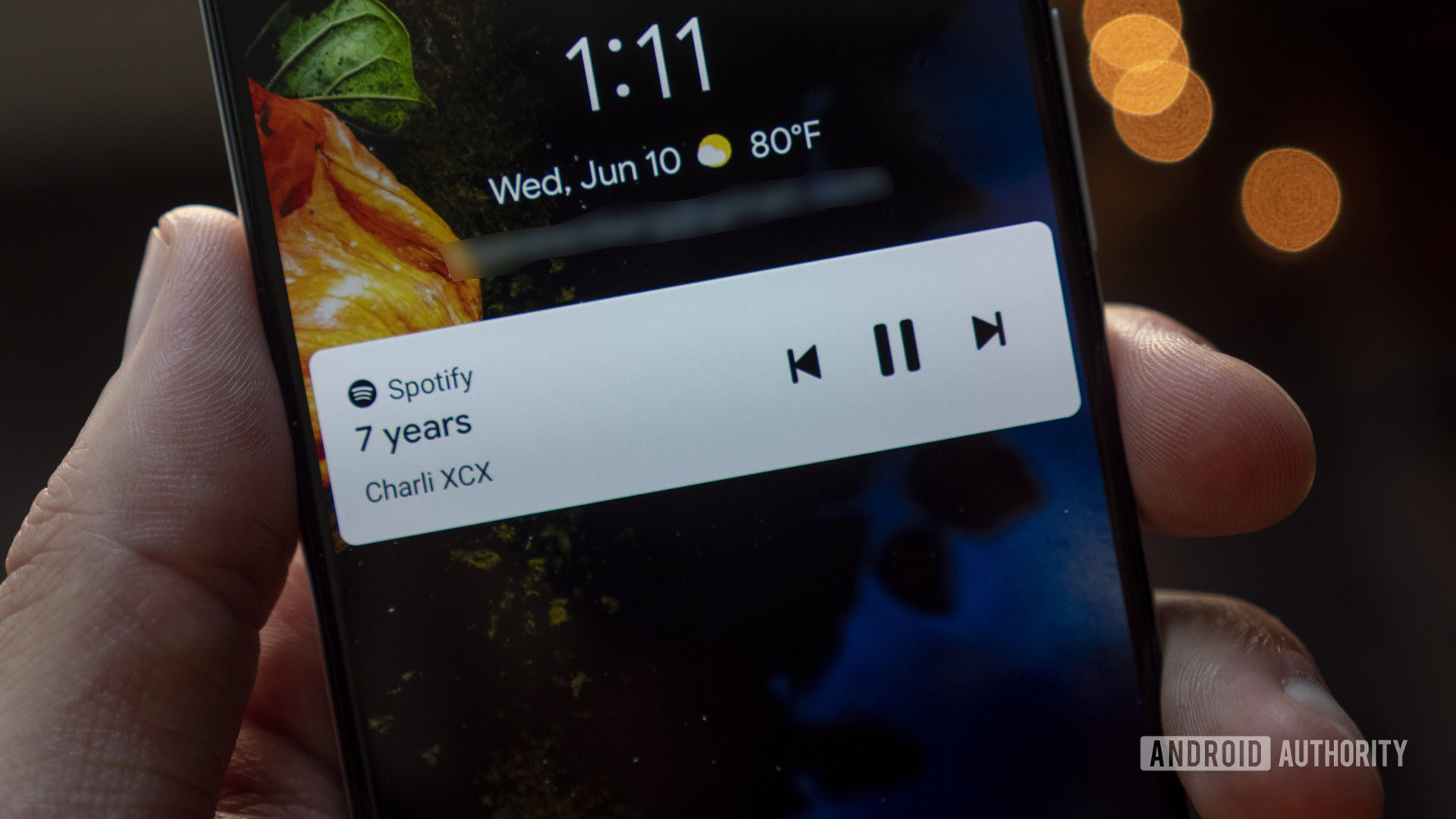
The new developer-focused release includes revamped media controls that both look nicer and offer more functionality. Where the first Android 11 beta included only a tiny set of controls on the first swipe of the notification shade, the second includes a much wider player that shows artist details, album art, and the audio destination. The first beta put the media controls in an awkward spot on the left, while Beta 2 expands the controls and puts them below the quick settings.
If you swipe down again to reveal more of your phone controls, you’ll see a slightly expanded player with more track details, the track timeline, and a “like” button. The media controls are now below the quick settings instead of above them.
Thank you for being part of our community. Read our Comment Policy before posting.