Affiliate links on Android Authority may earn us a commission. Learn more.
Android 11 review: The devil is in the details
Published onSeptember 23, 2020
Google launched the Android 11 stable release on September 8, 2020. The new OS version comes with a decent number of new features along with tons of tweaks, improvements, and under-the-hood additions. We have seen most of these in the earlier betas, but now it’s time for the real deal. This is our Android 11 review.
Unlike the betas, you can install the Android 11 stable release on your Pixel devices or any other device with access with confidence that everything will be okay. A few people have reported some bugs, but nothing major or widespread. If you run into any issues you can’t easily solve, we recommend a factory reset.
We covered the release of Android 11 in-depth, so we encourage you to check out the following articles; they cover a lot of bases we don’t intend on covering in this full Android 11 review. You can also check out the official Android 11 website for an overview of the biggest new features.
What’s new in Android 11?
Android 11 brings a handful of bigger features, as well as a bunch of smaller tweaks, changes, and additions. However, Google really wanted everybody to focus on three big aspects: People, Controls, and Privacy. Most of the big Android 11 features revolve around these three concepts. Let’s break them down.
People
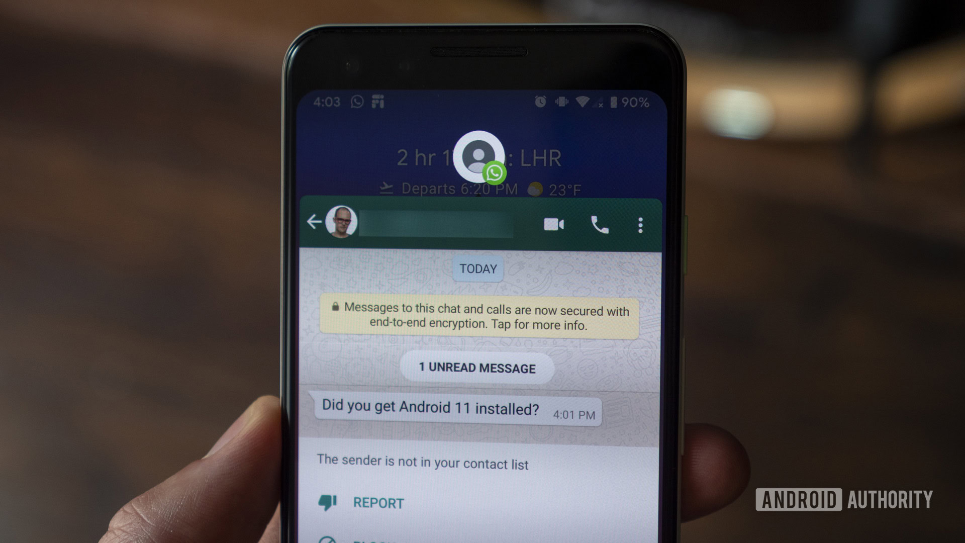
Let’s start with People. Android 10 already separated notifications by category. Android 11 adds a Conversations category where all of your messages go. It doesn’t seem to include email, but it worked with Discord, Telegram, text messages, and Snapchat during our testing. The idea is that the most important notifications, which generally come from real people, float to the top, so you can respond to them without sorting through all of your other notifications.
The other big People feature is Bubbles. This functionality was demoed in Android 10, but it’s now available in Android 11 in its full glory. Unfortunately, only about half of my messaging apps can use it at the time of this writing, but such major features often take developers a bit of time to integrate. Bubbles work exactly like Facebook Messenger’s “chat heads” — you get a circular thumbnail of your contact that floats on top of your screen, so it’s easily accessible at all times. There isn’t much else to talk about. You can turn Android 11 Bubbles on and off in the settings.
Also read: When will your phone get Android 11?
Controls
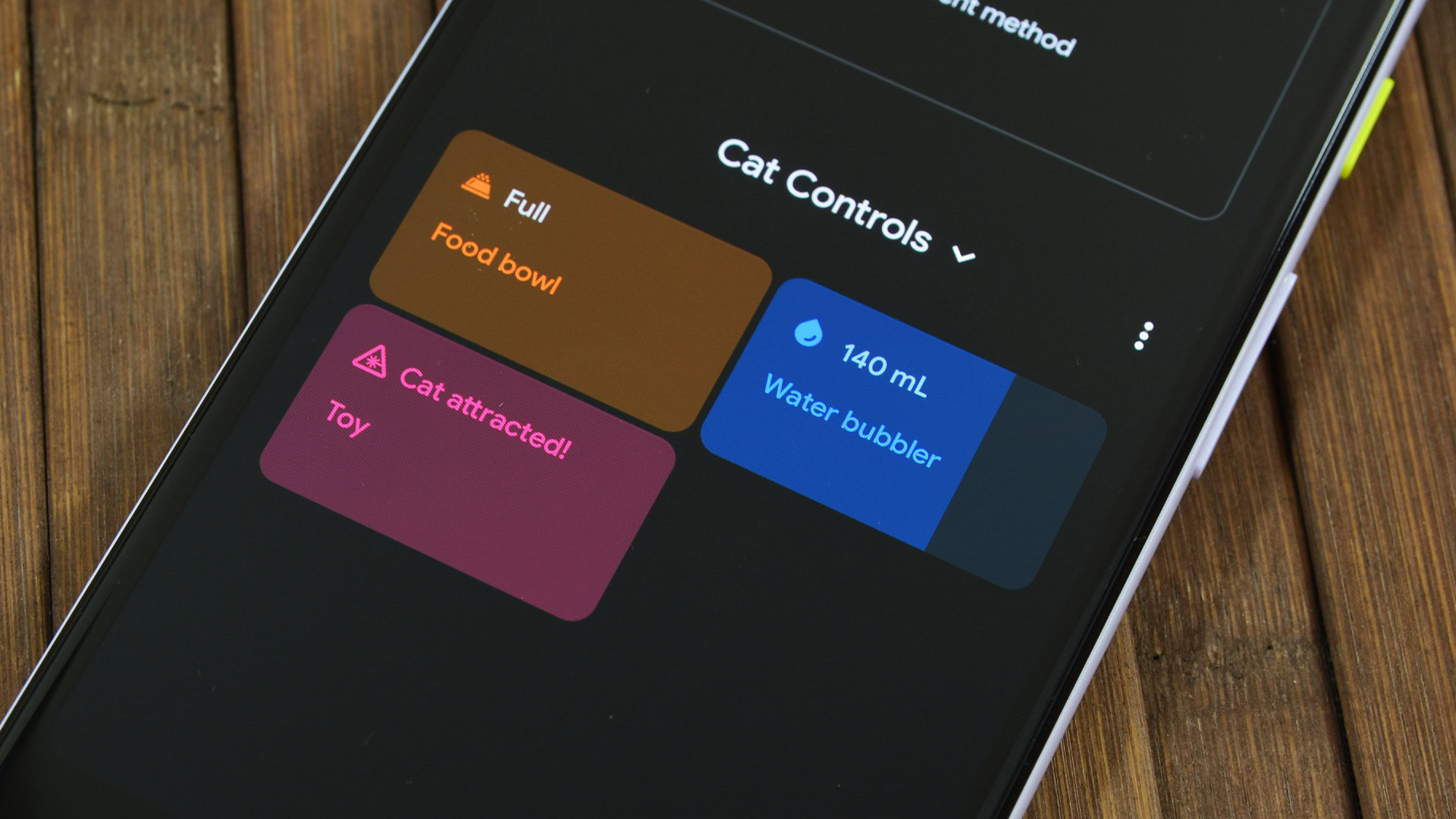
Google’s second big change is Controls. This is a little more widespread throughout the OS and, honestly, it’s the biggest change from Android 10. The hallmark Control feature is the complete overhaul of the power menu. It not only houses the screenshot, reboot, and shutdown options, but also a shortcut for Google Pay and literally all of your smart home tech (if you have any).
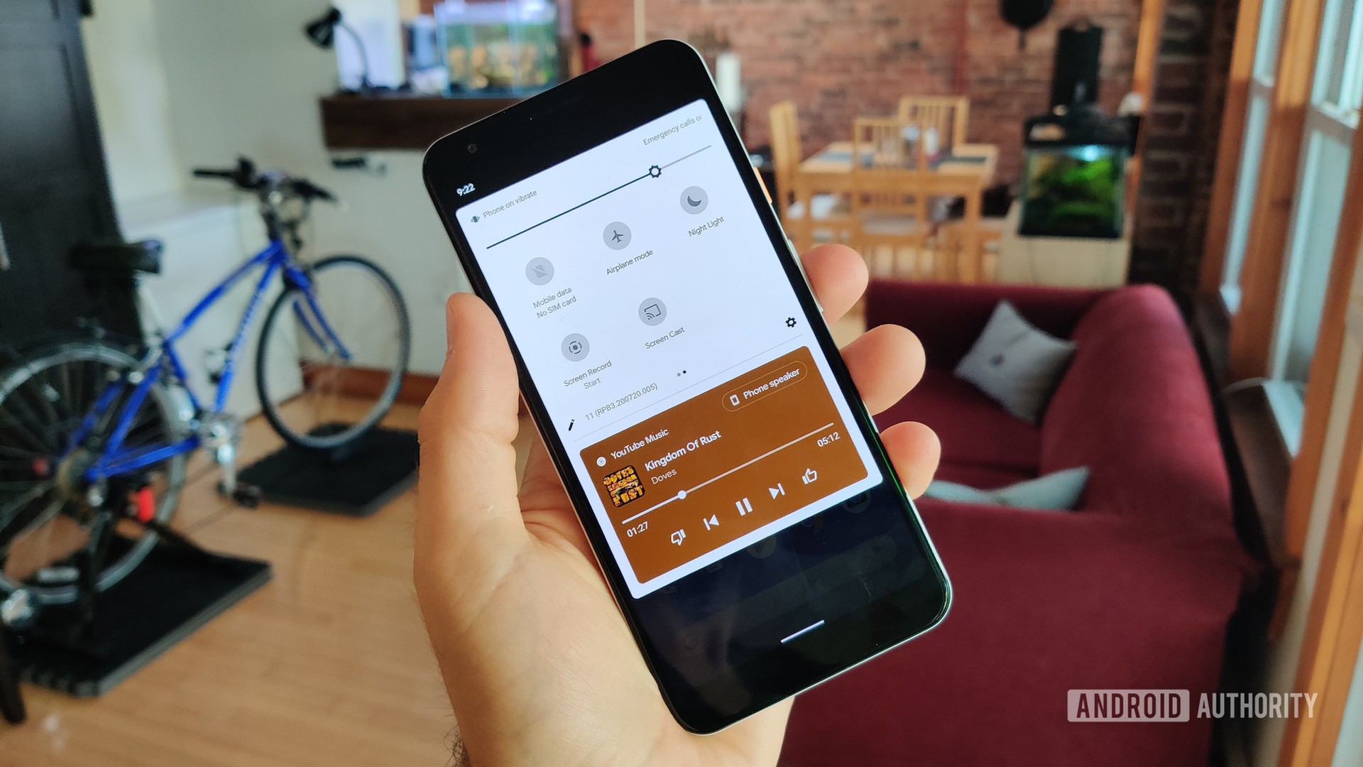
There are little bits related to the Controls theme all over the OS as well. Getting to your notification history is much easier thanks to the new button at the bottom of the notification shade. Conversely, media controls were moved to the Quick Settings instead of hanging out in the notification area. You can easily swipe between multiple media apps, pause, play, and there is a function to adjust volume or change source (from Bluetooth to phone speaker, for instance).
Privacy
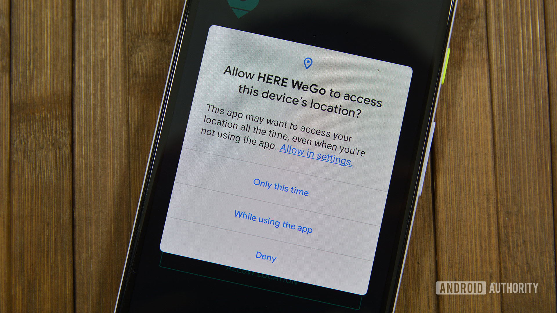
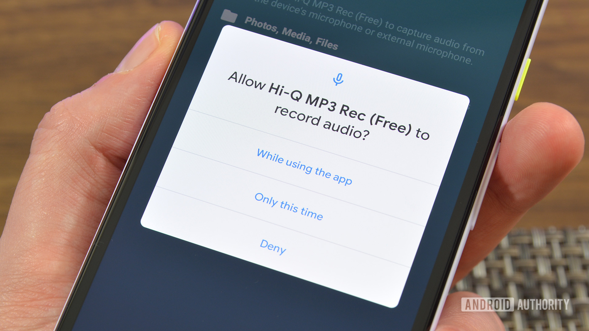
Finally, let’s talk about the Privacy aspect. Google’s big push in privacy this year is all about permissions. To start, you can now allow an app to have a permission on a single-use basis. You use the app with the permission, and the next time you open it, it’ll have to ask for it again. This is the big user-facing privacy feature in Android 11 and I’m sure plenty of people will appreciate it.
However, it goes deeper than that. Android 11 automatically revokes permissions for apps you don’t use very often and will notify you when it does so. It also restricts apps from using sensitive permissions such as your location, microphone, and camera while in the background. Android 11 limits this background access even if you enabled those permissions. Apps can get around the background location access denial, but only with your permission.
Those are the big features in the newest version of Android. We’ll get more into how they work later in our Android 11 review, but there is still a lot more to talk about.
It’s the little things that matter
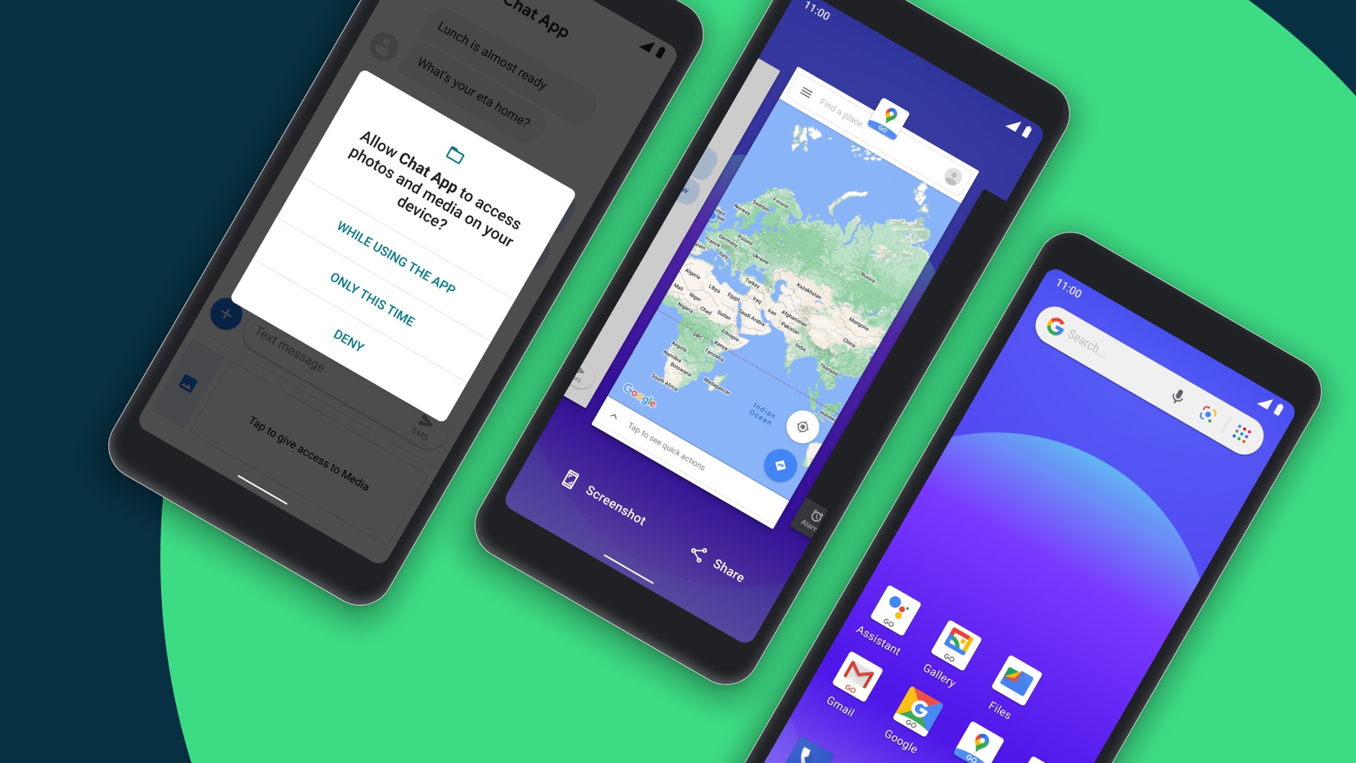
Google put a lot of work into the marquee features of Android 11, but there are a ton of little touches that make all the difference with this release. We’ll highlight a few of the more fun features you can expect to see in Android 11.
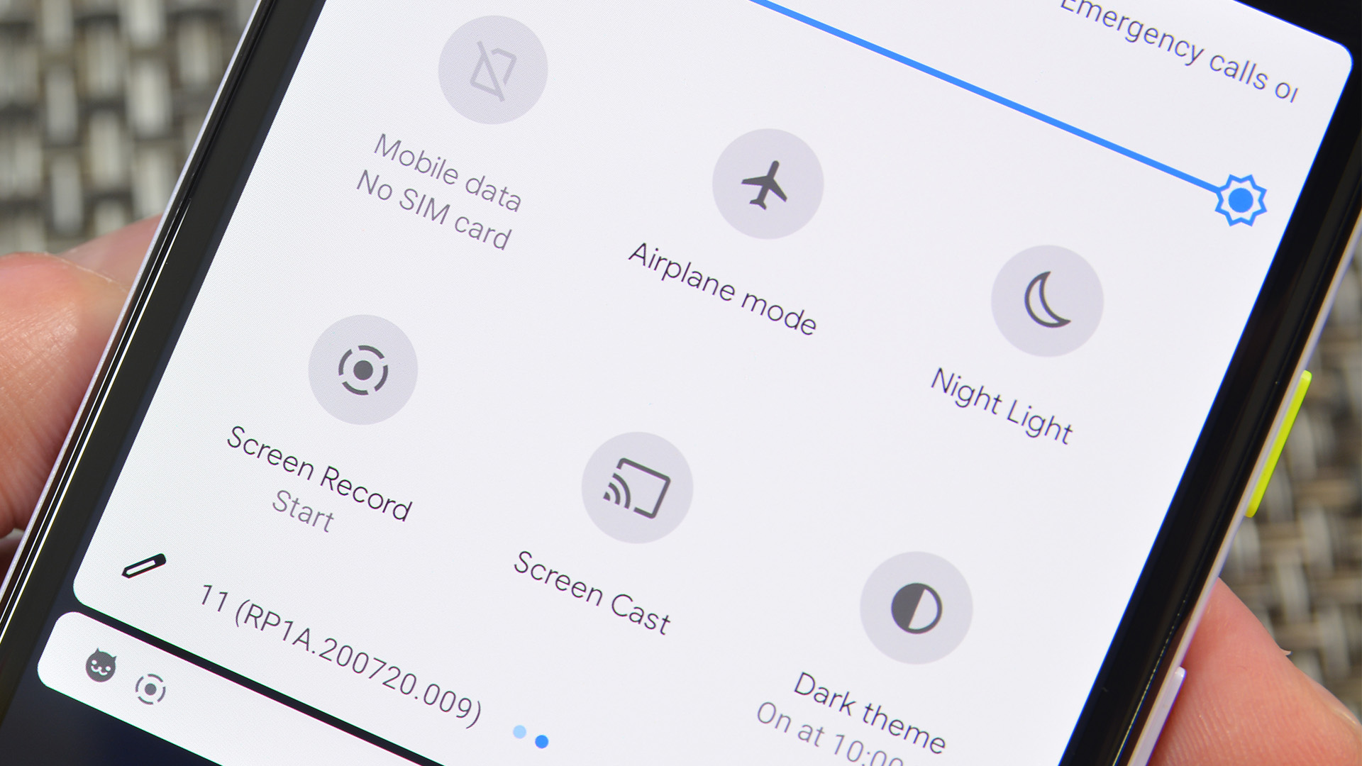
- Native screen recording is now available on all Android 11 devices. It can record your screen, along with your device audio and microphone, which is something you can’t easily do these days using a third-party solution. You can also use the Show Touches option to see what you press and swipe on while you record.
- The overview menu (recent apps menu) received a new design, complete with screenshot shortcuts and an option to quickly select and share text.
- A new autofill API that can include things like your password or username, but hides that sensitive information from the keyboard. Keyboards also have new APIs for smoother transitions.
- Both the widget selector and the Styles & Wallpapers section received decent overhauls. Both are easier to use, easier to read, and look better overall.
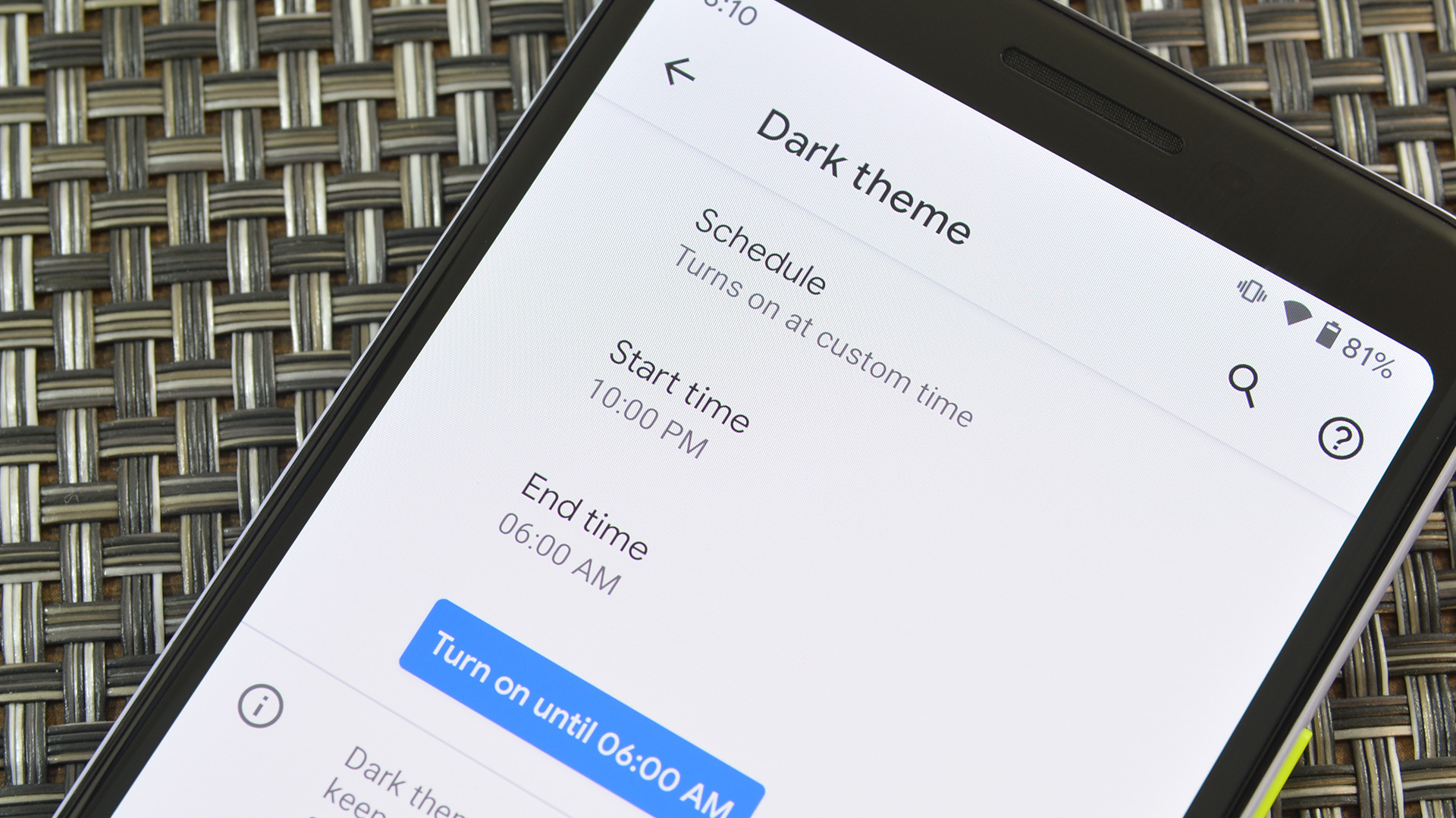
- A dark mode that can be scheduled or toggled at sunset and sunrise, respectively.
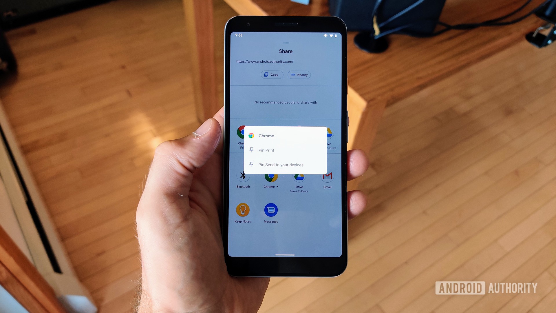
- You can now pin apps to the share screen so you’re not constantly scrolling through half of your list looking for Instagram or Facebook.
There is also evidence of call recording support returning at some point, but Google seems to keep hedging on actually bringing it back. We might have to wait until Android 12 to see more of that.
These are all smaller Android 11 features that most people probably won’t use every day. Nevertheless, they still help round out the Google Android experience and make it feel more mature.
Under the hood
Like every year, Android 11 brings many changes under the hood. Users won’t see these updates directly, but they’ll definitely benefit from them even if they don’t know it.
Variable refresh rate support lets apps stick to 120Hz when needed, and drop to 60Hz when higher refresh rates wouldn’t be noticeable, for some battery saving. Project Mainline, which allows core Android components to be updated via Google Play, received 12 new modules for even more updates over the Play Store, instead of OTA updates. A new resume-on-boot feature means apps can resume normal behavior without requiring the user to enter a password or PIN after an OTA is applied.
Additionally, native support for the Exposure API can help out during the COVID-19 pandemic and potentially future health emergencies as well. Google also removed the 4GB recording cap to address the rise of 8K video recording and included new thermal APIs so apps won’t overheat your phone.
Other new APIs include support for better 5G network information, better support for foldable displays and waterfall displays, and even low-latency video decoding for game streaming services like Google Stadia.
A lot of Android 11's under-the-hood changes are for supporting the tech you've been reading about the last two years.
All of these changes are an effort from Google to better support the influx of new hardware emerging in the Android space. High refresh rate displays, 5G, video game streaming, and 8K video recording are now commonplace, and Android 11 supports all of them natively, making lives easier for Android manufacturers and third-party developers alike.
Some of the changes we listed feel like a response to the public’s relatively newfound interest in security updates. Project Mainline’s new modules make updates more accessible, while resume-on-boot makes OTAs more seamless than ever before. That should make the security update crowd happier.
Interestingly, Google also planned some Scoped Storage API tweaks, but unfortunately, those have been pushed back to early 2021 due to the COVID-19 pandemic. A few other potential features, like scrolling screenshots, were rumored for Android 11 but were also pushed back, likely for similar reasons. It definitely gives us something to look forward to in Android 12.
Android 11 review: What is it like to use the new OS?
For this Android 11 review, we tested the new OS on a modest Pixel 3a. It felt better to use it on a mid-range device, rather than Google’s latest flagship since the mid-range Pixels are more popular than their flagship counterparts.
Android 11 runs surprisingly well on the Pixel 3a. Unlike Android 10, where some features were unavailable to all devices, such as Live Caption, everything in Android 11 is available from day-one even on lower-end and older Pixel phones.
Overall, the UI looks the same as it did before, and we didn’t experience any hiccups or slowdowns anywhere we didn’t already experience them in Android 10. The new Android 11 features all worked as expected. Functions like single-use permissions worked just fine on the first try without a hitch.
You can see the Pixel 3a move around Android 11 in the video linked at the top of the article. We didn’t spot any performance issues while doing the usual everyday stuff. Most of the operating system’s main controls are in the same spot, so most of my usage was similar to Android 10.
However, some Android 11 elements made it into my daily life. The power menu revamp made turning on my Philips Hue lights faster and easier than using the app. I quite enjoyed the faster screenshot editing process for cropping stuff down from games I play. Also, having the notification history just a tap away was helpful on a few occasions, especially with work email and messages.
After a few days of using Android 11, my urge to return to my Samsung Galaxy S20 Plus was not as strong as I had expected. I found that after returning to my S20 Plus, the media controls in the notification shade felt way more clunky and unintuitive than I had remembered. The bottom of the Quick Settings portion is a much better place for media controls once you get used to it.
There were some hiccups, though. Roughly half of my messaging apps don’t have support for Bubbles yet, so I turned that feature off for the time being. Additionally, I found myself using Android 10’s ability to allow “while in use” permissions more than Android 11’s single-use ones.
I still use Android 10's 'Use only while in the app' permission more than Android 11's 'only allow once' permission.
Some new features in Android 11 require much longer to test than I had allotted for this review. For instance, Android 11 revokes permissions from apps if you don’t use them, but this process can take a few months. Additionally, some of the newer APIs aren’t widely adopted by developers yet and it’s difficult to find real-world examples of them.
There are other features I simply couldn’t test. For instance, my car (like most cars) doesn’t have wireless Android Auto support even though Android 11 supports this feature.
It will be months if not longer before we can really see what Android 11 has to offer, as manufacturers and developers begin to keep up with Google. We’ll update this Android 11 review with more impressions down the line.
Boring, but awesome
Many folks may look at the new Android 11 features and the lack of major design changes as a bad thing. In some regards, that’s true. We’ve been in the Material Design age of Android since Android 5.0 Lollipop, and the Material Design era is a lot longer than the Holo era was. On the flip side, Android has definitely hit its stride, and moving away from Material Design could be change for the sake of change, rather than an objective move toward something better.
Luckily, Google is making fewer changes for the sake of change these days. While they are low-key, a lot of these new features serve to strengthen, mature, and improve the overall OS experience. Even the more niche features like the improved Voice Access (with Google Assistant) make Android 11 feel more complete. That’s what Google aims to achieve with updates these days.
There are some other benefits to this measured approach to product development. Most of the changes in Android 11 are variations of already existing features, created by OEMs or third-party developers. With these features becoming part of stock Android, OEMs and developers don’t have to waste resources supporting them themselves.
OEMs won't need to spend resources adding in all these features if Android already has them.
OEM “skins” and apps get lighter, as more features become part of stock Android. That lets OEMs focus on new things and potentially even update devices faster.

Another benefit is for Pixel owners. A lot of the new features in Android 11 were previously only available on devices from Samsung, LG, and others. With these features coming to stock Android, Pixel phones are now a stronger option than before.
In short, Android 11 won’t blow anybody’s socks off. It just won’t. However, the new features serve multiple important functions such as lightening the load on OEMs, making skins lighter, and making Pixels more competitive. Plus, these new features are actually pretty decent and should work even better once developer support catches up.
Android 11 has a lot going for it. It has a decent number of changes and additions but still manages to feel light and refreshing compared to heavier experiences like LG’s and Samsung’s user interfaces. The gap between Google’s Android and OEM skins is getting smaller every year.
Is Android 11 an exciting update? Not even remotely. But when I used it for a week as a daily driver, the urge to return to the comfort of Samsung’s One UI was weaker than it had ever been.
Read next: Android 11 is just a subtle upgrade, and that’s OK
It’s not bombastic, but Android 11 is still the best Android we’ve ever had.