Affiliate links on Android Authority may earn us a commission. Learn more.
Android 12 'ruined' the power menu, and some Googlers agree
July 19, 2021

- Android 12 now sends a notification to let you know what happened to all the features ‘missing’ from the new power menu.
- You now have to swipe down to access Google Pay and other perks.
- Googlers aren’t entirely happy with the change.
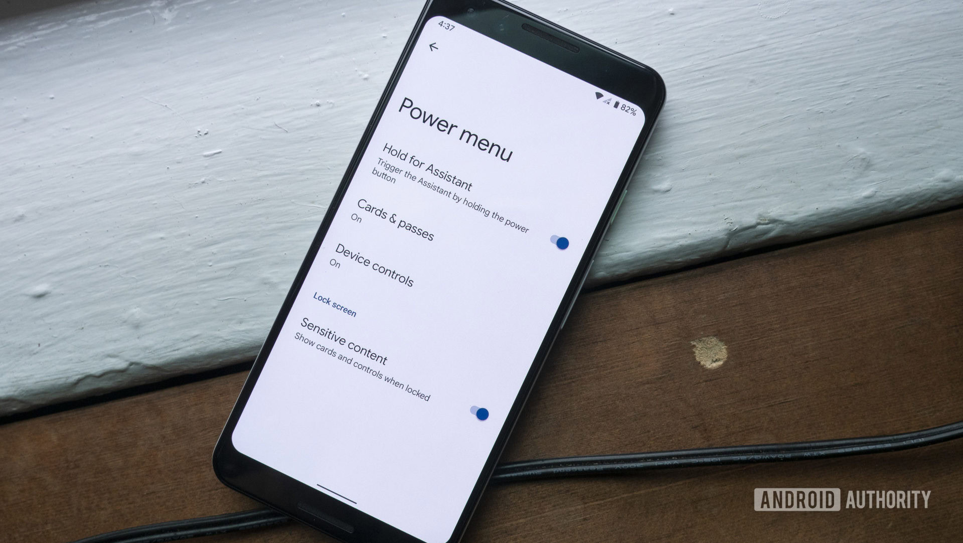
If you’ve used Android 12, there’s a good chance you’ve noticed the stripped-down power menu — Google has neutered many of the features after building them up in Android 11. And the company apparently knows it. As Android Police reports, Google has quietly added a notification explaining where all those missing features went.
Open the power menu for the first time and Android 12 will pop up a (rather dim) notification telling you to swipe down from the top of the screen to find Google Pay, Home controls and other ‘lost’ features. It’s not nearly as convenient as before, but you at least won’t be scrambling to locate common tasks.
See also: Android 12 beta hands-on
The alert suggests that some Google staff aren’t entirely happy with the Android 12 power menu change. There’s some evidence to support that dissatisfaction, too. One Googler commenting on a bug tracker for the power menu claimed that the product was “doomed” if the reduced feature set was a deliberate decision.
While that statement is clearly hyperbolic, it does raise hope (however slim) that Google might reverse course if enough people are unhappy about the power menu regression. If nothing else, it’s a reminder that companies don’t always have uniform support when they implement OS feature changes, and those changes aren’t necessarily set in stone.
Thank you for being part of our community. Read our Comment Policy before posting.