Affiliate links on Android Authority may earn us a commission. Learn more.
Android 12 redesign is the biggest revamp in years: What you need to know
Published onMay 18, 2021
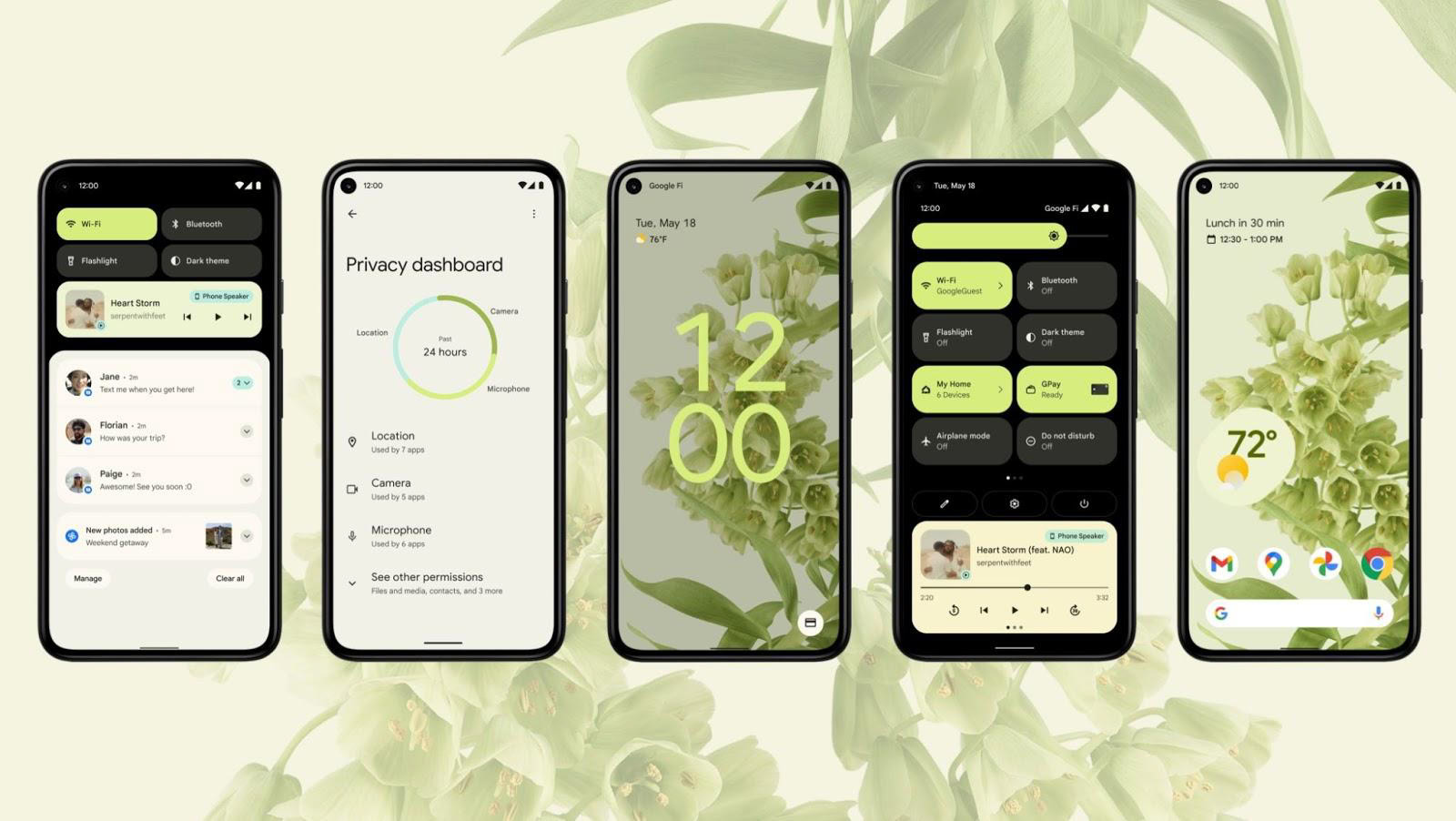
Today, Google kicked off its annual developer event, known as Google I/O. As in years past, today’s keynote featured a ton of announcements related to Google products, with Android 12 getting a lot of the spotlight.
At this keynote, Google confirmed what has been rumored for months: that the next version of Android will feature a wildly different visual overhaul. When users upgrade to the newest version of the OS, they will see a wholly unique Android that’s unlike anything we’ve seen previously. This starts today with the launch of the first beta of the software.
Related: Android 12 features: Everything confirmed and rumored so far
In this article, we’re going to give you the highlights of what Google revealed today. This should get you prepared for the true rollout of the software coming later this year.
Android 12: ‘A more personal experience’
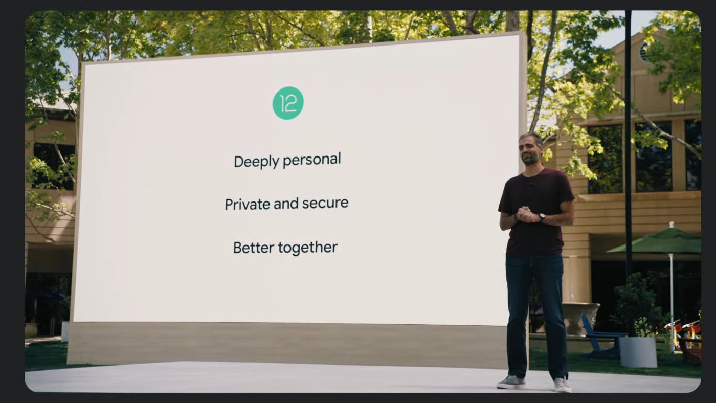
We’re going to dig into the various new aspects of Android 12 in a second. First, though, it’s important to understand Google’s overall mantra for all these changes, which is to make Android “a more personal experience.”
One of the things that truly differentiates Google’s Android from Apple’s iOS is the ability for users to make the operating system their own. Whether it’s through installing custom launchers, icon packs, or even simple things like changing the color scheme, Android can look different for everyone.
Customization is something Android 12 takes very seriously — much more seriously than any previous version.
However, true customization can be tricky for folks who aren’t tech-savvy. That’s where Android 12 comes in. The customization features on offer here are so simple — and in many cases automatic — that everyone can have a phone that feels unique.
This goes even further than just customization. Everything from the layout of icons to the new visual transitions makes the phone feel less like a foreign object and more like an extension of yourself. This results in an Android that feels wholly new but, at the same time, incredibly familiar.
Color extraction and customization
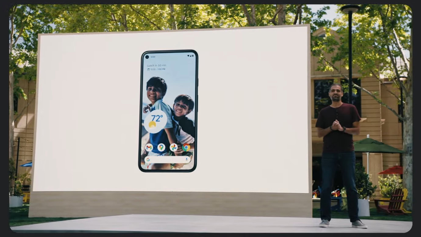
Right now, Android offers ways for you to change the color scheme of your phone. This includes things like buttons, the Quick Tiles in the notification shade, and more. However, in Android 11, you need to change these yourself, and some aspects of the OS won’t be affected.
In Android 12, this becomes automatic. Android will analyze your phone’s wallpaper and perform a color extraction. This means the system will determine the dominant and complementary colors that make up your wallpaper and then automatically apply those colors across the system.
Android will now look to your wallpaper for a good color scheme for your entire device.
This takes all the guesswork out of customization. You can change your wallpaper anytime you like, and the system will instantly change the colors of widgets, buttons, backgrounds, icons, highlights, and more to match. With this new feature, your phone becomes unique to you without any extra effort on your part.
If you’re the kind of person who already spends a lot of time “theming” their phone, you’ll enjoy this feature too. First, it will affect a lot more of the system than we’ve seen in prior versions of Android, giving you a very immersive experience. Second, if you don’t like the colors Android 12 takes from your wallpaper, you can always go in and tweak them to be closer to what you were hoping, which means you are still in control.
Lock screen, AOD, and transitions
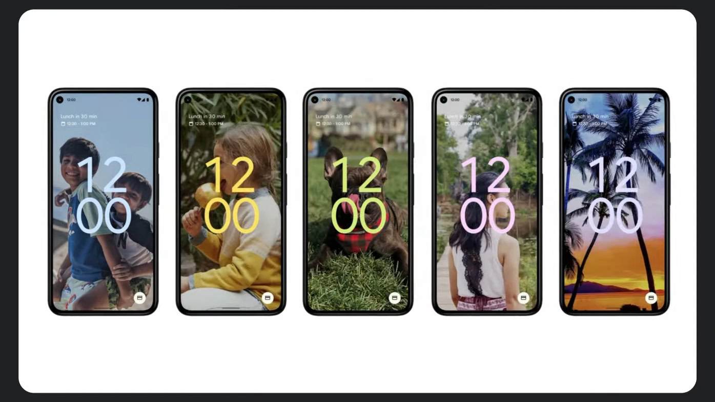
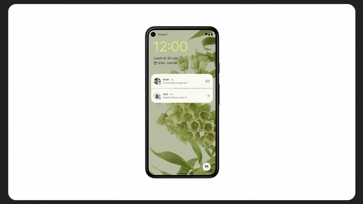
The always-on display (AOD) has a new look in Android 12, with a huge clock that takes up the middle of the display. The lock screen has a matching clock. You might think this enormous widget looks weird, but it actually serves a practical purpose.
When you receive a notification, the clock will become smaller and transition to the upper left corner of the display to make room for it. This allows you to easily tell with just a glance whether or not you have notifications. Even from the other side of a room, you’ll know there’s a notification waiting for you if you can’t see that enormous clock widget.
Also, the color extraction applies to the lock screen aesthetic, which is pretty cool.
See also: The best Android clock widgets and weather clock widgets
There are also new transition animations for moving between the lock screen and the AOD. The animation is “aware,” which means it changes depending on what’s happening. For example, if you go from the AOD to the lock screen by pressing the power button, the transition animation starts from the power button. If you lift the phone off the table, the animation starts from the bottom. If you unlock your phone using the rear-mounted fingerprint scanner, the transition starts from the upper center of the display. This is a cool way to feel more connected to your phone, as it appears to be reacting to your touch.
These transitions and others like them happen throughout Android 12.
Notification shade
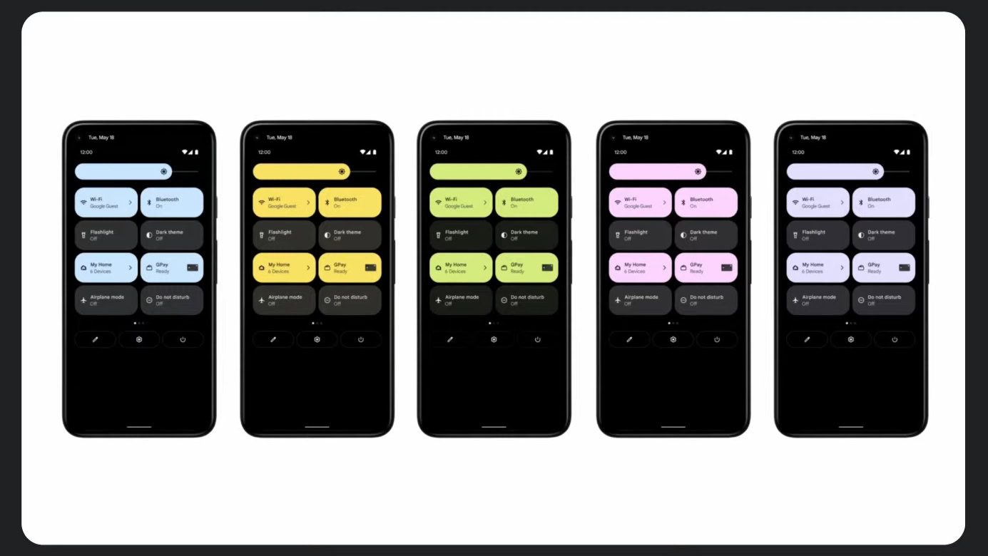
If that AOD clock widget got you into a tizzy, wait until you see the completely redesigned notification shade in Android 12. For the first time in years, the notification shade received a total revamp, bringing its design more in line with the power menu of Android 11.
The first thing you’ll notice is the new Quick Tiles. Instead of circle icons, tiles are now rounded rectangles, which allows for more information to appear with each one. Of course, this also changes the number of tiles you can see at once — four (instead of six) with the first pulldown and eight with the second. Power users might not appreciate this change.
The notification shade is completely different from any other version we've seen before.
Meanwhile, notifications themselves — as well as the always-there media player — get some new designs that make them line up better with the new tiles. The brightness slider, which appears after the second pull, also has a totally new look that matches the tiles. There are some new animations, too, which make things look cohesive.
Finally, the notification shade will also connect to the color extraction information that applies to the rest of your system.
Settings and system
When Samsung first launched its Android skin, known as One UI, it spent a lot of time discussing the importance of one-handed accessibility. That’s one reason why the settings pages within One UI have huge headers. This allows for the tappable information to appear more towards the middle of the display, rather than the difficult-to-reach top.
Google has realized the benefit of this. Android 12 features similar large headers within the settings pages now, although they are more reserved than Samsung’s.
Additionally, every settings page now uses the color extraction profile to match up with the rest of the system. This is a big change from the rainbow of colors that appears in Android 11’s settings. Now, everything is cohesive. Even the rounded rectangle shapes make an appearance here as a highlight when you have selected a certain toggle.
Finally, throughout the rest of the system, you’ll see the same rounded rectangles and color profiles. This includes volume sliders, the calculator, certain widgets, and the keyboard.
Android 12: The biggest revamp in years
What do you think about the Android 12 redesign?
There are a lot of big changes here. Keep in mind, though, that this is just the beginning. We have months to go until we see the stable version of Android 12, and who knows what Google could add (or take away) between now and then.
For more information on Android 12 and what to expect, be sure to check out our feature hub, which is constantly updated.
In the meantime, answer our poll above the let us know how you feel about these changes.