Affiliate links on Android Authority may earn us a commission. Learn more.
Latest Android 12 UI leak showcases changes to widgets and notifications
Published onMay 17, 2021

- New details of Android 12’s big redesign have leaked.
- The redesign will reportedly feature new widgets, a new keyboard, and nifty notification center improvements.
- The leak comes just days before Google I/O.
New details of Android 12‘s big redesign have leaked just days ahead of Google I/O via tipster Jon Prosser. In a recent YouTube video, Prosser showcases a brief marketing reel of Android 12 detailing changes to the operating system’s key features.
Judging by the reel, Android 12 will use the left-aligned clock as a notifications base and alert center. Although the time will still be displayed here, the number of pending notifications will be visible in a circle alongside it. Pulling down on the clock opens the notification shade as normal.
The change to this key display area is most apparent when on the lock screen. As the large clock now takes up most of the display on the lock screen, the top-left of the Android 12 screen no longer showcases a smaller clock but notification icons instead.
Google is also seemingly bringing a newly redesigned keyboard with more rounded keys to the table.
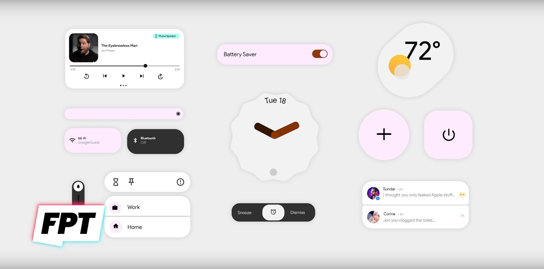
Other details highlight changes to the widgets, including a new music playback widget, clock and alarm sliders, and a weather widget.
Overall, the leaked images are pretty similar to the designs spied in earlier Android 12 builds. Google is seemingly committed to pastel colors, contrasts, and fluid UI elements in its next OS design.
Of course, with Google I/O taking place on Tuesday, we’ll get a more certain look at Android 12’s new and retained design elements very soon.
