Affiliate links on Android Authority may earn us a commission. Learn more.
Android 13 Beta hands-on: It's a little hard to get excited about
Published onApril 30, 2022
Android 13 has now officially entered Beta, bringing it one step closer to its primetime release later in the year. While there’s still work left to do, moving to beta means Google has locked in a good chunk of the features destined for the final version of Android 13. So, let’s take a look at what it’s like to use the latest and greatest version of Android, and whether you should dive right on in immediately.
I’ve installed the first Android 13 beta on the inexpensive Google Pixel 5 and spent a few days getting to grips with what’s new. If you’re looking for instructions for your Pixel handset, please check out our dedicated installation guide here. Be sure to check out the article below for a full rundown of all the new features too.
Read more: Everything you need to know about Android 13
The same look and feel

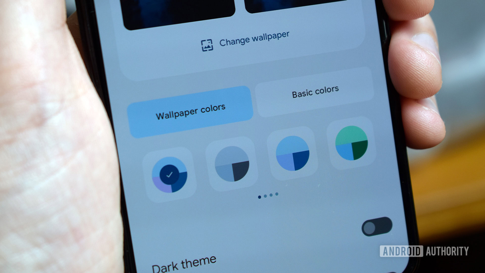
At face value, Android 13 in beta form looks virtually identical to Android 12. Google’s Material You theme is still big and bold, with large amounts of space dedicated to the quick settings icons, white space in the settings menu, home screen icons, and Google’s colorful widgets. Wallpaper color mapping works as before, although Android 13 picks out a wider range of matching colors to theme your handset around. There are now sixteen variants to pick from, up from four with Android 12. The Themed Icon option remains a beta feature, as it is in Android 12. Infuriatingly, it still doesn’t yet apply theming to every third-party app icon.
Our opinion: Material You’s unicolor themes are doomed to fail
So customization options are marginally more powerful, but not game-changingly so. Unfortunately, those who haven’t been a fan of Material You so far won’t find any consolation in Google’s continued investment in this particular interface design.
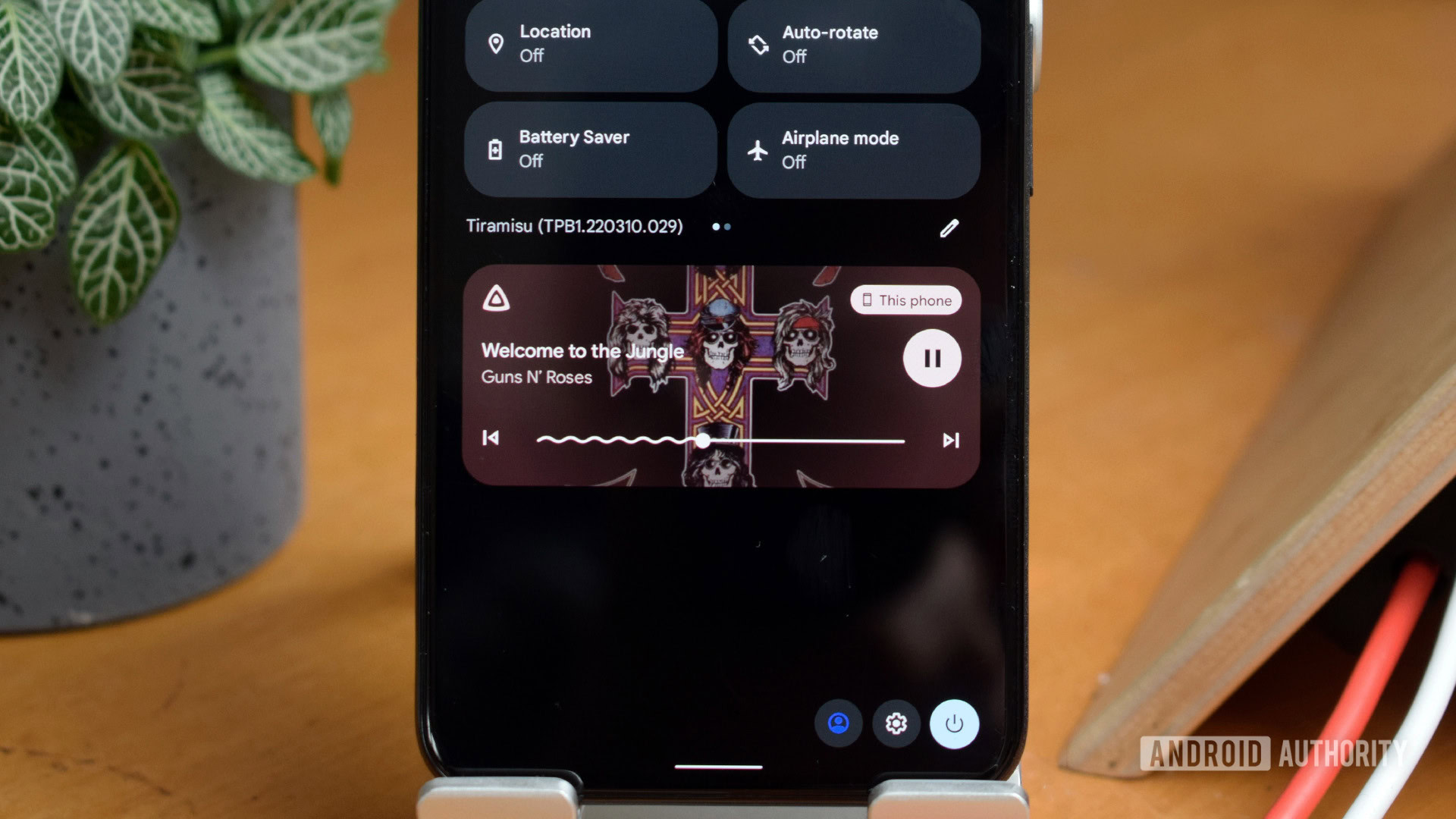
Google has made a few minor cosmetic changes to the beta’s UI. The power and settings buttons have moved from below the quick settings menu to the bottom right corner. Fine, but their proximity to each other now makes it too easy to press the power button instead of the settings icon. The time isn’t completely left-aligned in the notification shade either. These feel like changes for the sake of change rather than genuine improvements. There are equally marginal changes to the look of the media player notification area, and there’s an alternative lock screen clock setup to pick from too.
Android 13 looks and feels like 12. Most of the changes are behind the scenes.
You’ll also spot a few settings menu alterations, providing you have the patience to trawl through them all. Display size and text settings, for instance, are now housed together, complete with a new preview screen that shows how changes affect the UI in real-time. Do Not Disturb has gone back to its original name, dropping the Priority Mode moniker. Although certainly for the best, the pointlessness of such a change suggests there are a few thumbs just looking for anything to tweak over at Android HQ.
But overall, it’s hard to pick out any meaningful changes to how the Android 13 beta operates day to day. A new, more powerful clipboard overlay allows you to edit and share both text and images that you copy. It appears in the same bottom-left fashion as Google’s screenshot tool, complete with edit button. You can see it in action in the screenshots below. There’s not a lot to it, but it’s a nice little quality of life feature that most people will find useful, if only once or twice.
That’s the cosmetic nature of Android 13’s first beta in a nutshell. Nips and tucks to tweak the existing formula, but no major changes to the UI. This is to be expected, though, as the big alterations were already made with Android 12 and Material You will almost certainly stick around for the next couple of years — or longer.
Focusing on privacy and security

If you read Google’s blog post on the arrival of its Android 13 beta, you’ll have no doubt spotted that the latest OS version is all about building on the “core themes of privacy and security.”
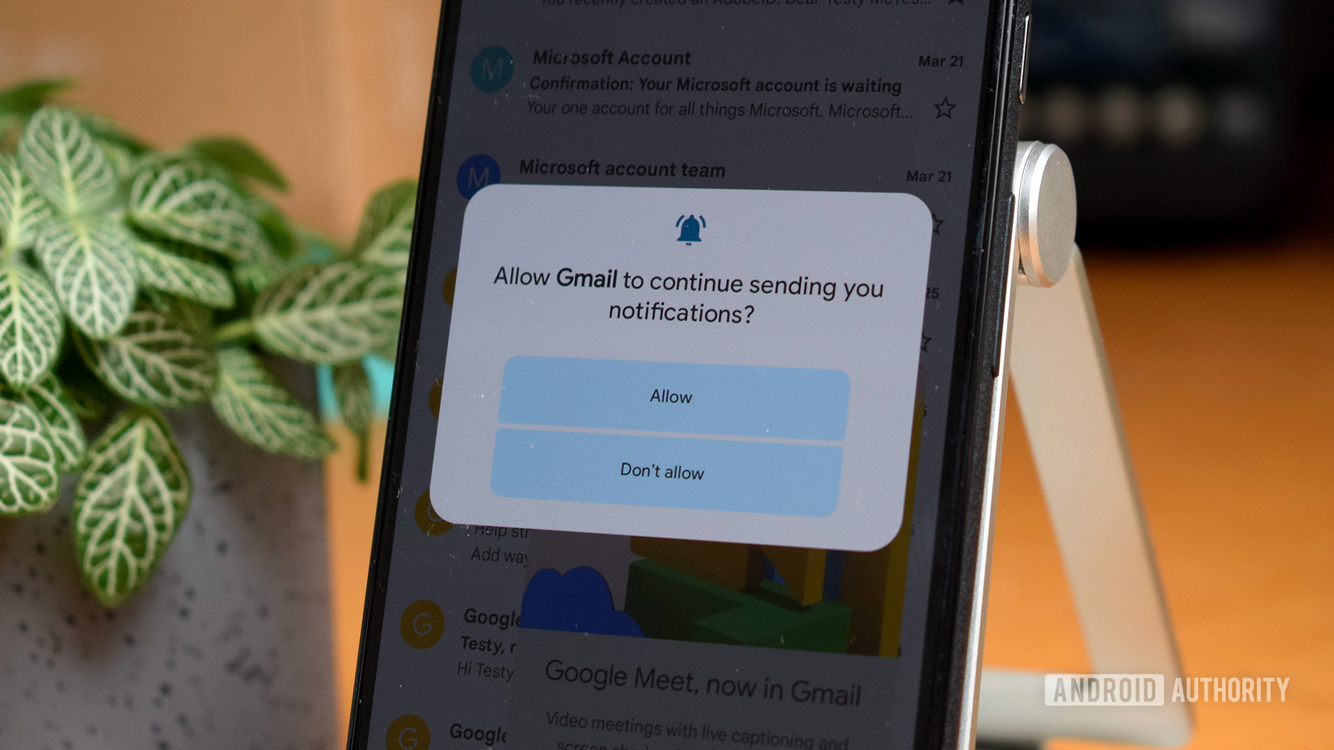
Android 13 is flush with popups asking for permission to allow apps to display notifications, for starters. It’s nice that Google takes notification spam more seriously, but the popup itself is a bit of a nuisance as it appears every time you open an app and seemingly at random intervals to ask for your continued permission.
More from Google: Google Pixel 6 Pro revisited six months later
Speaking of permissions, one of the new features in the latest beta is more granular app access to your media files. There is now dedicated permission for accessing shared media files broken down by audio, images, and video file permissions. Previously, there was just one general permission for access to media files. This feels like a more organic change and, while seemingly minor, will help keep important documents a little more secure.
Android's biggest changes continue to focus on giving users better control over their data and privacy.
This all follows Google’s recent drive to give users more control over their data and privacy. Android 11 and 12 already revamped a lot of the permission space, introducing the Privacy Dashboard to help users keep a closer eye on permission and automatically revoking permissions from apps that you haven’t used in a long time. This feels like where we’ll see the bulk of improvements come Android 13’s final release. Although these might not be particularly exciting changes and arguably could be added in as feature drops rather than waiting for a full OS upgrade, they’re certainly welcome additions to the tried and tested Android formula.
Android 13 early hands-on verdict: Yes… and?

A few cumulative niceties are tucked away in the first Android 13 beta, including baked-in support for better QR scanning, Bluetooth LE Audio, integrated Fast Pair, and tweaks to smart home controls. Rounding out the additions, there’s a new audio routing API that will help media apps anticipate how their media will be routed, plus improved error reporting for Keystore and KeyMint. But again, these are mostly behind-the-scenes changes users won’t necessarily notice.
However, there’s still a lot missing. I haven’t been able to activate the new private photo picker or spot the rumored changes to multi-user handling, and the Pixel 6 Pro face unlock feature that appears to be in the works still isn’t implemented. Many of Android 13’s other features are waiting on applications to support the various new APIs too.
Have you installed the Android 13 beta?
Based on my brief time with the first Android 13 beta, it’s a fine OS upgrade but not one of the more exciting changes to have come to the platform. Perhaps the more meaningful improvements will be felt with large screen devices. Even so, it runs great on the mid-range Pixel 5 I’ve installed it on, which bodes well for the full release in the coming months.
Android 13 is well on the way, but don't rush to install the beta just yet.
With all of that in mind, I wouldn’t recommend you dash out to install the Android 13 beta just yet, especially if you’re happy on Android 12. There isn’t much to discover and play with now, and Google still has work left to do before all the expected features are up and running. But things are shaping up nicely.
Continue reading: 5 Android 13 features we’re really excited about