Affiliate links on Android Authority may earn us a commission. Learn more.
Android 15 might force more apps to take up 100% of your screen
Published onFebruary 2, 2024

- The status and navigation bars take up precious screen space, but they’re capable of going transparent so Android apps can display content underneath them.
- This is called edge-to-edge mode, but many apps do not support this feature.
- Code snippets suggest that Android 15 could force some apps to go edge-to-edge by default.
Smartphones are much bigger than they used to be a decade ago. Thanks to the increased screen space, you can fit more content than you could in the past. But the sizes of smartphones and their bezels have plateaued in the last few years, so app developers need to get clever with how they use the available space. Android has long offered apps the ability to use the entire height and width of the display — i.e., go edge-to-edge — but many apps don’t take advantage of this. That could change with the release of Android 15, though, which is poised to force some apps to go edge-to-edge by default.
Today, in order to go edge-to-edge, apps need to opt-in by implementing a few APIs. This is because drawing the UI behind the navigation bar and status bar (otherwise known as “system bars”) might not make sense for every app, especially if there are interactive elements like buttons that would overlap with the system bars. Developers have a way to address these overlaps before enabling edge-to-edge mode for their apps, but the fact that this is necessary shows why Google has so far chosen not to enforce this behavior for every app. Those days might be ending, though, as I discovered code in the latest Android 14 QPR2 beta that suggests the OS might enforce this behavior for apps that target the next version of Android.
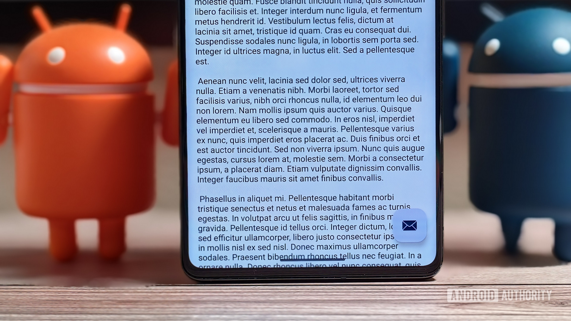
It's possible many apps will need to use the entire smartphone display — even the status bar and navigation gesture bar.
Because Google wants to give developers time to update, test, and debug their apps against newer versions of the Android OS, the company introduced a new settings page called App Compatibility Changes in Android 11 that lets developers toggle individual system behaviors that might break their apps. The list of compatibility changes applied to a particular app depends on its target API level, a number that denotes how the app is meant to run on different Android versions. An app that targets API level 34 (the API level corresponding to Android 14) will have all the OS’s new under-the-hood battery, memory management, and API changes enforced on it. By extension, an app that targets API level 35 (the API level corresponding to Android 15) will need to deal with whatever new system behaviors the new OS version introduces.
With that in mind, while I was digging through Android 14 QPR2 Beta 3, I discovered a new app compatibility change named EDGE_TO_EDGE_BY_DEFAULT with this description: “make app go edge-to-edge by default if the target SDK is VANILLA_ICE_CREAM or above.” Vanilla Ice Cream happens to be the internal dessert name for Android 15, which means this compatibility change will be applied to apps that target this year’s upcoming release. Given that Google forces developers to update their apps every year to target newer API levels, it’s only a matter of time before most apps on the Play Store target Android 15. Unless Google changes its policy again, the deadline for when new apps and app updates will be forced to target Android 15 will be August 31, 2025.
One thing to note, though, is that I don’t know if Google actually plans to enforce this behavior change in Android 15. Google has made some public-facing changes recently that suggest it wants to improve edge-to-edge support on Android, such as updating the enableEdgeToEdge API to draw around display cutouts like notches and hole-punches (H/T @Nail_Sadykov). Still, Google may punt it to a future release, as it’s done a few times with other behavior changes.
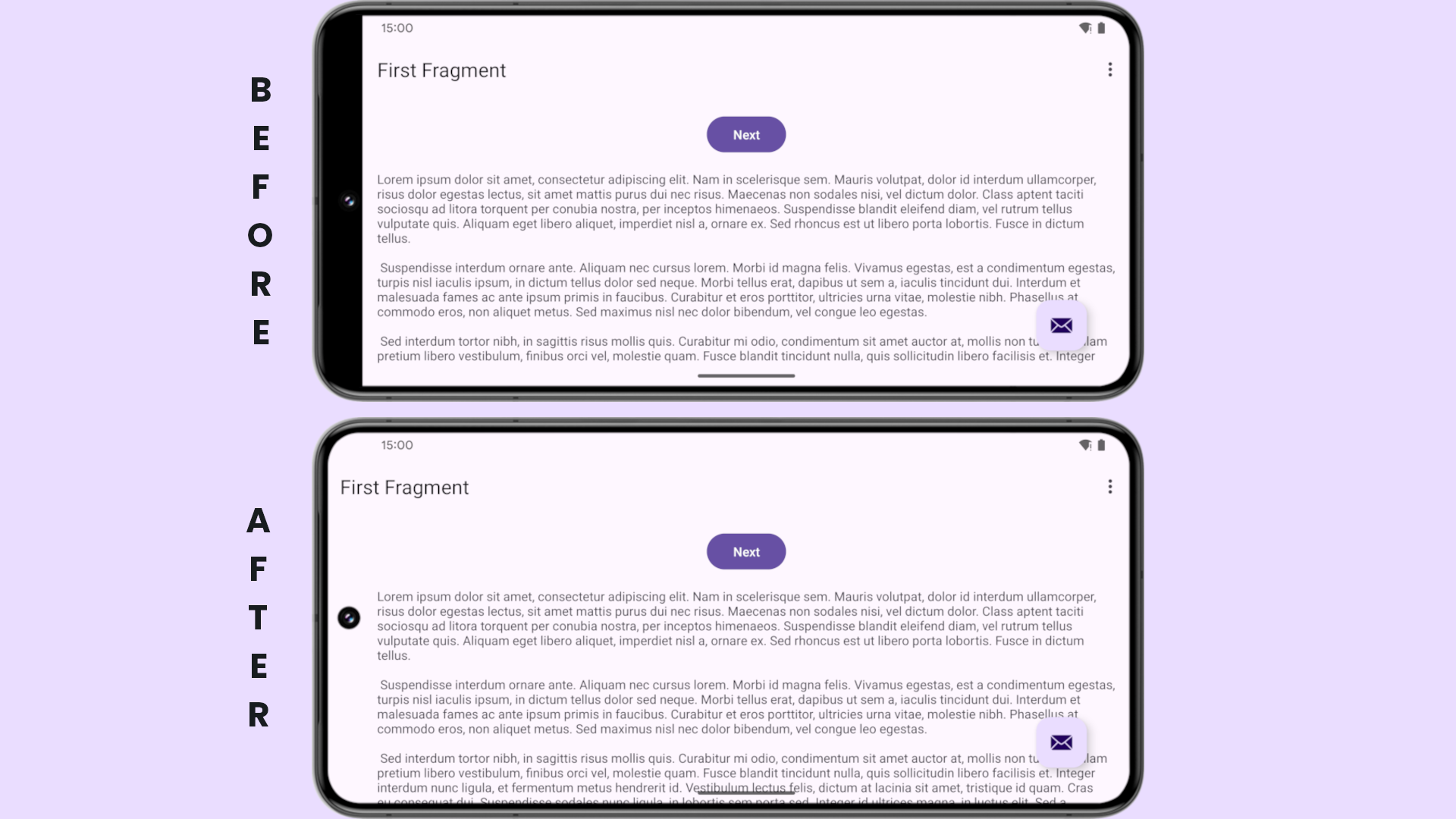
If this change were to go live in Android 15, you may wonder how it would impact the UI of your favorite apps. Through a bit of tinkering, I enabled the compatibility change and forced it onto an app. Here’s how the UI changed in both landscape and portrait modes before and after edge-to-edge mode.


For apps with a lot of text, enabling edge-to-edge mode makes a lot of sense. I also forced edge-to-edge mode onto some existing apps like Gmail and Google Keep, but the results weren’t as promising due to UI elements overlapping with the system bars. But that’s to be expected, which is why Google would likely give developers time to update their apps before flipping the switch to enforce edge-to-edge mode. That’s assuming, of course, that they actually plan to enforce this change.
We have yet to get our hands on even a single developer preview of Android 15, so only time will tell if this change ends up happening. Of course, we’ll be digging through the Android 15 preview builds once they’re available to confirm if this change is planned to go live in the next release.