Affiliate links on Android Authority may earn us a commission. Learn more.
Missing incident reporting on Android Auto? Your car's display is probably too short for it

- Incident reporting on Google Maps on Android Auto is rolling out, but many users aren’t seeing the new button on their car’s display.
- The button apparently doesn’t appear if your car display does not have enough vertical space.
- Incident reporting on Google Maps on Apple CarPlay has a different button layout, so it works properly.
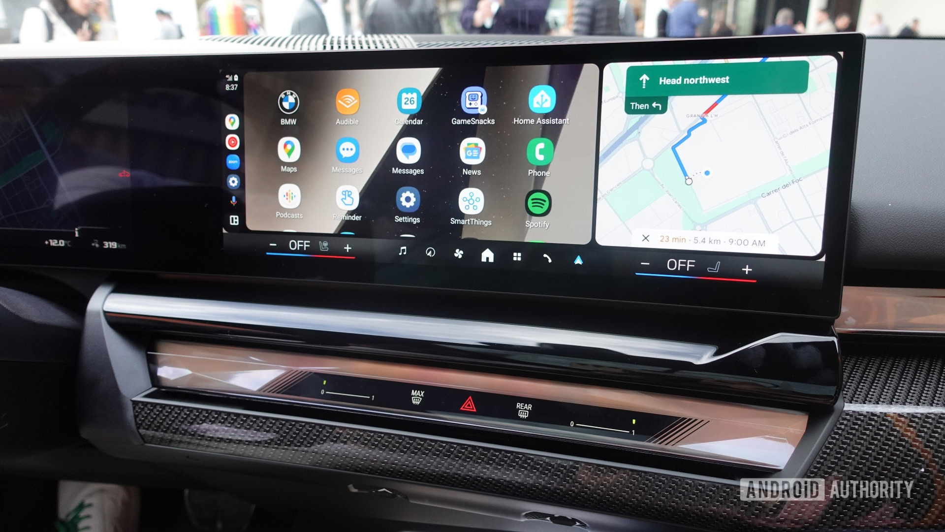
Google Maps on Android Auto recently got its much-awaited road-incident reporting feature, bridging the gap between the phone app and the app for your car’s dashboard. But if you have held your breath for the feature to show up on your car’s dashboard, there’s a quirk here that you probably didn’t know about. As it turns out, your car’s center console screen could be too short for this button.
As 9to5Google found out, the incident reporting button on Google Maps on Android Auto doesn’t always show up. This is because the button doesn’t appear if there isn’t enough vertical space in the car’s screen. If your car’s display isn’t tall enough to display all buttons, the incident reporting button gets removed instead of the buttons getting scrunched up.
The above images show two scenarios using the same phone with the same car. The first image shows a stock setup in which the hazard button is not visible on the left side of the display. The second image has a DPI tweak to show more information on the screen, and as a result, the hazard button becomes visible.
Merely having a longer display diagonal won’t surface the button either. Display diagonals are misleading, especially in cars, and you’d have to pay attention to the vertical space by noting the display diagonal along with the aspect ratio. If you have a display that runs wider rather than taller, you’d likely not get this button to appear.
Curiously, the same problem is not present on Google Maps on Apple CarPlay, as the implementation there shows fewer buttons and uses a different layout. So, not only did Apple’s implementation get the incident reporting feature on Google Maps earlier, but it also actually works irrespective of the car’s display. On the other hand, Android users are second in line, and that is if their car’s display is tall enough for another button.
We hope Google reconsiders this design decision and finds a button layout that scales more dynamically across car displays of various dimensions.