Affiliate links on Android Authority may earn us a commission. Learn more.
Inside Google's massive Android rebrand
Published onAugust 22, 2019
“It’s really important for us to acknowledge that Android is in fact, a large global brand,” said Sydney Thomashow, Google’s lead for brand and creative for Android. “In thinking about the brand, we wanted to make sure that we are as accessible and inclusive as possible.”
Thomashow told this to me a couple of weeks ago at Google’s New York City office, where her team has been working on a completely new brand identity for Android. Android’s branding has maintained a fairly consistent look over the last decade, but as the operating system has grown from a few users to over 2 billion, Google has decided it needs to be more inclusive.
Goodbye treats: Android 10 is the official name for Q instead of a dessert
You’re probably wondering what it means for branding to be inclusive, and that’s a fair question. In reality, color, shape, and names in branding are much more important for inclusivity than you might think. Some colorblind people don’t interpret certain shades of green correctly. Android’s tasty treat version names were hard to pronounce and even unheard of in a lot of regions. If Android is a global brand, it’s important that it represents a truly global audience.
This prompted a total return to the drawing board for Google. The company needed to decide how best to represent Android while making sure the brand felt easily accessible for anyone using the platform.
More visible, impactful colors
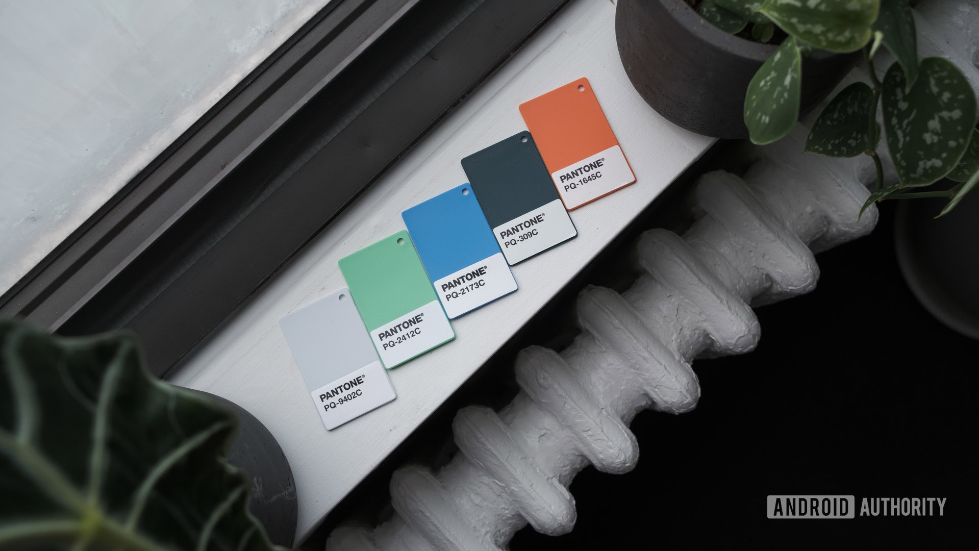
As I noted above, green isn’t exactly an optimal color for a global brand. The most common form of colorblindness is red-green colorblindness, which can make certain shades of green hard to see. The best way to make green more visible is to mix it with colors that are easier to see, which is exactly what Thomashow’s team did.
“[Android] started as a very, sort of limey yellow-green, then it got a little bit darker. And we knew that we wanted to continue to have green in our identity, and for it to be very prominent, but we thought about how might we start to introduce additional colors so that we could help with accessibility,” she said.
“We took our existing Android green, and we actually added a little bit more blue into it. What that allowed us to do is start to complement the Android green with other shades of blue.”
This move makes sense. Adding blue to Android’s existing shade of green allows the brand to match more closely with Google’s company branding, and gives more opportunity to mix the green with other colors. Thomashow’s team developed a palette of new brand colors to go along with the new Android green, for things like visual assets and packaging.
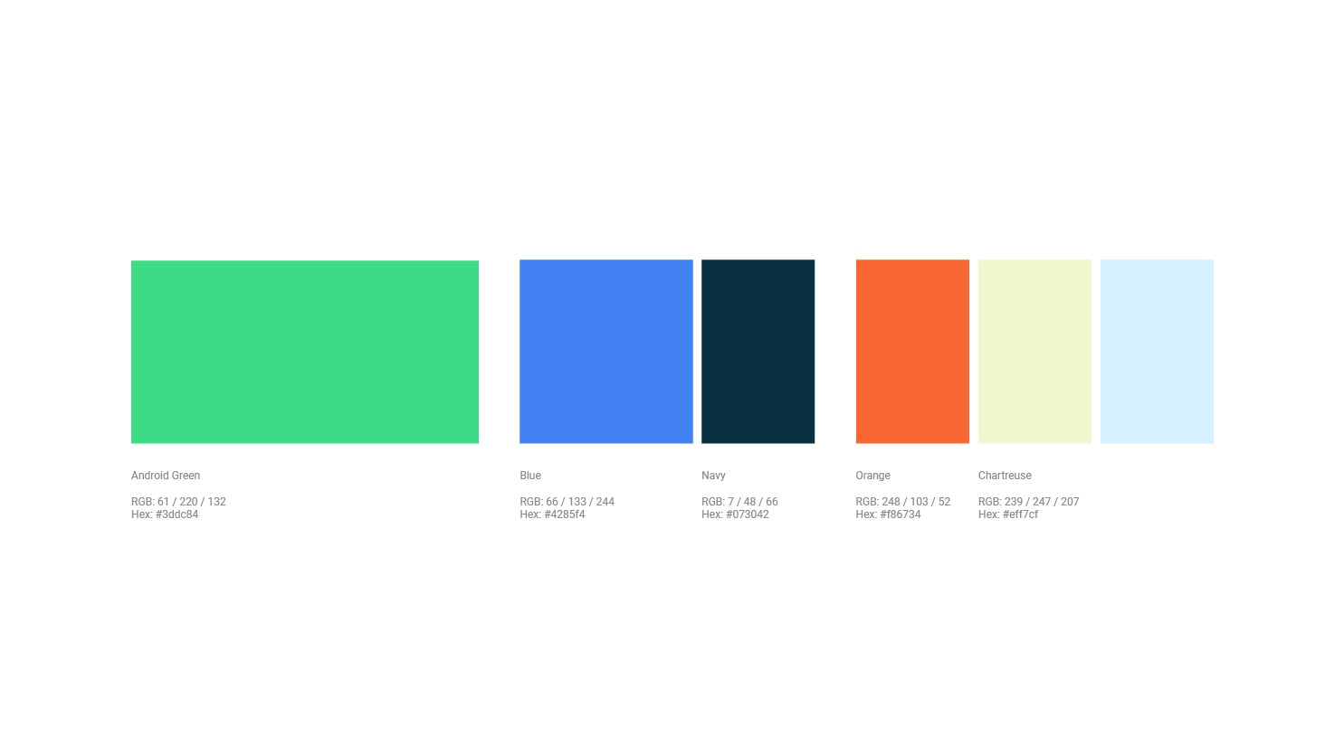
“We have sort of a dark navy, a more mid-tone blue, and then a very light blue. We also wanted to add some warmth. So we introduced a sort of light yellow, and then a very vibrant orange. Having all those colors has allowed us to create all sorts of creative compositions and brand visuals that have higher contrast and are easier for people to see. So accessibility was very important to us in considering how we might build out a more robust palette,” said Thomashow.
Accessibility was the driving factor behind the redesign.
Google’s previous shade of green was the only official color for the brand and it didn’t pass WCAG accessibility testing. It also didn’t technically go well with any colors except white. That was a big problem for Google. The new palette passes the WCAG guidelines with flying colors, and should make Android’s branding more accessible and more beautiful at the same time.
New robot, new wordmark
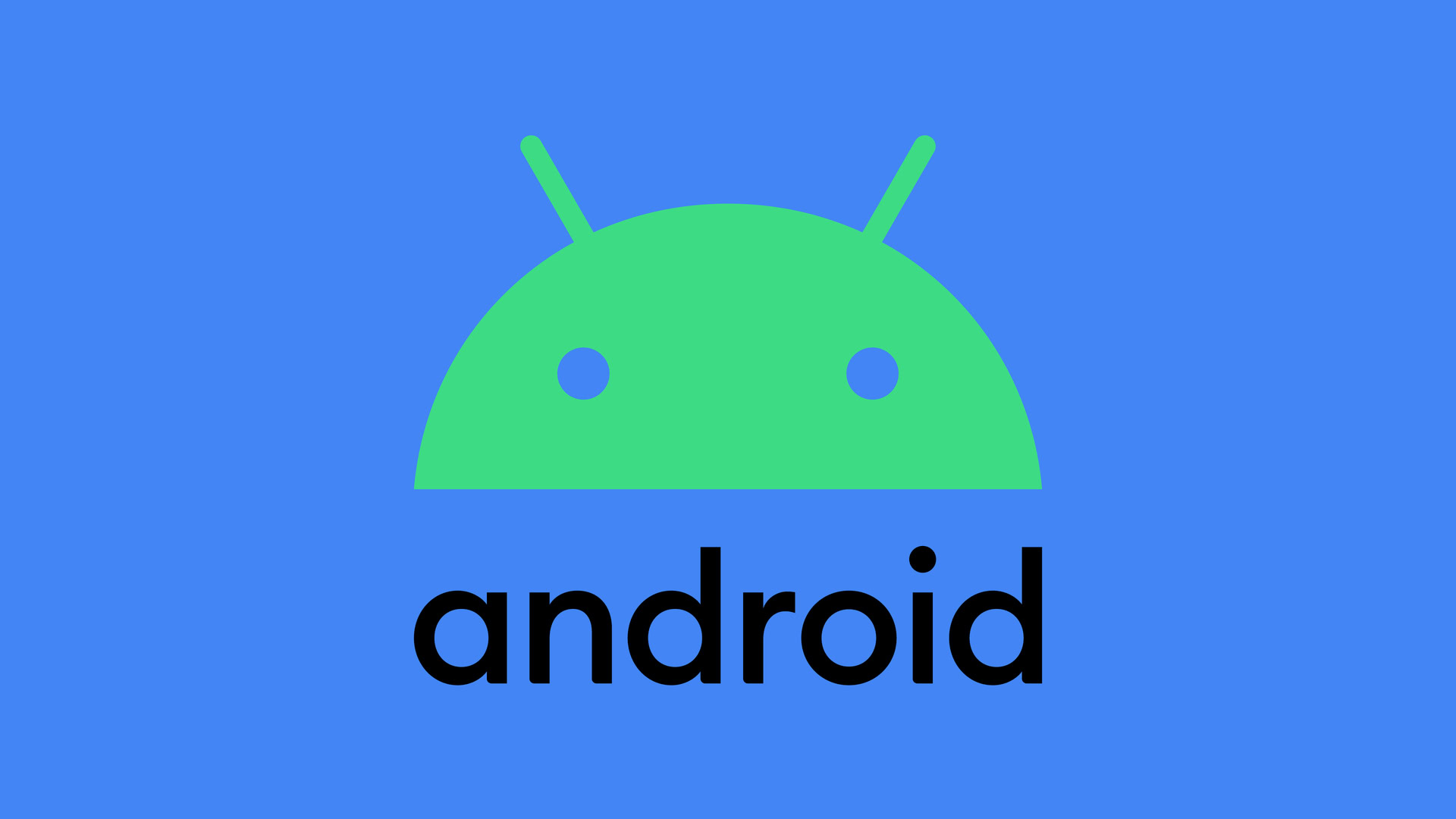
Previously, the branding for Android was fragmented. Andy the Android mascot would appear on some products, while the name Android would appear on others. Both represented the same thing, but Google realized it would be the most effective if the mascot and wordmark appeared together, but not the same. The Android mascot and the wordmark now appear in one image, either with the wordmark seated next to Andy or below it.
In an effort to make the branding fit together better, Thomashow’s team had to rethink both the mascot and the wordmark. Andy had a new color, but was that enough to make it more accessible? And how could the wordmark become a more cohesive brand image?
Also read: The history of Android: Name, origin, mascot, and more
Thomashow started with the wordmark itself. She wanted it to feel like it belonged with the mascot, so she made a few small tweaks you may not have even noticed.
“[In designing the wordmark] we took a tremendous amount of inspiration from sort of our most recognizable asset, which is the Android robot. And we started to make our wordmark a little bit thinner, a little more geometric and modern. And we actually introduced some curves into the wordmark itself that mimic and reflect the same radius that you would see all throughout the robot,” she said.
In the new wordmark, there are curves in the bottom of the text where you would normally find straight lines in the old design. This helps to make the wordmark feel more similar to the Android robot itself, as if it was meant to be with it. The curve of the “o” in the wordmark even has the same radius as Andy’s head. It’s subtle, but really drives home the new design.
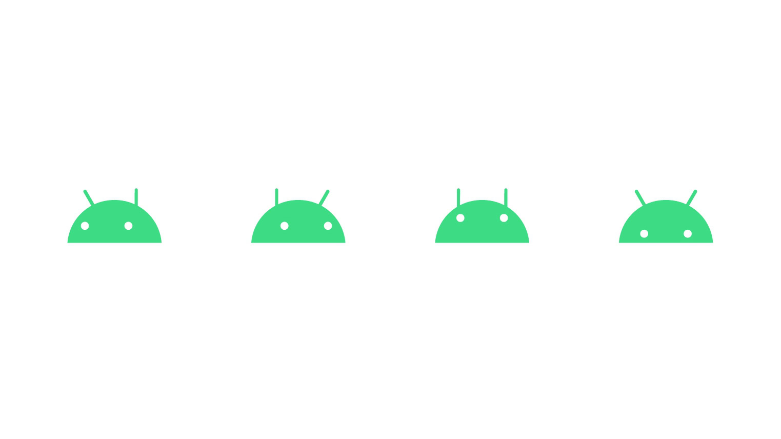
Moving to the Android mascot itself, Thomashow’s team decided to just use the head instead of the full body of the mascot. This allowed them to focus on how the robot could be more expressive, while using fewer elements. Andy might not look very different, but it’s the small changes that make the biggest impact.
“Some of the adjustments that we made to the Android robot, they’re very subtle and slight. But a lot of it had to do with developing a composition with the wordmark to create one cohesive logo. In my opinion, bringing the eyes down slightly also allows for the robot to almost look like it’s actually making eye contact. It feels a little more human to me. And for the antennas, we’ve shifted about one degree for anyone who’s really comparing the before and after, and that was really to balance things,” said Thomashow.
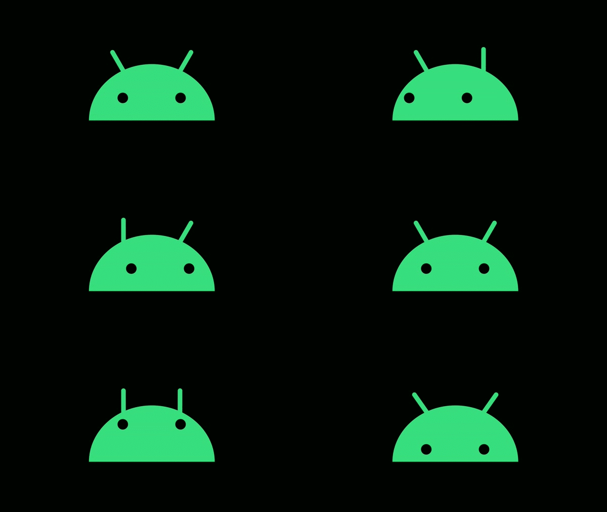
The new Android mascot is undeniably simpler. Removing the arms, legs, and torso moves the focus to its most expressive feature: the head. Google has been thinking a lot about how it can use small expressive elements like antennas and eyes to give the robot emotion and life, and it’s come up with some really interesting concepts. The antennas can help express emotion, lead the viewer’s eyes in a certain direction, and more.
Goodbye tasty treats, hello version numbers

While rethinking how it could make Android’s branding more accessible, Google concluded tasty treat version names don’t work well in a global market. In some regions, people have never heard of KitKat bars. And let’s be real, does anyone really know how to pronounce nougat?
While it’s a little sad to hear, moving away from version names to version numbers was the best call.
Now, Android Q is officially Android 10. This is a bit sad for the community, which has always loved to guess what the next version will be called. But Google assured me that it will still use internal codenames for major Android releases. Android Q was a bit of a transition period, likely because not many recognizable treats start with the letter “Q.” Regardless, I’d love to know what Google decides to call Android 11 internally.
Say hello to version numbers and goodbye to sweet treats.
But even with version numbers, Google is maintaining cohesiveness in the wordmark. The new design for Android 10 has the same curve you’ll find in the Android wordmark, referencing the robot. It all feels very similar and should help Android’s brand be much more accessible.
“So you’ll even notice in the mark for Android 10, that the same radius that you’ll see reflected in the Android wordmark has been carried through into the number 10. So that number “1” that you see has that same little curve, that same radius, which of course is based on the shapes that you see in the Android robot,” said Thomashow.
“In many ways, the Android robot has made its mark in many more aspects of our brand identity.”
It’s nice to see Google embracing Android as part of the Google brand. I personally thought it would eventually shift the branding to something along the lines of Google OS. That’s still possible, but Google seems to be leaning into Android for now. The dessert naming scheme might be disappearing from products, but the core OS is still the same Android we’ve always loved.
Just please don’t make us rebrand to Google Authority. I love my job.