Affiliate links on Android Authority may earn us a commission. Learn more.
Let’s face it, the Android brand refresh was long overdue
Android is getting a new logo and a new naming scheme that drops the quirky desserts in favor of dry, flavorless numbers. These are relatively small changes, but they touch on some of the most unique and beloved aspects of Android. They are bound to be controversial.
As my colleague Scott argues, Android is losing a bit of its quirky identity by dropping the celebrated tradition of naming releases after sweet treats. And that’s true about the new logo as well. But hear me out as I play devil’s advocate.
I think Google’s decision to retire the Bugdroid is correct and quite overdue.
No country for old droids
12 years after its debut, the green mascot is no longer representative for everything that Android stands for. The cute little robot is simply too humble for it.
The Bugdroid (an unofficial nickname, also known as Andy) was not supposed to be the logo of a major consumer brand. It was made to appeal to developers and meant to inspire simplicity and accessibility. It suggested Android was a piece of software anyone could pick up and start working with right away.
Don’t miss: Inside Google’s massive Android rebrand
The designer of the original green robot, Irina Blok, sketched its rough outline in, quite literally, five minutes. It kind of shows: there’s no pretense of sophistication here.
Cheap and cheerful
“There were 2 designers working on this – but at the end my sketch was selected…it is ironic that the most basic symbol was chosen. In fact, this was my first sketch that I created in 5 minutes, and after that we spent weeks ideating and sketching more. I think the simplicity of this mark really made a statement, this became an international symbol of Android (just like airport signs: men, woman, android),” Blok recounted.
The original Bugdroid was a cheap and cheerful limey green (hex code #A4C639), and it was nothing like the glossy skeuomorphism of 2007-era iPhones. The cheap aesthetic was likely intentional. Google needed to convey to developers and phone makers that Android provides tremendous value for free. Android’s biggest goal at the time was fast adoption. It worked extremely well.
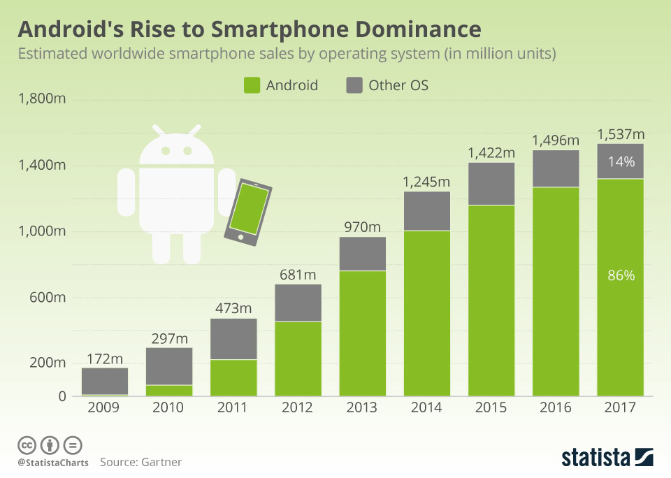
It worked for consumers as well – the unassuming green robot became an accidental crowd favorite. Google open sourced its design, so people and companies worldwide – even a theme park in North Korea – freely used the robot design, making it feel ubiquitous (and even cheaper) in the process.
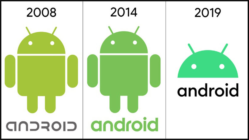
The Android logo received a small facelift in 2014. The robot remained mostly unchanged, except for a new hue of green. The “android” wordmark (the other Android logo) was revamped though, swapping the nerdy, sci-fi lettering for a more modern and inclusive design.
The same year, Google started requiring phone makers to use a “Powered by Android” splash screen on their devices. Only the wordmark was used, which was telling for how Google viewed the robot logo.
Material Design was also introduced in 2014, bringing some much needed visual consistency to Google’s numerous apps and broader Android app ecosystem.
Disembodied, but inclusive
Today’s refresh seems a culmination of changes set in motion in 2014 with the release of the minimalistic Material Design. The full robot is replaced by just its head, the most expressive part of the original design.
One driving principle behind the new design is inclusivity. It’s a thread going back all the way to 2007. The original Bugdroid was meant to be inclusive – it had no gender, no nationality, and as Irina Blok explained, “there are no cultural references to any other characters or cultural icons.” But Google felt it could make it more universal.
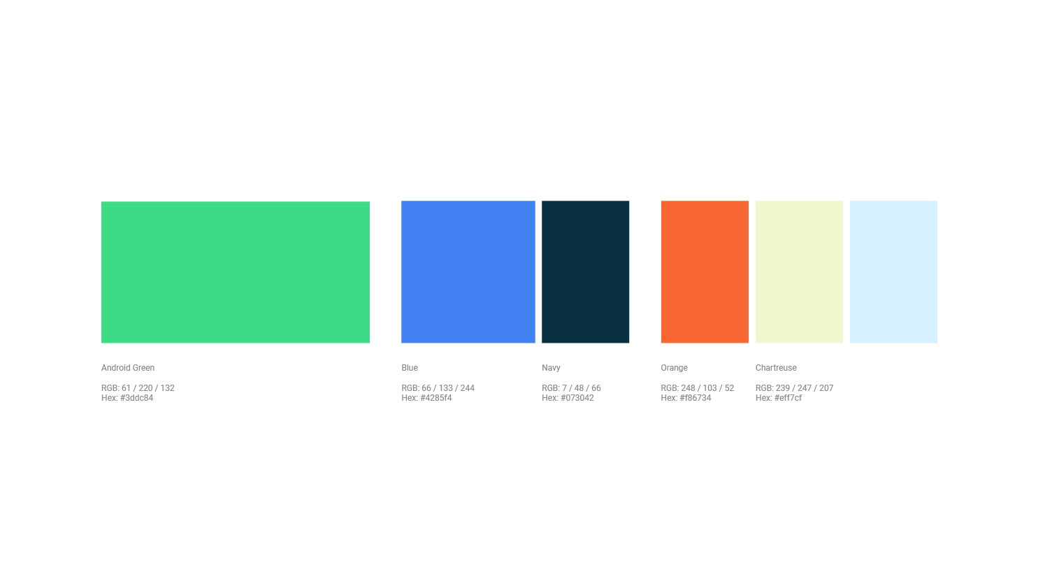
The new shade of green incorporates more blue. Sydney Thomashow, Google’s lead for brand and creative for Android, told us this works better for people with color-related visual impairments. It’s also easier to pair with other colors.
Other small tweaks include tiny adjustments to the position of the eyes and antennas to make it more expressive and balanced.
There’s a lot of attention to detail here, which was hardly the case with the original design.
The new logo is much more cohesive too. For the first time, the Android logo is made up of both a symbol (the head) and a wordmark (the “android” text). Previously, the two were used in parallel, in a somehow disjointed fashion.
“We took a tremendous amount of inspiration from sort of our most recognizable asset, which is the Android robot. And we started to make our wordmark a little bit thinner, a little more geometric and modern. And we actually introduced some curves into the wordmark itself that mimic and reflect the same radius that you would see all throughout the robot,” Thomashow said. There’s clearly a lot of attention to detail here, which was hardly the case with the original design.
On a tangent, Google said dropping dessert names is about accessibility too – names like Marshmallow, Nougat, or Lollipop are hardly global, or easy to pronounce for that matter.
Sophistication comes at a cost
The logo refresh is a fitting metaphor for Android’s growth as a technology and ecosystem. The original software was extremely basic, so much so that phone makers basically had to create their own skins to make up for its shortcomings. That’s all ancient history now: recent versions of Android have been all about refinement. In 2019, the key updates were focused on, you guessed it, accessibility. The days of fast growth and radical new features are over.
I asked Android Authority’s resident graphic designer Tayo Onabule what he thinks of the new design. His comment pretty much sums it up:
“A decidedly legible and familiar typeface, a lively and accessible color palette, and the most characterful realization of the Android mascot yet — Android is now a brand built for global audiences.”
Tayo also noted that Google might have been driven to refresh Android’s brand by competition from inside its own ecosystem. “They’re clearly trying to get it on the same level of seriousness and maturity that their other brands are on. In the same way that One UI for Samsung was a real smartening up of their approach to design,” he said. Indeed, this brand refresh comes as Google is differentiating its own flavor of Android, distinct from Samsung’s or Huawei’s takes.
Like the modern Android OS, the new Android logo is refined, yet stays faithful to its legacy. After all, the Bugdroid’s head is still in there. It no longer feels cheap, and that’s appropriate now that even budget Android phones feel “premium.”
Some may say Android is losing a bit of its soul and they may be right.
Some may say Android is losing a bit of its soul today and they may be right. But Android has to evolve, and at least some of the spirit of the old brand lives on. If it’s any consolation to you, Bugdroid is still open source. Nobody will stop you from using it just like before. I suspect the green robot will long remain beloved in the community, regardless of what happens to the official brand.
The final question is, is this a step towards a complete drop of the robot mascot or even the entire Android brand? Google gave us absolutely no clue that’s going to happen, but it’s not inconceivable. Speculation about an eventual replacement of Android has been going on for years, most recently fueled by the development of Fuchsia. Will a new Google OS one day replace Android? Who knows, but one thing’s for sure: the Bugdroid’s retirement was long overdue.