Affiliate links on Android Authority may earn us a commission. Learn more.
Android's design guidelines: what are they, and why should you care?
Published onAugust 25, 2014
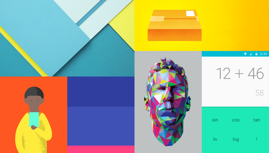

These days, there isn’t much left to say about design on Android. There’s a lingering stigma that Android applications are designed for tech enthusiasts, and remain inaccessible for the average user. The platform has many poor first impressions to overcome, but the design team at Google is working hard to clean up their fragmented past.
What Are Design Guidelines?
In some ways Google’s Android Design Guidelines (and similarly Apple’s Human Interface Guidelines) could be called Design Conversation Starters. They are not a coding framework, and they are not a programming language. Instead, they are a collection of thoughts, ideas, and principles that provide a common vernacular for designers and developers.
“What do you think about using an ActionBar?”, “I think a card metaphor is what we’re getting at here”, or “I’m not sure if this scene transition translates well to a larger screen.” These are all potential examples of conversations that product developers are having about the popular applications you use every day.
Provide A Baseline Look And Feel
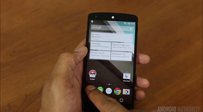
The guidelines also serve as an example of how basic applications should look and feel. Keep your navigation and actions along the top of the screen, maintain logical navigation hierarchies, avoid touch targets less than 48dp (density-independent pixels) in size, etc. However, these specifically read more like rules than guidelines. It’s preferred that you follow them, but hey, rules were meant to be broken.
Think Of The Users
Above the need for designers and developers to have a language to converse in, the user is paramount to any discussion. Having design guidelines means that users will naturally acquire a lexicon of behaviors that they can bring with them into any new application they encounter. Just like how your users know that ctrl+z is undo and you can right click for more options, they will also know that pulling to refresh will give them new content, and pressing back will return to their previous view.
Why Have Guidelines At All?
No article on Android Design would be complete without paying homage to its past. A past that I, and all other Android enthusiasts, would prefer to soon forget. A lot of these conversations start out the same way, “Why have guidelines at all? The web doesn’t have guidelines, why does Android?” That’s a whole article in itself, one I’m probably not qualified to write, but I’ll try and shed some light.
There were always design guidelines, but they usually read more as a book of rules rather than a ice breaker for conversations.
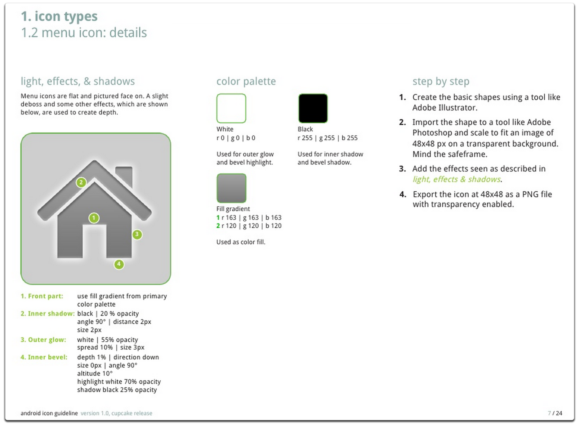
Android applications got off to a rocky start. There were always design guidelines, but they usually read more as a book of rules rather than a ice breaker for conversations. I remember one of my proudest moments as a budding designer was making the menu icons for the Android app at my first company. It had a complex set of rules to ensure that they looked like the icons in the rest of the system. In my naive experience, this was the pinnacle of design. Such thought was put into every glowing detail.

The only navigation available in the design documentation were tabs across the top of the screen, and a dashboard pattern (which I like to call the “Six Pack”) used in a twitter app (the source of which I’m still waiting for). There were many navigation needs that were left completely unanswered, and the designers did their best to fill those gaps. Actions would be in tab bars, navigation would be in menu items (from the physical menu button), and screens with actual back buttons baked into them, to name a few.
None of these design paradigms were inherently wrong in themselves, and they have all worked their way into the modern design framework in different ways. But the platform was evolving quickly, and applications designs were updating too slowly to allow these patterns to figure themselves out on their own volition.
#HOLO
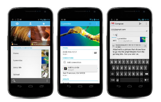
Quickly realizing the developers’ struggles, and needing a platform for unifying Android 2 and 3, the design team at Google brought us the Holo Design Guidelines with Android 4. Holo catapulted us into the modern application design age. Finally, the tools were available to reliably design applications in a unified style, and justifiable reasons were given as to why other platforms shouldn’t be mimicked.
Android 4 brought us an official ActionBar API, allowing us to easily add action bars across our applications. It also brought us Fragments (a system that enabled creation of views that could be rearranged in different ways to enabling phone and tablet interfaces to use the same components), better notifications, and a plethora of new features that put the platform on track to fostering a successful ecosystem.
Material World
The transformation from Android 4 to Android L is tremendous, and arguably even bigger than the jump from Android 2 to Android 4. Many developers are harkening this as Android design’s golden age, where the creative tools available are among the best in the industry.
Cognitive Context
Material applications are finally going to provide us some much needed cognitive context for many of the transitions designers are expecting us to understand. In Android L, visual components (called Hero Elements) will seamlessly transition from one screen to the next. An avatar from your contacts list will transition to its location on the details screen. An image in a grid will scale to the screens size when touching. It should finally make sense where the data on the screens is actually coming from.
Dynamic Color
I love color, and I love that Android is now treating color as a first class citizen. PocketCasts is a beautiful podcasting application I use on a daily basis, but no longer will it hold a monopoly on color-accented colored user interfaces in the Android ecosystem. With the introduction of Palette (an addition to the support-library with blazing fast algorithms that extract prominent colors from an image), as well as easy image tinting, Android applications are going to start looking more vibrant, and will adapt to the content in which they are displaying.
A New Era Of Card Based Interfaces
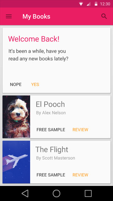
Developers have been asking for a card layout since Google+ introduced it almost 2 years ago. They were reluctant to hand it out, presumably because there wasn’t much benefit they could add aside from baking in a few assets for you. This has changed in L: A card widget has been added, but it does more than just provide you a simple card wrapper for your content. It provides simple API’s for specifying the corner’s radius, it masks the corners of content for you, and most of all, it provides shadows for you, even in the support versions, so that your shadows will look identical across all versions of an application.
Floating Action Buttons are the new kids on the block – expect to see more.
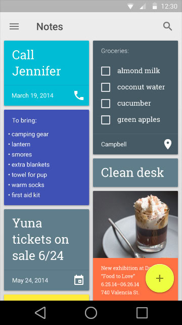
We have seen floating action buttons across a handful of apps in the past – Path, Tumblr, and Foursquare (the old one) to name a few, but these buttons have never been considered a design paradigm until now. Like it or not, this Floating Action Button (FAB for brevity) is going to start making an appearance in many of your favorite applications this fall.
Materials Are Platform Independent
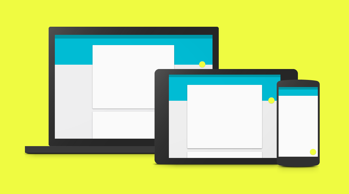
Developers and Designers, from Google or not, are striving towards one goal: Make beautiful applications that enrich the lives of those who use them.
The last key aspect of material design, and potentially the most important: Material design is not the new design language for Android. Material design is the new design language for Google, on all fronts. This means that we’ll be seeing Material design invading all of Google’s web properties, like Gmail and Maps. And don’t be surprised when you start seeing shadows making a comeback in your iOS applications.
The Evolution Of Design
The latest iteration of the Android Design Guidelines from the design team at Google is the best yet, and we should all be excited at the innovation it brings to the table. Even more importantly, they leave plenty of room for flexibility and interpretation to ensure that any idea can be represented in the best way possible.
Developers and Designers, from Google or not, are striving towards one goal: Make beautiful applications that enrich the lives of those who use them. Take a closer look at the applications you use everyday. Pay attention to which design patterns they follow, and also which ones they don’t. Every detail in these applications started out as a conversation – “Lets take a look at the guidelines.”
(Imagery taken from http://www.google.com/design/spec/material-design/introduction.html)