Affiliate links on Android Authority may earn us a commission. Learn more.
Here is a very sterile visual history of Android software distribution
Published onJanuary 11, 2017

A YouTube video uploaded yesterday provides a straightforward look at the distribution of the Android platform beginning December 14, 2009. The one minute, 17 second-long video shows the various Android versions’ adoption rate over time, bringing us up to date with the most current figures published by Google only a day ago.
The video’s uploader, Viktor Bohush, has a track-record of similar compilations, including classics such as Desktop browser market share over the years and the unforgettable Visualization and Comparison of Sorting Algorithms (which I believe was shortlisted for the 2015 Palme d’Or). Check out the Android versions video below.
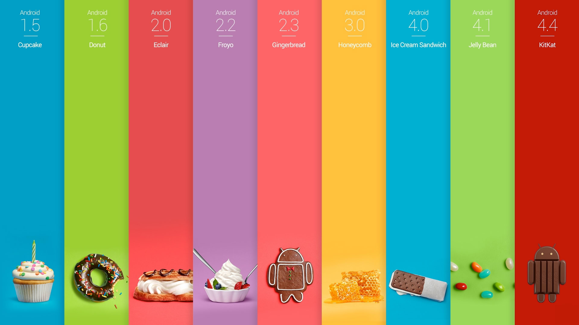
As you can see, the colored bars represent Android’s various versions. These scroll along the timeline, expanding and contracting in accordance with the percentage of overall devices they were running on at that period.
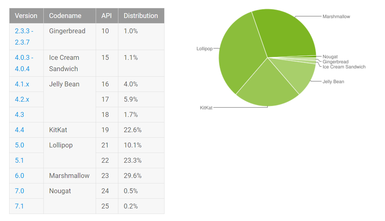
Meanwhile, Google’s distribution pie-chart shows only the current state of affairs. Android Froyo is now found on so few devices that it no longer makes the list and 0.7 percent of all Android devices are now running Android Nougat.

What did you think of the video? Let me know in the comments.