Affiliate links on Android Authority may earn us a commission. Learn more.
Android Go has a redesigned Recents view for more efficiency
Published onMay 20, 2017

In addition to specially optimized apps like YouTube Go, Android Go will feature a brand-new Recents UI to allow for faster and more power-efficient switching.

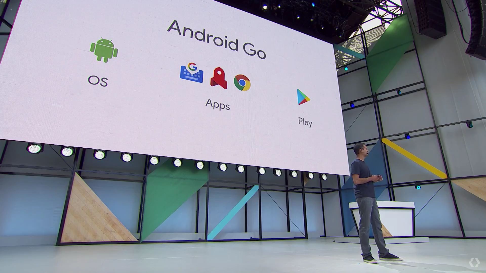
One of the most exciting announcements at Google I/O this year (aside from Google Home launching in Canada this summer) was the introduction of Android Go. Designed specifically for budget-friendly Android smartphones not just in developing markets but also established ones like the US, Android Go is similar to Android One but does not replace it. Any Android smartphone with 1GB of RAM or less will run on Android One, which boasts a completely modified system that promises significant power-efficiency and low data consumption.
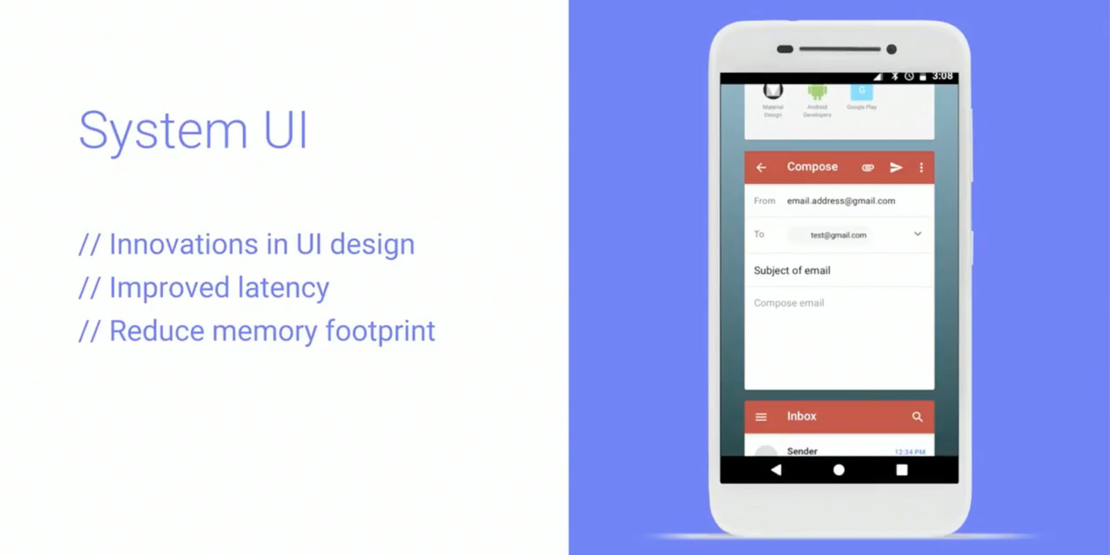
We’ve already explained how Google wants to bring optimized apps to these devices, but we haven’t heard much about the specific changes to the UI. Until now, that is. Google has made some important changes to the system UI, specifically the Recents view, in order to facilitate improved latency and to reduce memory footprint. Design-wise, with Android Go, you no longer have the stacked cards of recently used apps; instead, you get full preview cards, big enough to occupy the entire screen:

Google says that 95 percent of entry-level device users don’t do a whole lot of switching, usually sticking to the four most recent apps.
Google says that 95 percent of entry-level device users don’t do a whole lot of switching, usually sticking to the four most recent apps. Indeed, for power-hungry users, having almost full-screen cards in the Recents view is certainly less efficient than having stacked cards when it comes to jumping back and forth between multiple apps. However, it may not be so inconvenient for entry-level device users; in fact, it makes more sense. After all, this UI change is what enables fast and fluid switching on devices with 1GB or even 512MB of RAM.
What are your thoughts on Android Go? How do you like the new Recents UI? Let us know by leaving a comment below!